How to put the elements in the same line next to each other?
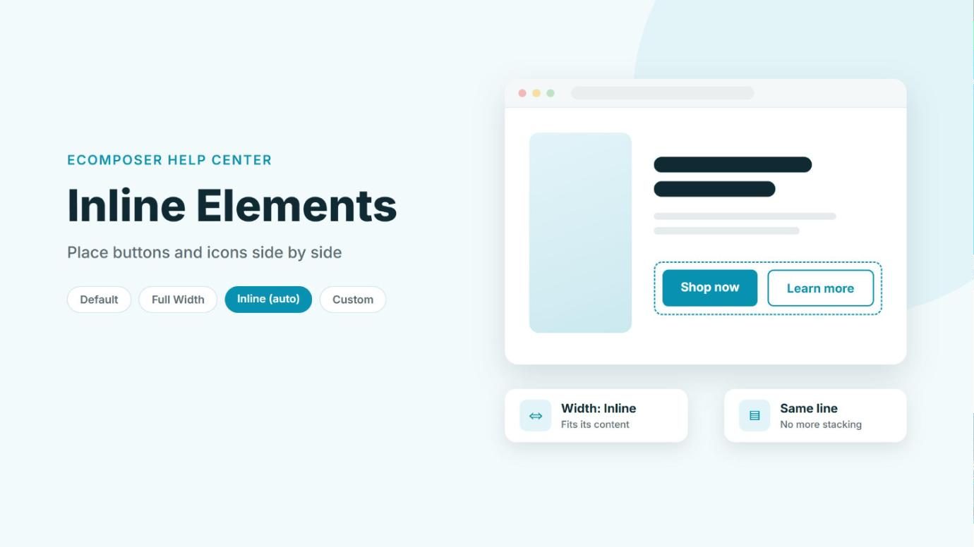
By default, every element you add in EComposer takes up a full line of its own, so two buttons or a few icons end up stacked on top of each other. If you’d rather have them sit side by side, for example a Shop now and a Learn more button, you can change their width to Inline (auto). Each element then only takes up as much space as its content needs, so the next one moves up right next to it.
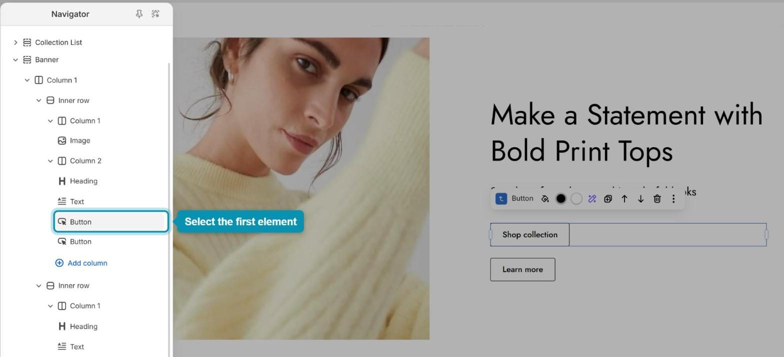
1. Select the first element
First, make sure the elements you want on the same line sit in the same column, one right after another. Then click the first one to select it. The easiest way is to open the Navigator (Ctrl + Shift + U) and click the element’s name there, so you don’t accidentally select something else on the canvas.
2. Set its width to Inline
Next, tell the element to only take up the space it needs instead of the whole line.
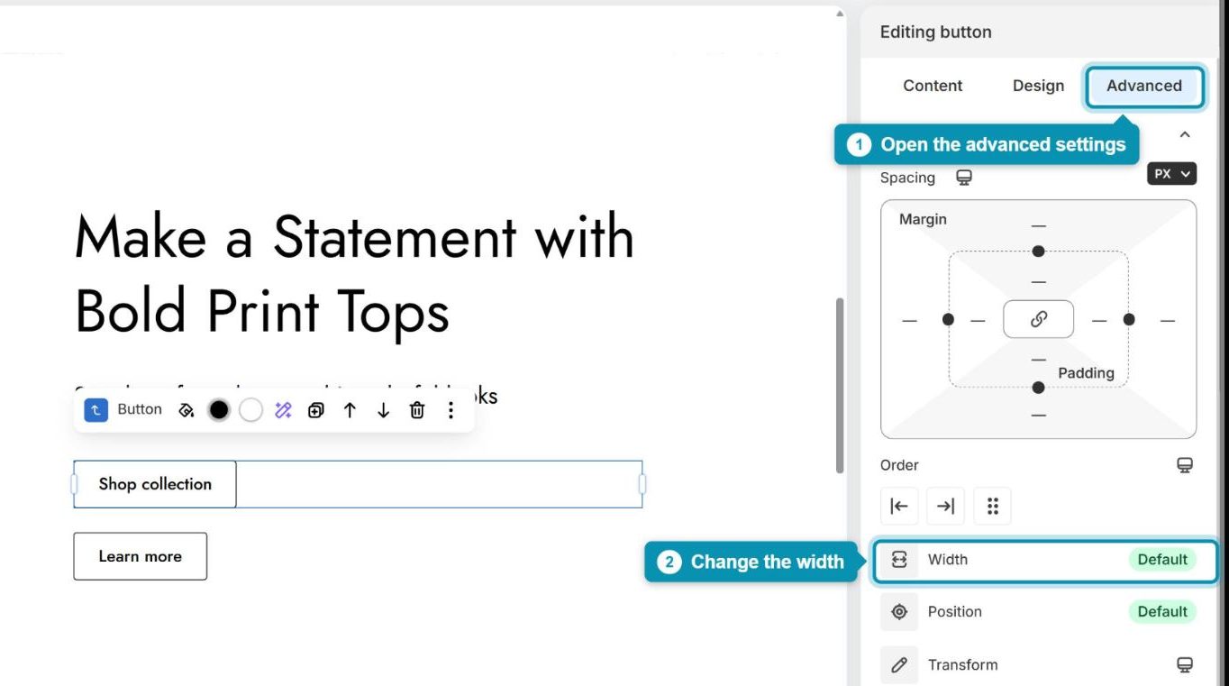
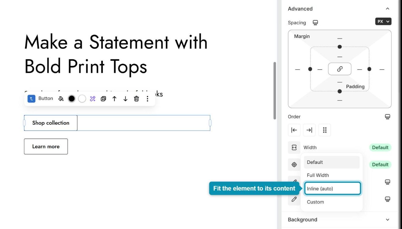
Step 1: In the settings panel on the right, open the Advanced tab, then click Width to see the width options.
Step 2: Choose Inline (auto). The element now shrinks to fit its content, but it stays on its own line until the next element is set to inline as well.
3. Repeat for the other elements
Now select the next element and set its Width to Inline (auto) in the same way. Once both are inline, they line up next to each other. If they sit right against each other, add a little space by giving the second element a left Margin (for example 12) in the same Advanced tab. Do the same for any other elements you want on that line, then press Save (Ctrl + S) to keep your changes.
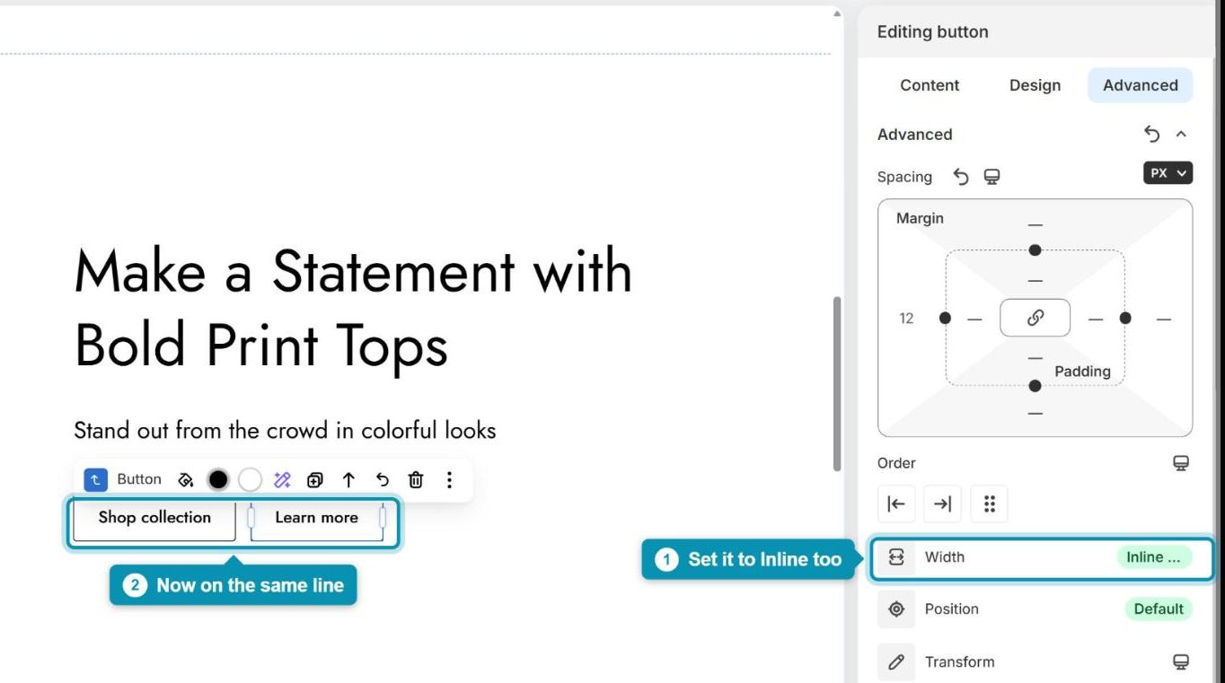
Elements only stay on the same line while there’s enough room in the column. If they’re too wide, the last one wraps onto a new line, so keep the content short or give the column more width. Changed your mind? Simply set Width back to Default.
4. Another way: use an Inner row
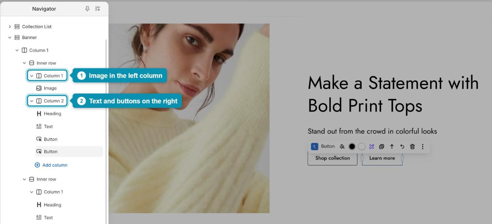
If you need more control, such as equal widths or a different alignment for each element, add an Inner row with several columns instead and put each element in its own column. The columns always sit side by side, so their content does too. In the example below, the image lives in Column 1 and the heading, text and buttons live in Column 2 of the same Inner row, so they appear next to each other on the page.