How to reverse position of element?
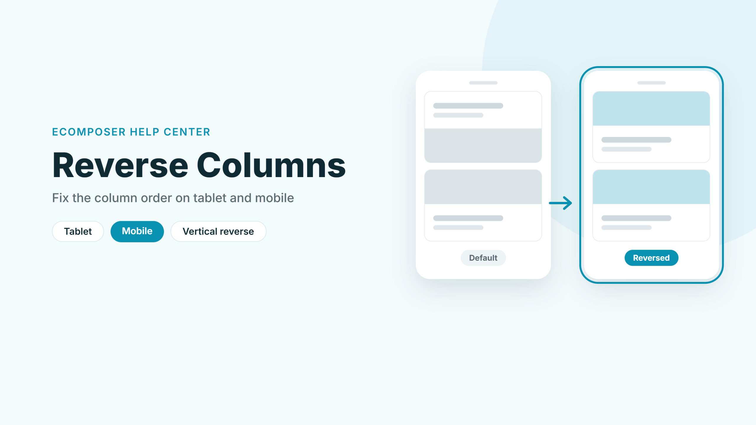
If you’ve designed a page where images and text alternate from row to row, you may have noticed that this pattern doesn’t always hold up on smaller screens. On tablet and mobile, columns stack on top of each other, so two images or two blocks of text can end up right next to each other. The Reverse option fixes this by changing the column order on tablet or mobile only, so your desktop layout stays exactly as it is.
Reverse works on sections and inner rows that contain columns. For the best result, make sure each column takes up a full line on the device you’re editing.
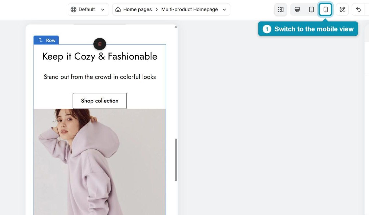
1. Preview the page on tablet or mobile
Because Reverse is set separately for each device, start by switching to the view you want to fix. In the top toolbar, click the Tablet or Mobile icon, and the canvas will show how your page looks on that screen size.
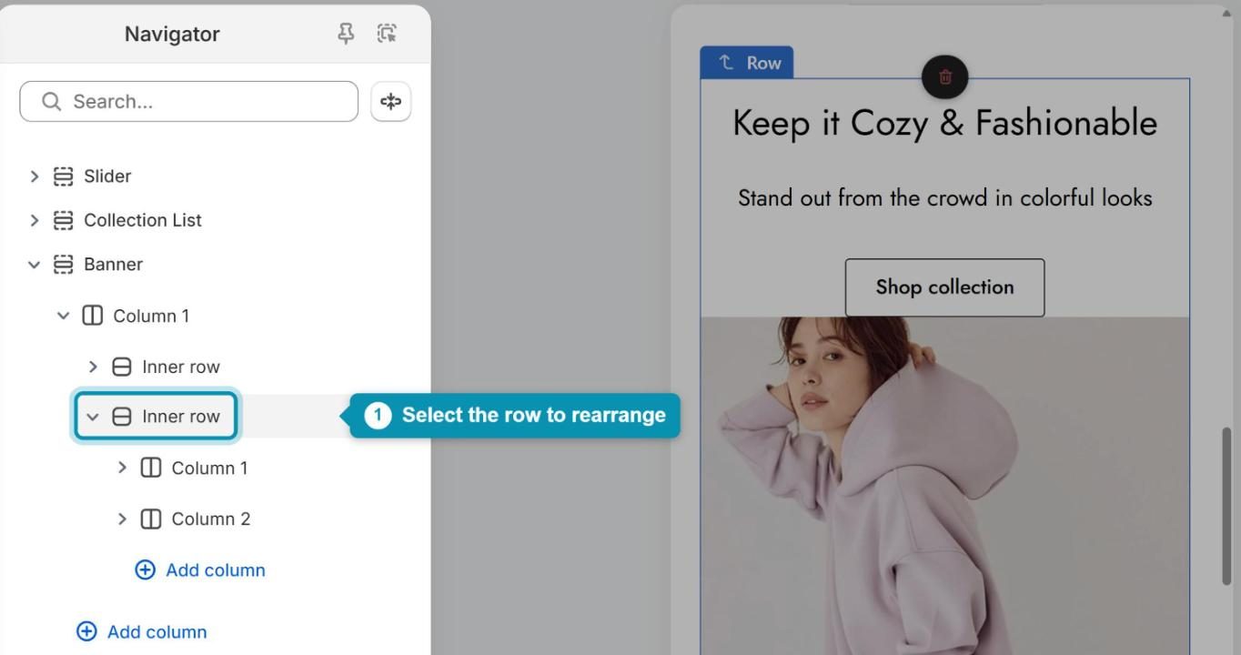
2. Select the row you want to rearrange
Next, pick the section or inner row whose columns appear in the wrong order. The easiest way is to open the Navigator (Ctrl + Shift + U) and click the row’s name there, so you don’t accidentally select an element inside it.
3. Reverse the column order
Now you’re ready to swap the columns. It only takes a few clicks.
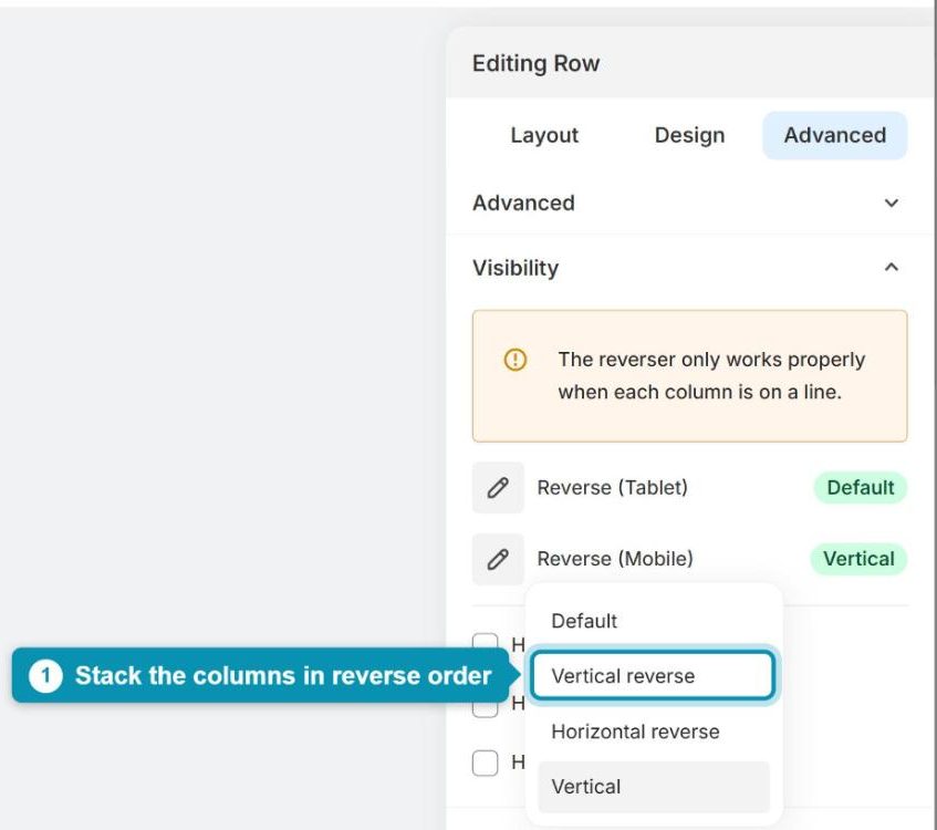
Step 1: In the settings panel on the right, open the Advanced tab and expand Visibility. You’ll find a Reverse option for both tablet and mobile here.
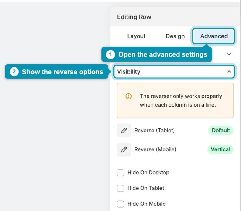
Step 2: Click Reverse (Mobile), or Reverse (Tablet) if you’re working on tablet, and choose Vertical reverse. The columns switch places right away, so you can see the new order on the canvas.
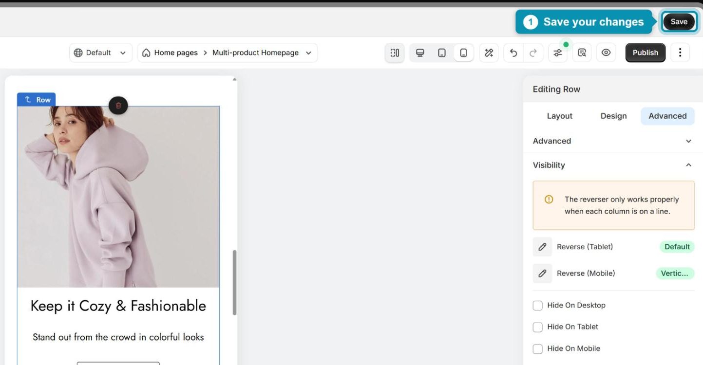
Step 3: Take a quick look at the preview to make sure everything sits where you want it, then click Save to keep your changes.
Changed your mind? Simply set the option back to Default to restore the original order. Either way, your desktop layout won’t be affected.