

Variable Products Extension
If you are looking for a way to split variants on the collection product list by Color or any other variant options, this is a new solution we bring to you!
Normally, a variable product occupies one slot in the product grid list. However, with this extension, you can display one product multiple times, and each variant can have its own slot in the catalogue. This improves product visibility, makes it easier for customers to find the desired variation, and can increase product discoverability and conversions.
As you can see in the image below, the product “Everyday Tote Bag” is showing 9 times continuously. Because this product has 9 different colour variants: Pink, Black, Yellow, and more.
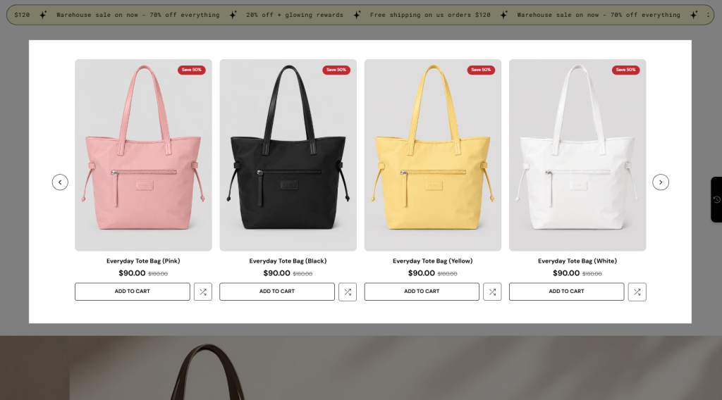
That means you can display each variant as an individual product while in the Shopify admin and Product details page, this product is still counted as only one product.
Note: You can use this extension on EComposer Pro and Premium plans. Upgrade now to unlock
1. How to install the Variable Products Extension?
Step 1: From your EComposer dashboard, go to CRO Extensions from the left sidebar menu.
Step 2: Search for the Variable Products extension.
Step 3: Click Details and install the extension on your store.
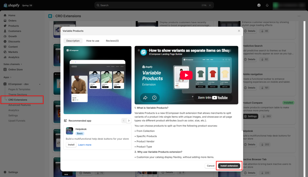
After installing the extension, go to Shopify Admin > Products and configure the variants for your products (such as Color, Size, or Style). For example:
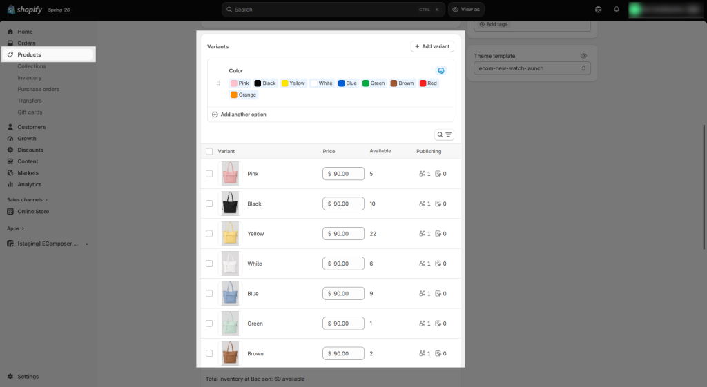
Notice: Variable Products does not enlarge the actual amount of your products of your store.
2. Call the Extension to the Editor & Customize
Inside the EComposer editor, open the Extensions tab from the left sidebar, then find the Variable Products extension from the installed extensions list and drag it into your desired position on the page. After adding it successfully, you can start customizing the extension settings and style.
2.1. Content
General
- Product source: Choose where the extension should retrieve products from.
- Collection: Display all products from one or more selected collections. This is the recommended option for displaying a large number of products.
- Specific products: Manually select individual products to display.
- Product vendor: Display products from one or more selected vendors (brands).
- Product type: Display products that belong to one or more selected product types.
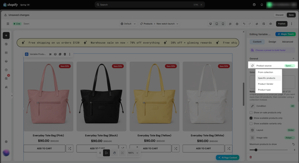
Note: A maximum of 20 unique products can be displayed per page when using this option. If you need to display more than 20 products, use Collection instead.
- Condition: Choose how product variants are displayed.
- All: Display all variants from the selected product source.
- Choose option to show: Display only variants that match the selected product option (for example, only variants with specific Colors or Sizes).
- Show on-sale products only: Filter the product list to show only products or variants that have a sale price.
- Show available products only: Filter the product list to include only products that are currently available for purchase.
- Show available variants only: Display only variants that are currently in stock. Unavailable or sold-out variants will be hidden.
- Layout: Choose how products are presented on the storefront.
- Slider: Display products in a horizontally scrollable carousel.
- Grid: Display products in a multi-column grid layout.
- List: Display products in a single-column list with more product details.
- Image ratio: Select how product images are displayed.
- Adapt to image – Preserve each product image’s original aspect ratio.
- Portrait: Display all product images in a vertical (portrait) ratio for a consistent appearance.
- Square: Display all product images in a 1:1 square ratio for a uniform product grid.
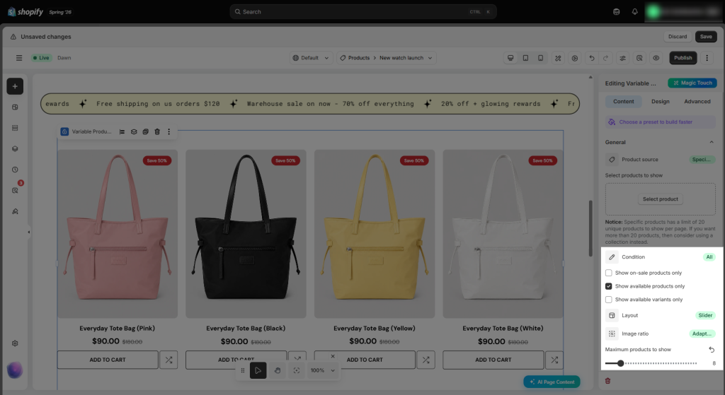
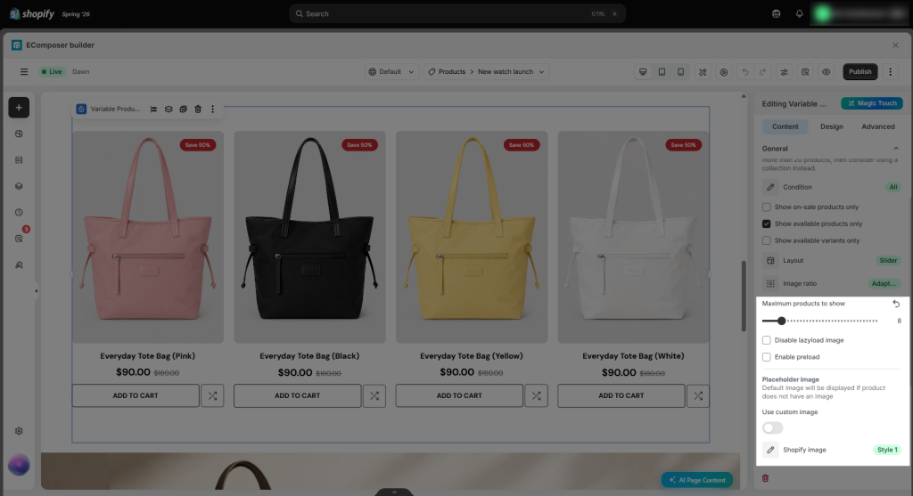
- Maximum products to show: You can adjust the number of products shown on a page.
- Disable lazyload image: Disable image lazy loading so that product images are loaded immediately when the page loads. This may improve the initial display of images but can increase page load time.
- Enable preload: Preload product images to help them appear more quickly when customers view the page, improving the browsing experience.
- Items per row: Select the number of items per row/line (It will be shown if you choose the Grid or List layout)
- Column/Row gap: Set the space between column and row.
Product Card
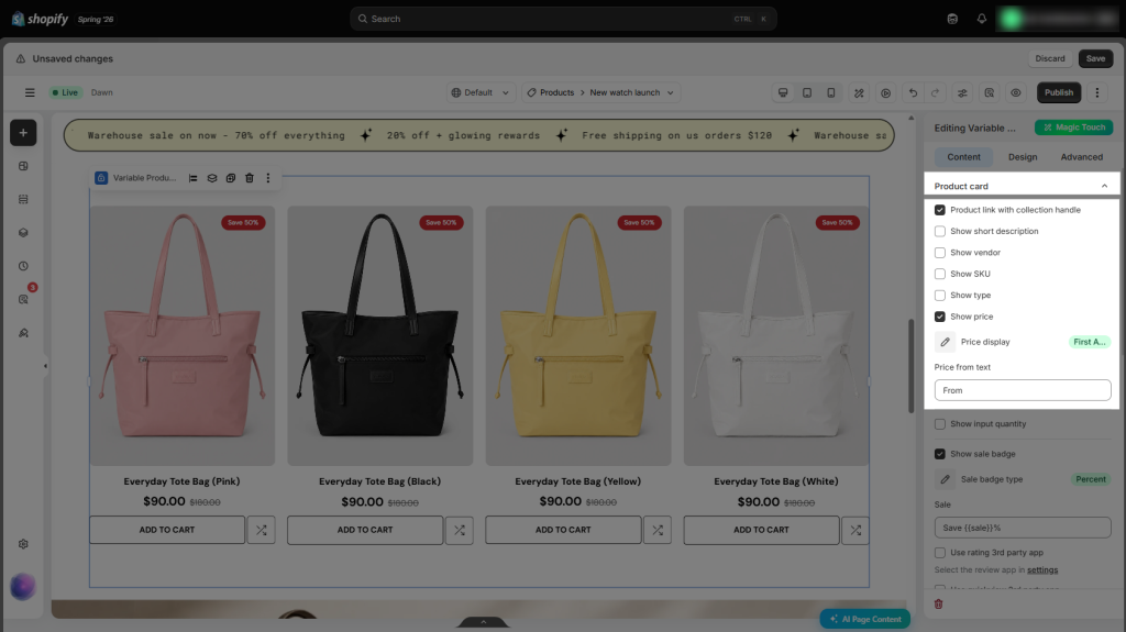
- Product link with collection handle: Include the collection handle in product URLs, allowing products to open within the selected collection and supporting breadcrumb navigation on compatible Shopify themes.
- Show short description: Show the product’s short description beneath the product title in the product list.
- Show vendor: Include the product vendor (brand) in the product information.
- Show SKU: Include the SKU (Stock Keeping Unit) of the selected product variant.
- Show type: Show the product type assigned in Shopify.
- Show price: Include the product or variant price in the product listing.
- Price display: Choose how the product price is presented.
- First available variant: Uses the price of the first available variant.
- Price min: Uses the lowest price among all variants. This option is recommended when variant prices differ.
- Price from text: Specify the text shown before the minimum price when Price display is set to Price min (for example, From or Starting at).
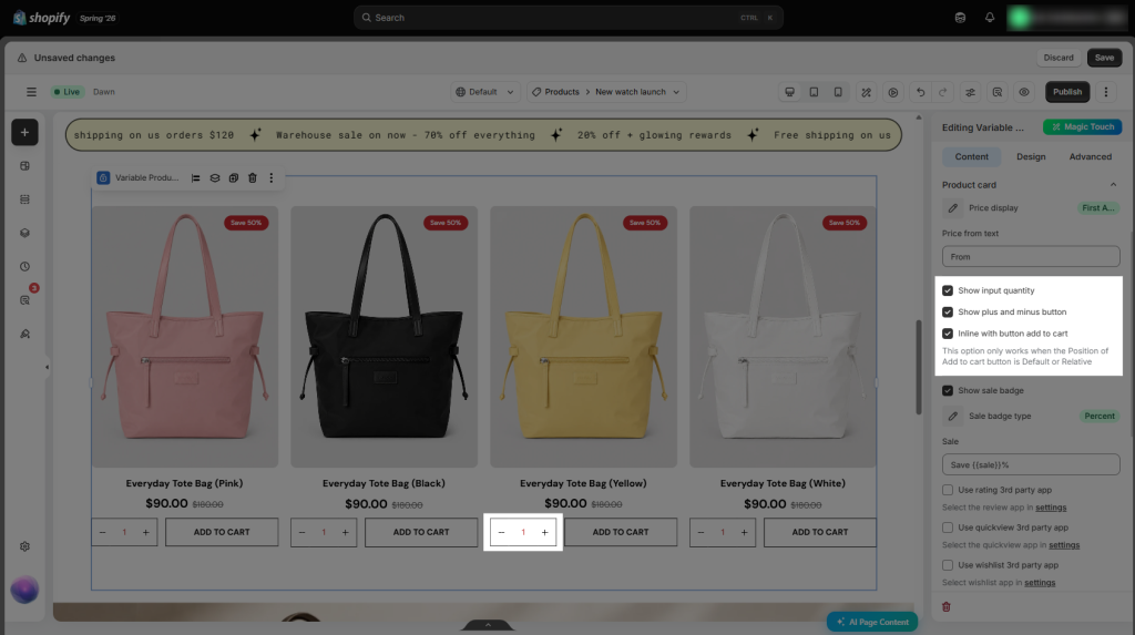
- Show input quantity: Add a quantity selector to each product, allowing customers to adjust the number of items before adding them to the cart.
- Show plus and minus button: Add + and − buttons to the quantity selector, allowing customers to increase or decrease the quantity with a single click.
- Inline with Add to Cart button: Place the quantity selector and Add to Cart button on the same row for a more compact layout.
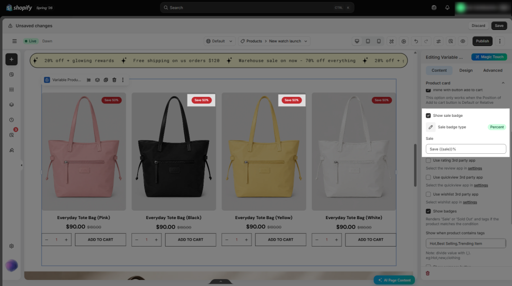
- Show sale badge: Show a sale badge on products or variants that are currently on sale.
- Sale badge type: Choose the format of the sale badge, such as displaying Percent value or the Discount amount, depending on the available options.
- Sale text: Customize the text shown on the sale badge (for example, Sale, On Sale, or Limited Offer).
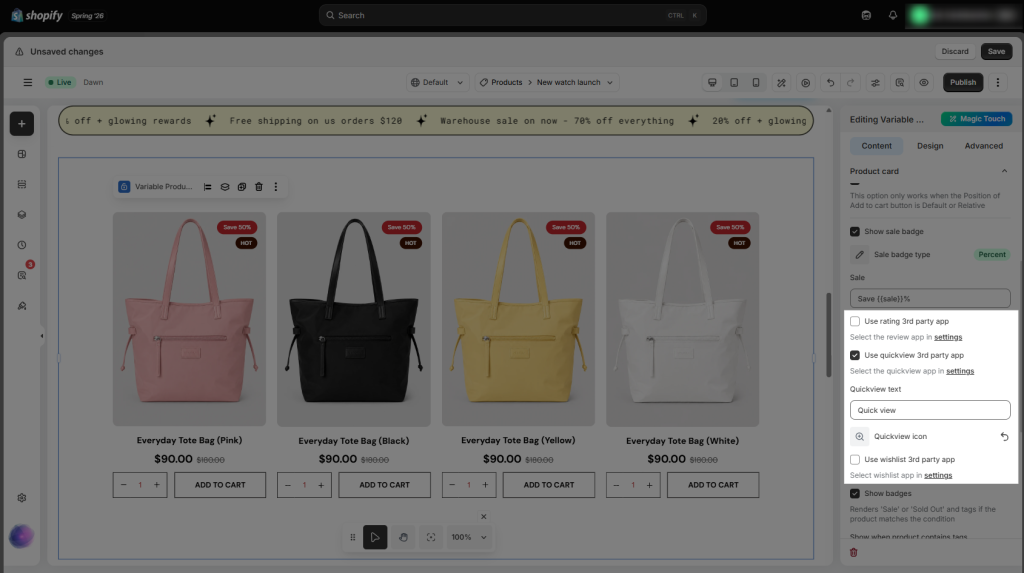
- Use rating 3rd party app: Enable integration with a supported third-party review app to show product ratings in the product listing.
- Use quickview 3rd party app: Enable integration with a supported Quick View app.
- After enabling this option, select the Quick View app in Settings. For the quickest setup and the best compatibility, we recommend using EComposer’s built-in Quick View feature here.
- Quickview text: Customize the text shown on the Quick View button.
- Quickview icon: Select an icon to appear alongside the Quick View button text.
- Use wishlist 3rd party app: Enable integration with a supported third-party wishlist app, allowing customers to save products to their wishlist directly from the product listing.
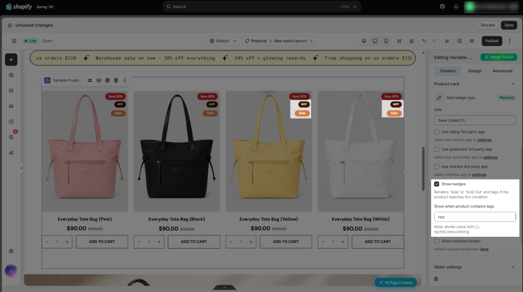
- Show badge: Displays the Sale badge when a product is on sale. Similarly, the Sold Out badge is displayed when the product is out of stock.
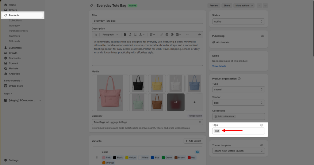
- Show when product contains tags: This feature allows you to display custom labels on product items based on their assigned tags. For example, if you’d like to display a “Hot” label, simply add the “Hot” tag to the product and enter the corresponding tag name in this option. The label will then be displayed automatically on the product item.
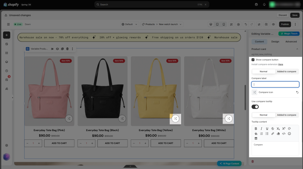
- Show compare button: Add a Compare button to each product, allowing customers to add products to a comparison list. To set that up, you can install this extension from EComposer to ensure full compatibility.
- Compare Label: It will let you enter the text for the button—for example, setting it to “Compare” before clicking and “Compared” after clicking.
- Compare Icon: You choose the icon to use. This visual cue lets mobile or fast-scrolling shoppers immediately see which items are selected.
- Use Compare Tooltip: Displays a helpful hint like “Add this item to your comparison list”
- Tooltip content: Customize the text displayed in the tooltip when customers hover over or interact with the associated element.
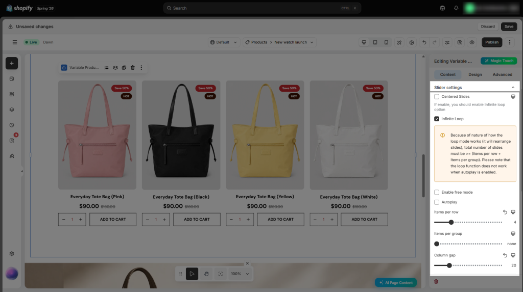
Slider setting
- Centered Slides: Center the active slide within the slider, allowing the previous and next slides to remain partially visible.
- Infinite Loop: Continuously loop through the slides, returning to the beginning after the last slide without interruption.
- Enable free mode: Allow the slider to scroll freely without snapping to individual slides, providing a smoother swiping experience.
- Autoplay: Automatically advance through the slides at a predefined interval without requiring customer interaction.
- Items per row: Specify the number of products to show in a single row.
- Items per group: Specify how many products move together when customers navigate the slider.
- Column gap: Set the horizontal spacing between product items in the layout.
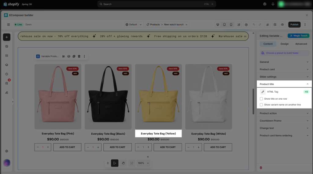
Product title
- HTML Tag: Choose the HTML tag used for the product title, such as H1, H2, H3, or Paragraph (P). This setting helps maintain the desired page structure and SEO hierarchy.
- Show title on one row: Keep the product title on a single line. If the title is too long, it will be shortened and end with “….”
- Show variant name on another line: Place the variant name (such as Color or Size) on a separate line below the product title.
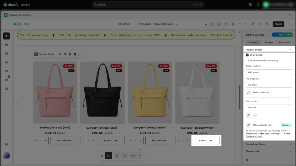
Product action
- Show button: Choose whether to show the primary action button for each product.
- Show “View More” button only: Show only the View More button, hiding other action buttons such as Add to Cart.
- Add to Cart text: Customize the text shown on the Add to Cart button.
- Add to Cart icon: Select an icon to appear alongside the Add to Cart button text.
- Pre-order text: Customize the text shown for products available for pre-order (for example, Pre-order or Reserve Now).
- Sold out text: Customize the text shown for products that are out of stock.
- Icon: Select an icon to accompany the Sold Out button or label.
- Add to Cart Then (This option is only available when Show Add to Cart Button is enabled): Choose what happens after a customer clicks the Add to Cart button. You can select different actions, such as showing the cart popup, reloading the page, and more. For a detailed explanation of each option, please refer to this guide before using the feature.
Countdown Promo
- Enable countdown: Show a countdown timer for each product, helping create urgency by indicating the remaining time for a promotion or offer.
- Enable progress bar: Show a progress bar alongside the countdown timer to visually indicate the remaining duration of the promotion or campaign.
- Layout: Choose how the countdown timer is arranged.
- Vertical: Stack the time units vertically.
- Horizontal: Arrange the time units in a single horizontal row.
- Time labels to show: Select which time units are included in the countdown timer.
- Week/Day/Hour/Minute/Second: Include the number of weeks, days, hours, minutes, seconds remaining in the countdown.
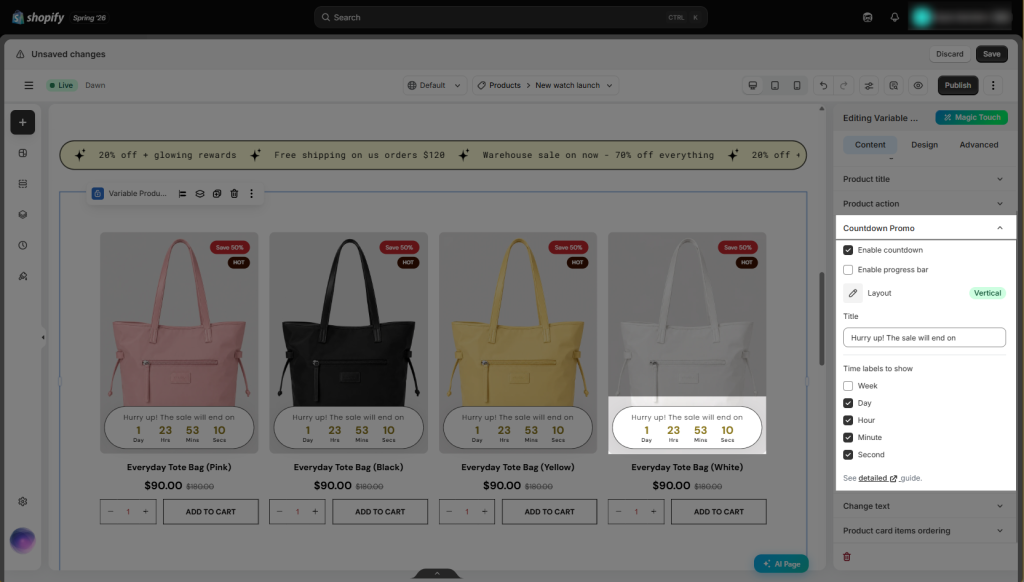
To do that, kindly go to Shopify > Products then select the product you want to add the countdown to.
After that, you can complete the setup by following the video below:
Change text
- This allows you to customize the text displayed for each field.
- For example, for the Title when no product when there are no products available, you can enter “There are no products yet” as the default message.
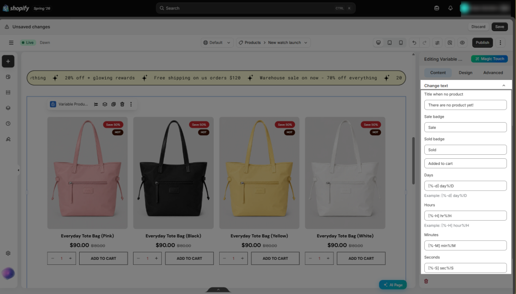
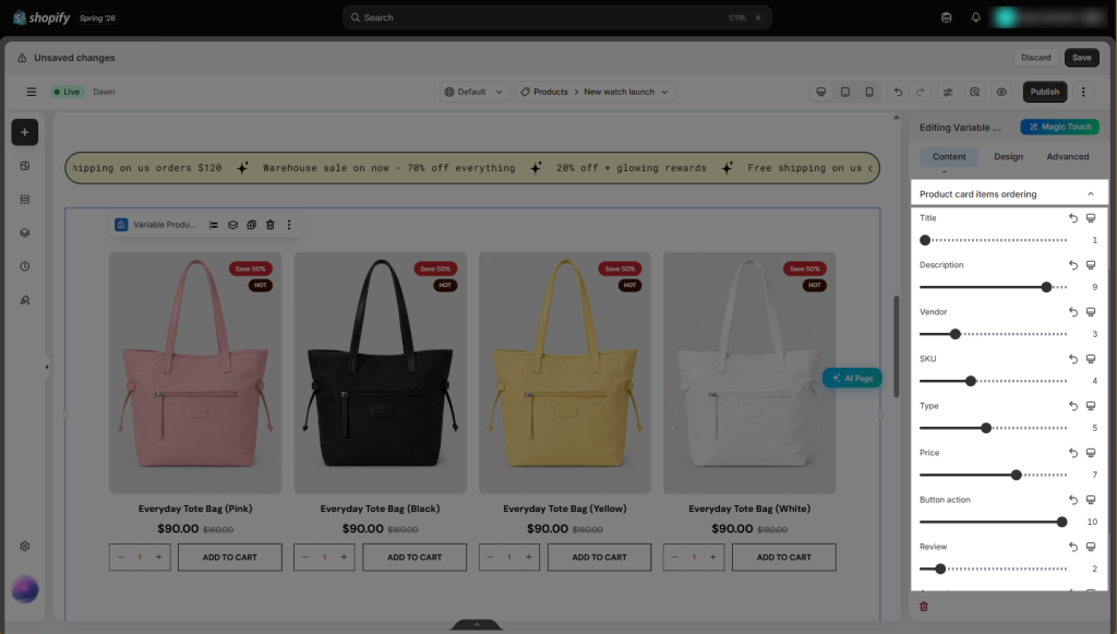
Product card items ordering
- Control the display order of elements within the product card.
- Blocks are arranged in ascending order based on their assigned value. For example, a block with the value 1 will appear first, while a block with the value 6 will be displayed last.
3. Design
The Design setting controls the visual presentation of variable product options on the storefront. It allows you to customize how customers see and interact with the available variations, without changing the product’s underlying variation data.
- General supports background for Normal & Hover, box shadow, border, border-radius, and padding.
- Product item has the same settings as General, but does not include padding. Instead, it provides a margin setting.
- Product image lets you edit the width, max-width, height, alignment, image fit, and opacity for Normal & Hover states. It also supports box shadow, border, border-radius, and spacing.
- Title supports alignment, typography, text color for Normal & Hover states, text shadow, fixed number of lines, and spacing.
- Variant title supports typography, text color for Normal & Hover states, and spacing.
- Price / Compare-at price / Sale price support alignment, typography, text color, text gradient, text shadow, and spacing.
- Add to cart/ Sold out / Quickview / Sold out support position, alignment, typography, width & height, text color, background, border, border-radius, and spacing for Normal & Hover states.
- Sale price badge / Sale badge / Sold out badge / Custom badge support alignment, typography, text shadow, box shadow, width, height, text color, background, border, border-radius, and spacing.
- Quantity supports width, height, alignment, quantity box spacing, quantity input alignment, typography, color, background, border, and border-radius.
- Plus / Minus / Navigation support size, rotation, color, background color, border, and border-radius for Normal & Hover states.


2 Comments
Nick
Hi, is it possible to filter which variant colors are shown on each collection page. For example, if I want to only show Pink variants on womens collection, and only show blue variants on Mens collection?
Anna Nguyen
Hi Nick,
If you want that, please create more collection templates and then assign them to your collections. For example, the collection template with the Pink color will be assigned to the Womens collection. And the collection template with the Blue will be assign to Mens collection. Here is the assign option https://prnt.sc/_dVbpgyMfU0a
Also, we have the option to select color to show here https://prnt.sc/YCSgpHjpQUQt
Feel free to ping us via live chat if you need any more help.