Countdown

Author: Henry Pham 967 views

When running a business, merchants always research and find out as many methods as possible to sell their products. They might use a sense of urgency to make shoppers come to a quicker decision on an order they are considering. Using countdown timers will take effect then.

The Countdown element helps you to limit the period of time that shoppers can make a purchase with the sale price. This could be a countdown until the end of a sales-off season, or for a specific offer such as a flash sale.

1. Generals

From the left side (Elements tab) > Basic elements option, you will see the Countdown element in the list of elements. Drag and drop it to any position of the selected structure. 
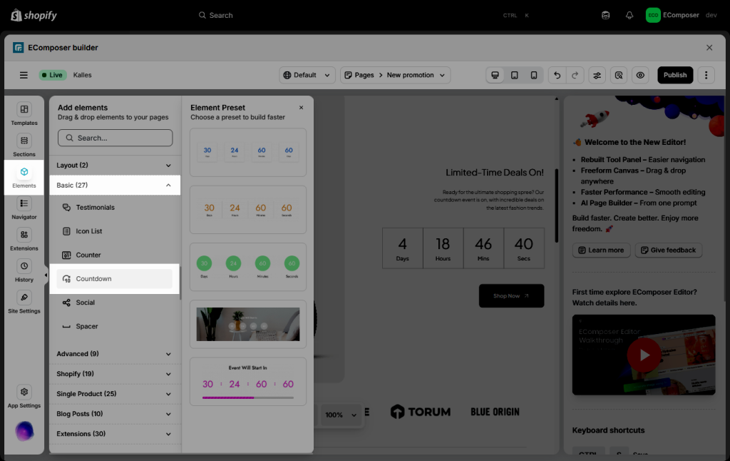
With Countdown element, you can build some layouts below:

Countdown element 01
Countdown element 02

2. Content

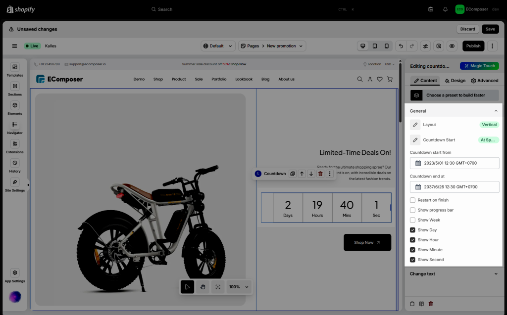
2.1. General

  • Layout: You can choose a horizontal or vertical layout for the Countdown element here.
  • Countdown start from: Configure the date that you wanna start the countdown here.
  • Countdown end at: Configure the date that you wanna end the countdown here.
  • Restart on Finish: Tick on this checkbox to enable the countdown again when it finishes the countdown time.
  • Show progress bar checkbox: Tick on this checkbox to enable the progress bar.
  • Show week/ day/ hour/ minute/ second checkbox: Tick on this checkbox to enable week/ day/ hour/ minute/ second on the countdown.
2.2. Change text

You can change the texts on the Countdown element in the options below:
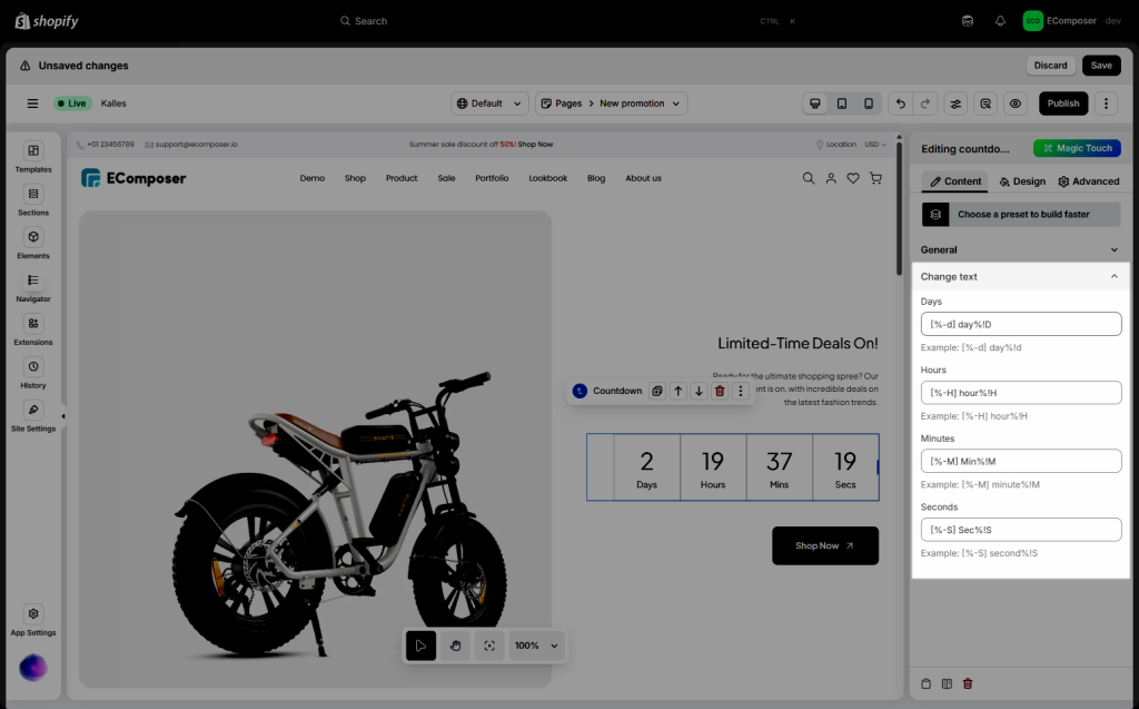
Example: If you only wanna show the day left (taking away weeks), please insert this format: [%-d] day%!D

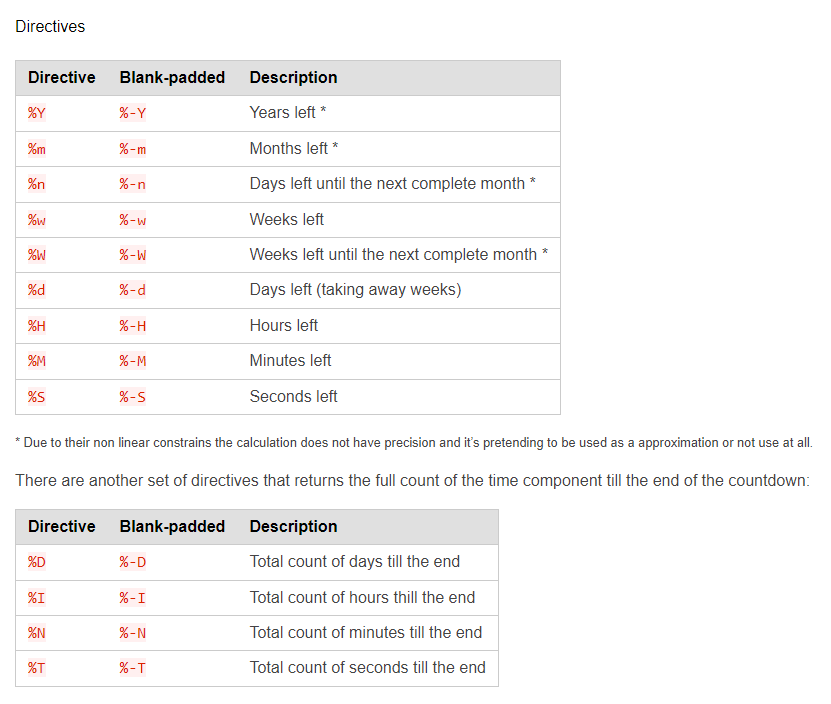
And if you want to show the total count of days till the end, please insert this format: [%-D] day%!D 

You can check the below image for more detail, or read more here 


You can check the video below to know how to use the format for text on the Countdown element. 

3. Design

3.1. General

  • Alignment: Allow you to align the entire Countdown element. You can choose Align Left, Align Right or Align Center. This option is available for desktop, tablet, and mobile devices.
  • Background: Configure the background color for the element here.
  • Box Shadow: Allow you to add a shadow for the Countdown element by changing the Blur, Horizontal, Vertical, etc…
  • Border: Choose border style for the countdown element here. You also can choose None style to disable the border.
  • Border Radius: Allow you to configure the border-radius for the countdown element, available for desktop, tablet, and mobile devices, available for desktop, tablet, and mobile devices.
  • Spacing: Set the spacing (by the way increase margin/ padding) between the Countdown element and other elements here. This option is available for desktop, tablet, and mobile devices.

3.2. Items

  • Width: Configure the Width for the countdown item here.
  • Height: Configure the Height for the countdown item here.
  • Alignment: Allow you to align the countdown item here. You can choose Align Left, Align Right or Align Center. This option is available for desktop, tablet, and mobile devices.
  • Background: Configure the background color for the Countdown item here.
  • Box Shadow: Allow you to add a shadow for the Countdown item by changing the Blur, Horizontal, Vertical, etc…
  • Border: Choose border style for the countdown item here. You also can choose None style to disable the border.
  • Border Radius: Allow you to configure the border-radius for the countdown item, available for desktop, tablet, and mobile devices, available for desktop, tablet, and mobile devices.
  • Spacing: Set the spacing (by the way increase margin/ padding) between the Countdown item here. This option is available for desktop, tablet, and mobile devices.

3.3. Number

  • Typography: This option allows you to customize the Font-size, Font-weight, Font-family, Line Height, Text-transform, etc… for the content on this element.
  • Text Shadow: Allow you add a shadow for the content by changing the Blur, Horizontal, Vertical, etc…
  • Box Shadow: Allow you to add a shadow for the Countdown item by changing the Blur, Horizontal, Vertical, etc…
  • Width: Configure the Width for the countdown number here.
  • Text Color: Configure the color for the countdown number here.
  • Background: Configure the background color for the Countdown item here.
  • Border: Choose border style for the countdown item here. You also can choose None style to disable the border.
  • Border Radius: Allow you to configure the border-radius for the countdown item, available for desktop, tablet, and mobile devices, available for desktop, tablet, and mobile devices.
  • Spacing: Set the spacing (by the way increase margin/ padding) between the countdown number with other texts here, available for desktop, tablet, and mobile devices.

3.4. Label

  • Typography: This option allows you to customize the Font-size, Font-weight, Font-family, Line Height, Text-transform, etc… for the content on this element.
  • Text Shadow: Allow you add a shadow for the content by changing the Blur, Horizontal, Vertical, etc…
  • Box Shadow: Allow you to add a shadow for the Countdown item by changing the Blur, Horizontal, Vertical, etc…
  • Width: Configure the Width for the countdown number here.
  • Text Color: Configure the color for the countdown number here.
  • Background: Configure the background color for the Countdown item here.
  • Border: Choose border style for the countdown item here. You also can choose None style to disable the border.
  • Border Radius: Allow you to configure the border-radius for the countdown item, available for desktop, tablet, and mobile devices, available for desktop, tablet, and mobile devices.
  • Spacing: Set the spacing (by the way increase margin/ padding) between the countdown number with other texts here, available for desktop, tablet, and mobile devices.

3.5. Progess bar

If you tick on the checkbox below, the Progress bar option will show on the Design tab:

  • Width: Configure the Width for the countdown progress bar here.
  • Height: Configure the Height for the countdown progress bar here.
  • Background: Configure the background color for the Countdown progress bar here.
  • Border Radius: Allow you to configure the border-radius for the countdown progress bar, available for desktop, tablet, and mobile devices, available for desktop, tablet, and mobile devices.
  • Spacing: Set the spacing (by the way increase margin/ padding) between the Countdown progress bar here. This option is available for desktop, tablet, and mobile devices.
Note: You can configure the style of the Countdown Progress bar on both Normal and Active mode.

You can view the video below to know how to configure the Countdown element:

Leave a Comment

Enjoy a free 3-day trial. Then get your first month for $1. Try Now.