

Collection Products
The Collection Products element allows you to display products from a selected Shopify collection on your page. It helps you present your collection products in a customized layout that matches your store’s design and provides a consistent shopping experience on the live page.
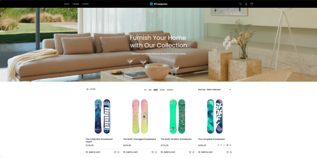
To add the Collection Products element to your page, navigate to Elements → Collection Page → Products, then drag and drop the element into your desired position.
1. Content
1.1. General
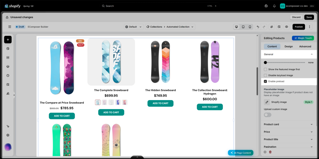
The General settings allow you to customize the product layout, adjust the product image size, and control the number of products displayed on the screen.
You can also enable the Preload option to improve navigation performance. When customers hover over a product, EComposer preloads the product page content in advance, helping the page open faster when they click it.
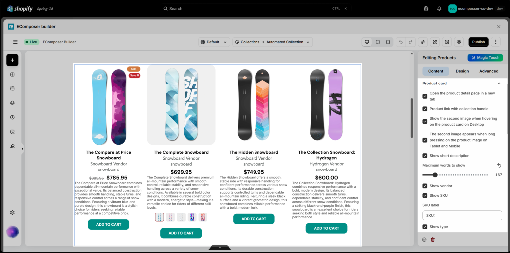
1.2. Product card
- Display options: Select the corresponding checkboxes to control how each product card behaves and what information it displays. You can open product pages in a new tab, keep collection-specific product links, show a second image when customers hover over or press the product image, and display details such as the short description, vendor, SKU, and product type. You can also adjust the maximum number of words shown in the short description and customize the SKU label.
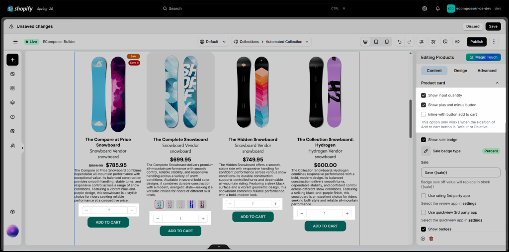
- Show input quantity: Enable this option to display a quantity selector on each product card. Customers can use the plus (+) and minus (−) buttons or enter a quantity directly before clicking Add to Cart, making it easier to purchase multiple units of the same product at once.
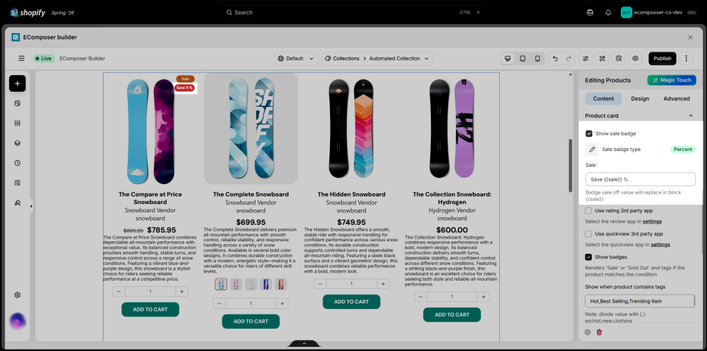
- Show sale badge: Enable this option to display a sale badge on products with a Compare-at price. Choose Percent to show the discount as a percentage or Amount to display the exact amount saved. You can also customize the badge text and use the
{{sale}}placeholder to insert the calculated discount value automatically.
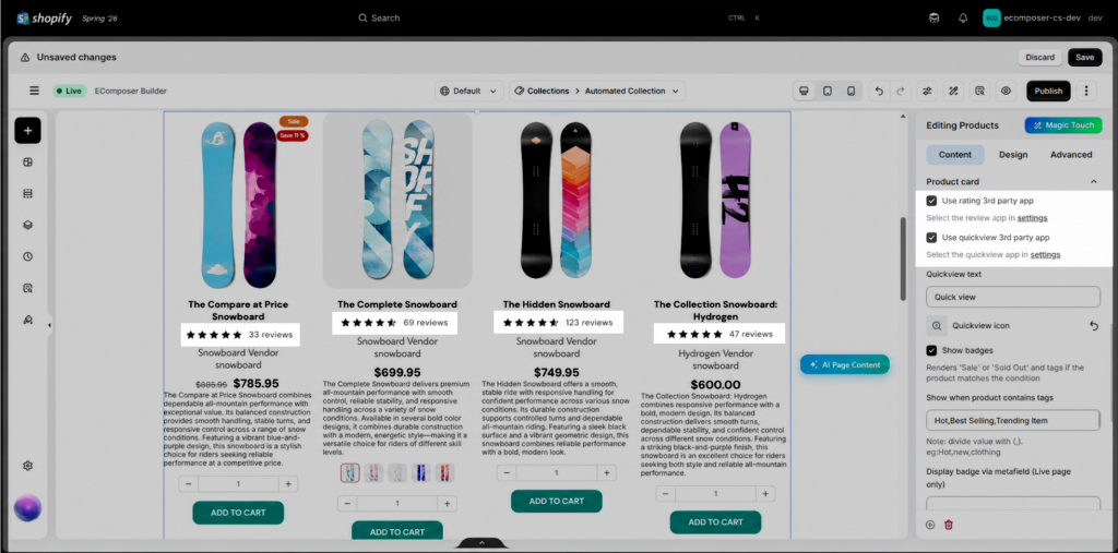
- Third-party apps: There are rating, quick view and wishlist apps that you may want to use on your page. To use these apps, please click on the “setting” link to open the setting popup. You must select an app from our app list and install that app to your store to use.
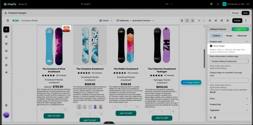
- Show badges: Enable this option to display “Sale,” “Sold Out” on product cards when the products meet the specified conditions.
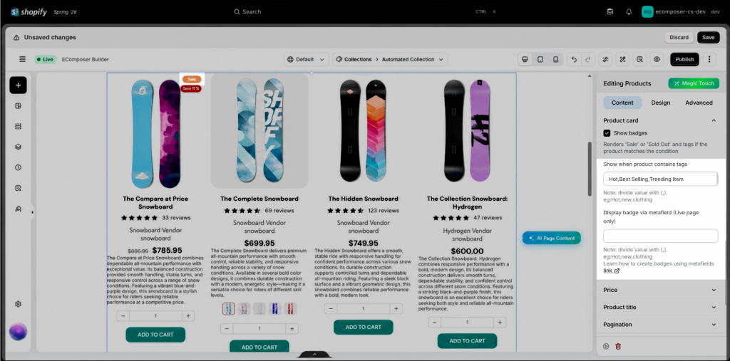
- Show when product contains tags: Display custom badges on product cards based on their Shopify product tags. For example, to show a “Hot” badge, add the Hot tag to the product and enter the same tag in this field. You can add multiple tags by separating them with commas. The corresponding badge will appear whenever a product contains one of the specified tags.
1.3. Price
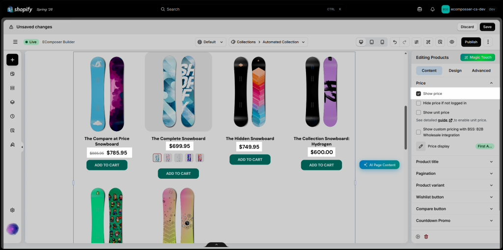
- Show price: Enable this option to display the product price on each product card. Disable it to hide the price from the product listing.
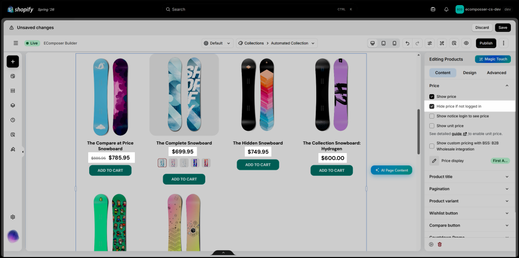
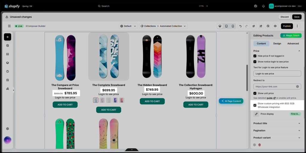
- Hide price if not logged in: Enable this option to hide product prices from visitors who are not logged into a customer account. Once they log in, the prices will become visible. You can also enable a login notice to inform visitors that they need to sign in to view pricing.
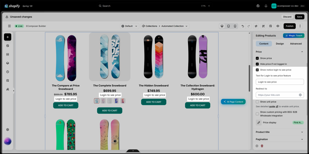
- Show login to see price text: Enable this option to display a custom notice when product prices are hidden from guests. Enter the message you want to show, such as “Login to see price,” and add a redirect link to guide customers to the login page or another relevant destination.
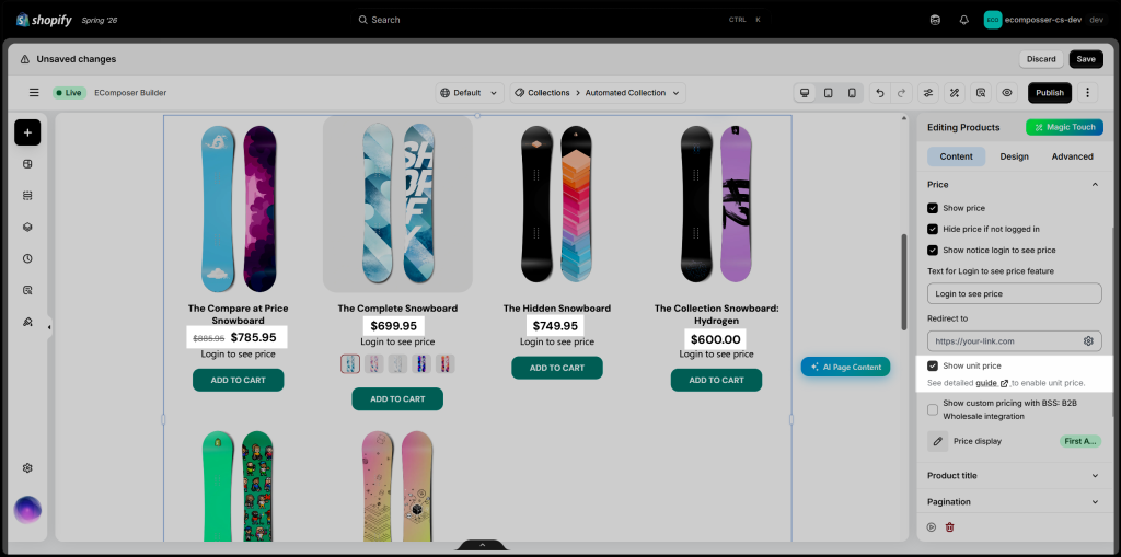
- Show unit price: Enable this option to display the product’s price per unit or measurement, such as per kilogram, liter, meter, or item. This is useful for products sold in specific quantities or measurement-based units. The unit price must first be configured in Shopify before it can appear on the product cards and other supported store pages.
- Show custom pricing with BSS: B2B/Wholesale integration: Enable this option to display custom B2B or wholesale prices provided by the BSS: B2B/Wholesale Solution app. Make sure the BSS app is installed and its pricing rules are configured correctly on your store before enabling this setting.
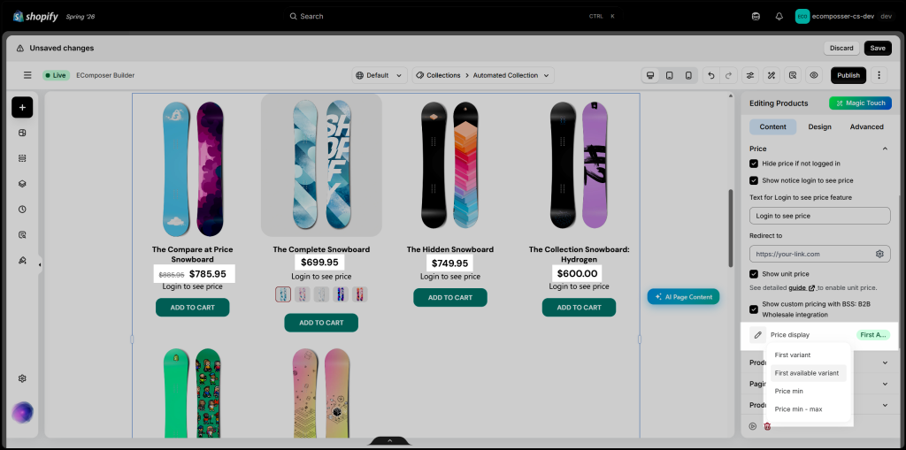
- Price display: Choose how the product price is displayed when a product has multiple variants.
- First variant: Displays the price of the first product variant.
- First available variant: Displays the price of the first variant that is currently available for purchase.
- Price min: Displays the lowest price among all product variants.
- Price min – max: Displays the full price range, from the lowest to the highest variant price. This option is only available when the product variants are hidden.
1.4. Product Title
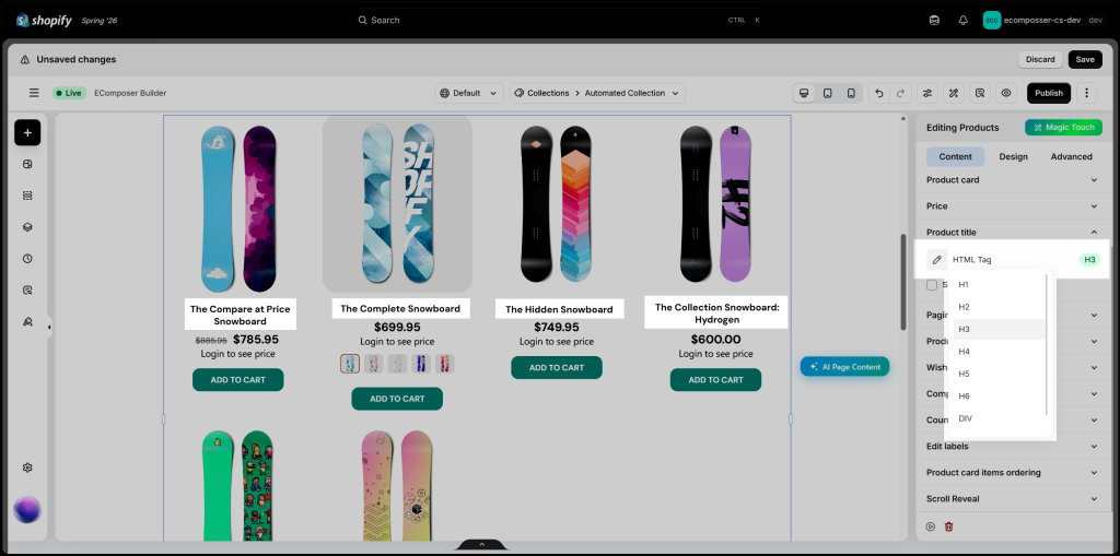
Customize how the product title is displayed on each product card.
- HTML Tag: Select the appropriate HTML tag for the product title, such as H1–H6 or DIV. Choosing a suitable heading level helps maintain a clear page structure and supports SEO.
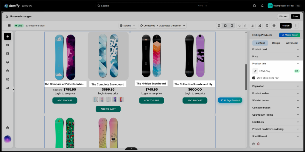
- Show title on one row: Enable this option to keep long product titles on a single line. When the title exceeds the available space, the remaining text may be truncated. Disable it to allow the title to wrap onto multiple lines.
1.5. Pagination
You can select between Off, Default, Load more buttons, and Infinite scrolling
- Show preview pagination: Enable this option to preview the pagination inside the editor. The actual pagination function is available on the live page.
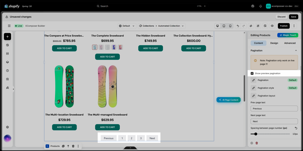
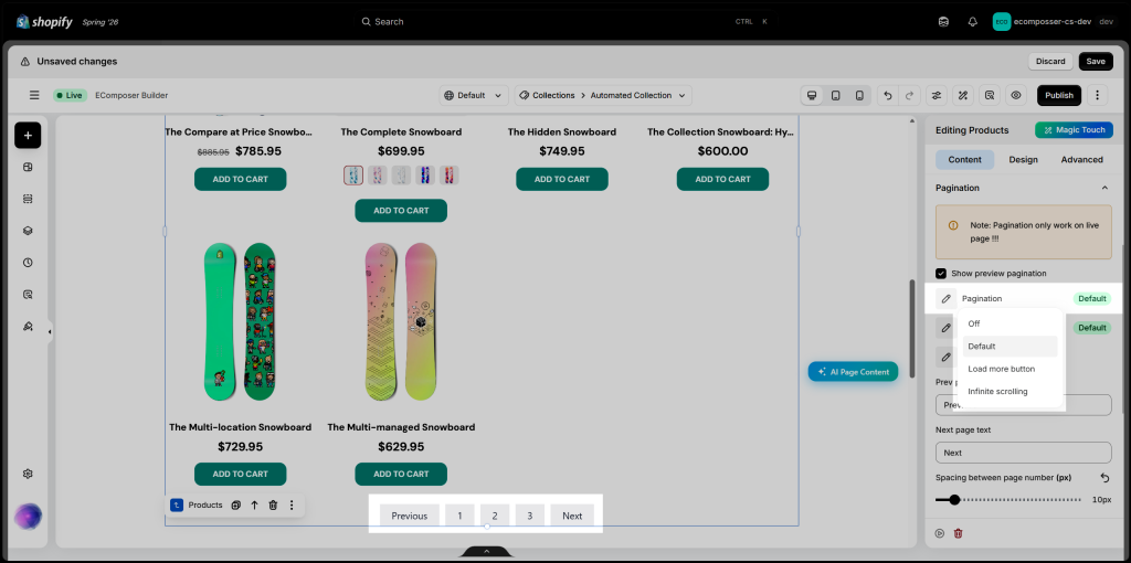
- Pagination: Choose how customers browse additional products when the collection contains more items than can be displayed at once.
- Off: Disables pagination.
- Default: Displays page numbers with Previous and Next navigation buttons.
- Load more button: Adds a button that customers can click to load more products without leaving the current page.
- Infinite scrolling: Automatically loads additional products as customers scroll toward the bottom of the product list.
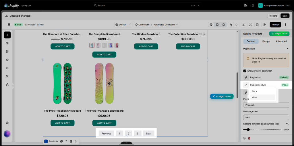
- Pagination style: Choose how the pagination items are arranged.
- Block: Displays each pagination item as a block-level element, typically taking up more horizontal space or appearing on separate rows depending on the layout.
- Inline: Displays the Previous, page numbers, and Next items in a single horizontal row.
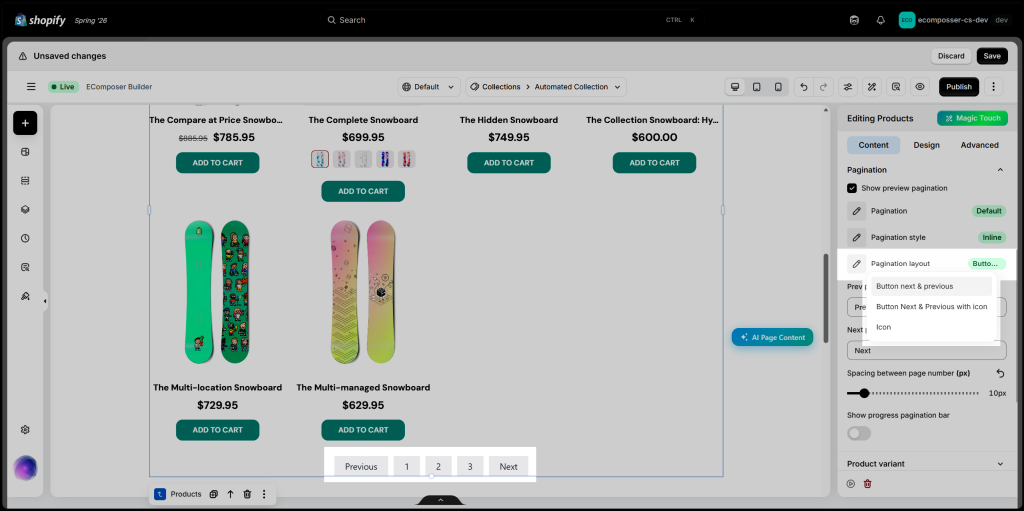
- Pagination layout: Choose how the pagination navigation controls are displayed.
- Button next & previous: Displays text buttons for navigating to the previous and next pages.
- Button Next & Previous with icon: Displays the navigation text together with directional icons.
- Icon: Displays only the previous and next icons without text labels.
- Pagination navigation: Customize the labels for the Previous and Next buttons, adjust the spacing between page numbers, and enable the progress pagination bar to show customers how far they have browsed through the available product pages.
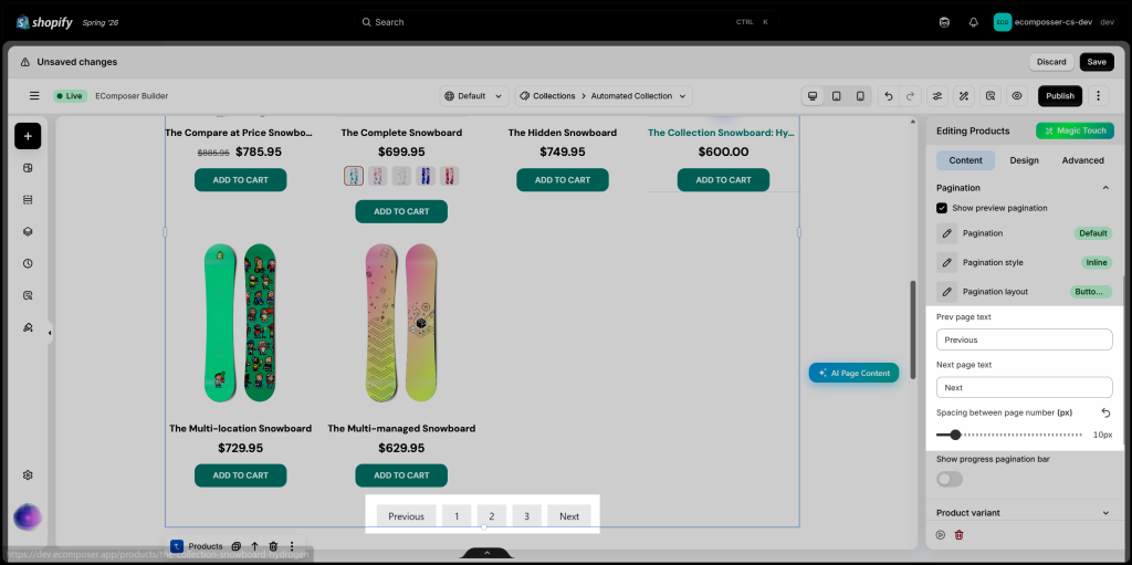
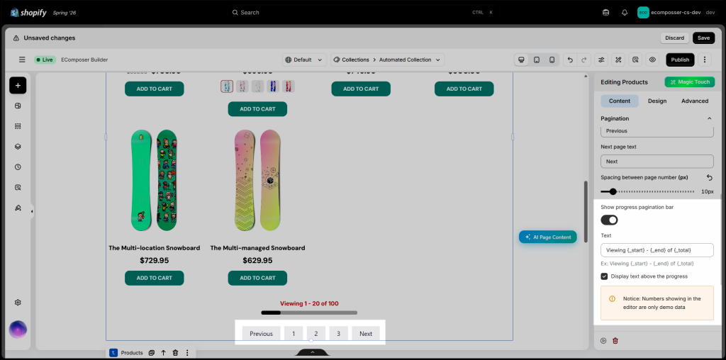
- Progress pagination bar: Enable this option to show customers their browsing progress through the product list. Customize the text with
{_start},{_end}, and{_total}, for example: “Viewing {_start} – {_end} of {_total}.” You can also choose to display this text above the progress bar. The editor uses sample numbers, while the live page shows the actual product data.
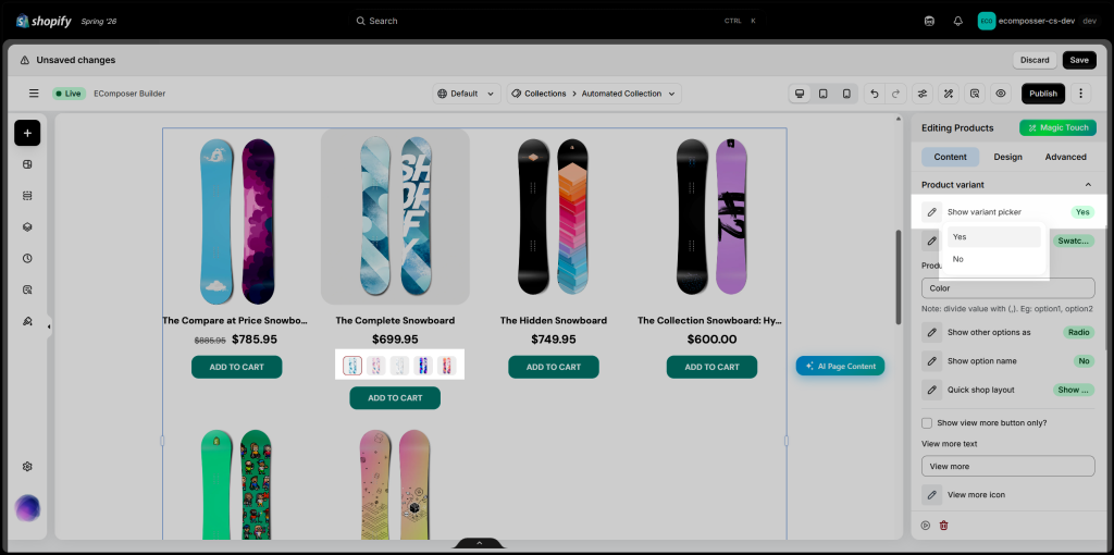
1.6. Product variant
- Show variant picker: Select Yes to display variant options on the product card or No to hide them.
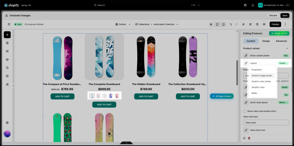
- Layout: Choose how product variants are displayed on the product card.
- Dropdown: Displays variant values in a dropdown menu.
- Swatch image picker: Uses variant images as selectable swatches.
- Swatch color picker: Displays color swatches based on the configured option values.
- Shopify color: Uses color values configured through Shopify’s native color system.
- Radio: Displays each variant value as a selectable radio-style option.
- Product option to show as swatch: Enter the product option name you want to display as swatches, such as Color. The option name must match the one configured in Shopify. To display multiple options as swatches, separate their names with commas, for example: Color, Material.
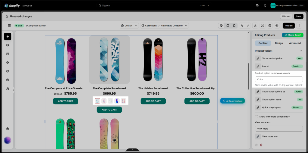
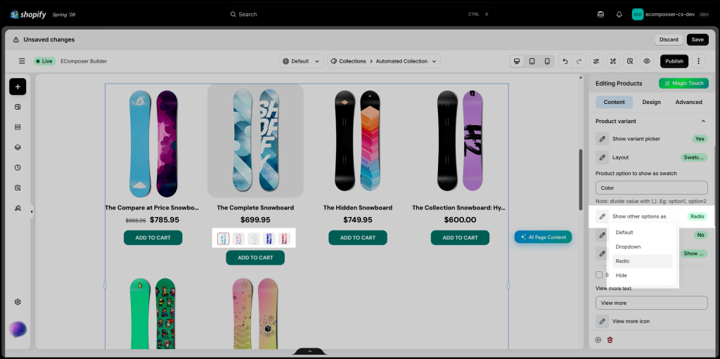
- Show other options as: Choose how the remaining product options are displayed when one option is shown as a swatch.
- Default: Uses the element’s default display style.
- Dropdown: Displays the remaining options in dropdown menus.
- Radio: Displays each option value as a selectable radio-style button.
- Hide: Hides the remaining product options from the product card.
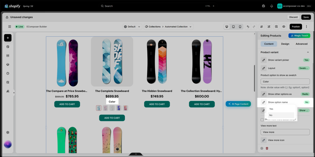
- Show option name: Choose whether to display the product option name, such as Color or Size, above the variant values. Select Yes to show the option name or No to display only the available variant values.
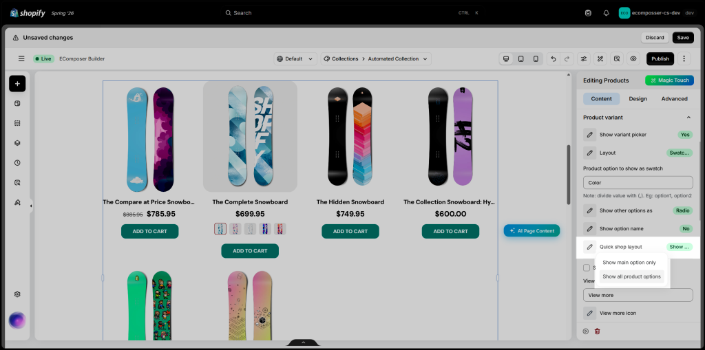
- Quick shop layout: Choose how product options are displayed in the quick-shop area. Select Show main option only to display only the primary option, or Show all product options to let customers view and select every available option directly from the product card.
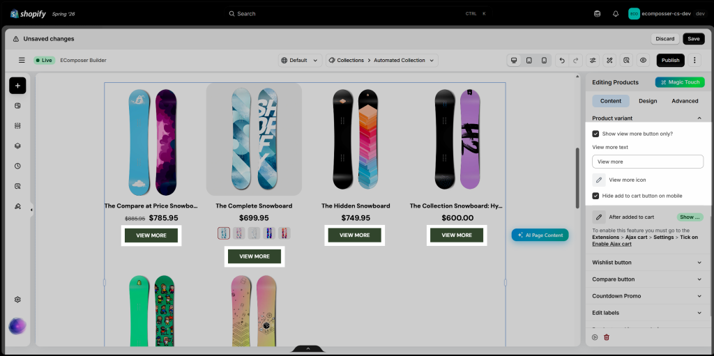
- Show View More button only: Enable this option to display a View More button instead of the Add to Cart button on product cards. You can customize the button text and icon.
- Hide Add to Cart button on mobile to ensure only the View More button appears on mobile devices. Clicking the button directs customers to the corresponding product page for more details and variant selection.
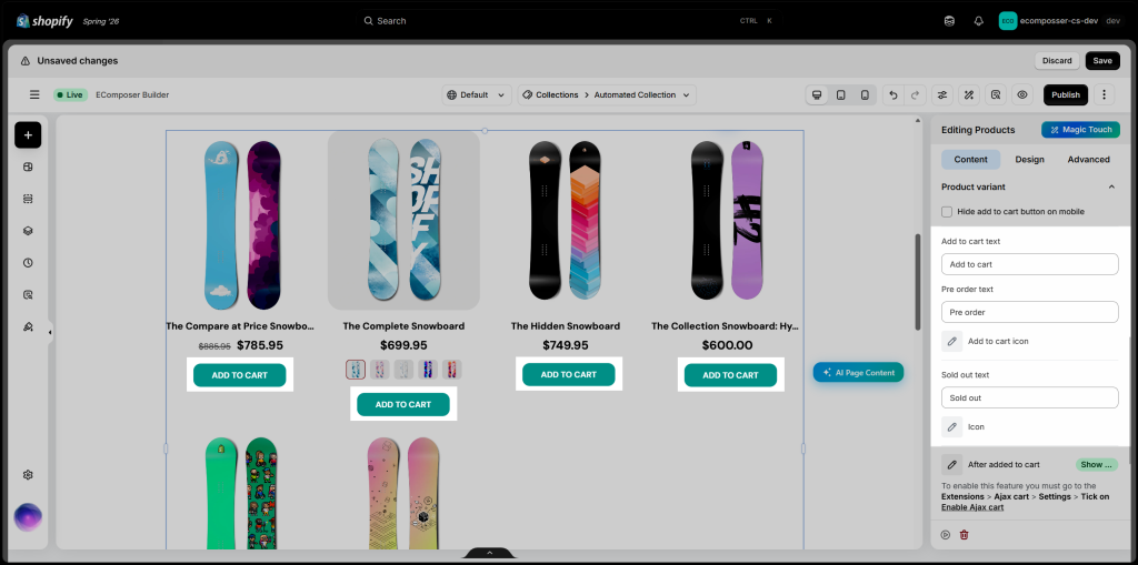
- Add to Cart button labels: Customize the text displayed for different product states, including Add to Cart, Pre-order, and Sold Out. You can also select an icon for the Add to Cart and Sold Out buttons, and choose whether to hide the Add to Cart button on mobile devices.
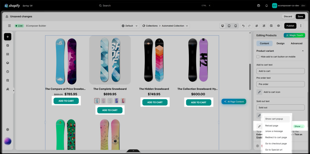
- After added to cart: Choose what happens after a customer adds a product to the cart. To use this feature, go to Extensions → Ajax Cart → Settings, then enable Ajax Cart.
- Show cart popup: Opens the cart popup.
- Reload page: Refreshes the current page.
- Show a message: Displays a confirmation message.
- Redirect to cart page: Sends customers to the cart page.
- Go to checkout page: Sends customers directly to checkout.
- Go to Special URL: Redirects customers to a custom URL.
1.7. Wishlist button
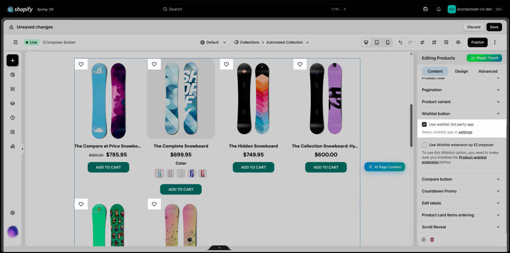
The Wishlist Button settings let you add a wishlist icon to each product card. You can either connect a supported third-party wishlist app or use EComposer’s built-in Product Wishlist extension.
Use wishlist 3rd party app
Enable this option to display wishlist buttons from a supported third-party app.
Click Settings to select the wishlist app you want to use. Make sure the selected app is already installed and configured on your Shopify store.
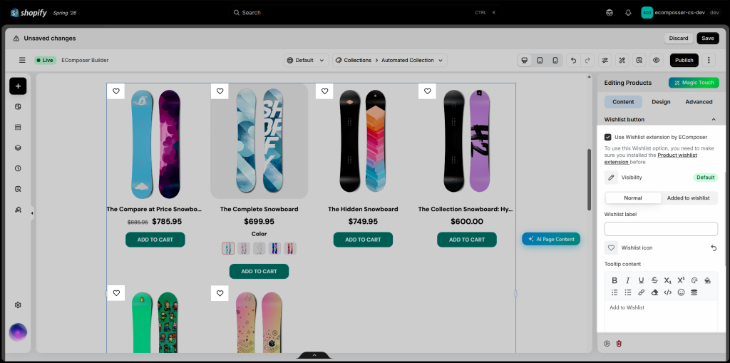
Use Wishlist extension by EComposer
Enable this option to use EComposer’s built-in Product Wishlist extension on your product cards. Before enabling it, make sure the extension has been installed and activated on your store.
You can then customize the button’s visibility, appearance in the Normal and Added to wishlist states, label, icon, and tooltip content.
For more details on the product wishlist button from the EComposer app please check the guide here.
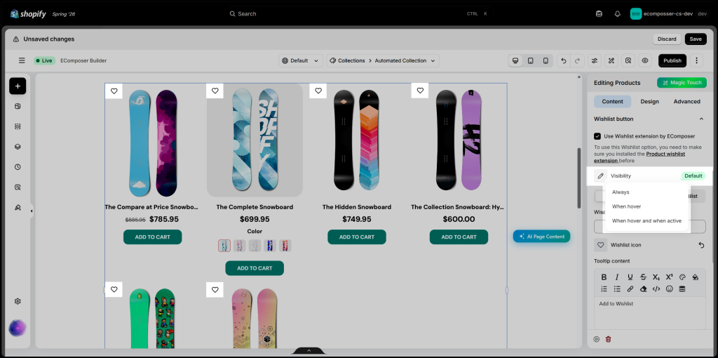
- Visibility: Choose when the wishlist button appears on the product card.
- Always: Keeps the wishlist button visible at all times.
- When hover: Displays the button only when customers hover over the product card.
- When hover and when active: Displays the button on hover and keeps it visible after the product has been added to the wishlist.
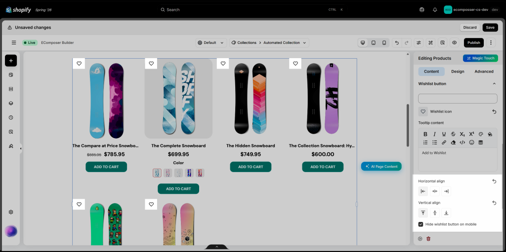
- Horizontal align: Position the button on the left, center, or right of the product card.
- Vertical align: Position the button at the top, middle, or bottom of the product card.
- Hide wishlist button on mobile: Enable this option to hide the wishlist button on mobile devices.

2 Comments
Kristian
Hi, I want to show size variants as radio buttons. Can I hide / mark sold out sizes on the collection page?
Anna Nguyen
Hi Kristian,
I’m Anna from EComposer team :)
To show the variants add radio buttons, you can open the element -> Content -> Product variants. Please follow this image https://prnt.sc/-UUR0-RO8bhO
We don’t have the option to hide the sold out sizes now. But please contact us via live chat support, our support team will try to check your page to help.
Thank you!