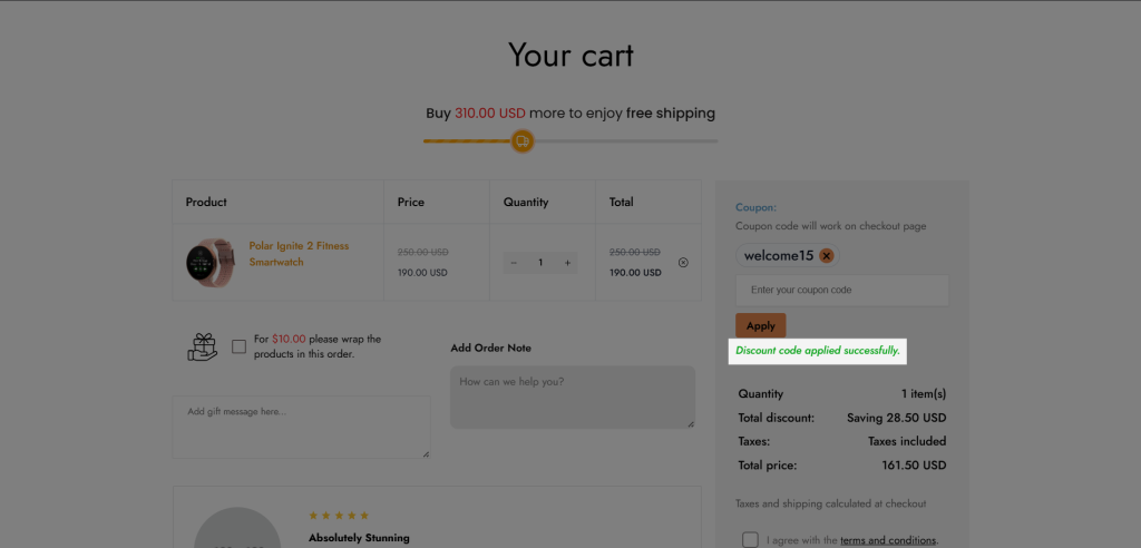

Cart Coupon
This element lets your customers enter discount codes on the cart page and then the discount will be calculated on the checkout page if they proceed to checkout.
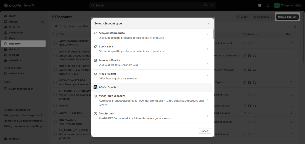
Before customers can enter a discount at the cart page, make sure you create a Discount Code from Shopify first.
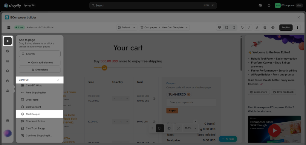
To add this element to your page, please go to Elements => Cart => Cart Coupon.
1. Content
You can customize the content displayed in the element, as well as the messages shown when a coupon is applied.
1.1. General
You can enter the Label title, Coupon placeholder, Apply button text, and choose the Layout.
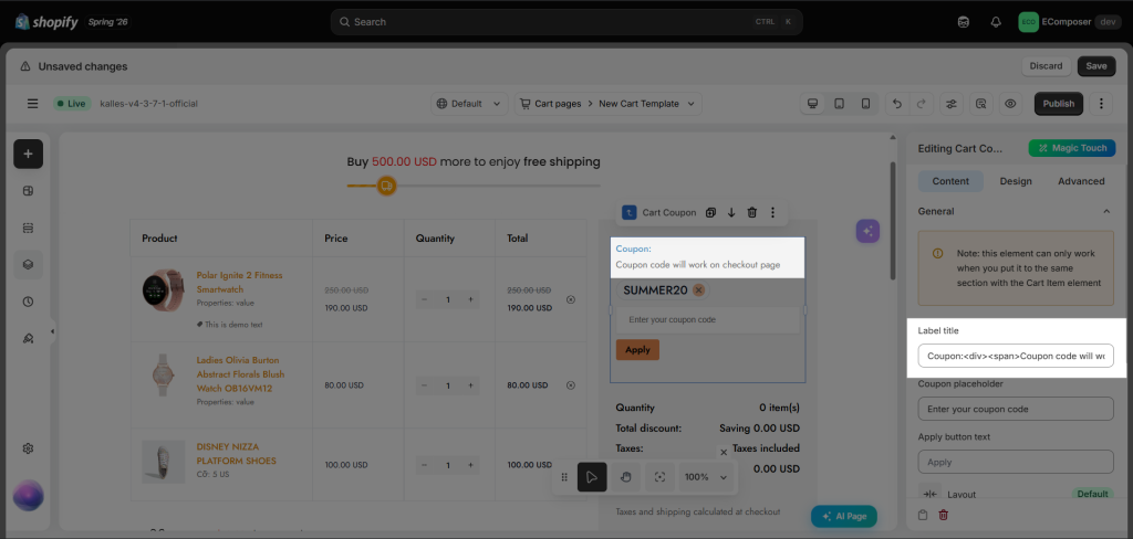
- Label title: Change the title at the top of the element.
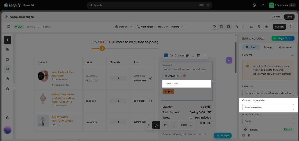
- Coupon placeholder: You can change the text placeholder of the coupon input field.
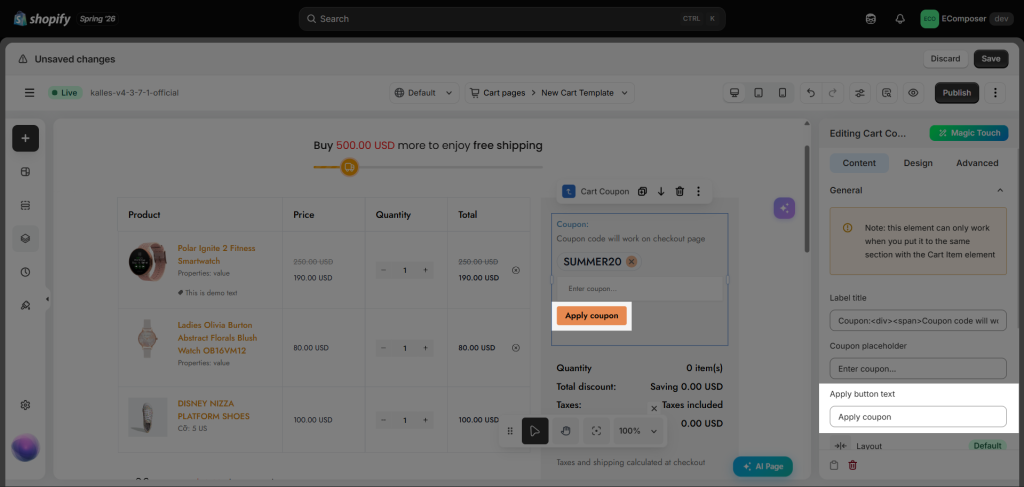
- Apply button text: You can modify the label of the Apply button.
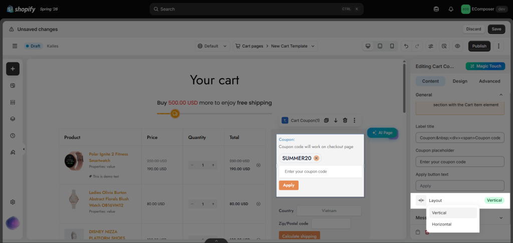
- Layout: The setting allows you to change the layout of the elements inside the Cart Coupon between Vertical and Horizontal.
1.2. Message
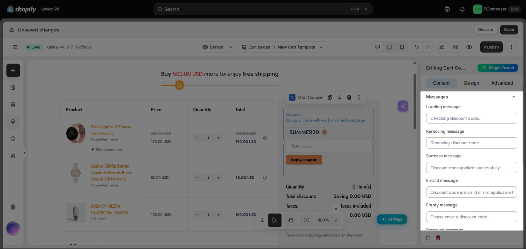
Under this tab, you can modify the messages, including Loading message, Removing message, Success message, Invalid message, Empty message, Removed message, Remove failed message, Error message, Duplicate message, Shipping discount message.
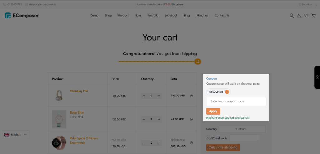
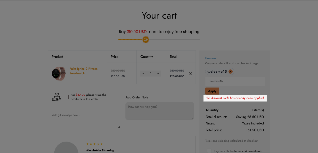
=> Result on the live page:
2. Design
You can adjust the style of the element through the General, Label, Input, Apply Button, Applied Coupon, Success Message, and Error Message categories.
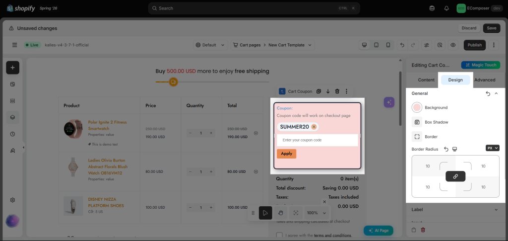
- General: This tab will have Background, Box Shadow, Border, and Border Radius and will affect the whole element.
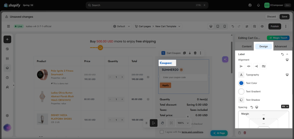
- Label: This tab will have Alignment, Typography, Text Color, Text Gradient, Text Shadow, and Spacing.
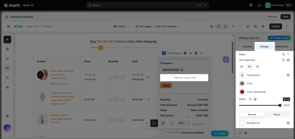
- Input: This tab will have Text alignment, Typography, Color, Color placeholder, Text Gradient, Width, and Spacing. These options will be set for both NORMAL and HOVER mode: Background, Box Shadow, Border, Border Radius, and Outline.
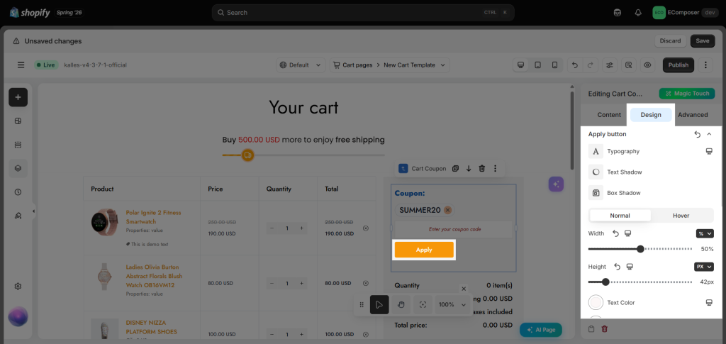
- Apply Button: You can change the Typography, Box Shadow, and Spacing. In the Normal and Hover tabs, you can change the Width, Height, Text Color, Background, Border, and Border Radius in 2 states.
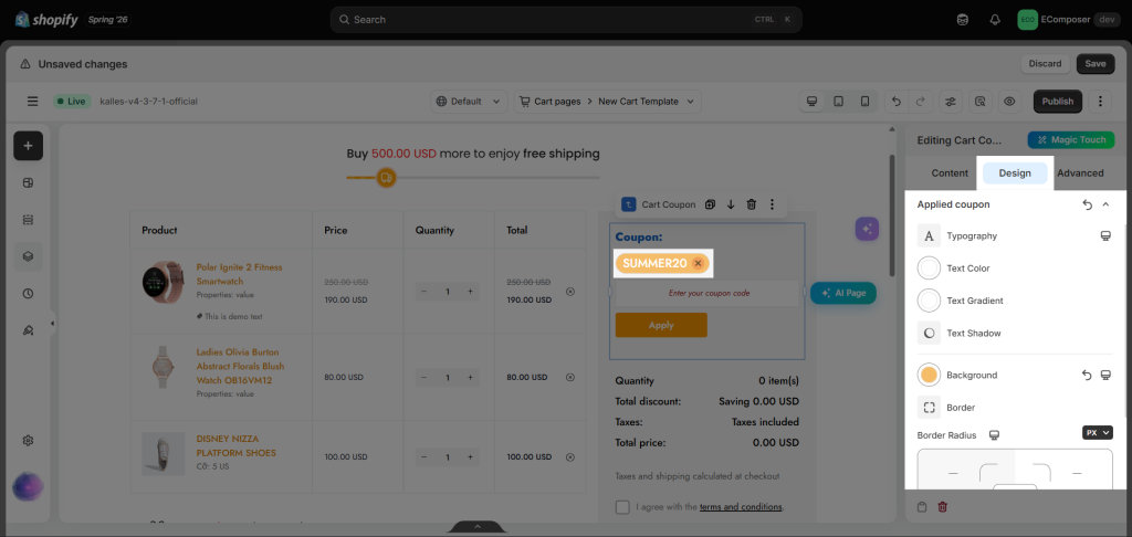
- Applied Coupon: You can change the Typography, Text Color, Background, Border and Border Radius of the applied coupons.
- Success Message and Error Message: You can change the Typography and Text Color of the success messages and error messages.
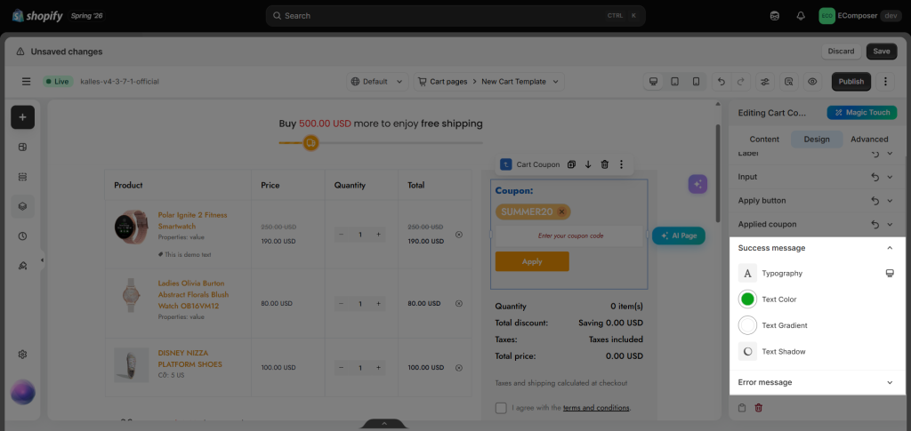
=> You can check the result on the live page when applying the coupons: