
Product Properties
The Product Properties element will allow you to add additional Property information for your product. The options are much easier, more flexible, and faster to use than variable products. Instead of generating thousands of variations, with this element, customers can customize products with additional options such as text fields, checkboxes, radio buttons, dropdowns, and more.
The Product Properties Options will work as an app that allows you to create multiple options for products based on customer needs. For example, if you are selling POD shoes, customers have different requirements that they customize, like Name, Position, Design, Color, etc.
1. How to Add the Product Properties element to Your Page
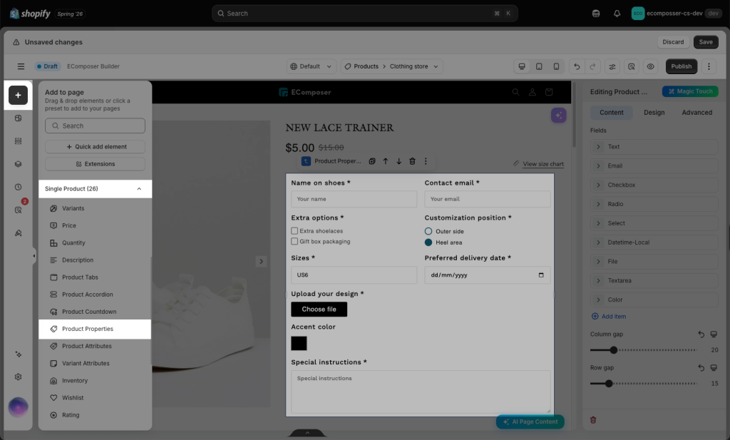
From the left side (Elements tab) > Single Product tab, you will see the Product Properties element in the list of elements. Drag and drop it to any position in the selected structure
2. How to Configure the Content of Properties
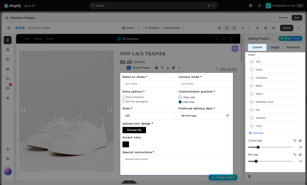
This element has a total of 9 Custom product fields that help you showcase a wider variety of products and options that work.
- Text Field
- Email Field
- Checkbox Field
- Radio Field
- Select Dropdown Field
- Datetime Local Field
- Color Field
- File Field
- Long Text Field
2.1 Add/Arrange/Delete a field
You can easily create new, change order, and remove fields. We also have Column gap and Row gap, a quick set for you to change the gap between fields just by dragging.
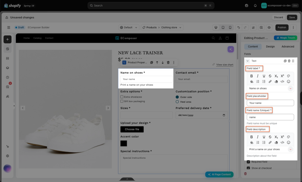
2.2 Edit field content
- Field label: This is the visible title/name shown above or beside the field.
- Field placeholder: This is the light gray hint text shown inside the input box before the user types.
- Field name (Unique): This is the internal unique name/key used by the system to identify this field. It could be any name, including spaces, and not duplicated. Field Name is the most important field that you can’t leave blank. You have to put a unique name for each field; otherwise, this widget can not work properly.
- Field description: This is extra help text explaining what the customer should enter, shown below the field.
2.3 Show input fields at Checkout
- Required field: means the customer must fill in this field before they can submit the form.
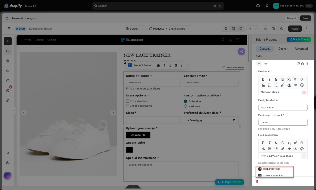
- Show at checkout: After customers fill in these fields and click Add to Cart, the entered information will be displayed on the Cart page, the Checkout page, and in the Shopify order.
3. How to Configure the Design of Properties
Configure Design of Properties allows you to customize how the property fields look on the storefront, such as colors, spacing, borders, font style, and field effects.
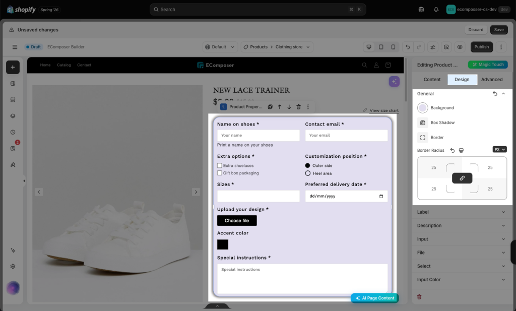
- General: This option allows you to customize the overall design of the custom option area, including Background, Box Shadow, Border, and Border Radius.
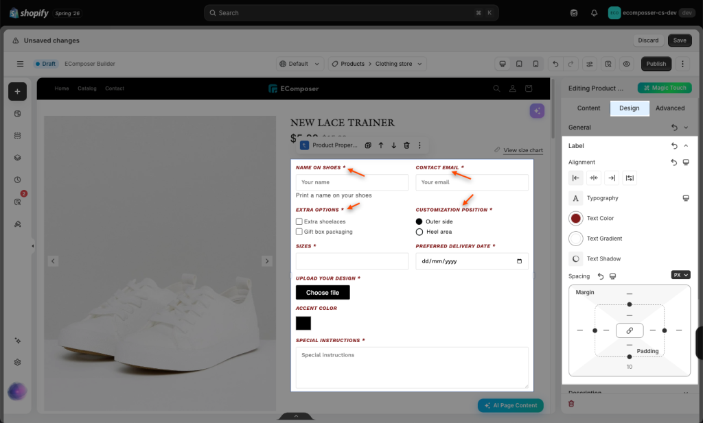
- Label: This option allows you to customize the style of the field label, including font size, font weight, text color, letter spacing, and margin.
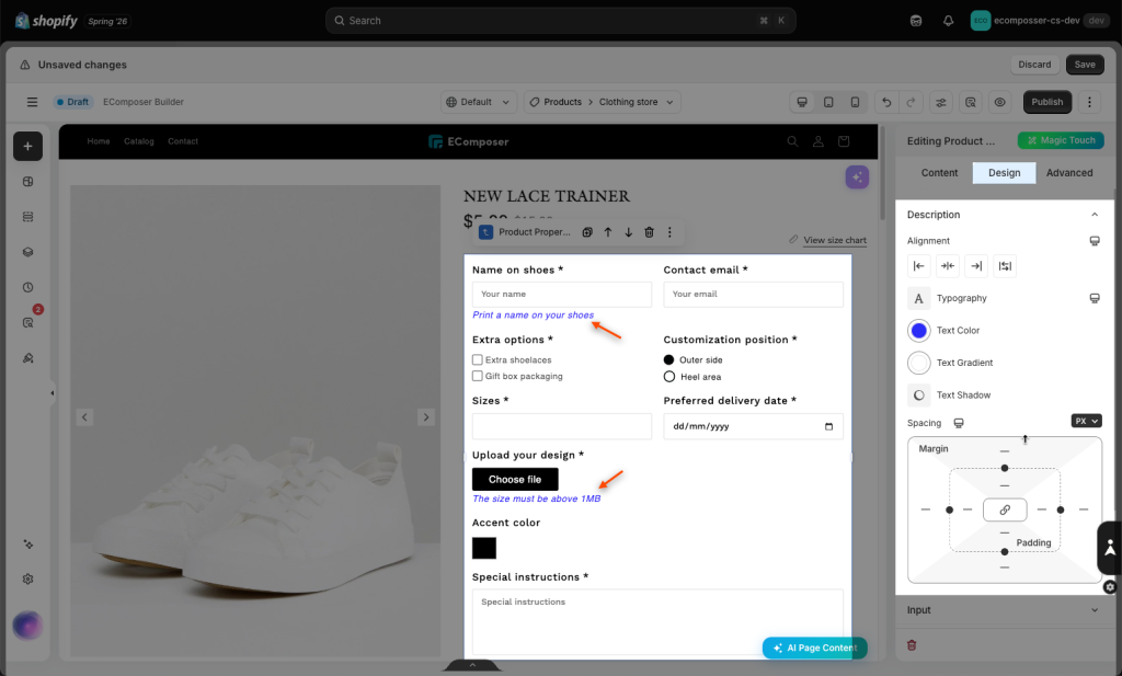
- Description: This option allows you to customize the style of the description or helper text below each field, including font size, text color, font style, spacing, and visibility.
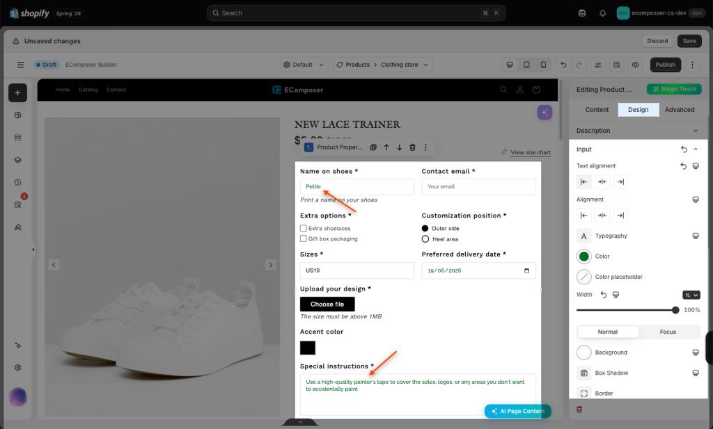
- Input: This option allows you to customize the design of text input fields, including input height, width, padding, border color, border width, border radius, background color, text color, placeholder color, and focus state.
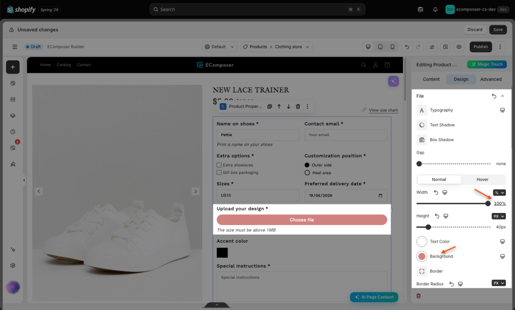
- File: This option allows you to customize the design of the file upload field, including the upload button style, button size, button text color, background color, border, border radius, and spacing.
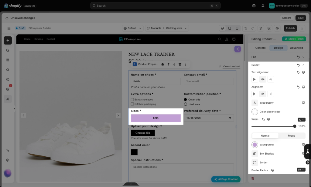
- Select: This option allows you to customize the design of dropdown fields, including height, padding, background color, border radius, text color, dropdown arrow style, and focus state.
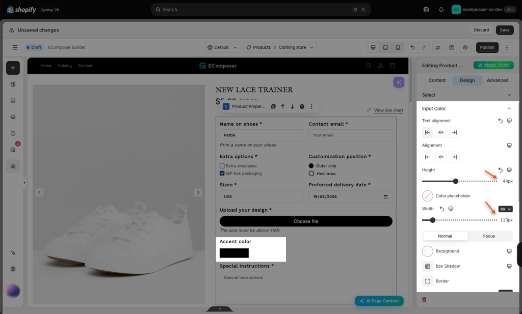
- Input Color: This option allows you to customize the design of the color input field, including swatch size, shape, border color, border radius, selected state, and spacing.
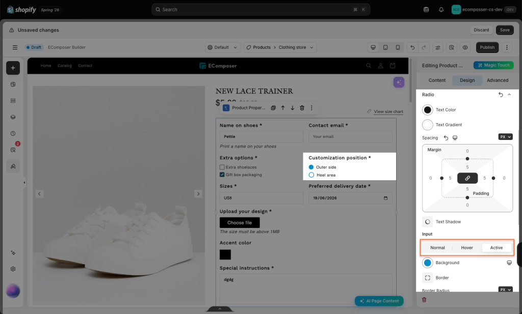
- Checkbox: This option allows you to customize the design of checkbox options, including checkbox size, border color, border radius, active/hover color, check icon color, label spacing, and text style.
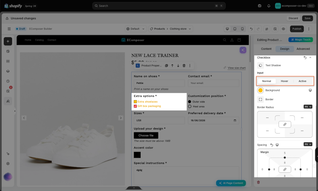
- Radio: This option allows you to customize the design of radio options, including radio size, border color, active/hover color, inner dot color, label spacing, and text style.