

Collection Tags
The Collection Tags element displays all available product tags on a collection page, allowing customers to quickly filter products by selecting a tag. This helps improve product discovery and provides a more convenient shopping experience.
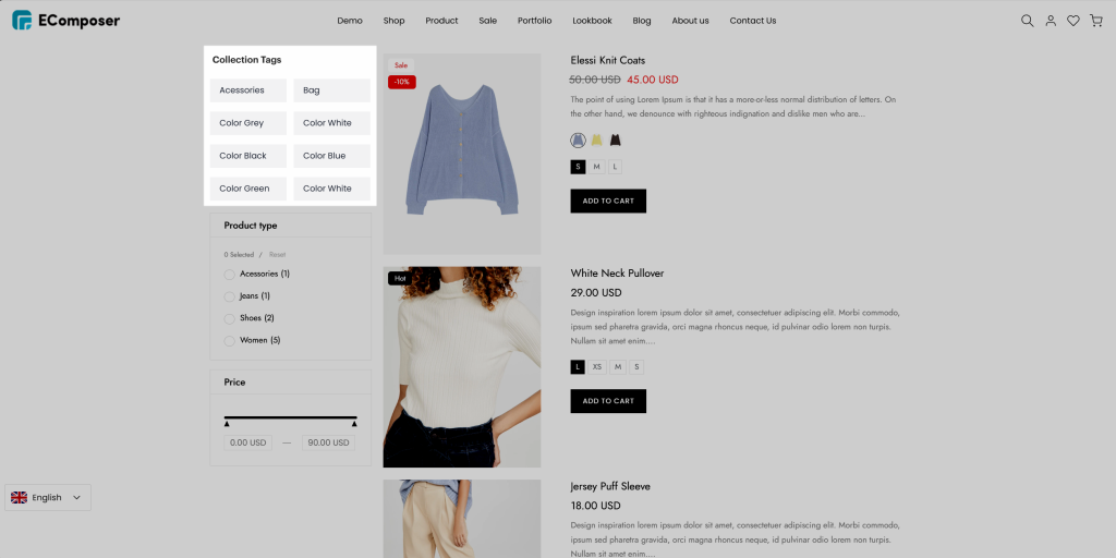
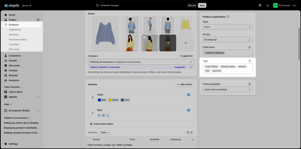
1. Add product tags in Shopify Admin
In your Shopify Admin, navigate to Products → select a product → add tags in the Tags field. These tags will be displayed in the Collection Tags element on your collection pages.
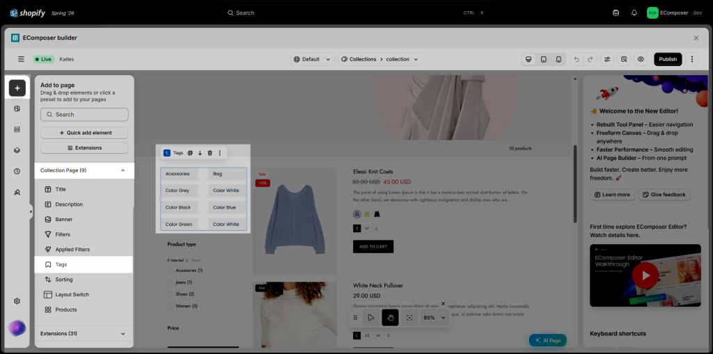
2. Add the Collection tags element to your EComposer page
Navigate to Elements → Collection Page, then drag and drop the Tags element into your desired location on the page.
3. Content
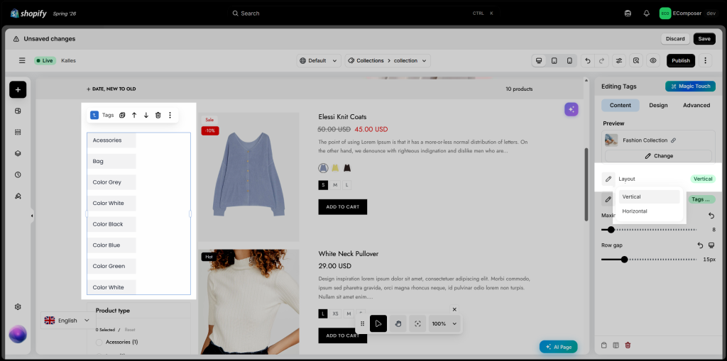
The Content tab lets you configure the basic settings of the Collection Tags element. Here, you can choose how tags are arranged to match your collection page layout and provide a better browsing experience for customers.
- Layout: : Choose the display layout for the Collection Tags element. You can display tags Horizontally in a row or Vertically in a column, depending on your page layout and design preferences.
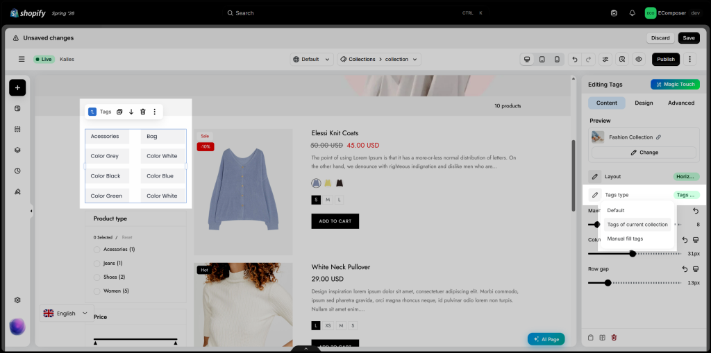
- Tags Type: This options allow you to select tags to display. There are 2 options for you:
+ Default: Uses the default behavior of the Collection Tags element to automatically display product tags from the current collection.
+ Tags of current collection: Automatically displays all available product tags from the current collection.
+ Fill tags manually: Manually enter the tags you want to display.
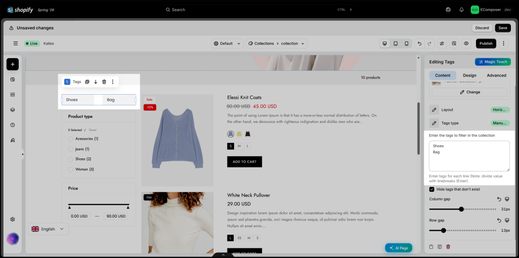
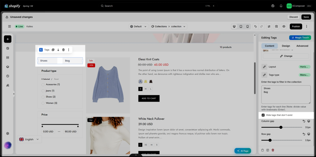
- Enter the tags to filter in the collection: Manually enter the tags to display in the Collection Tags element. Enter each tag on a new line. Only the specified tags will be shown as filter options.
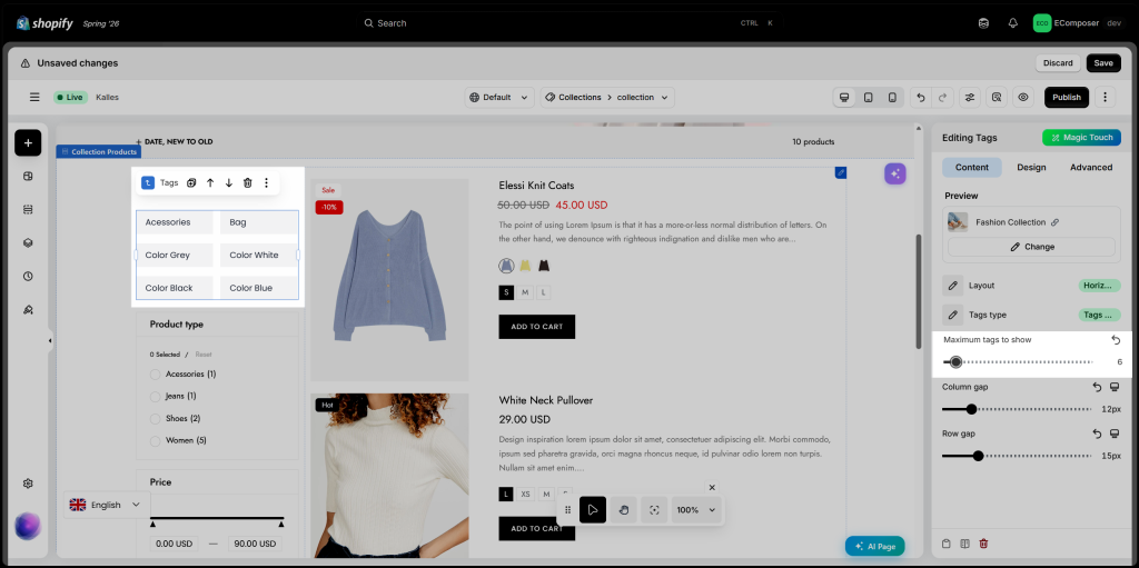
- Maximum tags to show: Specify the maximum number of tags displayed in the Collection Tags element.
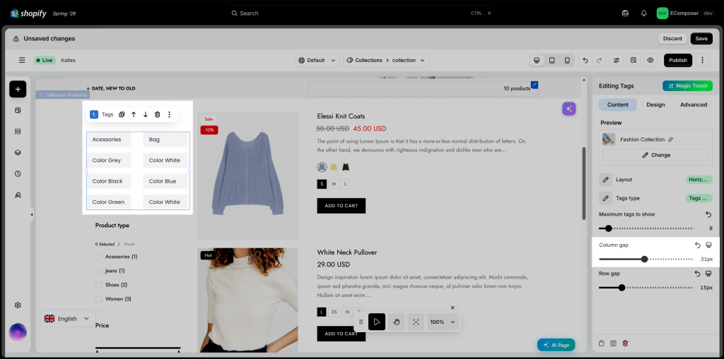
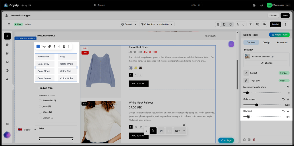
- Column gap: Adjust the spacing between columns in the Collection Tags element. This option is available only when the Horizontal layout is selected.
- Row gap: This option allows you to define the size of the gap between the rows.
- Hide tag when not exists in current collection: Enable this option to hide tags that are not associated with any products in the current collection.
4. Design
The Design tab lets you customize the appearance of the Collection Tags element. You can adjust the layout, colors, typography, spacing, borders, and other styling options to match your store’s branding and collection page design.
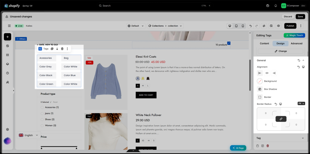
4.1. General
Customize the appearance of the Collection Tags element using the available styling options, including Alignment, Background, Box Shadow, Border, and Border Radius.
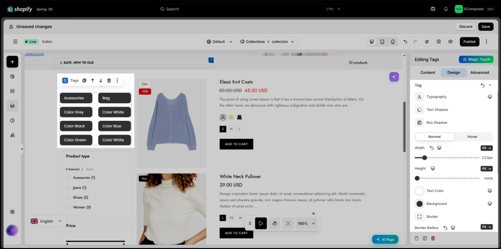
4.2. Tag
Customize the style of individual tags using options for Typography, Text Shadow, and Box Shadow. Separate settings are available for both Normal and Hover states, including Width, Height, Text Color, Background, Border, Border Radius, and Spacing.
You can learn more about design options here.