
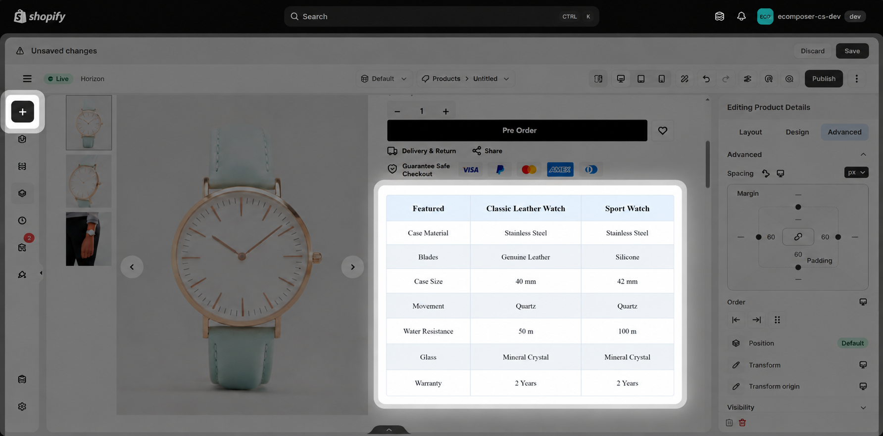
Table
The Table element allows you to organize and display information in a clear, structured format using rows and columns. It is ideal for presenting product specifications, product comparisons, pricing, size charts, and other structured content.
Each table cell can be configured with different content types, including Text, Icon, Image, Button, and Metafield, giving you more flexibility when creating tables for your store.
1. How to Add a Table
Follow these steps to add a Table element to your page:
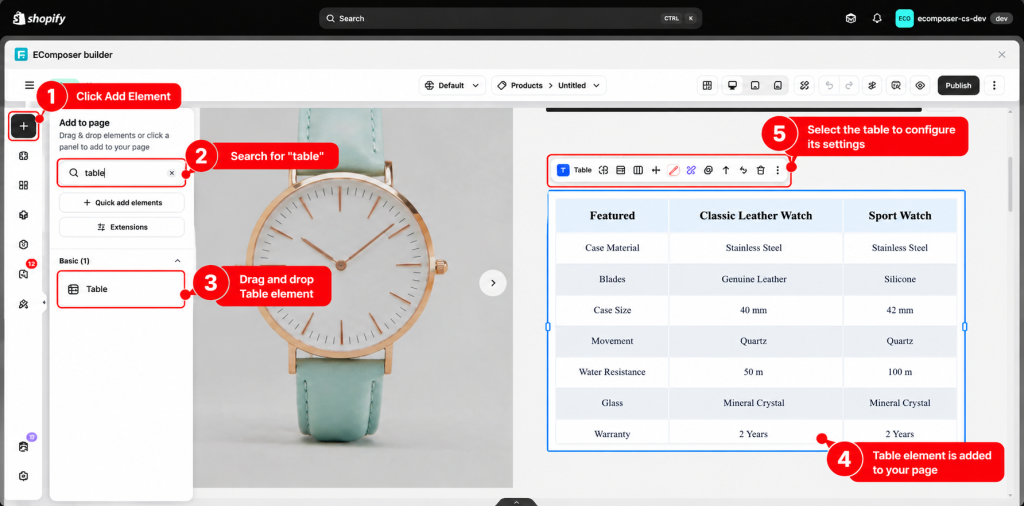
Step 1. Open the EComposer Editor and select the page where you want to add the table.
Step 2. Click Add Element and search for Table.
Step 3. Drag and drop the Table element into your desired section.
2. Configure Table Content
After adding the Table element, you can customize the content of each cell based on your needs.
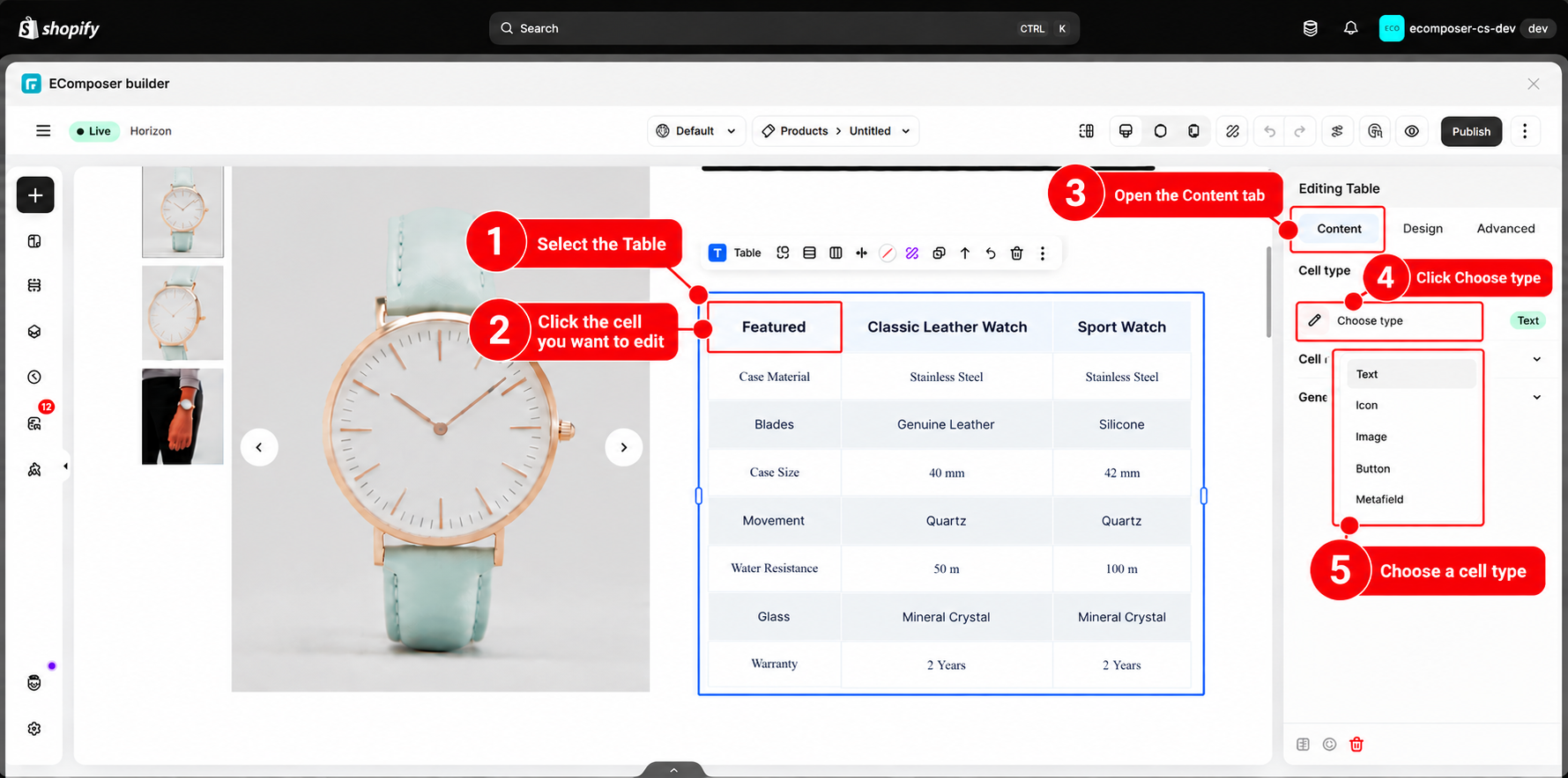
Step 1. Select the Table element on your page.
Step 2. Click the cell you want to edit.
Step 3. In the Content tab, locate the Cell type setting.
Step 4. Click Choose type to select the content type for the cell.
Available Cell Types
The Table element supports the following cell types:
- Text: Display regular text content.
- Icon: Add an icon to a cell.
- Image: Display an image inside a cell.
- Button: Add a clickable button.
- Metafield: Display dynamic information from Shopify product metafields.
2.1 Text
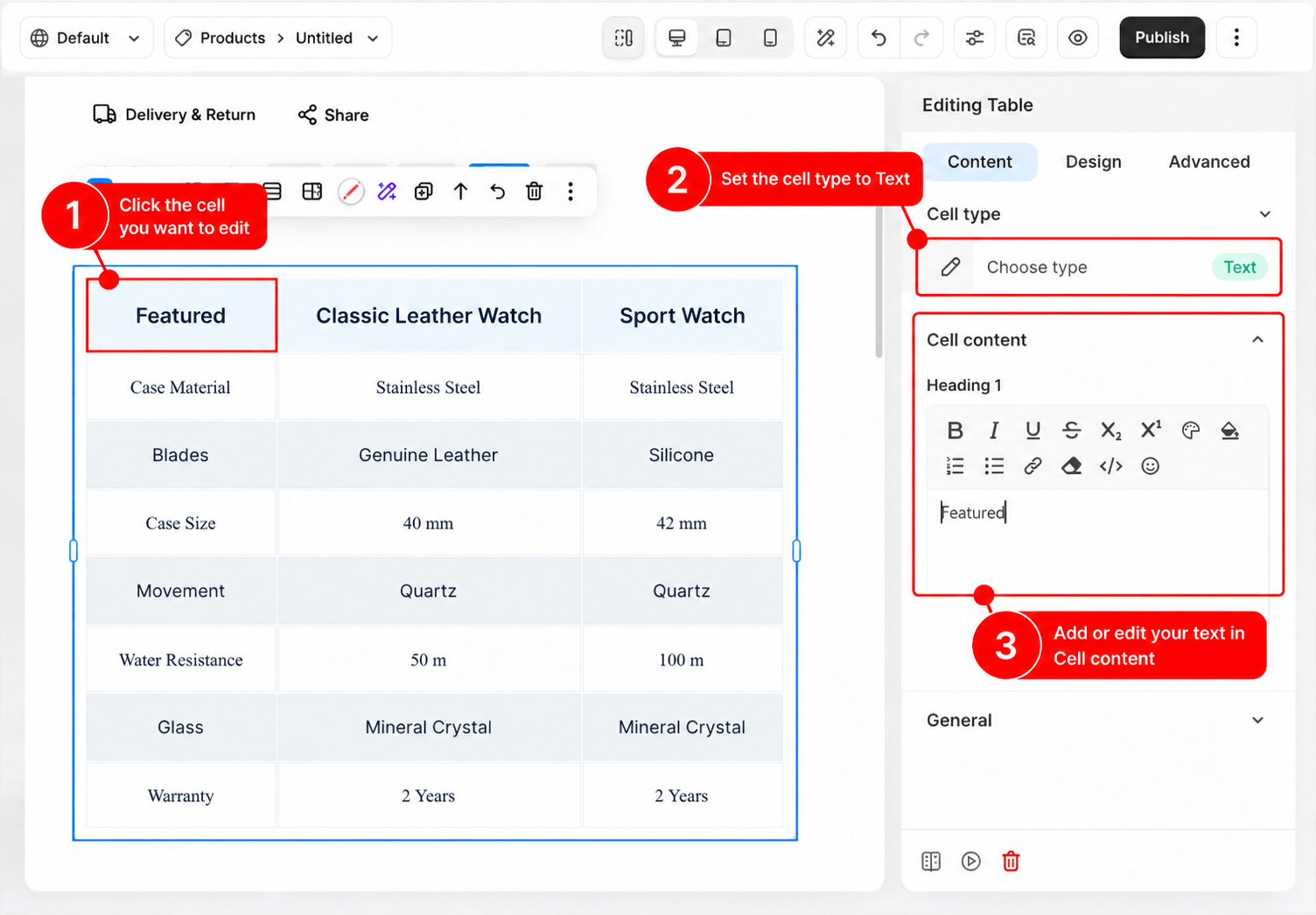
The Text cell type allows you to display static text directly inside a table cell. It is suitable for product names, specifications, descriptions, and other text-based information.
Use the Cell content section to add or edit the text displayed in the selected cell.
2.2 Icon
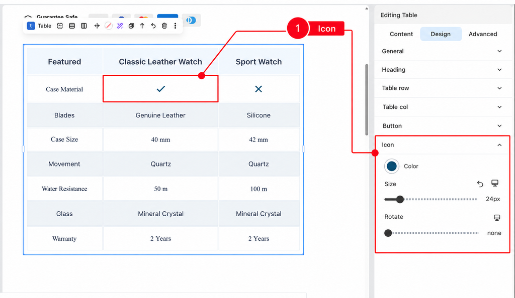
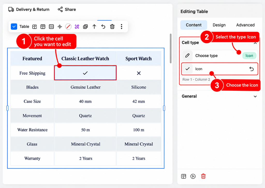
The Icon cell type allows you to display an icon inside a table cell. It is useful for representing features, statuses, or options visually, such as checkmarks for available features and cross icons for unavailable features.
For example, you can use icons in a product comparison table to indicate whether a product includes a specific feature.
2.3 Image
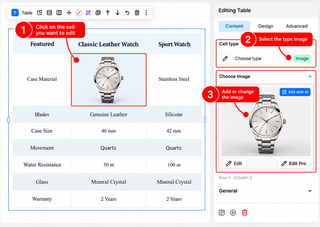
The Image cell type allows you to display an image directly inside a table cell. It is useful for showcasing product images, visual features, or other image-based information in your table.
After selecting the Image cell type, you can add an image to the selected cell and customize its display settings.
2.4 Button
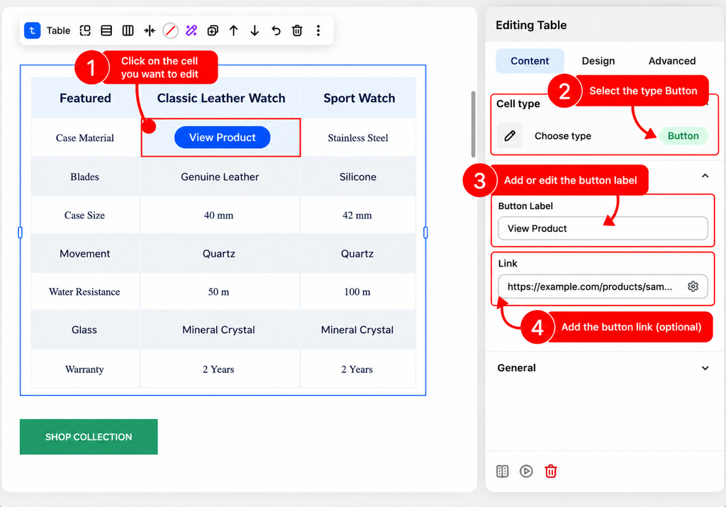
The Button cell type allows you to add a clickable button inside a table cell. It is useful for adding actions such as View Details, Shop Now, or Learn More to your table.
After selecting the Button cell type, you can customize the button text and link from the Cell content settings.
2.5 Metafield
Use a Metafield to display custom product information in your Table that is not available in Shopify’s standard product fields. It is useful for adding additional details such as material, dimensions, technical specifications, or other product-specific information.
Create a Product Metafield in Shopify
Before connecting a metafield to your Table, you need to create the metafield definition in Shopify and add a value to the product.
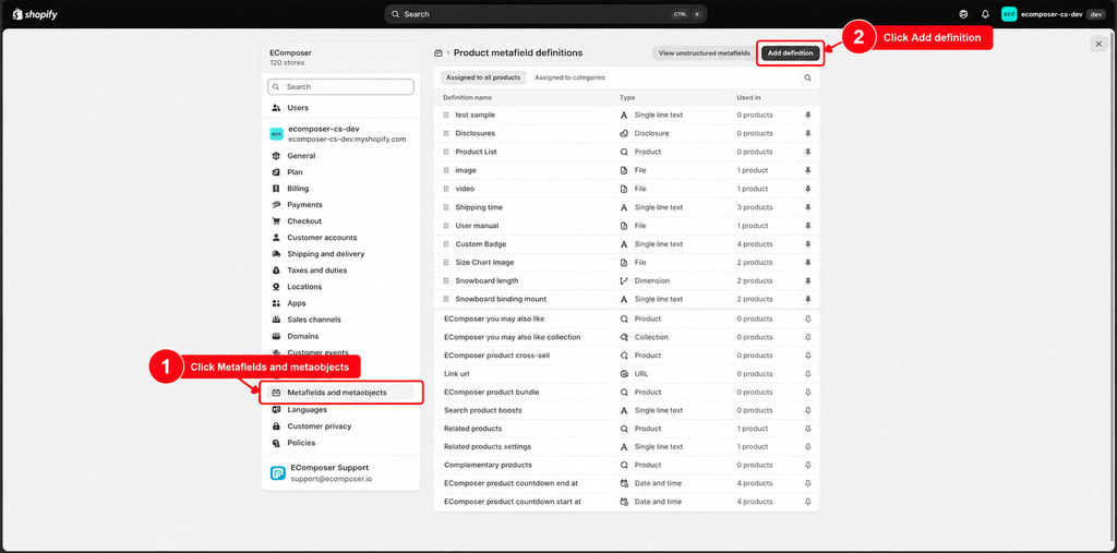
Step 1: In your Shopify admin, go to Settings > Metafields and metaobjects, then click Add definition to create a new product metafield.
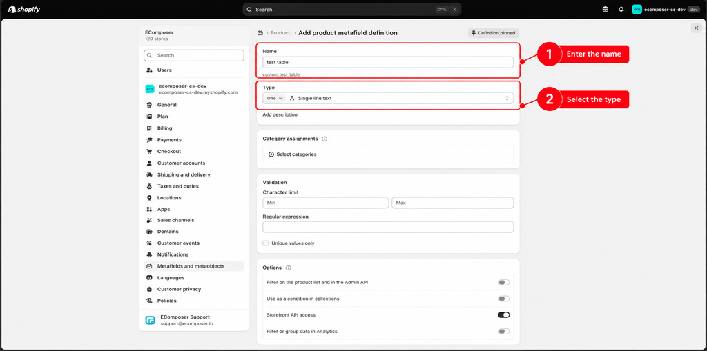
Step 2: Enter a name for the metafield and select the appropriate Type based on the information you want to store.
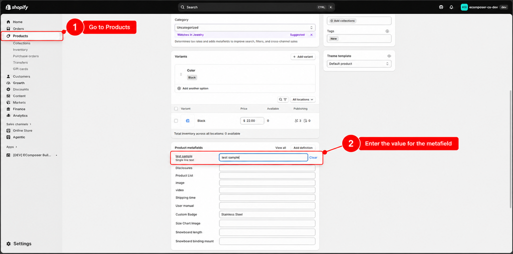
Step 3: Go to Products and select the product where you want to add the metafield value. In the Product metafields section, locate the metafield you created and enter the value you want to display in the Table.
Once the metafield has been created and a value has been added, you can connect it to a Table cell in EComposer.
Connect a Metafield to a Table Cell
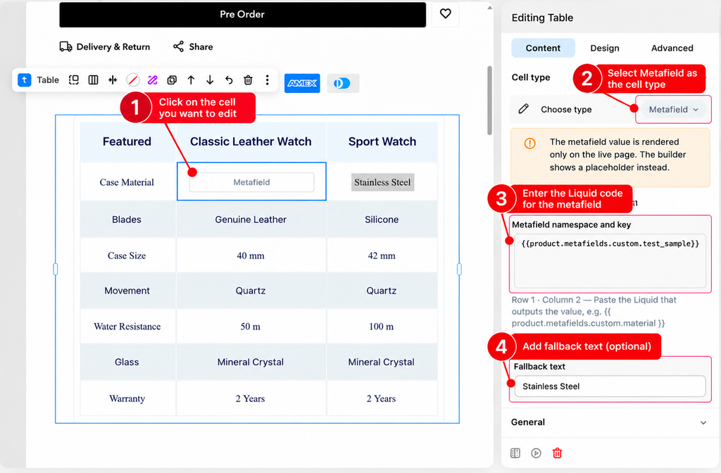
To display a metafield value, enter the corresponding Liquid code in the Metafield namespace and key field. If the metafield has no value, you can add Fallback text to display a default value instead.
3. Adjust General Settings
The General settings allow you to configure the overall structure and behavior of the Table element.
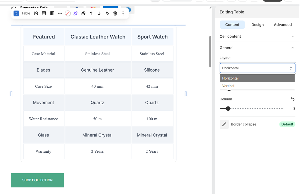
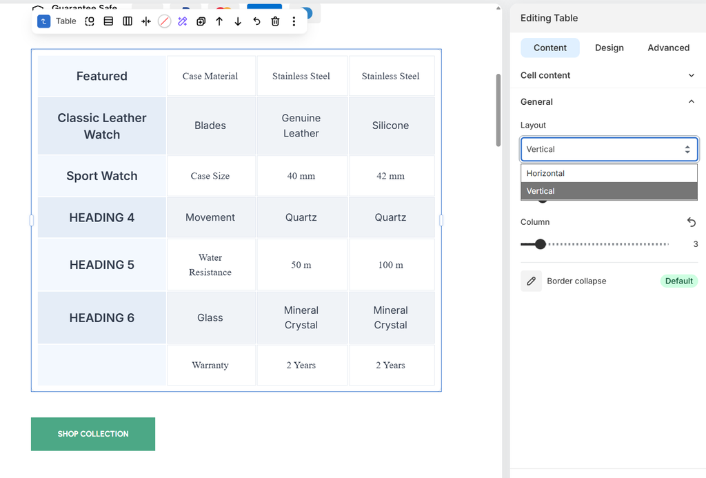
– Layout : Choose how the table content is arranged :
+ Horizontal: Arranges table content across columns.
+ Vertical: Arranges table content vertically.
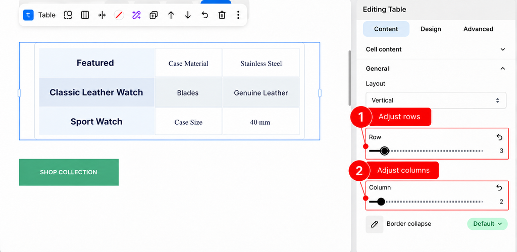
– Rows: Adjust the number of columns displayed in the table.
– Columns: Adjust the number of columns displayed in the table.
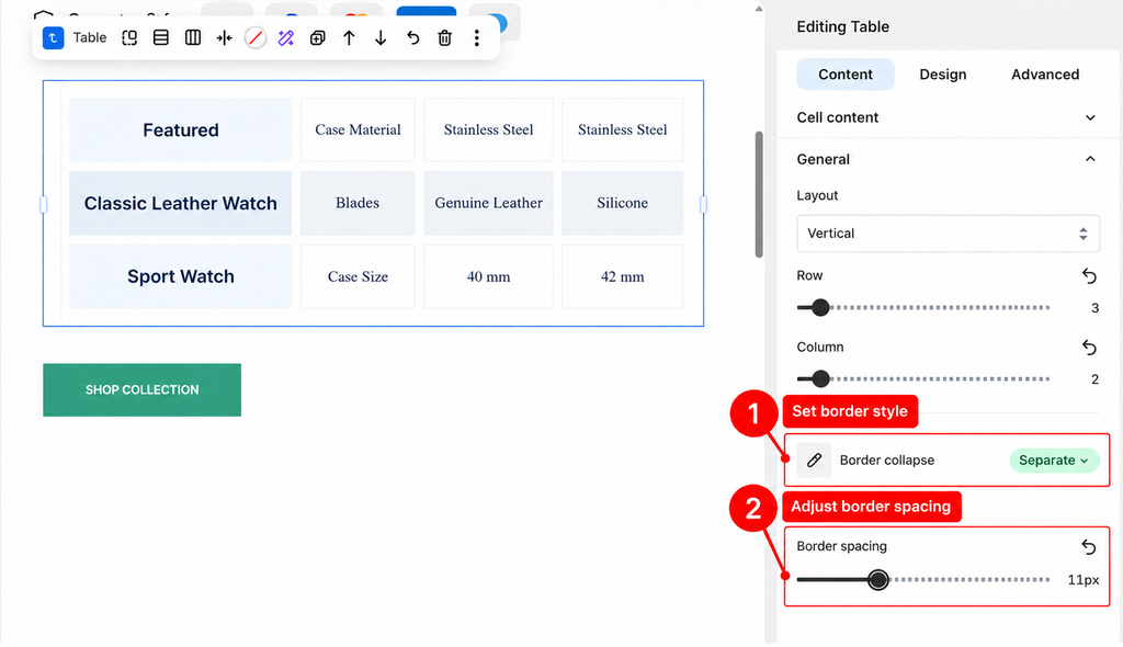
– Border Collapse: Control how borders between table cells are displayed:
+ Collapse: Combines adjacent cell borders into a single border.
+ Separate: Displays each cell with separate borders.
+ Inherit: Uses the border-collapse setting inherited from the parent element.
4.Adjust Design Settings
The Design tab allows you to customize the appearance and layout of the table. You can adjust the table container, headings, rows, columns, buttons, and icons to match your store’s design.
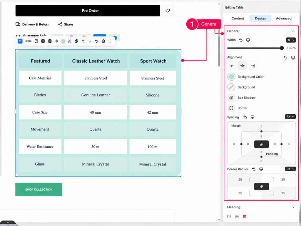
General
Customize the table’s overall appearance and layout, including its width, alignment, background, shadow, border, spacing, and corner radius.
Heading
Customize the header’s alignment, typography, text color, background, border, dimensions, spacing, gradient, and shadow to match your store’s design.
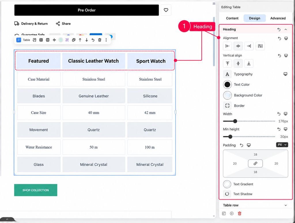
Table Row
Customize the borders, row height, background colors, text colors, and typography for odd and even rows to achieve the desired table layout and visual style.
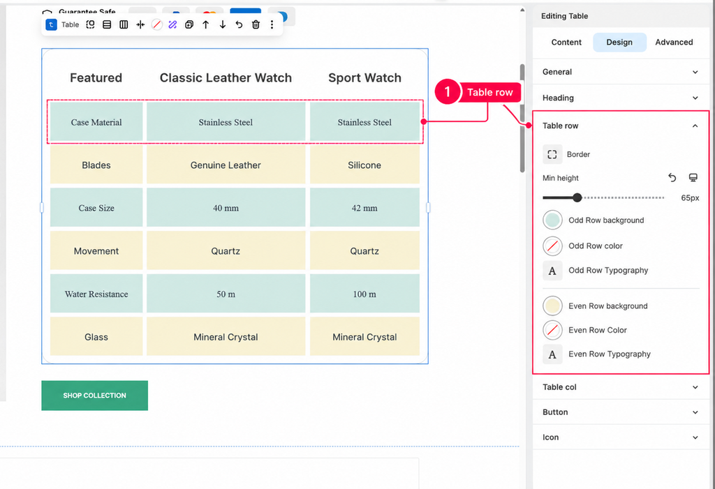
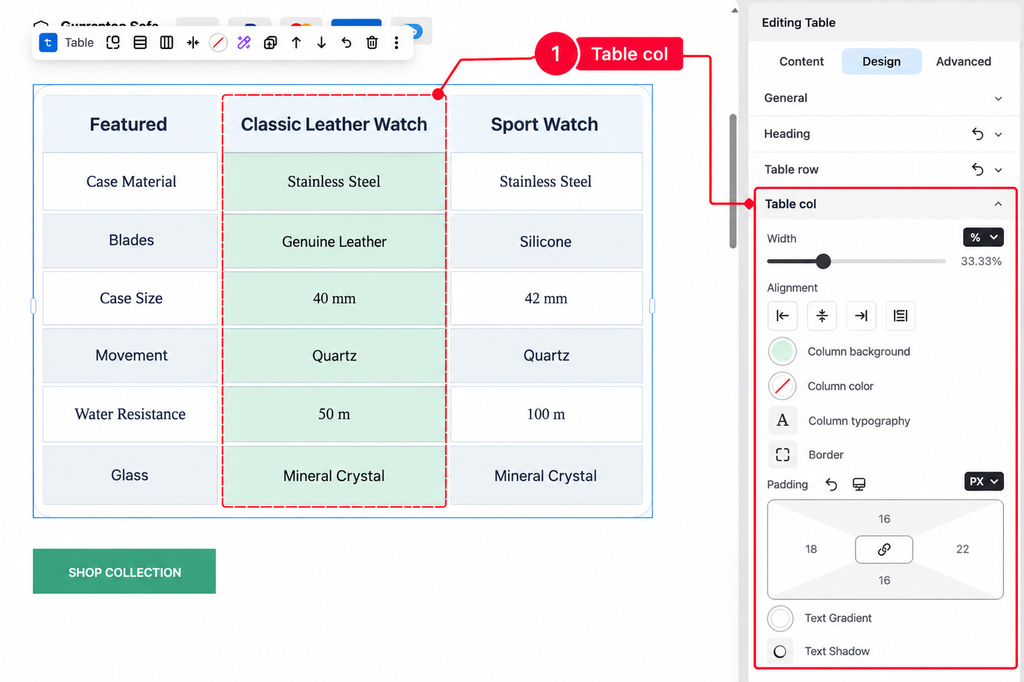
Table Column
Customize the column’s dimensions, alignment, typography, colors, background, border, spacing, gradient, and text effects to achieve the desired table layout and visual style.
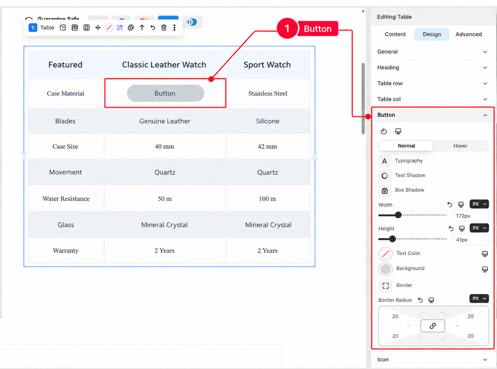
Button
Customize the button’s typography, dimensions, colors, background, borders, spacing, and visual effects, with separate styling options for Normal and Hover states.
Icon
Customize the icon’s color, size, and rotation to achieve the desired appearance and visual alignment within the table.