
Applied Filters
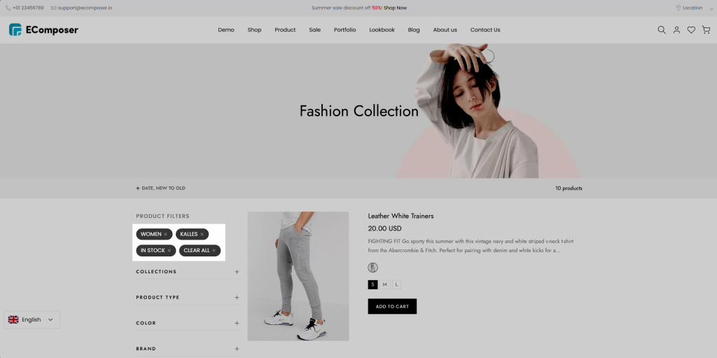
The Applied Filters element displays all active filters applied by customers on a Collection page. It allows shoppers to quickly review and remove selected filters for a smoother filtering experience. This element is available exclusively on Collection pages.
1. Add element to your page
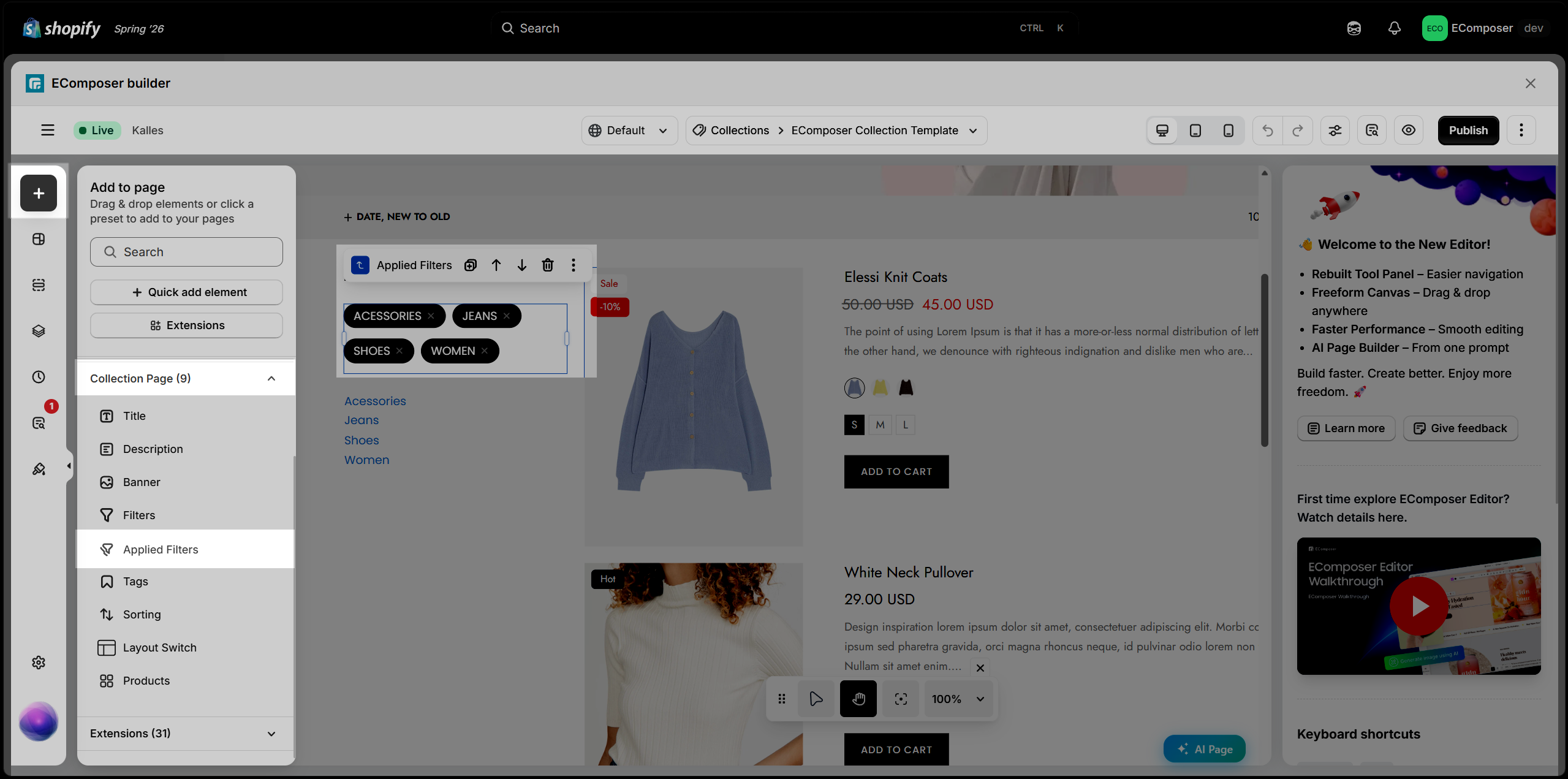
From the left panel, go to Elements > Collection Page and find the Applied Filters element. Drag and drop the Applied Filters element to your desired position within the selected structure.
The Applied Filters element displays the filters currently selected by customers. It works together with the Filter element, so make sure the Filter element is added and configured on the Collection page for the Applied Filters element to function properly.
2. Content Options
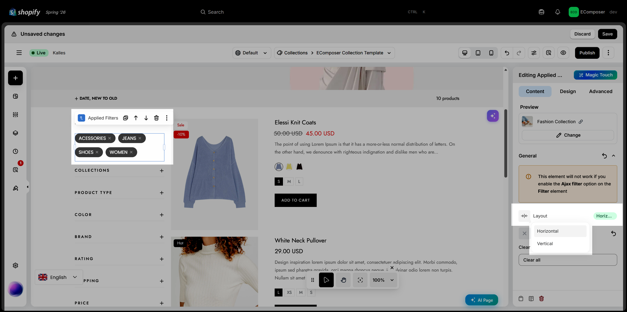
The Content tab allows you to customize the appearance of the Applied Filters element. You can configure its layout and icon to match your collection page design.
- Layout: Choose a layout for the Applied Filters element. You can select either the Horizontal or Vertical layout.
- Icon: Select a built-in icon or upload a custom icon for the Applied Filters element.
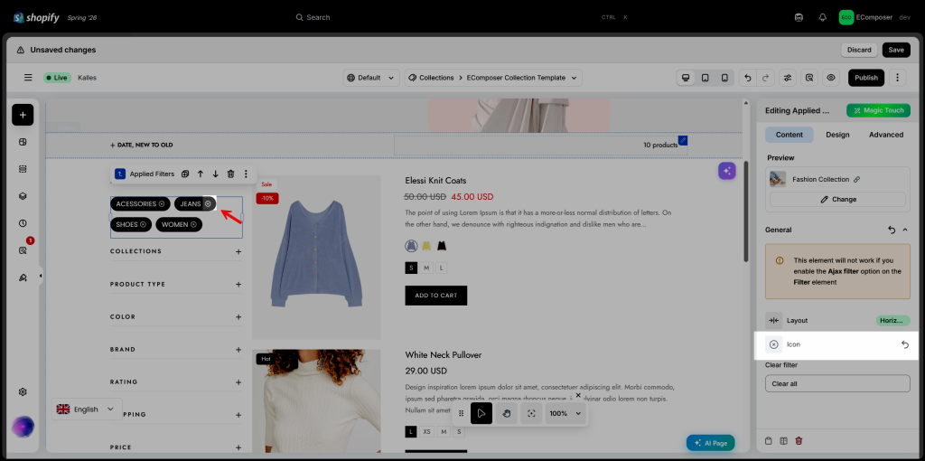
- Clear filter: Customize the text displayed for the Clear filter button, allowing customers to remove all applied filters with a single click.
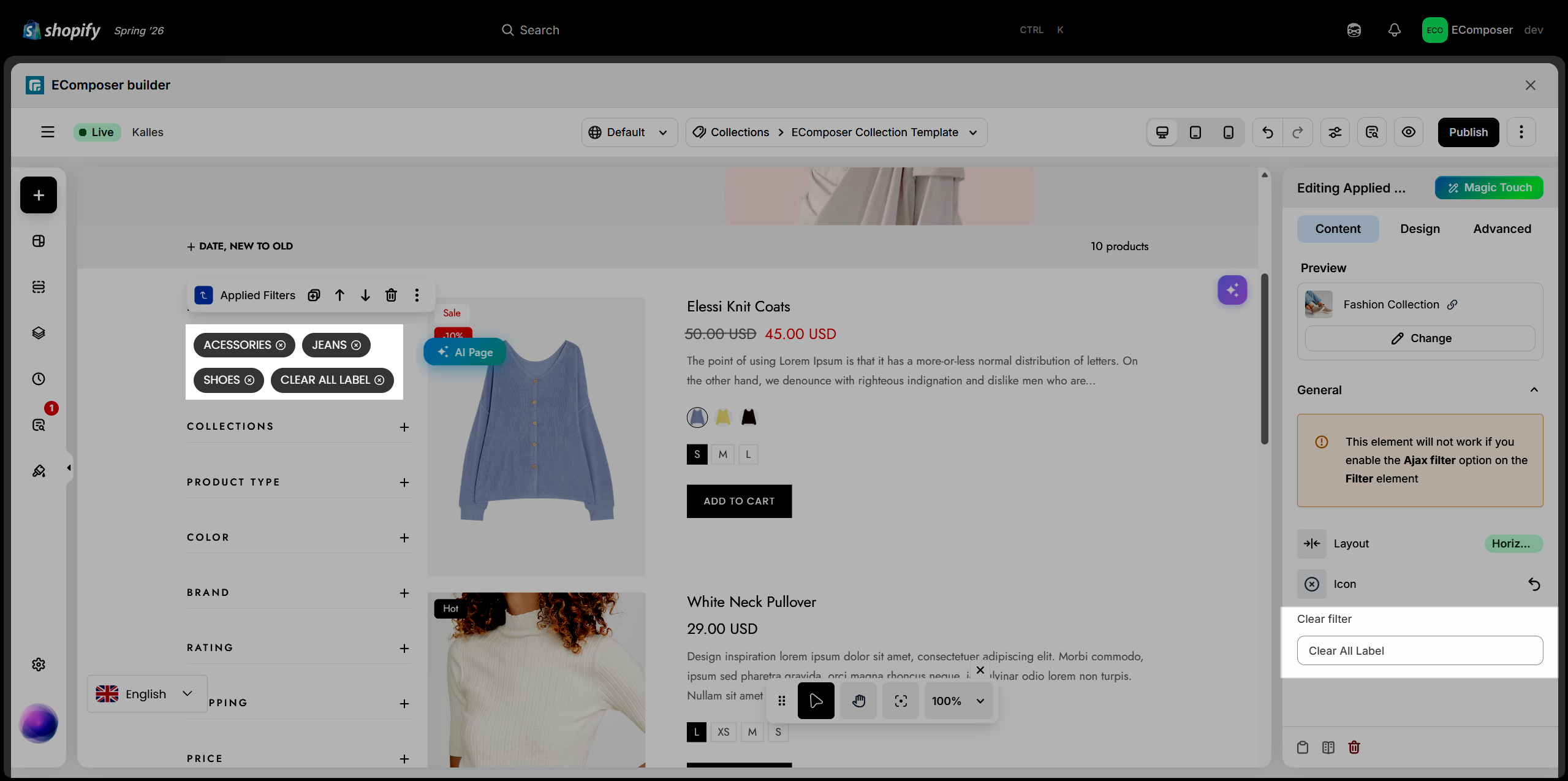
3. Design Options
The Design settings let you customize the appearance and styling of the Applied Filters element, including its overall layout, filter values, and icons.
3.1. General
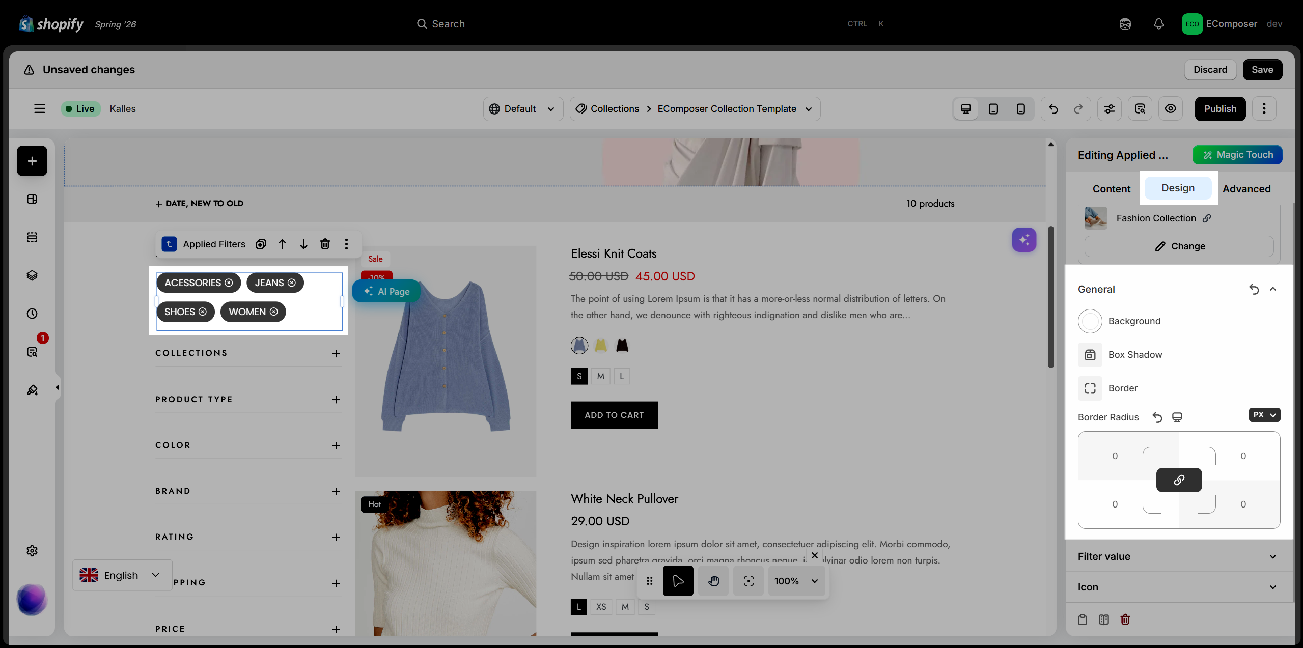
The General settings control the element’s basic visual styling, such as its background, box shadow, border, and border radius.
- Background: Set the background color of the Applied Filters element.
- Box Shadow: Add a shadow effect by adjusting properties such as Blur, Horizontal Offset, Vertical Offset, Spread, and Color.
- Border: Customize the border style, width, and color. Select None to remove the border.
- Border Radius: Adjust the corner radius of the Applied Filters element. Responsive settings are available for desktop, tablet, and mobile devices.
3.2. Filter Value
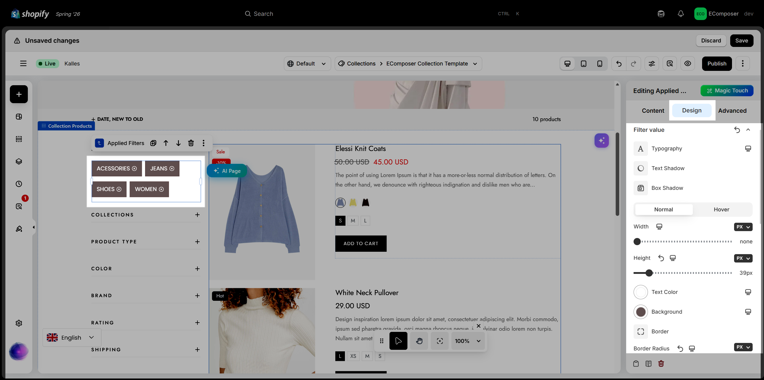
The Filter Value settings allow you to customize the appearance of each selected filter tag displayed in the Applied Filters element.
The following styling options are available:
- Typography: Customize the font family, size, weight, style, line height, and letter spacing.
- Text Shadow: Apply a shadow effect to the filter value text.
- Box Shadow: Add a shadow around the filter value.
- Width & Height: Set the dimensions of each filter value.
- Text Color: Change the text color.
- Background: Set the background color.
- Border: Customize the border style, width, and color.
- Border Radius: Adjust the corner radius.
- Outline: Configure the outline style and appearance.
- Transition: Control the animation effects when the filter value changes state.
- Spacing: Adjust the margin and padding around the filter value.
3.3. Icon
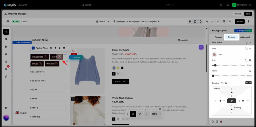
The Icon settings allow you to customize the appearance and positioning of the remove icon displayed on each applied filter.
- Color: Change the color of the remove icon.
- Size: Adjust the size of the remove icon.
- Rotate: Rotate the icon to the desired angle.
- Spacing: Adjust the spacing around the icon to control its position relative to the filter value. Responsive settings are available for desktop, tablet, and mobile devices.