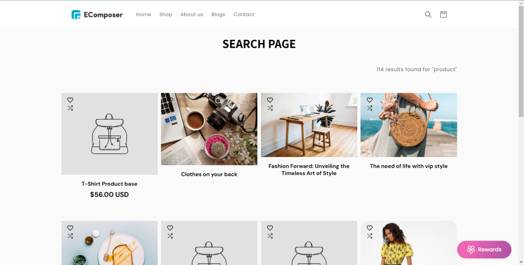
Search Result
This element will show the product, article, or page on the website when you search in the search bar.
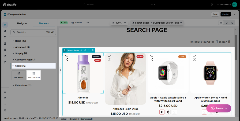
1. Content
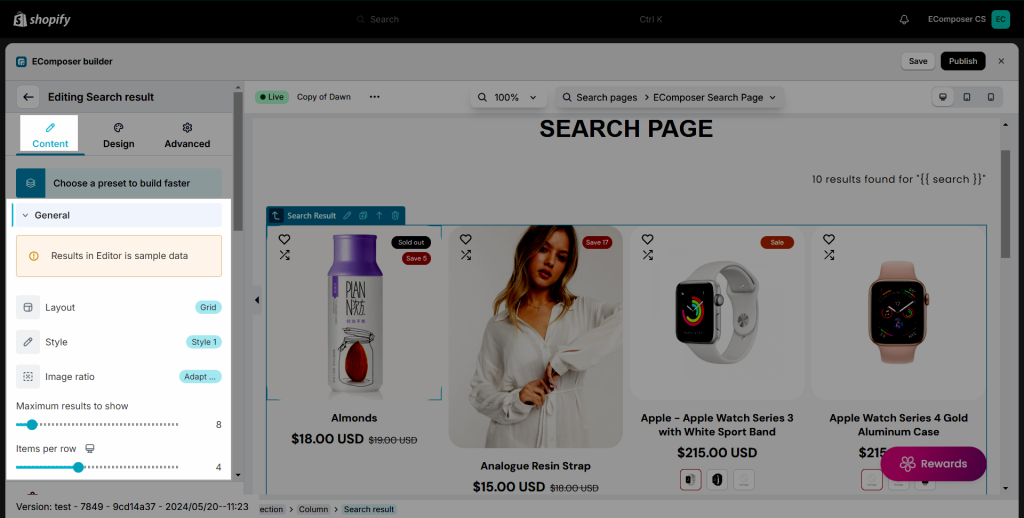
1.1 General
The most general settings for the element will be in this tab
- Layout: We have 3 layout types are Grid, List, and Slider.
- Style: If you select the Grid or Slider layout, this option will show allow you to choose the style. We have three available styles.
- Image ratio: You can change the ratio for product images.
- Maximum products to show: You can adjust the number of products shown on the element.
- These options will only show if the Style is set to Grid:
- Items per row: Select the items per row.
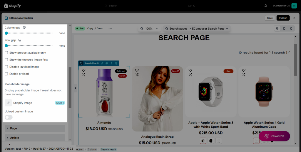
- Column/Row gap: Set the space between column and row.
- Show product available only: This option will show the product which is still in stock or available.
- Show the featured image first: This option will show the featured image of the product set in Shopify.
- Disable Lazyload: Give you the ability to disable lazy load for the product images.
- Enable preload: You can tick this to preload the product grid.
- Placeholder image: This option allows you to select an image to show up as a featured image with the products that don’t have the image in Shopify media.
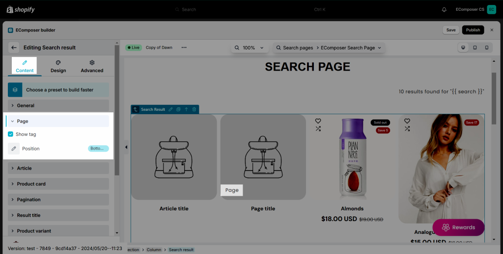
1.2. Page
The options in this tab will configure for the landing page results on the Search page.
- Show tag: Show the tag of the page
- Position: Choose the position to show the tag
1.3. Article
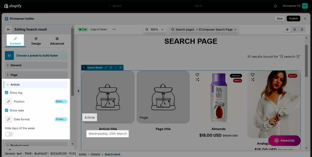
Here are some options to configure for the article results on the Search page.
- Show tag: Show the tag of the article
- Position: Choose the position to show the tag
- Show date: Show the date created of the article
- Date format: You can choose the date format you want to show
- Hide days of the week: Toggle to hide or show the days
1.4. Product Card
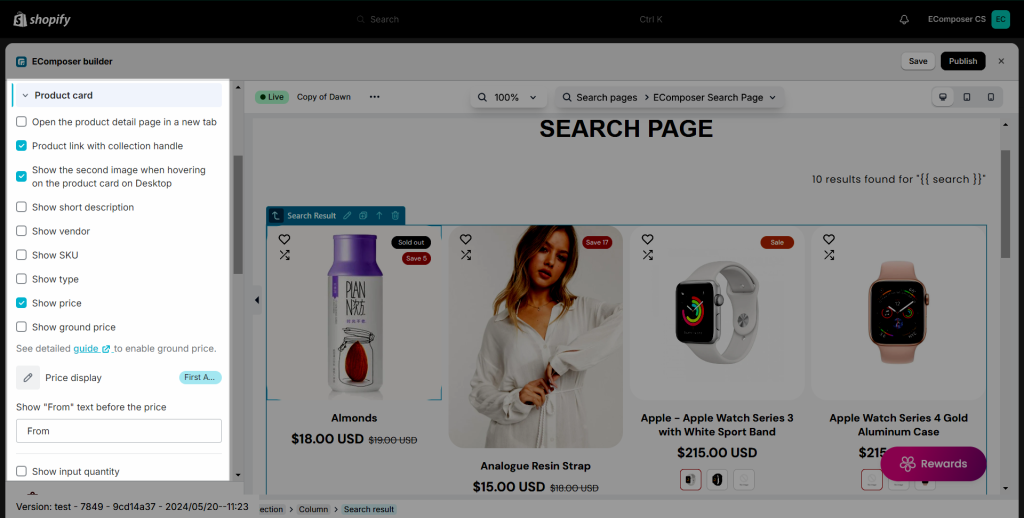
In addition to the product image, there are other important parts that you may want to display on your page:
- Checkbox options: We have options available and you just need to tick the checkboxes to show the product title, vendor, short description, price, SKU, sale label…
- Show input quantity: Allow user to add multiple quantity of the products to the cart page.
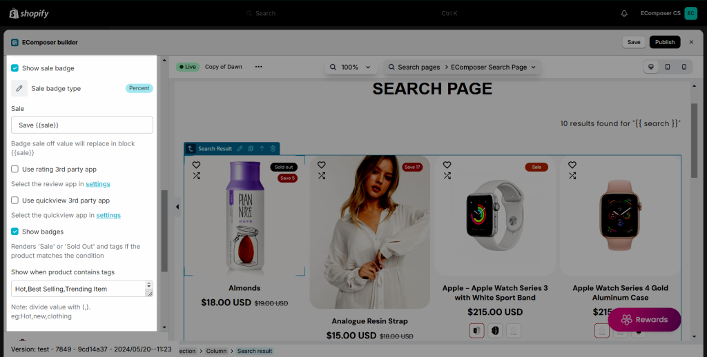
- Show sale badge: You can set the badge to show as percentage or exact value, you can change the text of the badge as well.
- Third-party apps: There are rating, quick view, and wishlist apps that you may want to use on your page. To use these apps, please click on the “setting” link to open the setting popup. You must select an app from our app list and install that app to your store to use.
- Show when product contains tags: This is a very nice feature, it helps you to display custom labels on product items through product tags. Eg you want to show the “Hot” label on your product items, please add the “Hot” tag to your product and fill the tag name to this option to show.
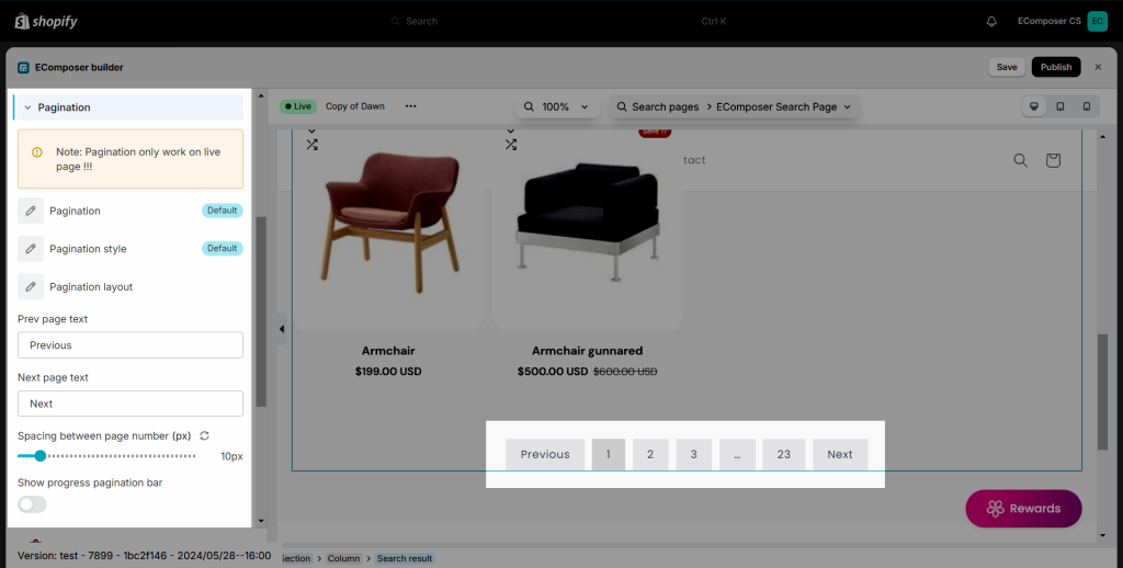
1.5. Pagination
In this setting, you can choose the look of Pagination, Pagination Style, Pagination layout, Prev page text, Next page text, Spacing between number, and choose to Show progress pagination bar.
1.6. Result Title
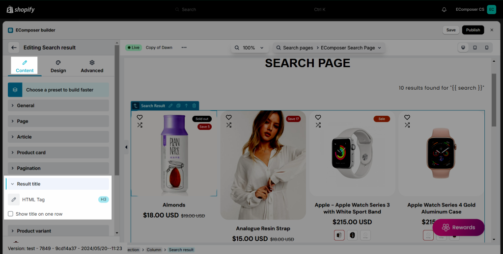
You can set the HTML tag for the Result title here and also there’s an option to set the title to one row if it’s too long.
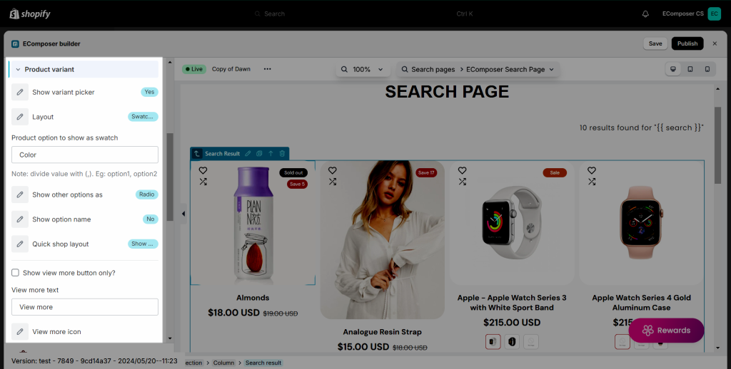
1.7. Product Variant
If your products have variants, you can configure them to show here.
- Show variant picker: Choose “Yes” to show them on product items.
- Layout: You can select a layout for your variants. Dropdown, swatch image, swatch color, or radio. The variant images will be taken from the Shopify to show. If you choose the “Swatch color“, you must install an extension to custom color options.
- Other options as: For example, your products have three variants. So you can select the first variant as a swatch image and the other ones as a dropdown or radio layout.
- Show option name: If you choose “Yes”, it will show the variant name as a label.
- Product option to show as swatch: Enter the variant name that you want to show as a swatch option here. It is the name of the variant that you created in Shopify.
- Hide buttons on mobile: You can tick this option to hide the View More, Add to cart, Sold out,… buttons on the mobile version.
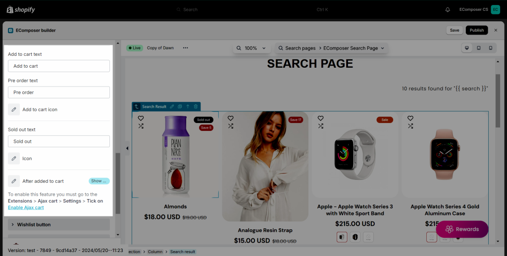
- Add to cart/Pre order text: You can change the name for the Add to cart or Pre order buttons. Also, you can add the icon to those buttons if you want.
- View more/Sold out text: This will change the view more and sold out text for the product grid.
- After added to cart: There is a list of option to choose after you click add to cart (Most of the options require an Ajax cart extension, besides Redirect to the cart page).
- Show cart popup: This will open a pop up.
- Reload page: Reload the page after clicking add to cart.
- Show a message: This will show a message.
- Redirect to cart page: Go to the cart page.
- Go to checkout page: Go to the checkout page.
- Go to a Special url: You can set a link to redirect to after clicking the Add to cart button.
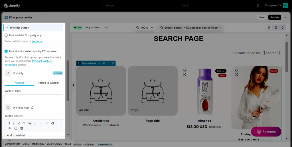
1.8. Wishlist button
You will have the option to choose between a 3rd party wishlist app or the Wishlist extension from EComposer.
For more details on the product wishlist button from the EComposer app please check the guide here.
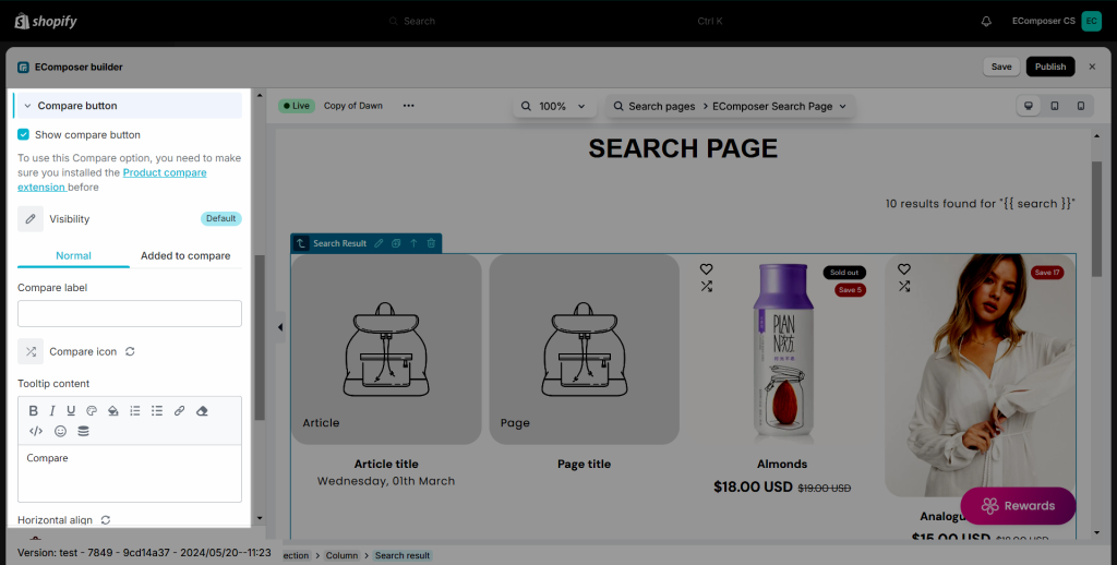
1.9. Compare button
You will have the option to show the Compare product button, for further details please check the guide here.
1.10. Countdown Promo
Here you can enable/disable the Countdown/Progress bar and change the Layout/Title, you can also change the time labels you want to show.
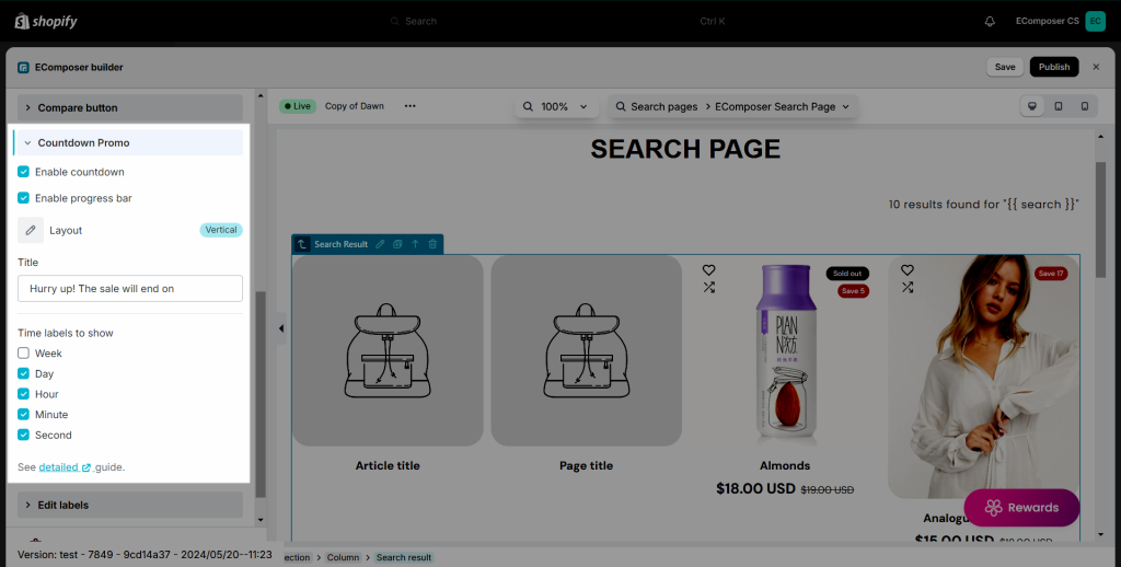
But first, to set up the Countdown we need to go to Products in Shopify and choose a product that you want to display the countdown, after that you will need to go down to the bottom of the page and click on Show all next to the Metafields.
In here there will be 2 metafields: Product Countdown Start and Product Countdown End for you to choose the countdown time.
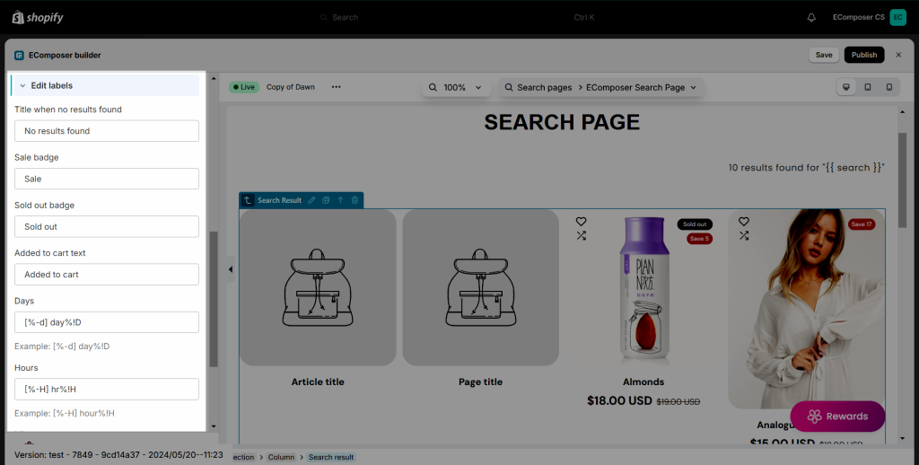
1.11. Edit labels
There are some text like title, description, vendor, type… will be taken from Shopify. The rest of the text on the element like the badge, and countdown label you can edit here.
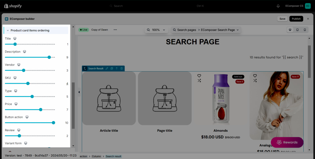
1.12. Product cart items ordering
The product carts will be sorted in default order. If you want to change the order for them, you can do so here, just drag the progress bars to change the position.
2. Design
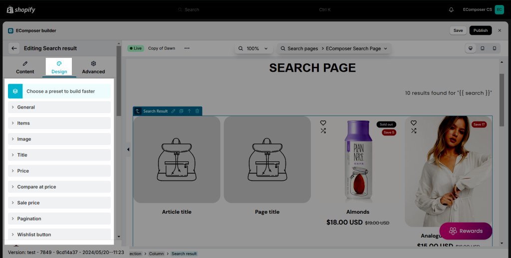
In this design tab, there are many options to help you design the element as you want. For example, if you want to add a border around the item, you can go to the “Items” tab. Or if you want to change the title color, you can go to the “Title” tab. All options are very easy to use and flexible.
All of the settings in this tab are covered in detail here.
3. Advanced
These tabs have been very well documented here.
This is a result on live page when publishing and make a search:
