Gallery

Author: Jimmy 1719 views

If you are looking for an Element that can help you display a group of images and allows you to easily add and style beautiful image pop-up galleries on your page. Gallery Element will be the perfect choice for you.

1. Generals

From the left side (Elements tab), you will see the Gallery element in the list of elements. Drag and drop it to any position of the selected structure. This element allows you to build so many beautiful layouts for your page.

Please view the video below to know how to add the Gallery element to your page.

2. Content

2.1. Images

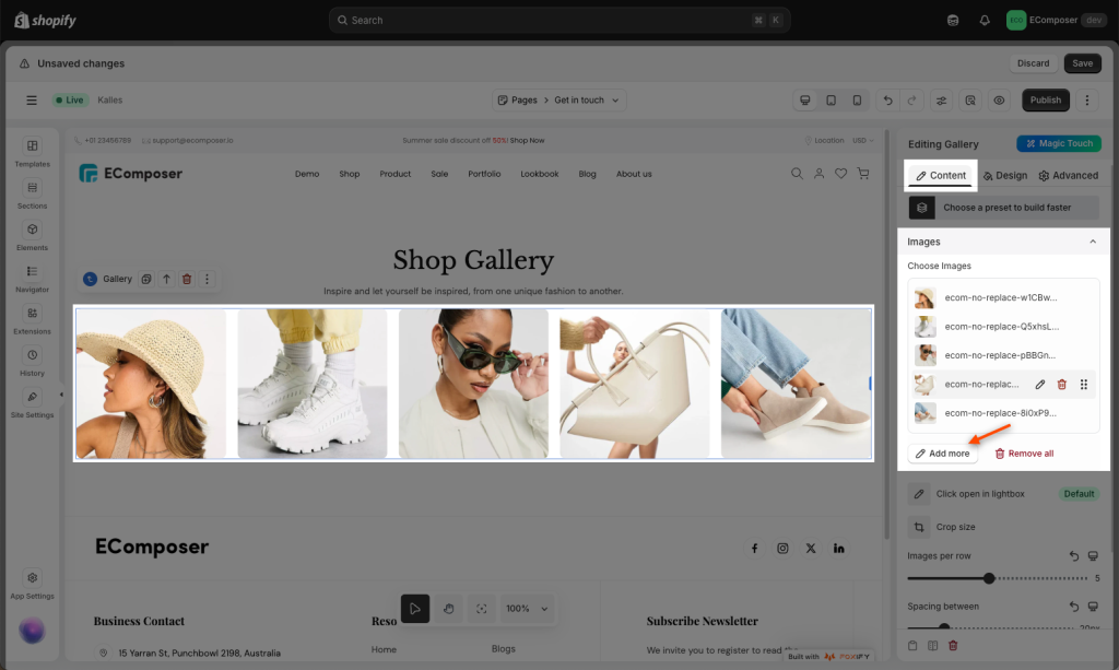
  • Choose Images: Choose the image that you wanna show on the Gallery element here. Click Add more button to add more images. Inside here there’s couple more option below:
    •  Alt: By default, the name of the image that you pick in Gallery will show here. But you also can remove the default name, and add custom text for the image here. The text will show when you hover over the image.
    • Caption: You can add a caption for the image here. The caption will show below the image.
    • Link: You also can insert a link for the image here. Choose None if you don’t wanna insert a link. Choose Media Field, once you click on the image, the page will redirect to the link of the image and show the Click open a lightbox option. And if you choose Custom Link, you can add any Url for the image here. You even can redirect it to the Brands page.
    • Insert a link option: You can add a custom link for the gallery image here.
    • Click open a lightbox: You can choose Yes or No to enable the feature of open a lightbox.
  • Crop Size: This option allows you to choose a size for the image. You can use Original size, Custom size or available size: 400x300px, 500x500px, 800x450px.
  • Images per row: Configure the number of images that you wanna show per row.
  • Spacing between: Configure the space between each image here.

2.2. Overlay

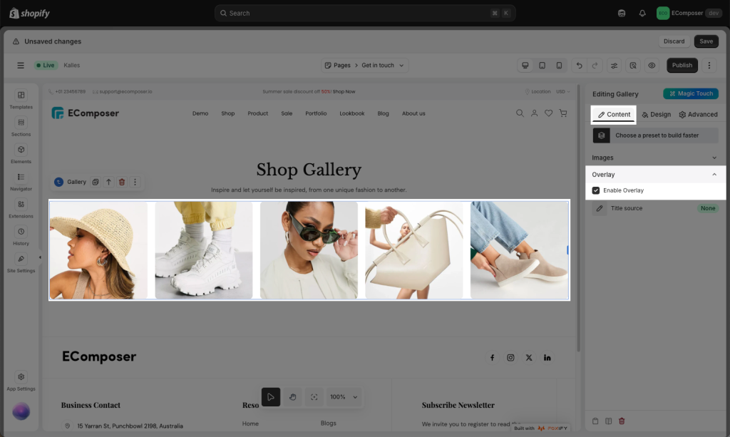
  • Enable Overlay checkbox: Tick on this checkbox to enable overlay for the image.
  • Title Source: You can choose a source for the title here. We have 3 sources: Alt, Caption and Custom. You can choose none if you don’t wanna show a title for the image when hovering.
  • Custom Title: Add the custom title for all images on the Gallery element here.

Please check the video below for a general overview of the Content tab.

3. Design

3.1. Image

  • Align Items: This option will arrange the content of the element. Example: Align left, Align center, Align right.
  • Width: Choose the width for the image here.
  • Max Width: Configure the maximum width for the image here.
  • Height: Configure the height for the image here.
  • Image fit: You can choose one of these styles for the image on Gallery element: None, Fill, Contain, Cover, Scale down.
  • Opacity: Configure the opacity for the image here.
  • CSS Filters: Adjust only section’s background Blur, Brightness, Contrast, Saturation…
  • Box Shadow: Adjust the icon style by changing the Color, Horizontal, Vertical, Blur, Spread, and Position to create a shadow for the image.
  • Border: Choose border style for the element here. You also can choose None style to disable the border.
  • Allow you to configure border-radius, this option is available for desktop, tablet, and mobile devices.
  • Animation: Choose animation for the image when hovering here. We have more than 10 animation styles.
  • Transition Duration: This option allows you to set the transition duration of the border when hovering.

3.2. Caption

  • Alignment: Align the image caption to the left, center, or right. This option is available for desktop, tablet, and mobile devices.
  • Typography: Change typography for image caption here.
  • Text Color: Adjust the color for the caption here.
  • Text Shadow: Property adds a shadow for the caption here. Choose a color > Adjust the position of Shadow using Horizontal and Vertical attributes.
  • Spacing: Adjust the margin and padding for the caption here.

3.3. Overlay

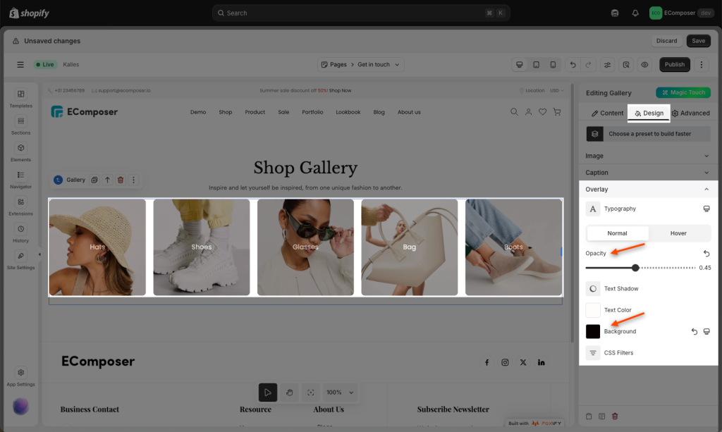
  • Opacity: Configure the opacity for the image here.
  • Background: Configure the background color for the image overlay here.
  • CSS Filters: Adjust the background image overlay here:Blur, Brightness, Contrast, Saturation…
  • Transition Duration: This option allows you to set the transition duration of the border when hovering.

You can see the video below to know how to configure the design the Gallery section:

4. How to open the Gallery image as a pop up?

For this effect we will have to choose the Media File for the Link option and select Yes for the Click open a lightbox option. Please check out the video below for an easier visualization.

Leave a Comment

Enjoy a free 3-day trial. Then get your first month for $1. Try Now.