Simple Slider
Simple Slider is a powerful tool that allows you to easily create beautiful image and content sliders for your website or application. Simple Slider typically features navigation buttons, dots, or scroll bars that enable users to easily switch between slides. You will probably see a Simple Slider on the homepage of most websites, so it is really important.
With EComposer you can create your own slider, there are so many things that you can do. You can add everything to the slider like text, images or buttons… and you can design each slider a style. In addition, you can also make the entire background image of the slider clickable (this is a very useful function). If you do not how to build a Slider for your website, this article will help you.
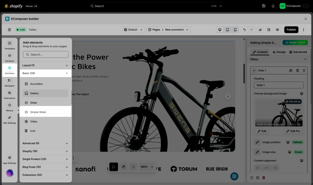
To add a Simple Slider element to your page, please drag it from the Basic tab to the position that you want.

1. Content tab
1.1. Slides
- In each Slide item tab, it will go with the basic settings below:
- Add New Slide – create additional slides
- Duplicate – clone an existing slide
- Delete – remove any slide
- Reorder – drag slides to change display order
- Move to deeper inside the Slider setting, you can modify:
- Heading: it is the name of the slide and will only appear on the left side of the editor so you can distinguish between the slides.
- Choose background image to upload the image that you need to use for that Slide.
- Image position to focus on a few specific points in the image, for example, the top, the centre, or the bottom.
- Image size to make the image fit the Slider via the option as Contain, Cover, Fill, etc.
- Content alignment to move the content into the position that you prefer, like Left – Center – Right.
- Image link will let you add the page link for the image to make that image clickable to the page that you need.
- Enable the overlay setting if necessary. This will make your image the darker overlay, making the content easier to see and understand.
- Modify the option called ‘Disable lazyload’ or ‘Fetch’ to use for the Slide if needed.
- Add new slide here will let you add the new slide to the Slider to use.
- Content width will allow you to adjust the content width for the Slider element. You can set the content width for different devices.
- Image Height will support the image height options as adapt to first image, Adapt to image, Fill screen height, Fixed height. In there Fixed height you can change the height of the element to make the background image fully visible. And you should set each device to a different size.
- Content vertical align will help you move the content box into Top – Centre – or to the Bottom of the Slide.
1.2. Settings
In this tab there are many options to configure your slider, the option names are easy to understand so you don’t need to worry about them.
- Transition effect: When you switch to the next Slider page, the effect for the Slider could be adjusted. Such as Fade or Slider
- Drap: You can enable/ disable/drap free mode to drap slider to the next slider page by computer mouse.
- Autoplay: Enable this option to make your slides automatically advance to the next one. Autoplay works best in conjunction with the Infinite Loop feature. When both functions are enabled, your slides will automatically advance and then loop back to the first slide. Besides you can choose enable Autoplay reverse, Pause on hover, Show progress bar, Speed.
- Centered Slides: This option will allow you to center the Slider anytime you move it, but you should also select the Infinite Loop option.
- Infinite Loop: Enable this option to loop your slider again upon reaching the final slide.
- Items per row: Items per row will display how many Sliders are visible at first glance on 1 row.
- Items per group: When you click the next Slider, items per group will indicate how many Sliders will appear.
- Column gap: Set the space between the column. These options only work when your slider has more than two columns.
- Transition duration: Customize transition duration between 2 sliders.
1.3. Navigation
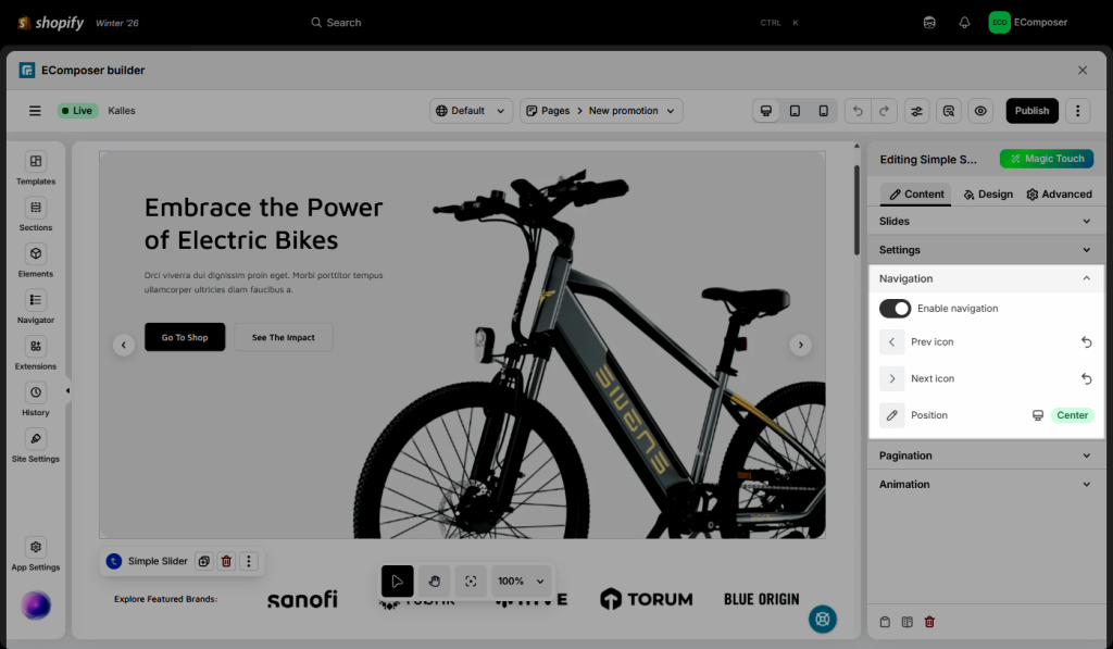
Here you can select whether to enable/disable navigation and set its position. Additionally, you can change the icon’s appearance for navigation.

1.4. Pagination
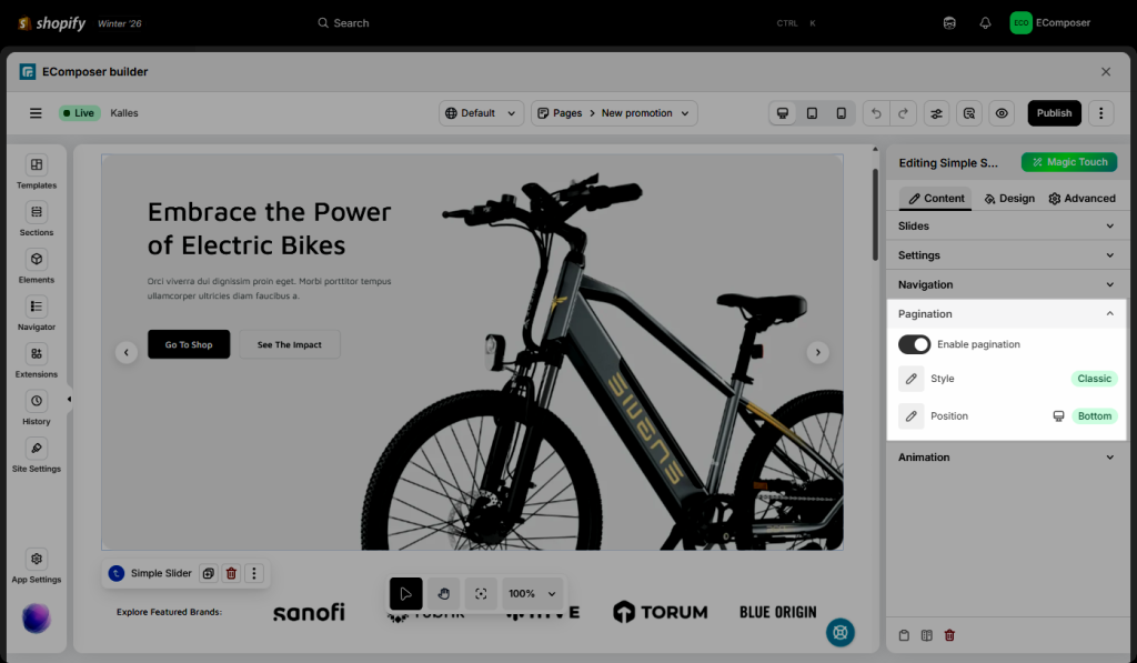
Here you can select the enable/disable and position for the pagination. Additionally, you can change style for pagination.

1.5. Animation
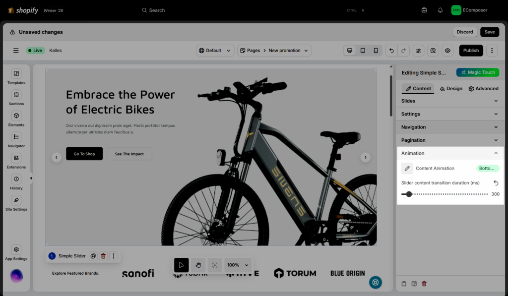
Here you can set the animation for the content block in the slider that will appear when the slide advance to the next one. Additionally, you can custom transition duration (ms) for slider content.

2. Design tab
- Slide:
- Slide animation: We have some available animation options for the slides here, you can select the one you love.
- Slider Transition Duration (ms): Refers to the amount of time it takes for a slider to move from one slide to the next.
- Background: You can set the background colour for your slides. But this option will work when you don’t use a background image for your slide.
- Border: Set the type of border, choosing from None, Solid, Double, Dotted, Dashed, or Groove. Also, allow editing of the border colour of the slides.
- Border Radius: Set the border-radius to control corner roundness, available for desktop, tablet, and mobile devices.
- Spacing: Set the spacing for the slide, available for desktop, tablet, and mobile devices.
- Navigation: We have options for you to design the navigator however you want. Such as the size, rotate, icon size, primary colour, background colour, box-shadow, border, border-radius and spacing
- Pagination: The design options are almost similar to Navigator. You can set the Pagination’s width, height, and more for the Normal/Hover/Active effect.
- Overlay: It is primarily used to ensure your text is readable regardless, based on the Background color, CSS Filters, Transition Duration when Nomal or Hover.
Note: There are NORMAL, HOVER, and ACTIVE. NORMAL is the pagination that you see first when browsing the Slider element. HOVER is the tag you see when you hover on. ACTIVE is your current position as the Slider. You can customize both with different designs.


