
Cart items
The Cart page plays a crucial role in the customer journey and should be carefully considered during the design process, as its effectiveness can directly impact conversion rates and checkout completion.
Before proceeding to checkout, customers review their selected items on the Cart page. The Cart Items element displays key information for each product in the cart, including its price, selected quantity, and subtotal, while also providing the overall total value of the order.
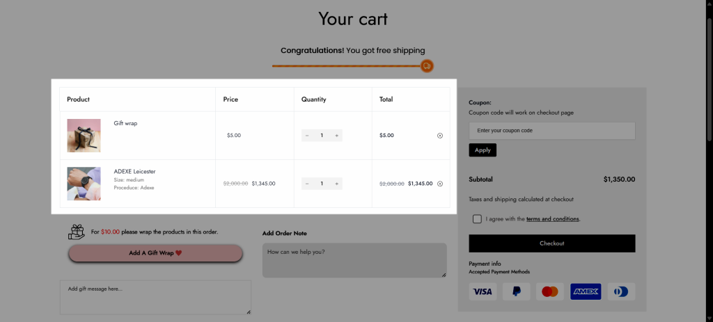
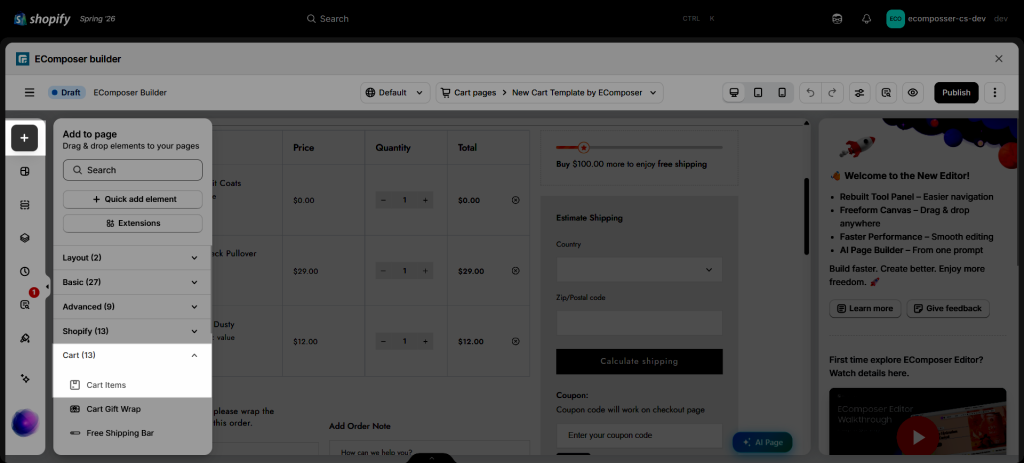
You can find the Cart Items element in the Elements panel => Cart => Cart Items:
1. Content tab
1.1. How to configure the cart items table
Note: This section is only showing up when you had added an item to the cart.
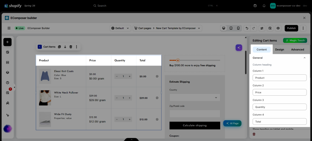
- Column heading: There are 4 columns by default, along with their headings. With these options, you can edit the wording of each heading or remove it.
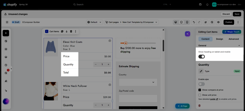
- Show heading on tablet and mobile: This setting allows you to show or hide the column headings (such as Price, Quantity, and Total) on tablet and mobile devices. Hiding these headings can help create a cleaner layout and save screen space on smaller devices.
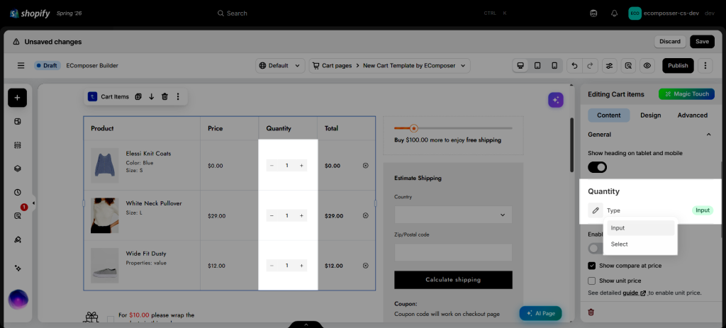
- Quantity Type: Choose how customers adjust product quantities in the cart. Select Input to display plus and minus buttons for increasing or decreasing the quantity, or Select to show a dropdown list of quantity options.
- Enable Ajax: Update cart quantities instantly without refreshing the page, providing a smoother and faster shopping experience.
- Show Compare at Price: Display the product’s compare-at price to highlight discounts or savings.
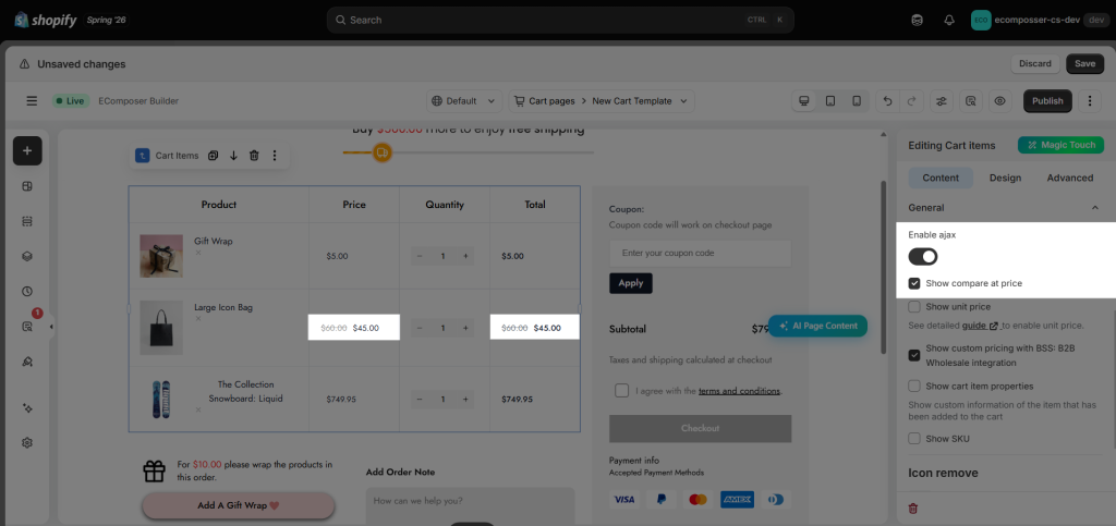
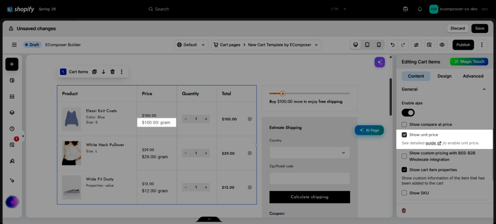
- Show Unit Price: Display the unit price configured for the product, such as price per weight or volume unit.
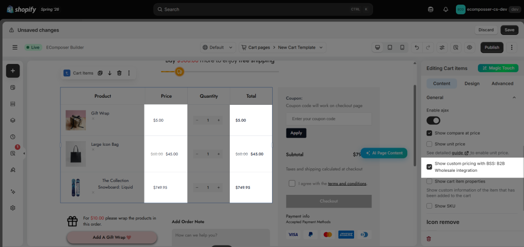
- Show Custom Pricing with BSS (B2B Wholesale Integration): Enable this option to display custom prices defined in the BSS: B2B Wholesale app for eligible customers.
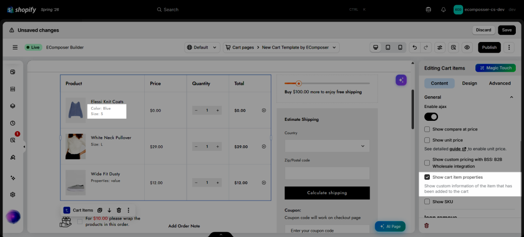
- Show cart item properties: Products usually come in different variations. If you present them right here, your customers can double-check what option they chose without going back to the product page, not to frustrate customers. Then you can drive them go straight to the Checkout page.
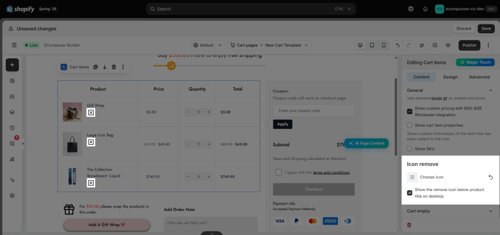
You can also customize the Remove icon, including its appearance and position within the cart item layout.
- Choose Icon: Select a different icon for the Remove action.
- Show Remove Icon Below Product Title on Desktop: Display the Remove icon beneath the product title instead of at the end of the cart item row.
1.2. How to configure the style of the cart empty layout
Note: This element is only showing up when you have no items in the cart
- Preview cart empty: You tick this option to be able to preview the cart empty layout inside the Editor view. Untick to show normal cart items layout.
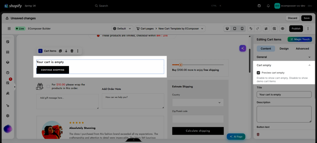
- You can also change the wording on this layout with options such as Title, Button text, and Button link
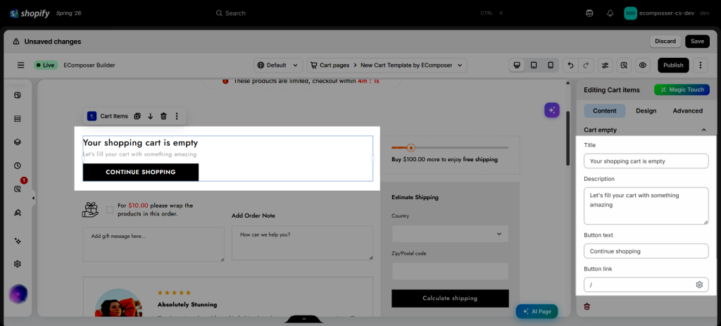
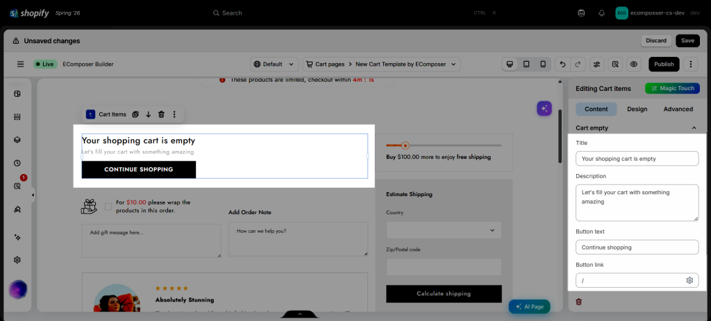
- Gap: It’s the spacing between the button and the text above it.
2. Design tab
The Design tab provides styling options for the Cart Items element, allowing you to customize both the element itself and the components contained within it.
2.1. General
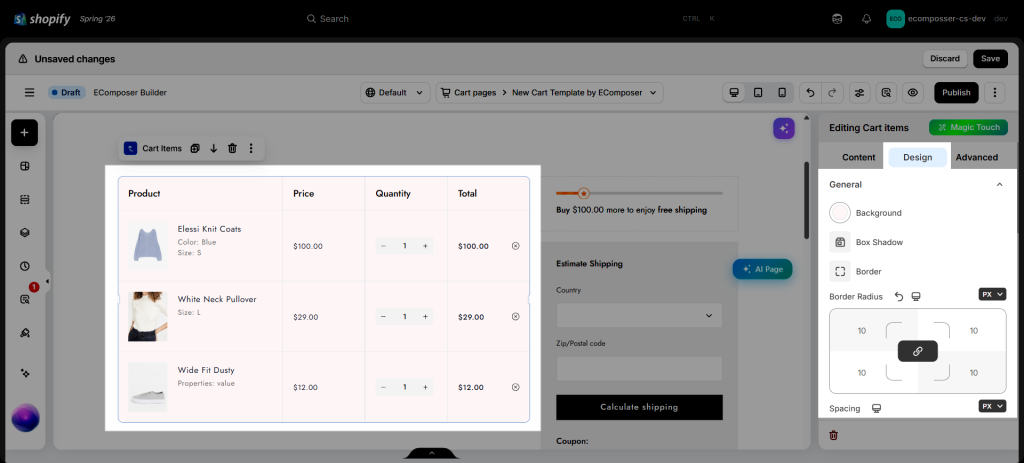
You can change the Background color, Border, Border Radius and Spacing of the entire Cart Items table area.
2.2. Column Heading
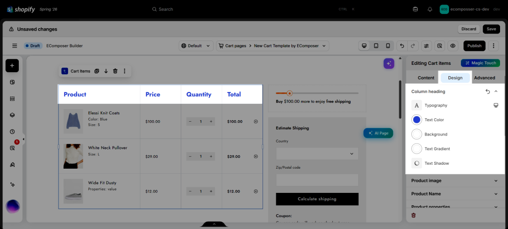
You can style the Typography, Text Color and Background of the Headings.
2.3. Product Image
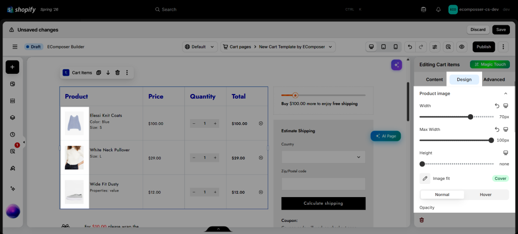
You are allowed to change the Width, Height, Image fit of the Product Images and their Opacity in Normal and Hover states.
2.4. Product Name
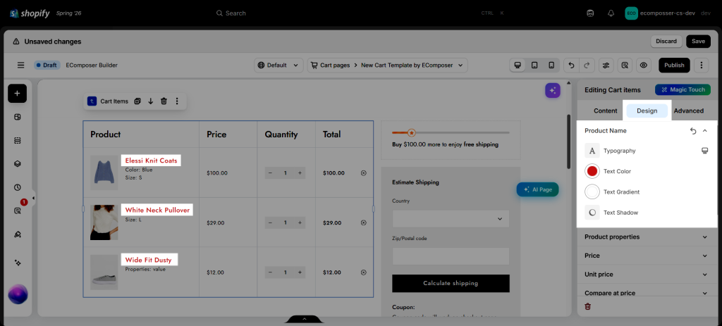
You can change the Typography and Text Color of product item names here.
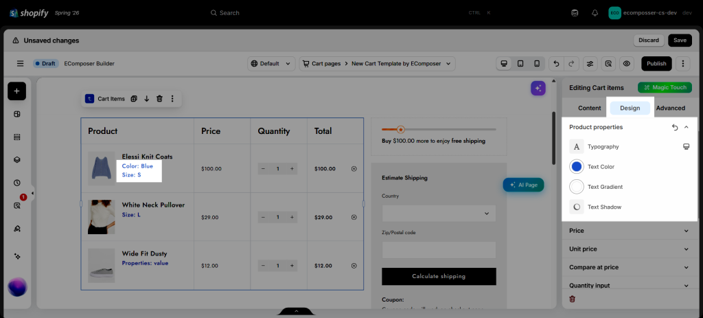
2.5. Product Properties
You can edit the Typography and Text Color of the product properties, such as choosing variants.
2.6. Price, Regular price, Unit Price, Total
There are settings to configure the Typography and Text Color of the prices.
2.7. Quantity, Plus, Minus
You can manage the style of the quantity input field in Quantity, Plus, and Minus categories.
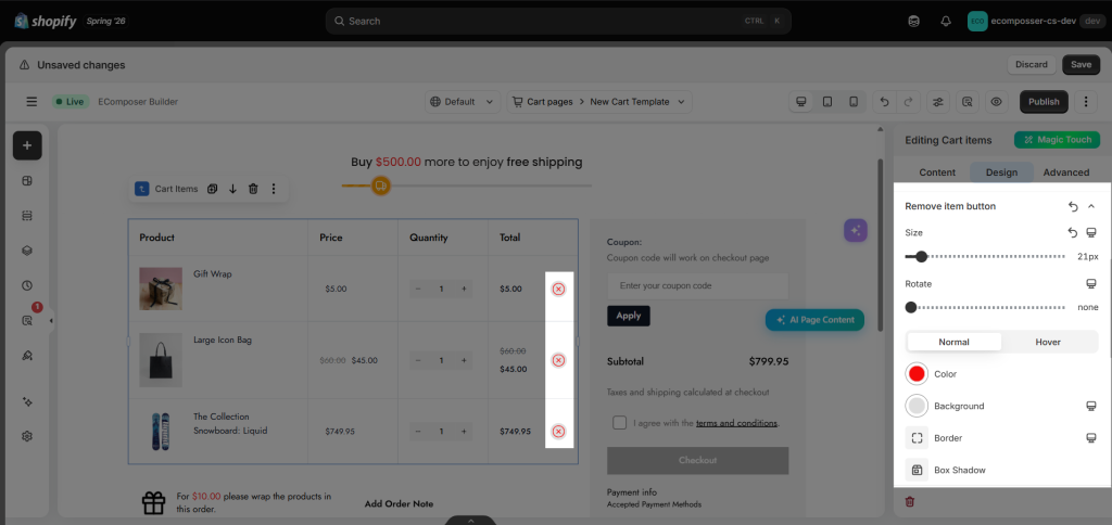
2.8. Remove Item Button
Customers can use the Remove button to delete items from their cart. Customize its appearance by adjusting the icon Size, Rotate, Spacing, and styling Color, Background, Border and Border Radius for both Normal and Hover states.
2.9. Elements when Cart empty
- Title When Cart Is Empty: Customize the title displayed when the cart contains no items.
- Description When Cart Is Empty: Customize the description shown below the title on the empty cart page.
- Button When Cart Is Empty: Customize the appearance of the button displayed on the empty cart page. This button can direct customers back to your shop, helping them continue browsing and discover more products.
- Button Icon When Cart Is Empty: Customize the icon displayed within the empty cart button to better match your store’s design and branding.
3. How to add an additional text to this element?
By default, we give no options to edit or customize the code structure of the Cart Item element. Because a bit of the wrong code you add can affect the whole app, making it not work well anymore. It will be very hard for us to find out where the wrong code you added to fix and solve.
However, there is still a way to insert a small HTML code/ Text/ Metafield text inside the grid layout of the Cart Item.
Step 1: Turn on the Ecomposer Hook option
This will allow you to insert or add additional codes to an element, and insert between the elements, since normally you can only drag and drop other elements to the very top or bottom of an element, right?
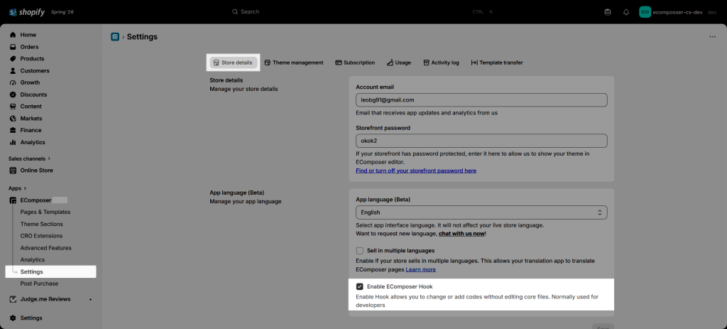
From the App Dashboard -> Settings -> Store details tab > tick the Enable Ecomposer Hook option
Step 2: Go to Online store -> Theme -> Edit code -> Snippets
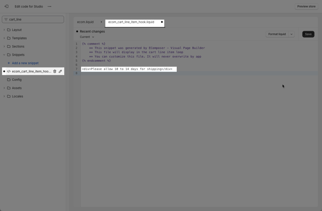
Please type ecom_cart_line_item_hook.liquid, you can start making changes to this file of code, and the change will reflect on the Cart Item’s grid area.
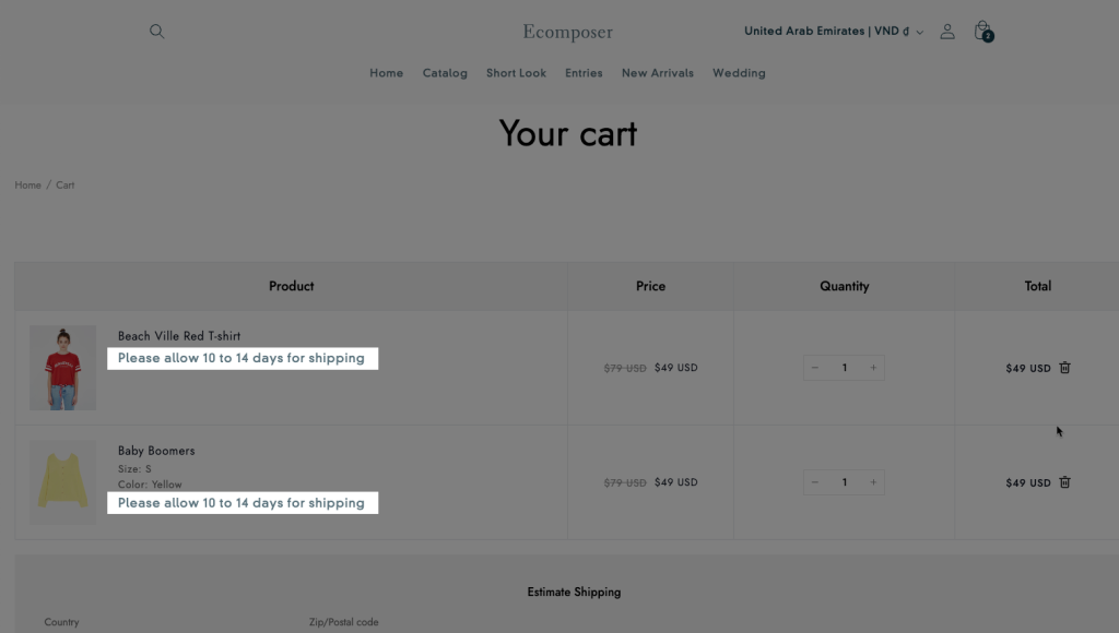
For example 1: I would like to add an additional text: “Please allow 10 to 14 days for shipping” for all product items displayed on the Cart page.
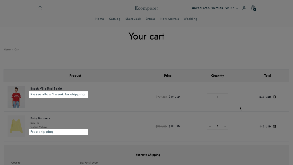
Result: This new text is appearing on all product items.
For example 2: I would like to add a different text for different Products. Then we have to create and use a Metafield. Please refer to this document to create a Metafield Text first.
After we had a Metafield, you can add Metafield code to the file ecom_cart_line_item_hook.liquid
<div>{{line_item.variant.product.metafields.custom.additional_text}}</div>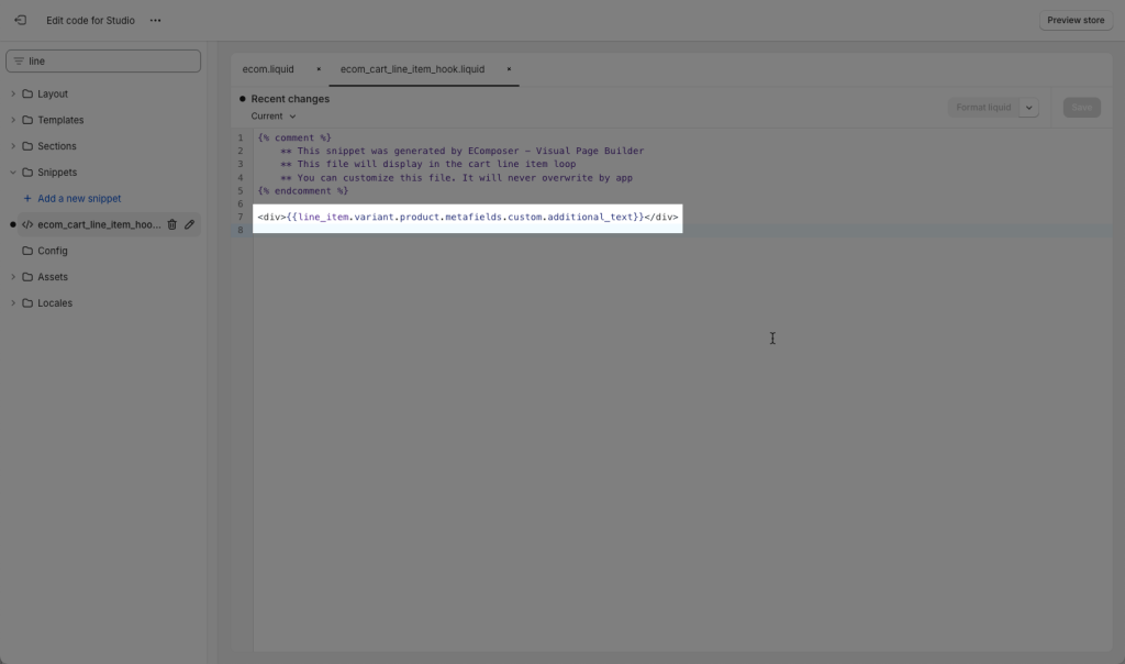
Please make sure to add different text values for each product.
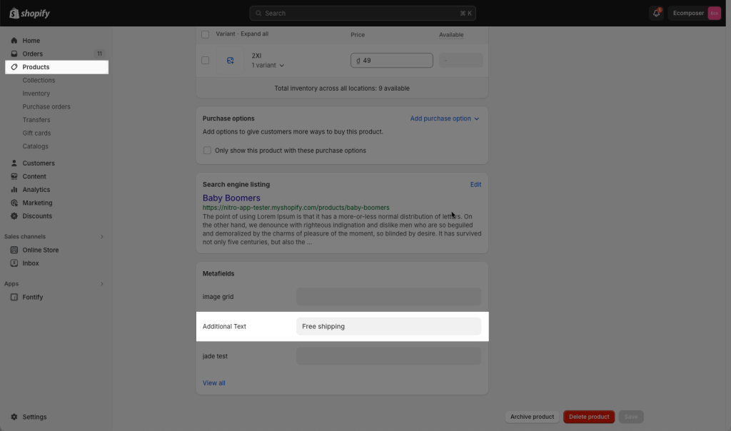
Result: you can see different texts showing for different products.