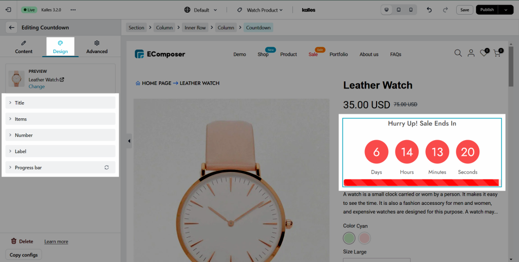
Product Countdown
When running a business, merchants always research and find out as many methods as possible to sell their products. They might use a sense of urgency to make shoppers come to a quicker decision on an order they are considering. Using countdown timers will take effect then.
The Countdown element helps you to limit the period of time that shoppers can make a purchase. This could be a countdown until the end of a sales-off season, or for a specific offer such as free shipping.
1. Generals
From the left side (Elements tab) > Single Product’s elements option, you will see the Countdown element in the list of elements. Drag and drop it to any position of the selected structure. This element should be used on the product page.
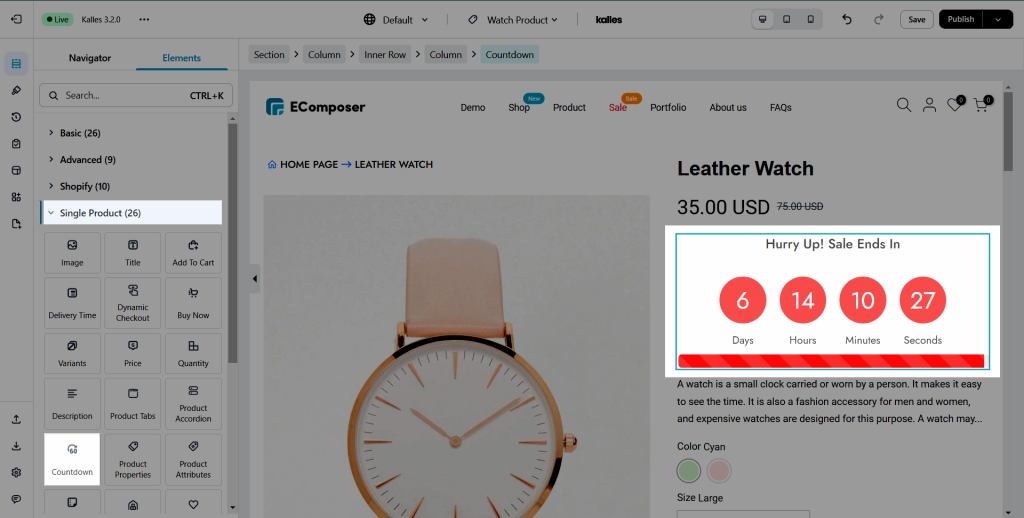
With Countdown element, you can build some layouts below:


2. Content
2.1. General
- Choose a product option: This option will allow you to pick a product to show on the Single Product page.
- Title: You can configure the title for the Countdown element here.
- Type: There are three types for you to choose. Metafields, Custom, Metafield & Custom.
- Metafields type: This type will take the date-time from metafield of product from Shopify to show. When you install the EComposer app, two metafields (EComposer Product countdown from and EComposer Product countdown to) are automatically generated for products in Shopify.
- If you choose this type, you must go to Shopify Admin > Product > All products
> Select a certain product that you want to display metafields content > Add countdown on EComposer product countdown to and EComposer product countdown from the field.
For example: When you add the EComposer product countdown from May 10, 2022 to May 11, 2022. It’ll countdown 1 days. See the below image:

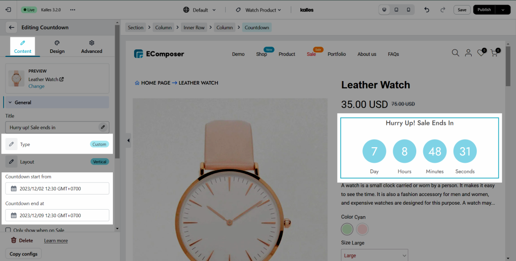
- Custom type: This type allows you to enter the date-time directly into the app to display the countdown timer. You can set the start and end times to show.
- Metafield & Custom type: If you choose this type, it will prioritize showing countdown from metafield of products. It means if you set metafield for product in Shopify, it will show. Otherwise it will show the value you added to start and end options in app.
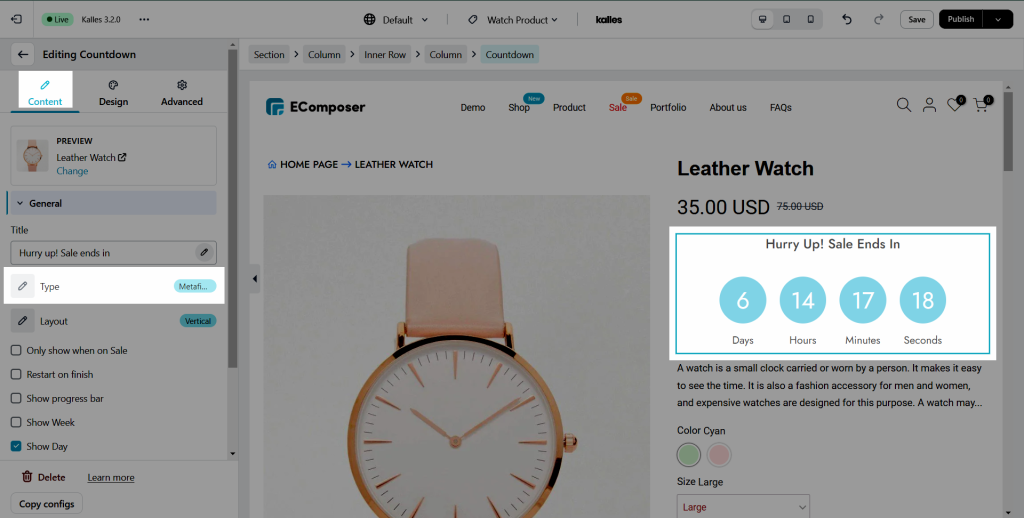
The countdown timer will be the same on all products if you create a template and set it as default template for all products. So if you want to have the same template to all product and have different countdown to each one, you should choose the “Metafield” type and set the metafield in Shopify backend.
- Layout: You can choose a horizontal or vertical layout for the Countdown element here.
- Countdown start from: Configure the date that you wanna start the countdown here.
- Countdown end at: Configure the date that you wanna end the countdown here.
- Only show when on Sale checkbox: Tick on this checkbox to enable Countdown only for products that have the sale price.
- Show progress bar checkbox: Tick on this checkbox to enable the progress bar.
- Show week/ day/ hour/ minute/ second checkbox: Tick on this checkbox to enable week/ day/ hour/ minute/ second on the countdown.
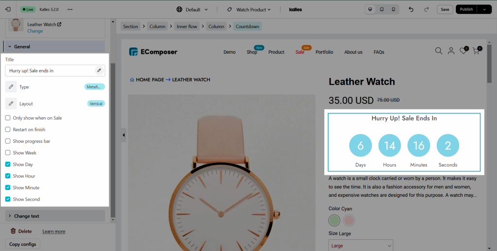
2.2. Change Text
You can change the texts on the countdown item in the options below:
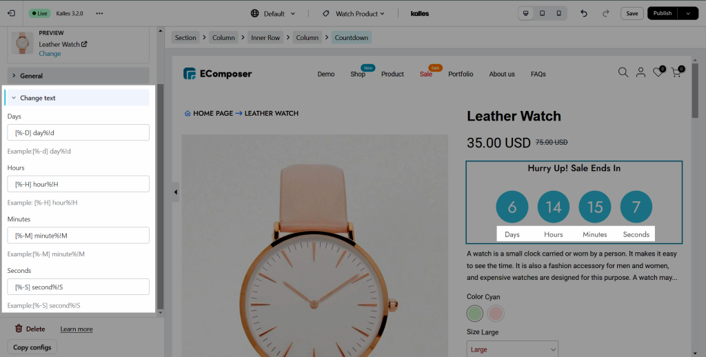
Example: If you only wanna show the day left (taking away weeks), please insert this format:
[%-d] day%!D
And if you only wanna show the days left until the next complete month*, please insert this format:
[%-n] day%!N
3. Design
3.1. Title
- Alignment: Allow you to align the title of the Countdown element. You can choose Align Left, Align Right or Align Center. This option available for desktop, tablet, and mobile devices.
- Typography: This option allow you customize the Font-size, Font-weight, Font-family, Line Height, Text-transform, etc… for the Countdown title here.
- Text Color: Configure the color for the Countdown title here.
- Text Shadow: Allow you to add a shadow for the Countdown title by changing the Blur, Horizontal, Vertical, etc…
- Spacing: Set the spacing (by the way increase margin/ padding) between the Countdown title and number/ label here. This option is available for desktop, tablet, and mobile devices.

3.2. Items
- Width: Configure the Width for the countdown item here.
- Height: Configure the Height for the countdown item here.
- Alignment: Allow you to align the countdown item here. You can choose Align Left, Align Right or Align Center. This option is available for desktop, tablet, and mobile devices.
- Background: Configure the background color for the Countdown item here.
- Box Shadow: Allow you to add a shadow for the Countdown item by changing the Blur, Horizontal, Vertical, etc…
- Border: Choose border style for the countdown item here. You also can choose None style to disable the border.
- Border Radius: Allow you to configure the border-radius for the countdown item, available for desktop, tablet, and mobile devices, available for desktop, tablet, and mobile devices.
- Spacing: Set the spacing (by the way increase margin/ padding) between the Countdown item here. This option is available for desktop, tablet, and mobile devices.

3.3. Number
- Typography: This option allows you to customize the Font-size, Font-weight, Font-family, Line Height, Text-transform, etc… for the content on this element.
- Text Shadow: Allow you add a shadow for the content by changing the Blur, Horizontal, Vertical, etc…
- Box Shadow: Allow you to add a shadow for the Countdown item by changing the Blur, Horizontal, Vertical, etc…
- Width: Configure the Width for the countdown number here.
- Text Color: Configure the color for the countdown number here.
- Background: Configure the background color for the Countdown item here.
- Border: Choose border style for the countdown item here. You also can choose None style to disable the border.
- Border Radius: Allow you to configure the border-radius for the countdown item, available for desktop, tablet, and mobile devices, available for desktop, tablet, and mobile devices.
- Spacing: Set the spacing (by the way increase margin/ padding) between the countdown number with other texts here, available for desktop, tablet, and mobile devices.

3.4. Label
- Typography: This option allows you to customize the Font-size, Font-weight, Font-family, Line Height, Text-transform, etc… for the content on this element.
- Text Shadow: Allow you add a shadow for the content by changing the Blur, Horizontal, Vertical, etc…
- Box Shadow: Allow you to add a shadow for the Countdown item by changing the Blur, Horizontal, Vertical, etc…
- Width: Configure the Width for the countdown number here.
- Text Color: Configure the color for the countdown number here.
- Background: Configure the background color for the Countdown item here.
- Border: Choose border style for the countdown item here. You also can choose None style to disable the border.
- Border Radius: Allow you to configure the border-radius for the countdown item, available for desktop, tablet, and mobile devices, available for desktop, tablet, and mobile devices.
- Spacing: Set the spacing (by the way increase margin/ padding) between the countdown number with other texts here, available for desktop, tablet, and mobile devices.

3.5. Progess bar
If you tick on the checkbox below, the Progress bar option will show on the Design tab:
- Width: Configure the Width for the countdown progress bar here.
- Height: Configure the Height for the countdown progress bar here.
- Background: Configure the background color for the Countdown progress bar here.
- Border Radius: Allow you to configure the border-radius for the countdown progress bar, available for desktop, tablet, and mobile devices, available for desktop, tablet, and mobile devices.
- Spacing: Set the spacing (by the way increase margin/ padding) between the Countdown progress bar here. This option is available for desktop, tablet, and mobile devices.

Note: You can configure the style of the Countdown Progress bar on both Normal and Active mode.
You can view the video below to know how to configure the Countdown element: