
Continue Shopping Button
The Continue Shopping Button element will help you show a button on your Cart page, and you can add the link to a Collection page or to the homepage. So your customer can click on it to go back to the store to continue shopping.
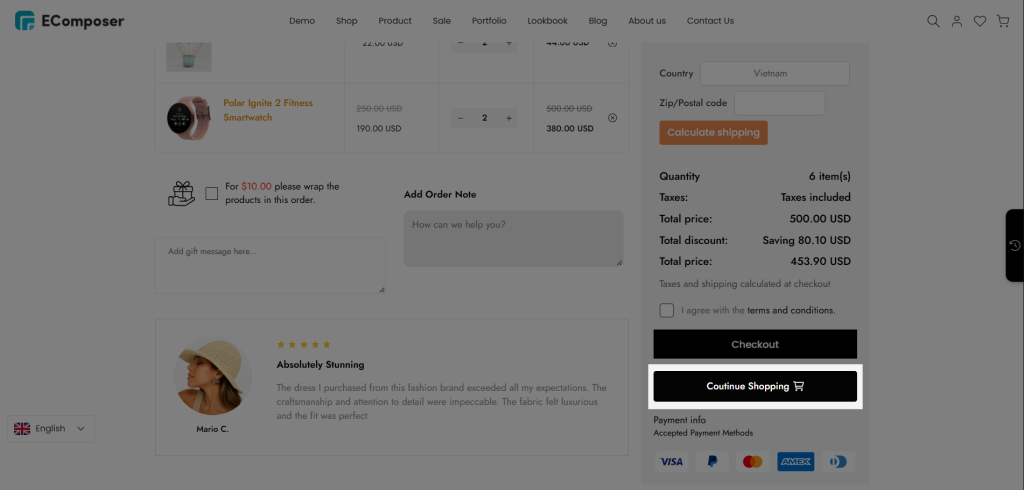
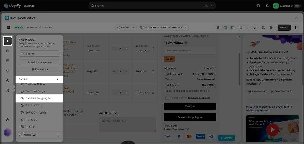
You can find the element in the Elements panel => Cart => Continue Shopping:
1. Content
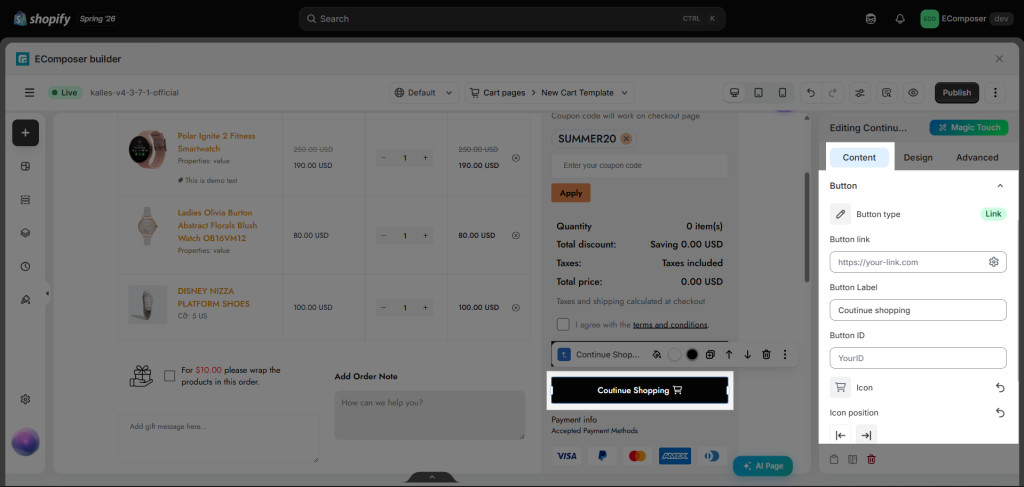
Under the Button tab, you can set the label, link, ID, and icon for the button.
- Button Type: You can choose the type of the button to Link or Open Popup.
- Button Link: Make a button clickable with a link.
- Button Label: Edit button text.
- Button ID: Attach an ID to this button; then from other places, you can quickly navigate to this ID(button).
- Icon: Set the icon for the button along with its position and spacing, and animation of it.
- Button Animation: Set an animation for the button.
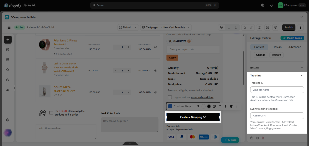
The Tracking tab allows you to assign a tracking ID to the button. When the button is clicked, this ID is sent to either the EComposer’s Analytics or Meta Pixel Analytics, helping you track button interactions. Learn more about EComposer Analytics here.
2. Design
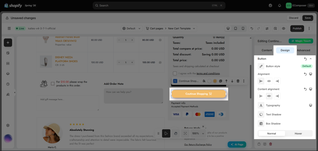
The Design tab with the style options helps you design the button as you like.
- Button: You can customize the Button Style (by configuring different styles for Default, Primary, Secondary, Accent, and Link buttons in Site Settings), Alignment, Content Alignment, Typography, Box Shadow, and Spacing. In the Normal and Hover tabs, you can further adjust the button’s Width, Height, Text Color, Background, Border, and Border Radius for each state.
- Animation Effect: You can choose the kind of button animation here.
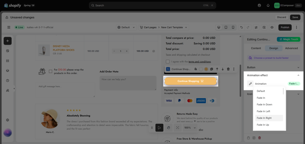
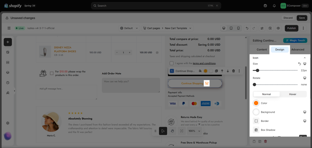
- Icon: You can adjust the icon’s Size, Rotate, and Spacing. In the Normal and Hover tabs, you can customize the Color, Background, Border, Box Shadow, and Border Radius.