Filter
The filters feature helps your customers find products in a faster way and also increases the conversion rate. When you enable filtering, customers can filter your products by availability, product type, color, size,…. or other options to quickly find the products that interest them the most.
From Element list > Collection page > Filter
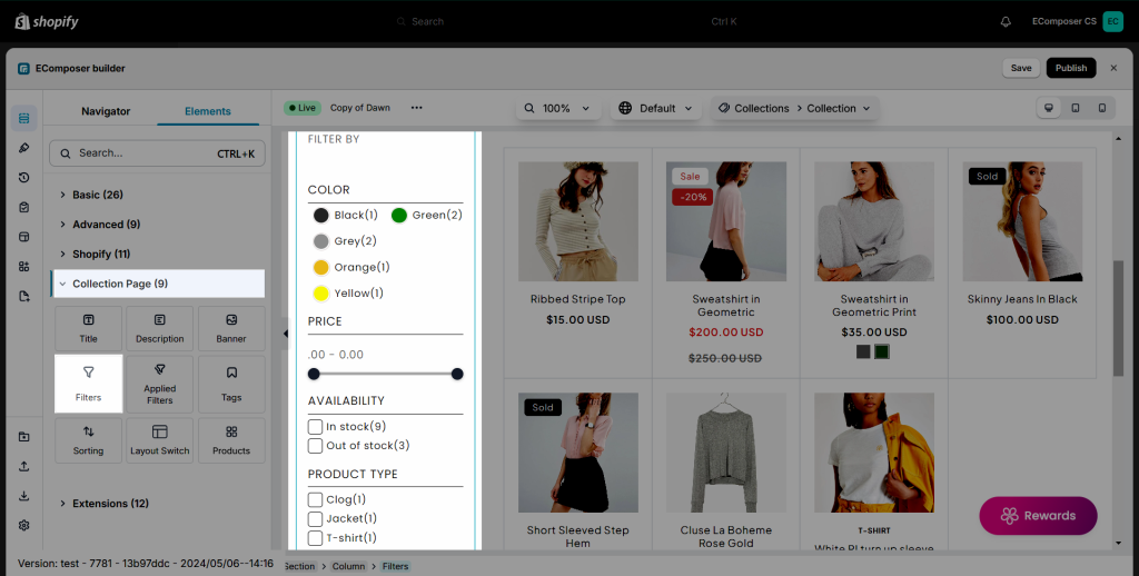
Note: This element can only work on the Collection page and when you add it to the same section with the Products element. The Filter content only shows when you have already configured a filter for your collection on Shopify.
Surely you can manage which content like color variants, size, variants, brand options, price ranges,… showing or not on this Filter.
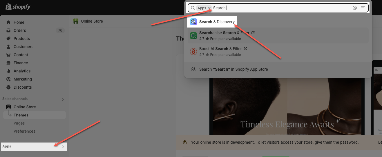
Ensure you have installed the Search & Discovery app to your store.
Please go to Apps -> Search & Discovery to open the app and continue configure.
Click the Customize Filters button.
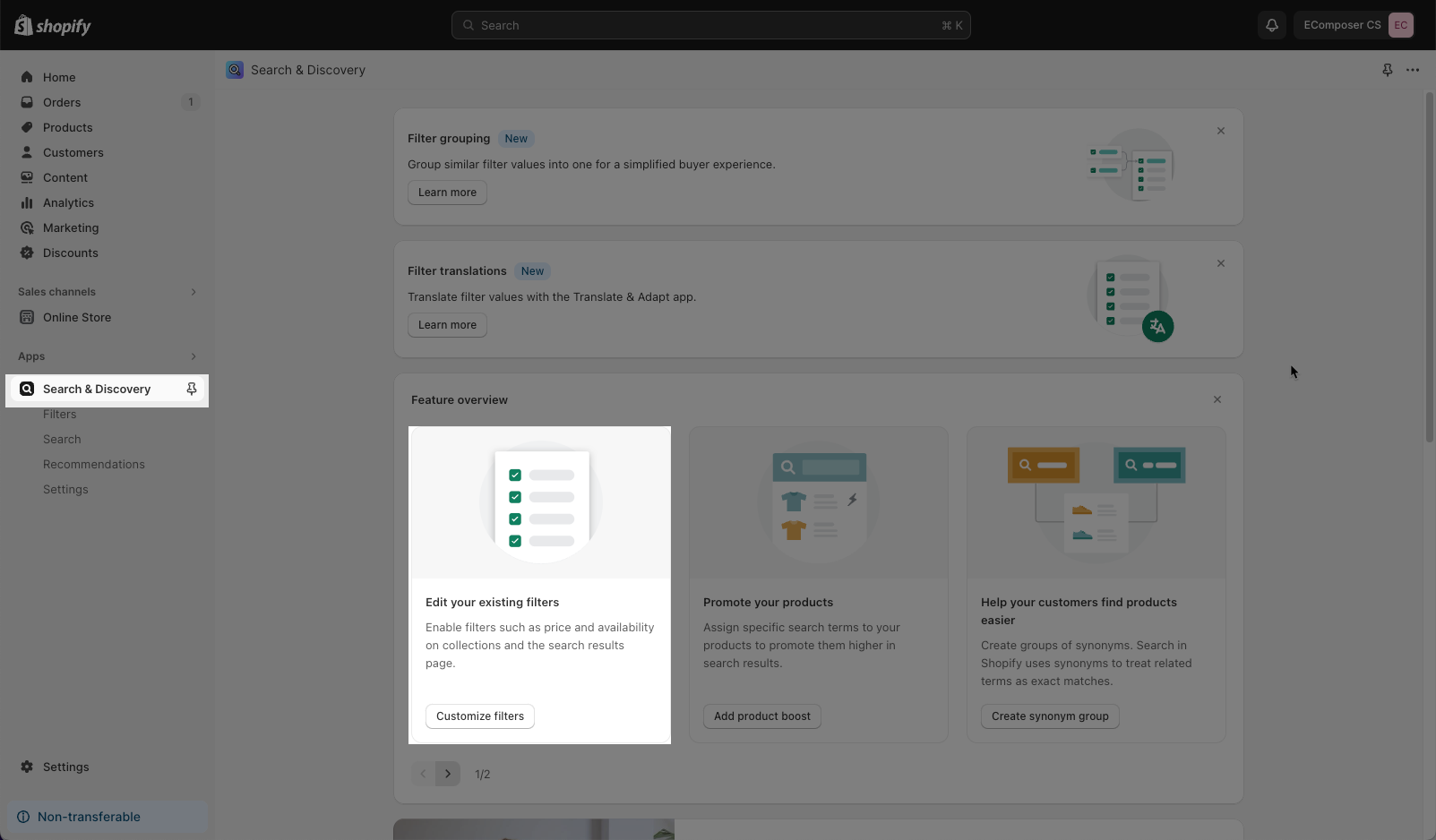
Here you can see all the filters that you added to your store. They will show the same order in EComposer.
Click Add Filter button on the top right.
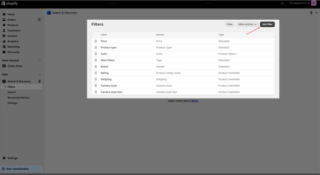
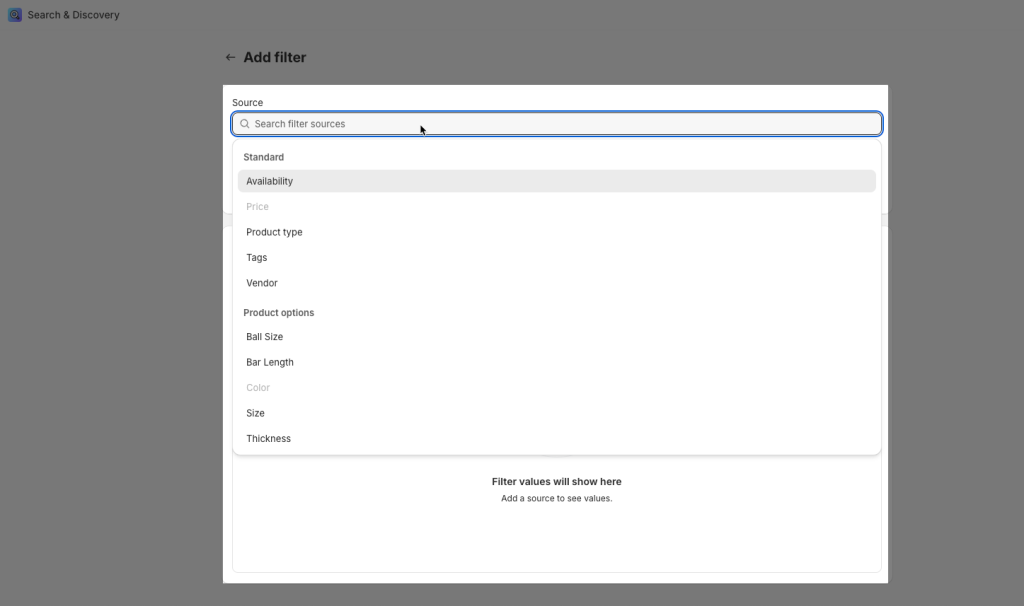
Choose more Filter options that you want to show.
1. Content
1.1. General
- Filter title: You can freely enter the name for this Element.
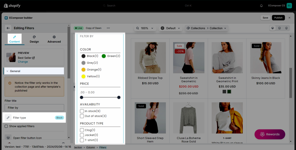
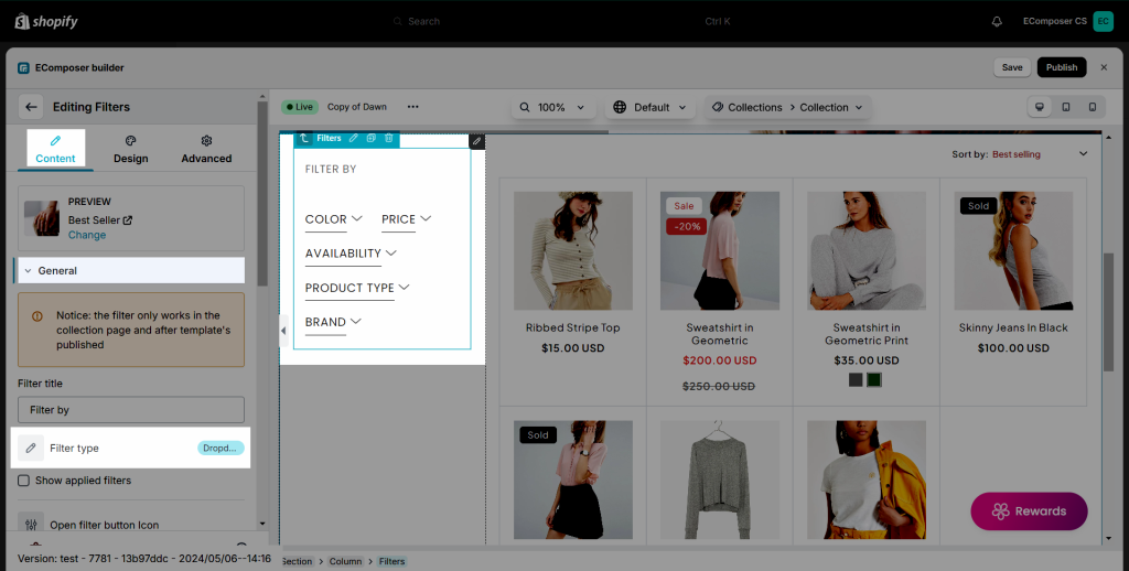
- Filter type: There are three types of filters for you to choose including Block, Collapse, and Drop-down.
Block: the filter is showing in a column beside the product list.
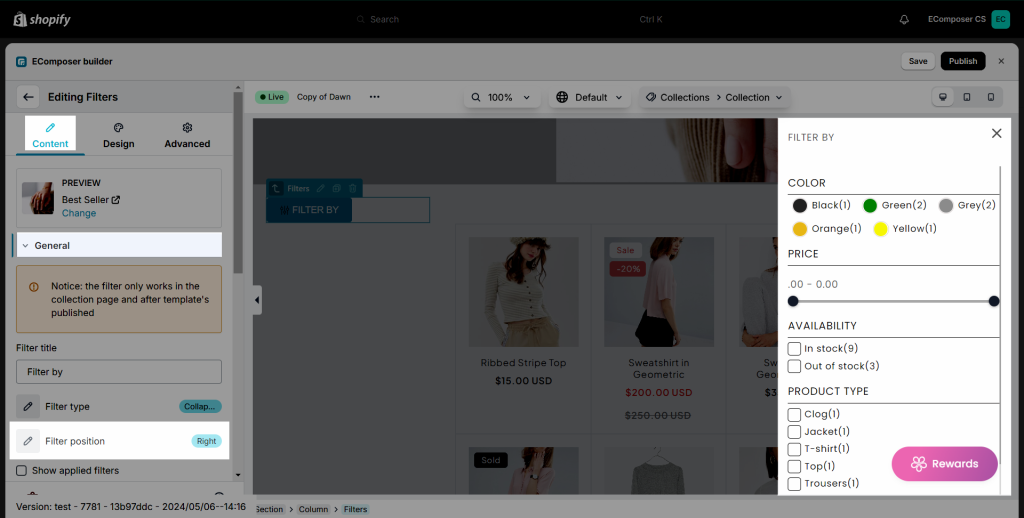
Collapse: The filter bar is showing up as a drawer popup overlaying the product list.
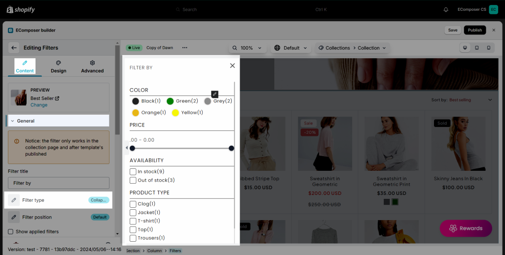
You can choose the option to open the Filter on the left or right.
Drop-down: put the filter element on a row above of product list to display it correctly.
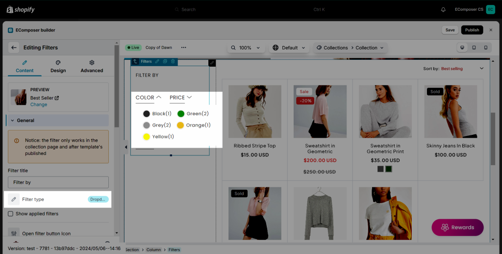
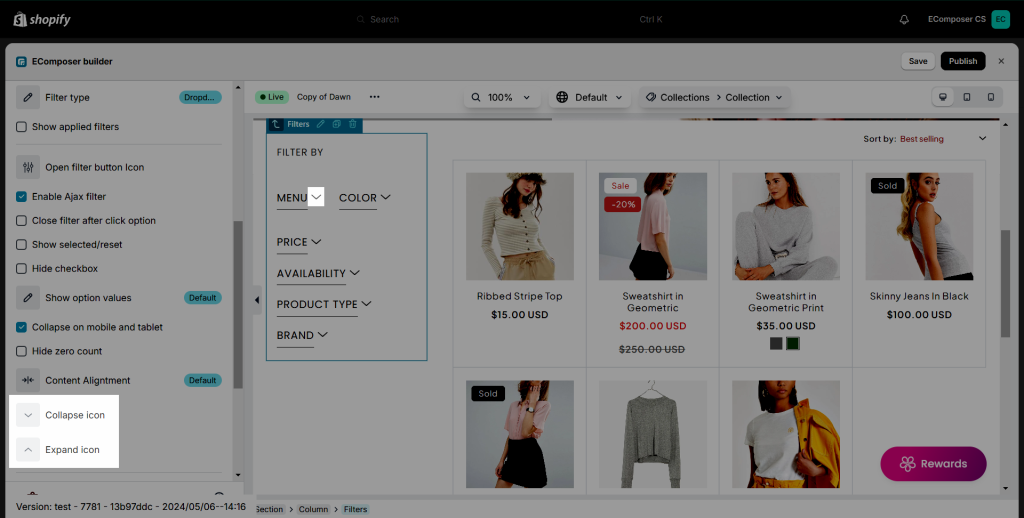
You can change the icon for expand and collapse here:
Pushdown: Put the filter element on a row above of product list to display it correctly.
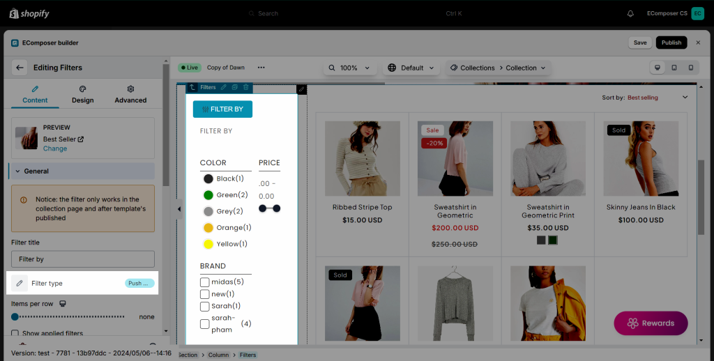
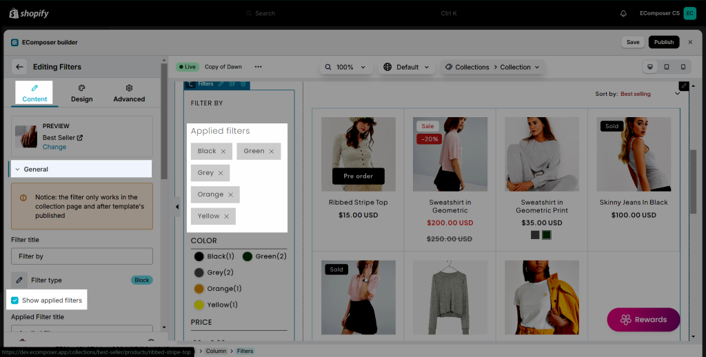
- Show applied filter: You can choose this or not. If you turn it on, when your customers click on a filter, the filters be shown on the top of the filter bar. Besides, you can also change the name of the applied filter.
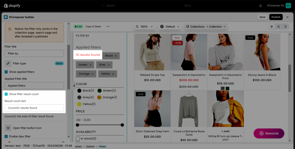
- Show filter result count: This option allows you to show how many results can be found when you filter.
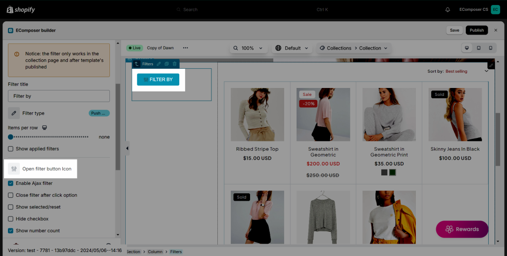
- Open filter button icon: You can change the icon of the Filter button when the Filter layout is set to Collapse or Pushdown only.
- There is also an Enable Ajax Filter option, which prevents the page from having to refresh every time the customer chooses a filter.
- Besides, Collection Filter allows you to choose Display as accordion, Show selected/reset, Hide checkbox, Show number count, Collapse on mobile and tablet, and Hide zero count or not.
- Content alignment: This option allows you to choose between Vertical/Horizontal alignment.
1.2. Price filter
We have 3 types of price filters:
- Slider: This will show the price filter as a slider with a draggable point on each end.
- Custom segment steps: This will separate the price into segments depending on the steps. For example, if the highest priced product in the collection is 350$ and you set the step to 10, then each price range would be 350/10 = 35$.
- Custom price for segment: You can choose specifically the range of the price. For example, if you choose 100, then the price range will be 0–100 and 100–200.
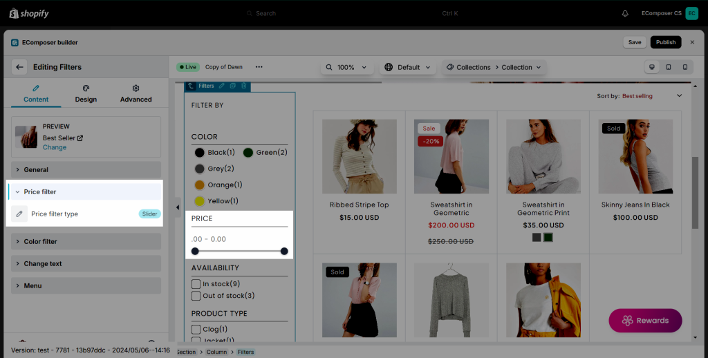
1.3. Color filter
- Show options as color: Only use for “Color filter”.
If you want to show a color swatch layout instead of color text, you can write the correct color name that you set in your Shopify Admin to the field.
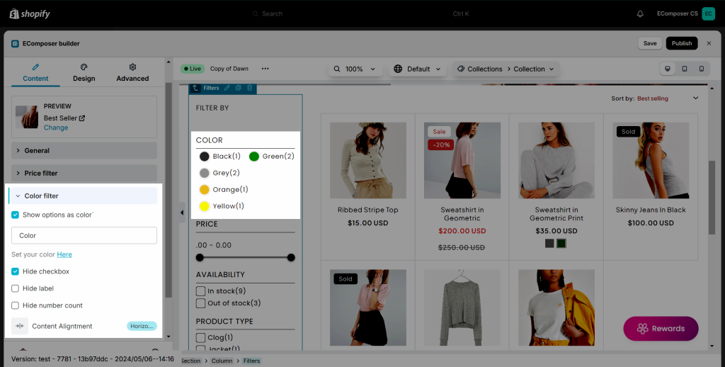
Note: As you can see, all the color circle are in white by default because you haven’t defined colors yet.
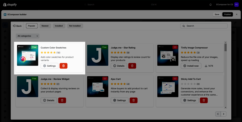
To set up the swatch color layout, you must install the Custom Color Swatches extension first. Please read more about the extension here.
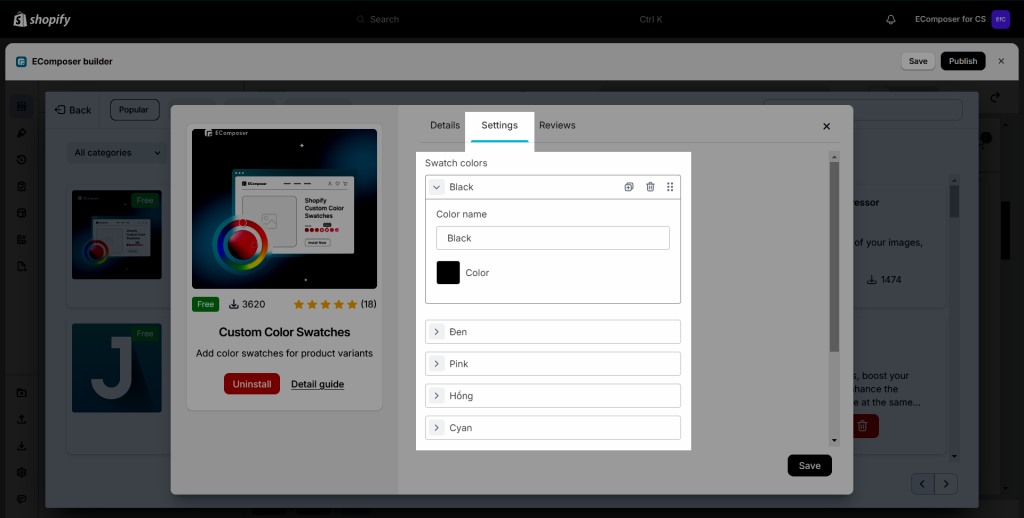
Under the Settings tab, choose which color is associated with which color name.
Result:
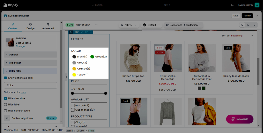
- In addition, you can choose to hide the Check box, Label, Number count, and choose Align.
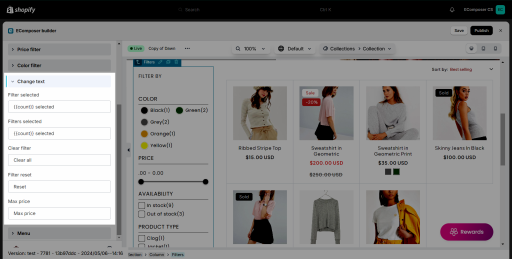
1.4. Change text
- You’re free to change the text for Filter selected, Filters selected, and Reset.
1.5. Menu
With a navigation menu, you can show the menu items with the Collections, so your customer can easier to navigate to other collection pages.
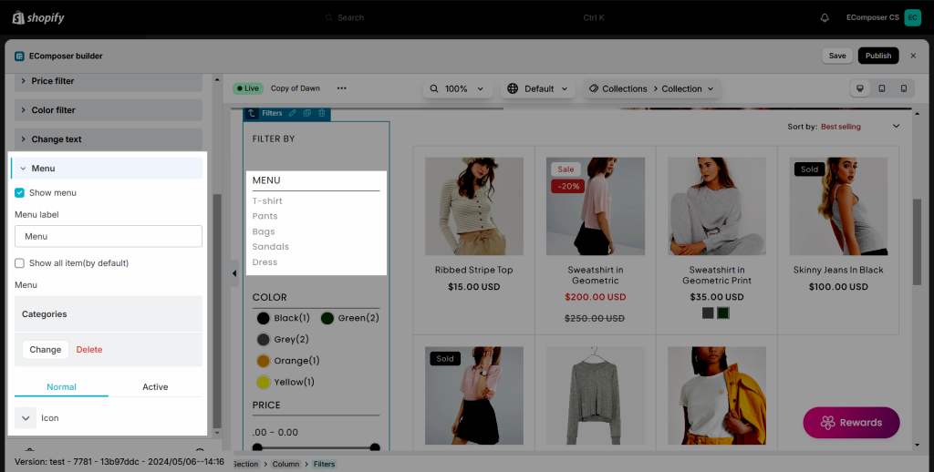
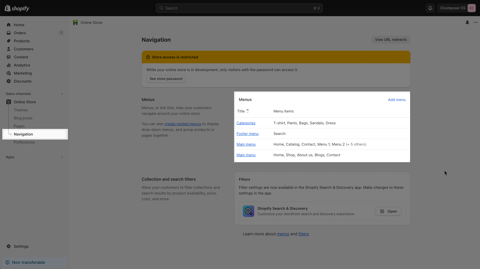
To show the menu here, you should go to Shopify Admin -> Navigation to create a menu with the items that you want to show first. Then select that menu in EComposer.
2. Design
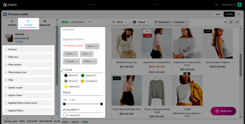
Collection Filter allows you to configure design for General, Filter box, Filter button, Filter button icon, Title, Value content, Name, Count, Color, Selected, Values, Button, Range, and Menu options.
In each main option, there are so many options inside to change Color, Background color, Border, Border radius, Width, Spacing, etc. Please go here to figure them out.
