Divider
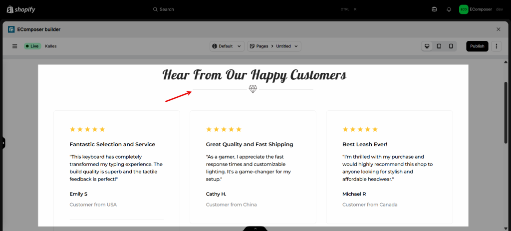
The Divider element allows you to add a styled, horizontal line to add a divider between other elements. You can change the line type, its width and color, and other settings. With the Divider element, you can build some layouts below:

1. Content
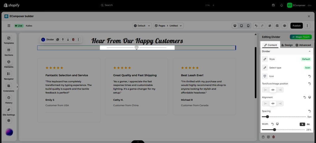
- Style: Select the divider line style. There are 6 styles for you to choose Solid, Dotted, Dashed, Double, Zigzag, and Curly.
- Select Type: Select the divider type. There are 4 types for you to choose None, Text, Icon, and Image.
- Icon/Text/Image Position: This allows you to select the position of the text, icon, and image in the divider.
- Alignment: This allows you to align the divider for each screen size (Desktop, Tablet, Phone).
- Spacing: This allows you to adjust the spacing between the divider line and the text/icon/image space.
- Width: Select the divider’s width.

2. Design
Text/Icon/Image
- Text: includes Color and typography fields that apply to text.
- Icon: includes Size and Rotate options.
- Image: include options like Width, Max Width, Height, Image fit, CSS Filters, Opacity, Border, Border radius, Box shadow, and Spacing for both Normal and Hover.
Divider
- Color: Allows you to select the divider line color.
- Size: Allows you to set up the height of the divider line.
Gap
- Gap: Allows you to set up the gaps around the divider (available for desktop, tablet, and mobile devices).
Please follow the video below for details about the design of the Divider element:


