Inner Row
From the left side (Elements tab), you will see Inner Row element in the list of elements. Drag and drop it to any positions of the selected structure. This element allows you to build so many beautiful layouts for your page.
1. Generals
This element allows you to add inner row to a pre-built layout. And you can drag and drop this element to any position on your page.
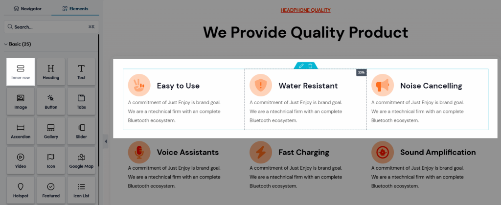
Please view the Video below to know how to add inner row to your page.
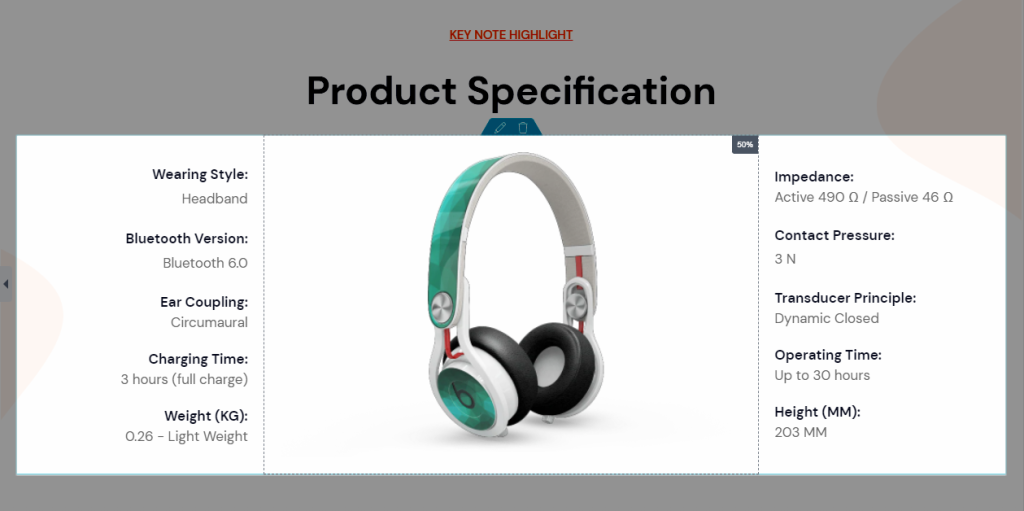
With Inner row, you can build some layouts below:


2. Layout
2.1. Layout
You also can configure Layout of the Inner Row element in the options below.
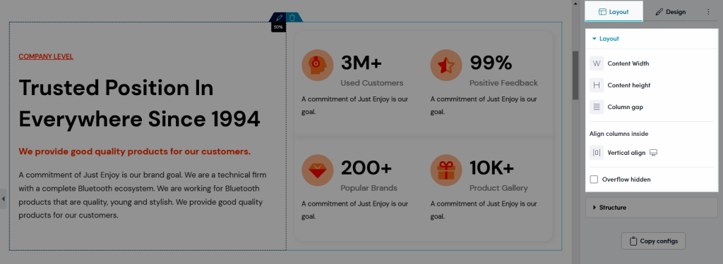
- Content Width: Choose Width layout for the element: Boxed layout or Full-width layout.
- Content Height: Choose Height for the element here: Default height, Fix to screen or Min height.
- Column Gap: This option is used to specify the “space” between two text columns. You can choose layout Default Gap, No Gap, Wide Gap, etc…
- Vertical Align: This option will vertically arrange the content of the element. Example: Vertical-align: top – Aligns the element’s top to the top-highest element in the same row.
- Overflow Hidden: This option is used to determine: when the height of the box is not enough to contain the content, the overflow content will be hidden.
2.2. Structure
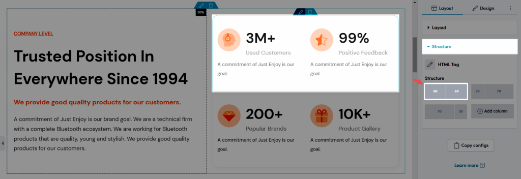
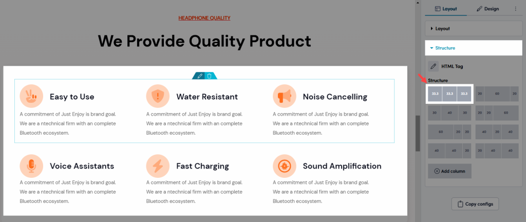
You also can configure Structure of the Inner Row element in the options below.
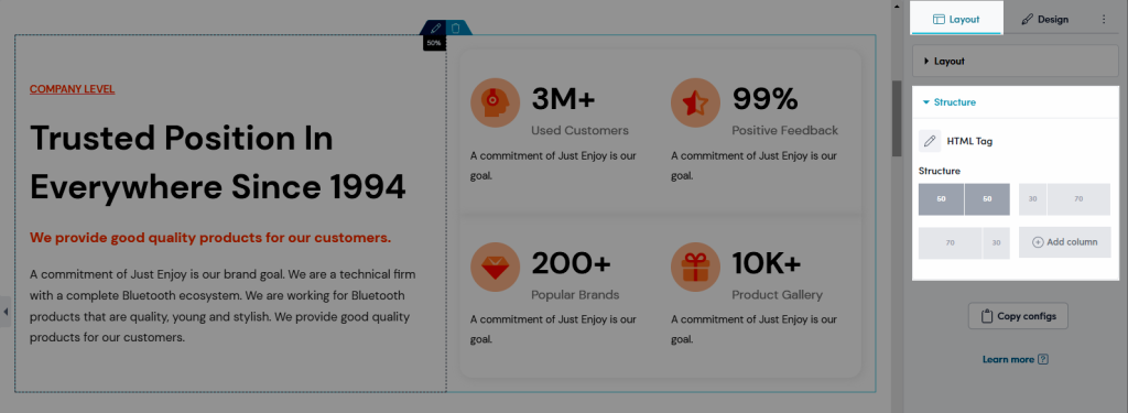
- HTML Tag: This option allows the user to choose which HTML tags should surround the element. Tags like H1, H2, H3, div, header, footer, etc…
- Structure: This is an option construction of identifiable elements which give form and stability.
3. Design
3.1. Background
- Background: Choose between Classic color (a single color background), Gradient color (gradient background mixed by 2 colors) or a background image. This option is available for desktop, tablet, and mobile devices.
- CSS Filters: Adjust only section’s background Blur, Brightness, Contrast, Saturation…
- Transition Duration: Set the time for the background to change from the Normal background to the Hover background.
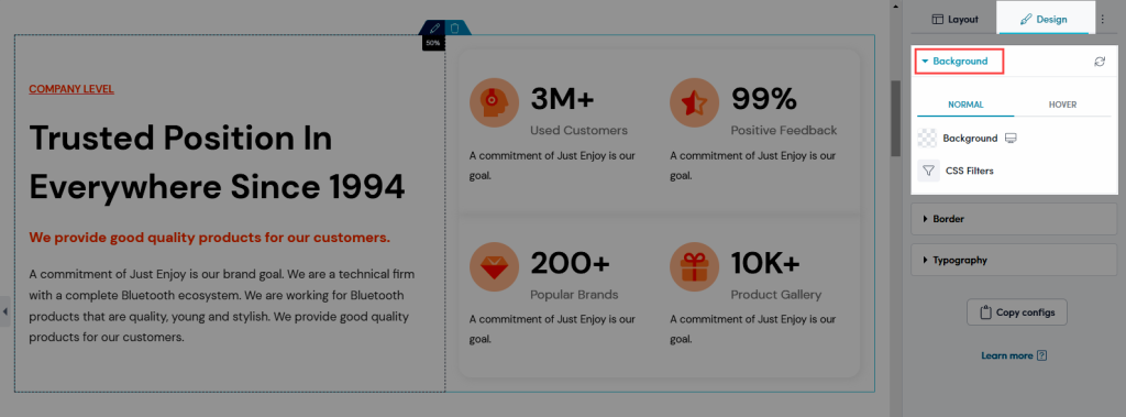
You can use different color for section background between normal and hover state.
3.2. Border
- Border: Choose border style for the element here. You also can choose None style to disable border.
- Box Shadow: Adjust the icon style by changing the Color, Horizontal, Vertical, Blur, Spread, Position to creating shadow for icon.
- Border Radius: Allow you configure border radius, this option is available for desktop, tablet, and mobile devices.
- Transition Duration: This option allow you set transition duration of the border when hover.
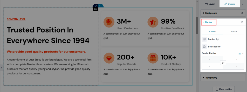
You can use different color for section border between normal and hover state.
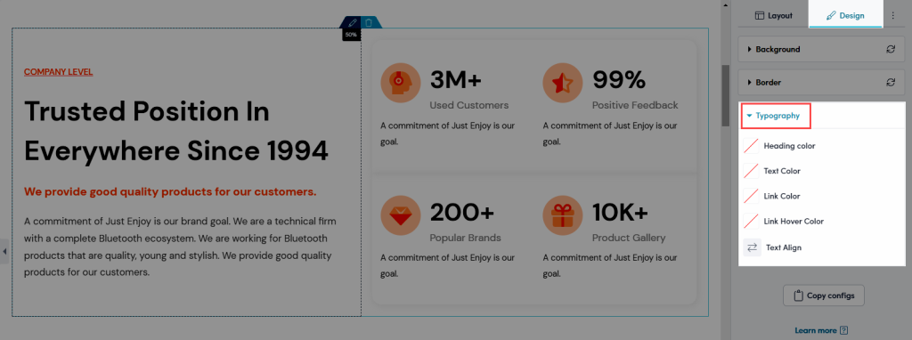
3.3. Typography
- Heading color: Configure the color for Heading in this option. You can pick your color or use Global colors in Global tab.
- Text Color: Configure the color for text here.
- Link Color: This option allows you to set color for the link.
- Link Hover Color: This option allows you to set color for the link in Hover mode.
- Text Align: Choose alignment for your text here.


2 Comments
Eyal
Hello,
I’m using your app on my shopify website. In my about us page (over ons) i’ve used a background just to try it out. But it seems that i can’t delete the image because it doesn’t show me the image it’s just looking like its transparant. Could you please help me out
Henry Pham
Hi, could you please contact our team in live chat? our support agent will check it for you
Thank you