
Collection Description
The Collection Description element displays the description content of a Shopify Collection on your Collection page in EComposer.
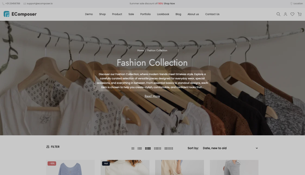
Collection descriptions are useful for providing additional information about a collection, such as featured products, materials, brand story, shopping guides, or SEO-friendly content to help customers better understand what the collection offers.
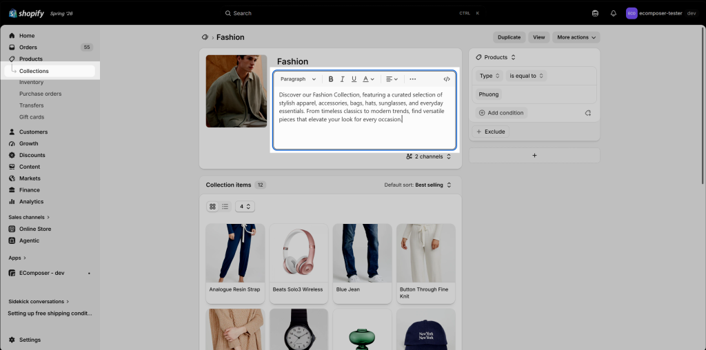
Note: In the EComposer App, you can’t directly edit the Description Content. It is the description of Collection that you add to Shopify. You can go to edit your Collection in Shopify admin to edit the description.
1. Adding Description element in EComposer
Navigate to Elements → Collection Page, then drag and drop the Collection Description element into your desired location on the page.
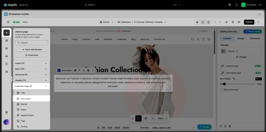
2. Configure Description
2.1. Content
- Preview: Use this option to preview how the Description element will appear with a selected collection while editing in the EComposer editor.
- Content type:
- Text: You can render the original text this way, and all HTML tags in the Collection Description have been removed.
- HTML: In Shopify -> Collection has a text editor that you can use to format and decorate your description. HTML tags will be inserted if you use the rich text editor. Click the Show HTML button to view the HTML document directly from the Shopify Collection editor to edit with HTML. Please follow the instructions below for more details.
Edit the Collection Description in Shopify:
Navigate to Shopify Admin → Products → Collections, open the collection you want to edit, update the Description field, then Save your changes. The Collection Description element in EComposer will automatically display the latest content from Shopify.
- Description type: Choose how the collection description is displayed. Select Full to show the entire description, or Short to display a shortened version. When Short is selected, you can control the visible content using the options below.
- Maximum words to show: Specify the maximum number of words displayed when the Short description type is selected.
- Show view more: Enable this option to display a View More button, allowing visitors to expand and read the full collection description. You can also customize the button’s text, icon, and spacing.
2.2. Design
- Description: Customize the appearance of the collection description, including Alignment, Typography, Text Color, Text Gradient, Text Shadow, and Spacing.
- View More: Customize the View More button for both Normal and Hover states. You can adjust its typography, alignment, width, colors, border, shadow, spacing, and other styling options.
- Icon: Customize the View More icon by adjusting its Size, Rotation, Color, Shadow, Border Radius, and Spacing.