Product Grid
The Product Grid element is used to show products in a grid view. You can use it on a Landing, Homepage, Collection or any page that you want. It helps your customers see more products for more choices. The special thing about EComposer is that you can select products from a Collection, Vendor, or Type or even you can select specific products.
To add this element to your page, please go to Elements -> Shopify -> Product Grid.
1. Content
1.1 General
The most general settings for the element will be in this tab
- Product source: EComposer has 4 sources for you to choose.
+ From Collection: You can create the collection in Shopify first, then select the app.
+ Specific products: You can select specific products to show. But it limits 20 unique products to show per page.
+ Product vendor: It is the vendor of products in Shopify. You can select the vendor to show all of the products to that vendor.
+ Product type: You can select a product type to show. - Sort by: This option allows you to choose the sort order for products.
- Layout: We have 3 layout types are Grid, List and Slider.
- Style: If you select the Grid or Slider layout, this option will show allow you to choose the style. We have three available styles.
- Image ratio: You can change the ratio for product images.
- Maximum products to show: You can adjust the number of product will show on the element.
- These options will only show if the Style is set to Grid:
- Items per row: Select the items per row.
- Column/Row gap: Set the space between column and row.
- Show the featured image first: This option will show the featured image of the product set in Shopify.
- Disable Lazyload: Give you the ability to disable lazy load for the product images.
- Enable preload: You can tick this to preload the product grid.
- Placeholder image: This option allows you to select an image to show up as a featured image with the products that don’t have the image in Shopify media.
1.2. Product Card
In addition to the product image, there are other important parts that you may want to display on your page:
- Checkbox options: We have options available and you just need to tick the checkboxes to show the short description, vendor, SKU, type, etc.
- Show input quantity: Allow user to add multiple quantity of the products to the cart page.
- Show sale badge: You can set the badge to show as percentage or exact value, you can change the text of the badge as well.
- Third-party apps: There are rating, quick view and wishlist apps that you may want to use on your page. To use these apps, please click on the “setting” link to open the setting popup. You must select an app from our app list and install that app to your store to use.
- Show when product contains tags: This is a very nice feature, it helps you to display custom labels on product items through product tags. Eg you want to show the “Hot” label on your product items, please add the “Hot” tag to your product and fill the tag name to this option to show. Watch the below video for more detail.
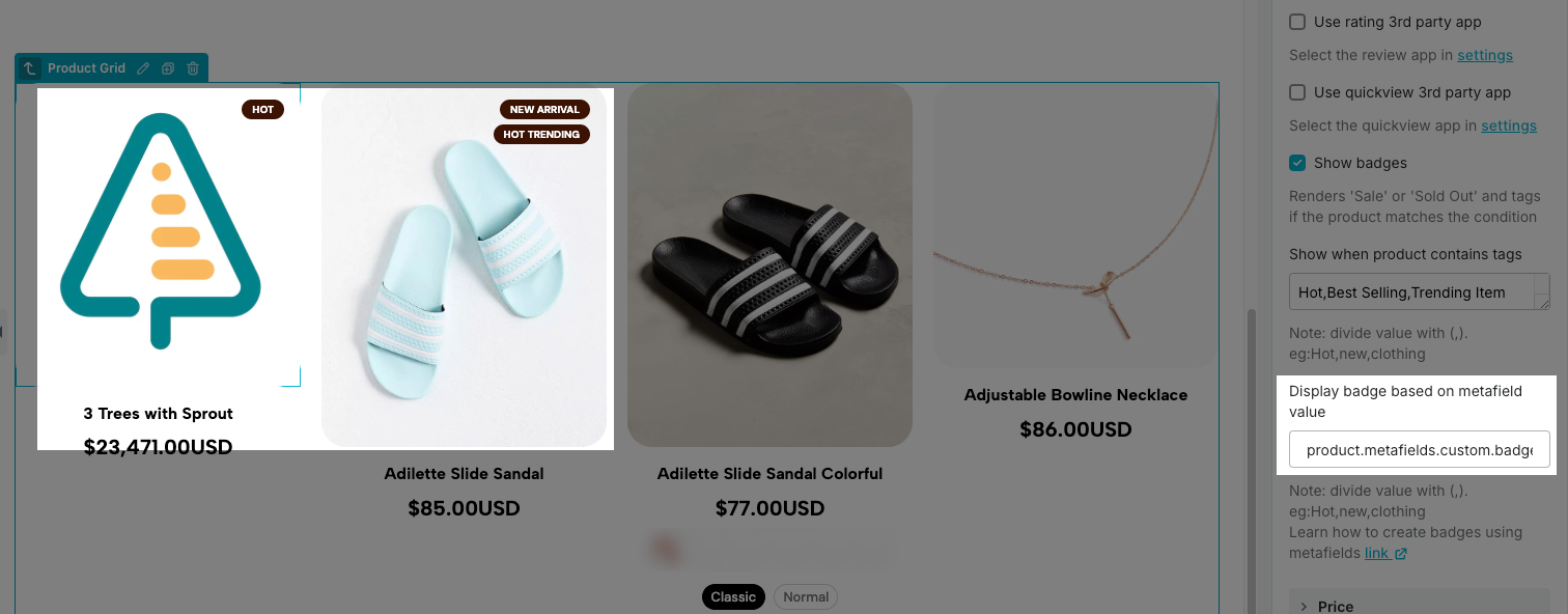
- Display badge based on metafield value: Show a badge on the product based on the value stored in its metafield. This allows dynamic labeling or highlighting of specific features, statuses, or attributes.
To show badges using metafields, you need to do some steps below:
- Step 1: Create metafields
- Go to Shopify admin -> Settings -> Custom data -> Product -> Add definition
- Add one Product metafield with Single line text type and Save.
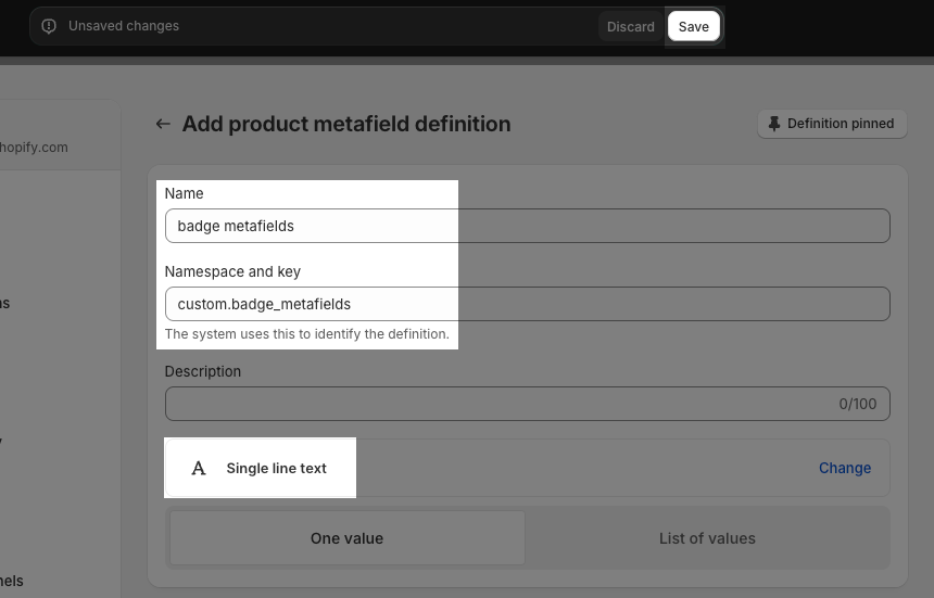
- Step 2: Add the Product’s metafield value
- Go to the Product that you want to add metafield value
- Add values as you want. Note: to display multiple badges, enter several values in the metafield, separated by commas
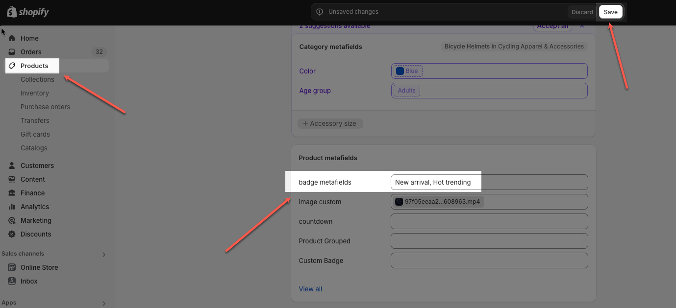
- Step 3: On EC builder -> Product Grid -> Display badge based on metafield value field, add the metafield namespace and key following format: product.metafields.[namespace and key]
- Step 4: Go to Design tab -> Custom badge to style for badge metafield.
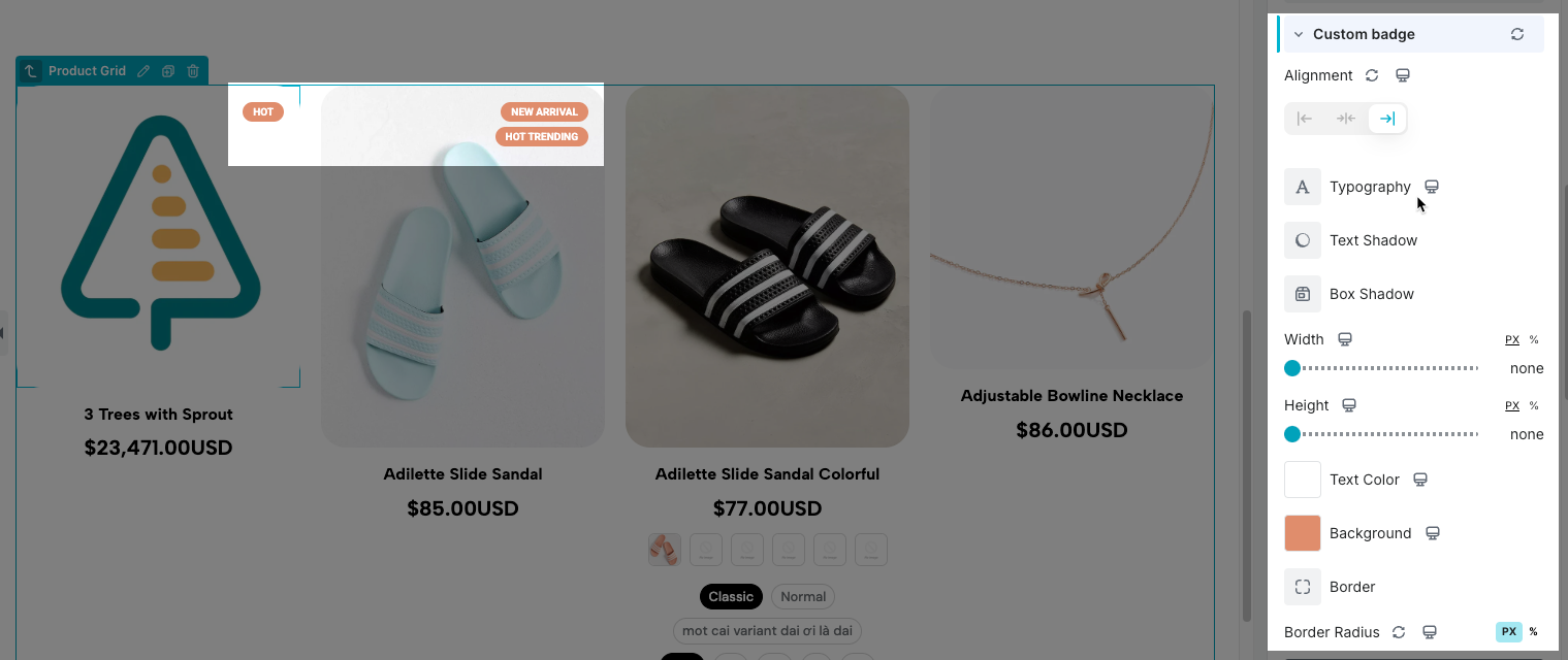
- Step 5: Save the page and view the result on Live page.
1.3. Price
In this section, we show you some options to config for Price
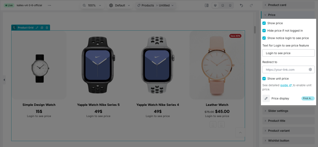
- Show price: You can show Price or not
- Hide price if not logged in: If you only want to show prices to customers who already have an account, this option will help you do that.
- Show login to see price text: If you hide the price for Guests, you can show a text here to guide what they need to do to view the price.
- Show unit price: If you sell products in quantities or measurements, then you might need to display the price per unit for certain products. When you enter a unit price for a product, the unit price is displayed on the product pages, collection pages, cart page, checkout pages, and order confirmation notifications.
- Price display:
- First available variant: Display the price of the available variant of that item.
- Price min: Show the price of that product’s smallest option.
- Price min – max: Display the product’s top and lowest prices based on all variants. Please note the Price min-max option will only appear if the variant is hidden.
1.4. Product Title
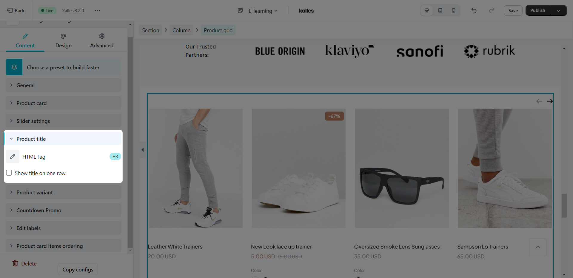
You can set the HTML tag for the Product title here and also there’s an option to set the title to one row if it’s too long.
1.5. Product Variant
If your products have variants, you can configure for them to show here.
- Show variant picker: Choose “Yes” to show them on product items.
- Layout: You can select a layout for your variants. Dropdown, swatch image, swatch color, shopify color or radio. The variant images will be taken from Shopify to show. If you choose the “Swatch color“, you must install an extension to custom color options.
- Product option to show as swatch: Enter the variant name that you want to show as a swatch option here. It is the name of the variant that you created in Shopify.
- Show other options as: For example, your products have three variants. So you can select the first variant is swatch image and the other ones as dropdown or radio layout.
- Show option name: If you choose “Yes”, it will show the variant name as a label.
- Quick shop layout: Show main option only or show all product options.
- Show view more button only?: You can tick this option to only show Viewmore button. Additional enter button text and choose icon for button.
- Hide buttons on mobile: You can tick this option to hide the View More, Add to cart, Sold out,… buttons on the mobile version.
- Add to cart/Pre order text: You can change the name for the Add to cart or Pre order buttons. Also, you can add the icon to those buttons if you want.
- View more/Sold out text: This will change the view more and sold out text for the product grid.
- After added to cart: There is a list of option to choose after you click add to cart (Most of the options require an Ajax cart extension, besides Redirect to the cart page).
- Show cart popup: This will open a pop up.
- Reload page: Reload the page after clicking add to cart.
- Show a message: This will show a message.
- Redirect to cart page: Go to the cart page.
- Go to checkout page: Go to the checkout page.
- Go to a Special url: You can set a link to redirect to after clicking the Add to cart button.
1.6. Wishlist button
You can choose 1 of 2 options to show wishlist: Use wishlist 3rd party app or Use Wishlist extension by EComposer
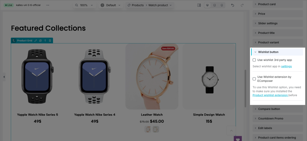
Use wishlist 3rd party app: Tick this option and select wishlist app in settings to show wishlist for 3rd party app
Use Wishlist extension by EComposer
To use this Wishlist option, you need to make sure you installed the Product wishlist extension before
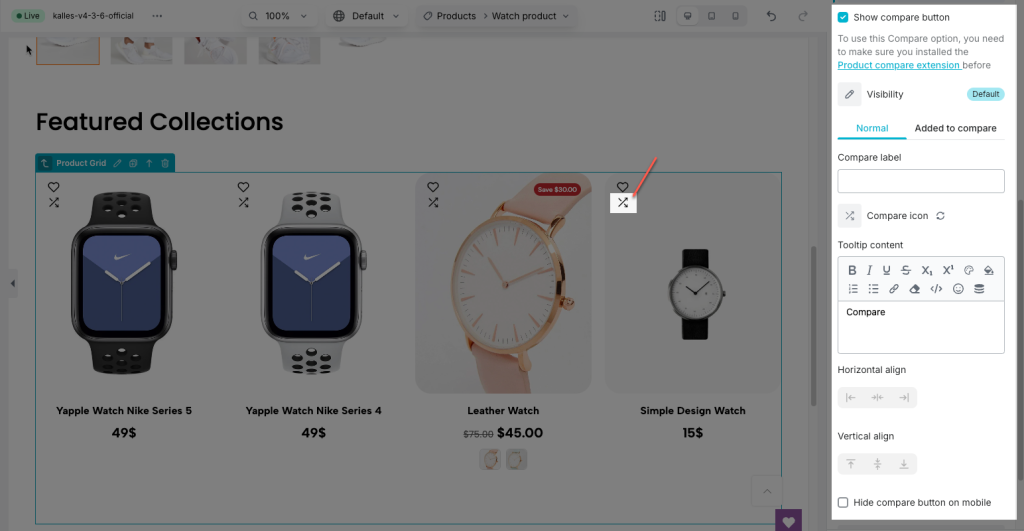
- Visibility: Determines how the wishlist button is displayed, Always, When hover or When hover & when active
- Wishlist label: Text that appears next to the wishlist icon.
- Wishlist icon: The icon representing the wishlist feature.
- Tooltip content: The content displayed when hovering over the wishlist icon.
- Horizontal align: Alignment of the wishlist feature horizontally
- Vertical align: Alignment of the wishlist feature vertically
- Icon spacing: Space between the icon and label
- Hide wishlist button on mobile: Show or hide the wishlist button on smaller screens.
1.7. Compare button
In here you can tick Show compare button option and config button like as Wishlist button. To use this Compare option, you need to make sure you installed the Product compare extension before
1.8. Countdown Promo
In here you can enable/disable the Countdown/Progress bar and change the Layout/Title, you can also change the time labels that you want to show.
But first, to setup the Countdown we need to go to Products in Shopify and choose a product that you want to display the countdown, after that you will need to go down to the bottom of the page and click on Show all next to the Metafields.
In here there will be 2 metafields: Product Countdown Start and Product Countdown End for you to choose the countdown time.
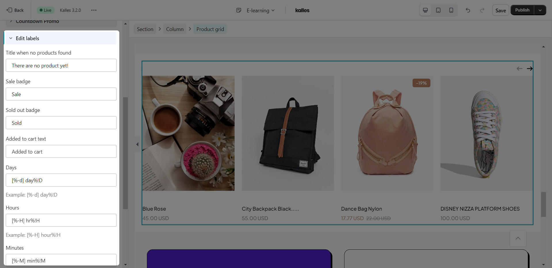
1.9. Edit labels
There are some text like product title, description, vendor, type… will be taken from Shopify. The rest of the text on the element like the badge, and countdown label you can edit here.
1.10. Product cart items ordering
The product carts will be sorted in default order. If you want to change the order for them, you can do so here, just drag the progress bars to change the position.
2. Design
In this design tab, there are many options to help you design the product element as you want. For example, if you want to add a border around the product item, you can go to the “Product item” tab. Or if you want to change the product title color, you can go to the “Title” tab. All options are very easy to use and flexible.
All of the settings in this tab are covered in detail here.
3. Advanced
This tabs have been very well documented here.


