

Variant
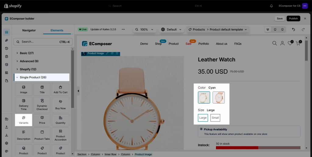
Product variants are combinations of a product. For example, those that have different colors or sizes. Product variants are a powerful way to model catalog data.
Also, you can model a Product Variant for each size of pant and each color available. This is a must-have feature in the product page, as well as in the gallery product page layouts we’ve implemented, in order to present Shopify variants and let the user choose the one they want.
1. Content
Drag and drop the Product Variant from the left-sidebar to any position you would like to.
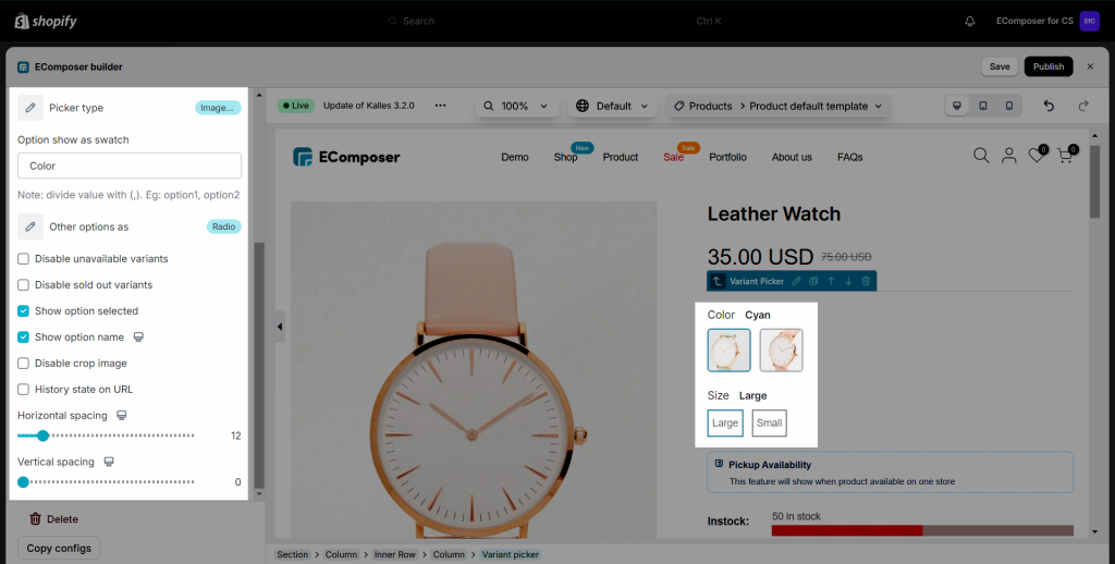
- Picker Type: Pick a type that you wanna use for the Variant here. We have a total of 4 types for you to choose from: Dropdown, Image picker, Color picker, and Radio button.
- Set your color here: You can install the “Custom Color Swatches” extension and configure the Variant color. Click “Here” link to explore more about that extension.
- Option show as swatch: Insert the option name that you wanna show as a swatch here. Example: Color. Please keep in mind that this is the Variant name that you configure for your Products in the Shopify backend.
If you have different variants for your products, you can fill in this option with more than one name. For example, “Color,Material” - Other options as: Choose the type for other variants here. You can show those variant options in Dropdown type or Radio type.
- Hide dropdown arrow: If you don’t want the arrow when utilizing the dropdown style, you can select this option.
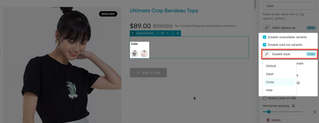
- Disable unavailable variants: The alternative will be fuzzy and not clickable while that variant is unavailable.
- Disable sold-out variants: The variant would be unselectable when the variant is sold out.
- Select first variant: The first variant will always be selected, whether in stock or not.
- Show option selected: Show the variant name that was picked next to the variant name.
- Show option name: Show the variant name. If you uncheck this checkbox, the Variant name will be hidden.
- History state on URL: The URL above will change when you select a different option based on the one you just made.
- Vertical/Horizontal spacing: Configure the vertical/horizontal space for the Variant here. This option is available for desktop, tablet, and mobile devices.
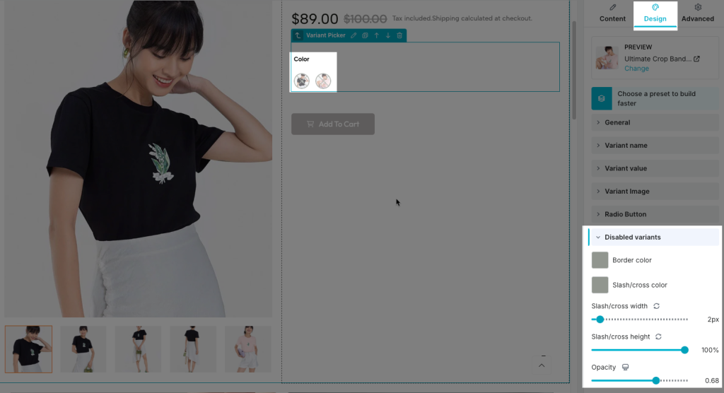
If you choose the “Disable sold out variants” option, you’ll have four additional disable styles to select from. You can also change the design for these styles.
View the video below to get more details on using the Content setting:
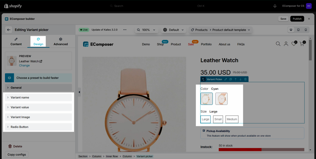
2. Design
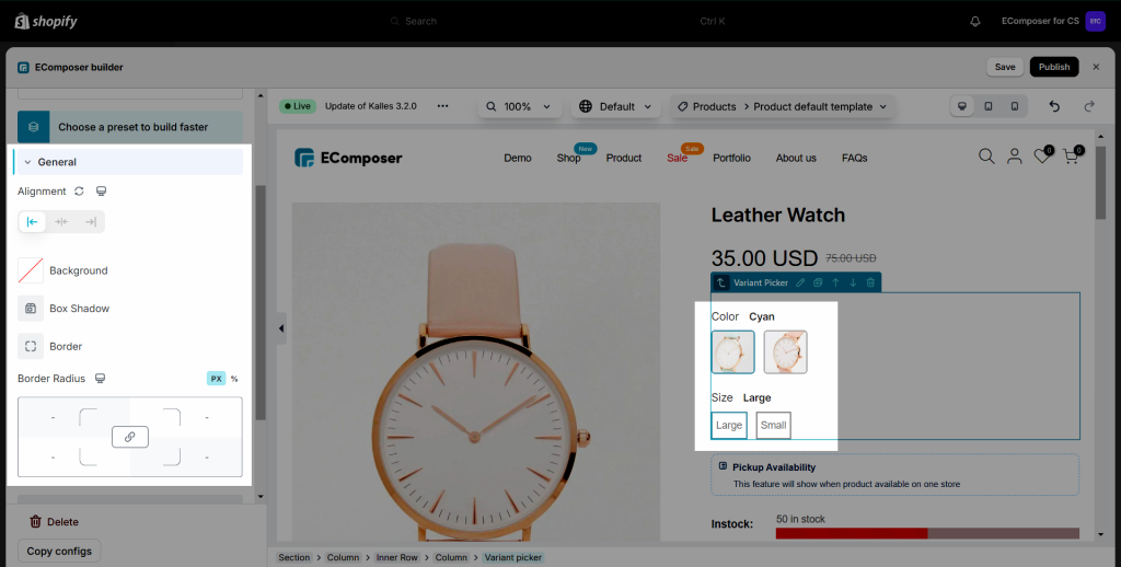
2.1. General
- Alignment: Allow you to align the Variant Picker element here. You can choose Align Left, Align Right or Align Center. This option is available for desktop, tablet, and mobile devices.
- Background: Configure the background color for the Variant Picker element here.
- Box Shadow: Allows you to add a shadow for the Variant Picker element by changing the Blur, Horizontal, Vertical, etc…
- Border: Choose the border style for the Variant Picker element here. You also can choose the None style to disable the border.
- Border Radius: Allows you to configure the border radius for the Variant Picker element, available for desktop, tablet, and mobile devices, available for desktop, tablet, and mobile devices.
2.2. Variant Name, Variant Image, Color Picker, Dropdown
- These all have settings like Typography, Text Color, Text Shadow, Spacing, and further with the Width + Height setting for the Varaint Image. Also, you can click here to learn more about How to configure options in the Design tab.
- You can configure the style of some design settings on both Normal and Focus/Hover modes.


2 Comments
Peter bange
Is it possible to create a page for a single variant (where the shopify product has multiple variants).
Maria
Hi dear!
Currently the app doesn’t support this.