Newsletter
Typically, the purpose of a Newsletter is to promote a product or service and create an individual touchpoint with your email subscribers. Objectives could be things like improving your open rate and click-through rate, gaining new subscribers, or creating your best email yet in terms of conversions.
Another benefit of newsletters is that they can be used by nearly any type of business, no matter your scale or industry. This article on how to create a newsletter is a great place to start if you want a guide on how to craft your email marketing campaign. The store owner can achieve those emails and use them for marketing purposes.
Please don’t put the Newsletter element in the same section as the Product elements.
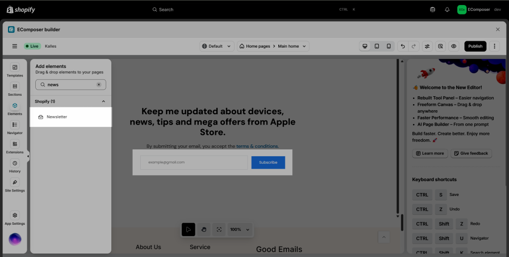
From the left sidebar (Elements tab) > Drag and drop the Newsletter element to any position of the page. This element can be used on any page type.
1. Content
1.1 General
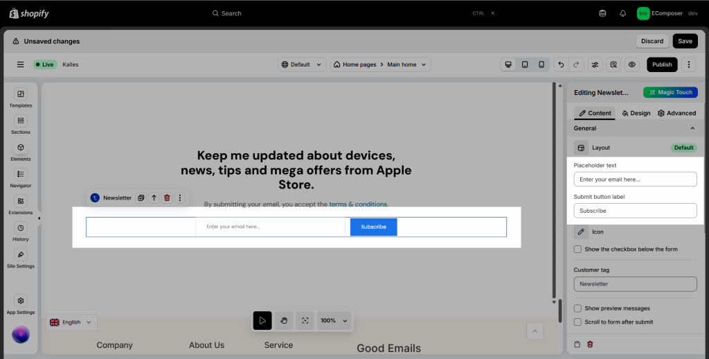
- Placeholder text: Placeholders are like mail merge fields that define where you want a value that will be defined later.
- Submit button label: Enter the label of the Submit button.
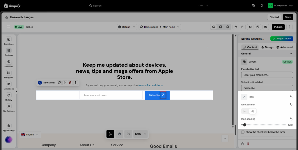
- Icon: The icon option allows you to display a small icon within the submit button.
- Icon position: Choose the position that you wanna show the icon in here. Show in front of the Text button or behind the text.
- Icon spacing: Configure the space between the icon and the button text here.
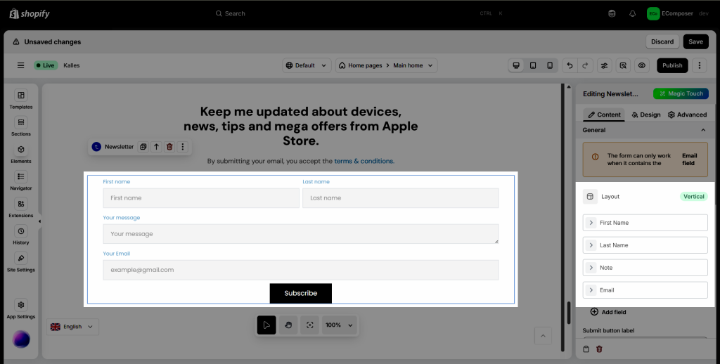
- Layout: you can build 2 styles of layouts, with Vertical as below:
Layout Vertical has 4 fields: First name, Last name, Note, and Email Field
If you already have a newsletter form, please replace it with a new form to use the vertical layout.
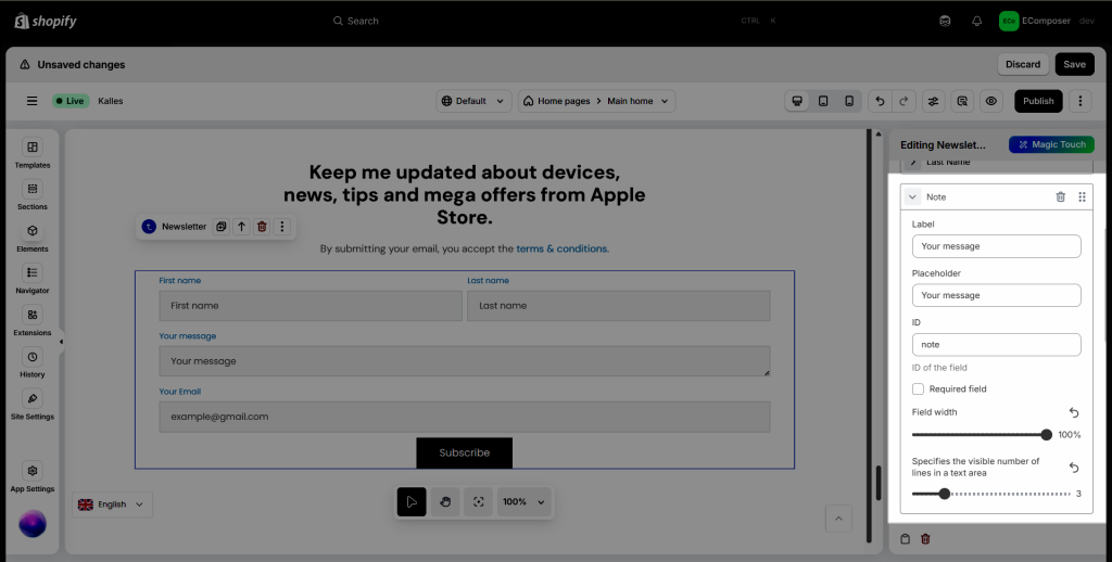
– Label: The descriptive text displayed above or beside the input field, indicating what data should be entered.
– Placeholder: A hint or example text displayed inside the input field to guide the user on what to enter
– ID: A unique identifier for the input field, used for HTML, CSS, or JavaScript references.
– Required field: Specifies whether the input is mandatory
– Field width: Defines the size of the input field
– Specifies the visible number of lines in a text area (set auto height)
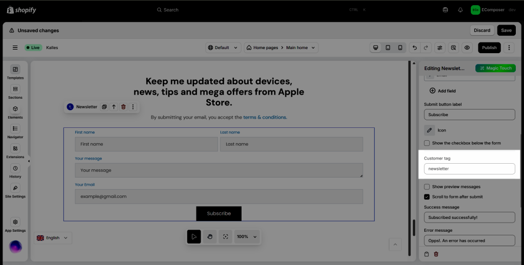
- Customer tag: Using custom tag(s) helps you track newsletter subscribers and whether they are signing up from the newsletter section, footer, or pop-up newsletter forms. This can also be used to segment customers making it easier to create marketing campaigns or send emails.
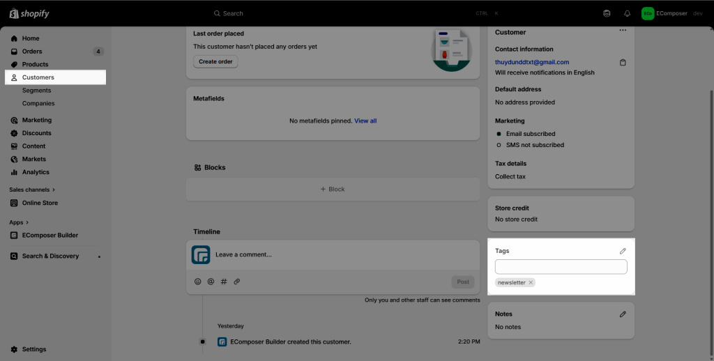
After submitting the email, the tag will be sent to the Customers in Shopify Dashboard.
In order to filter the tag to check whether they are signing up from the newsletter section, footer, or pop-up newsletter forms.
Please go from Shopify Dashboard -> Customer -> Filter -> Customer tags.
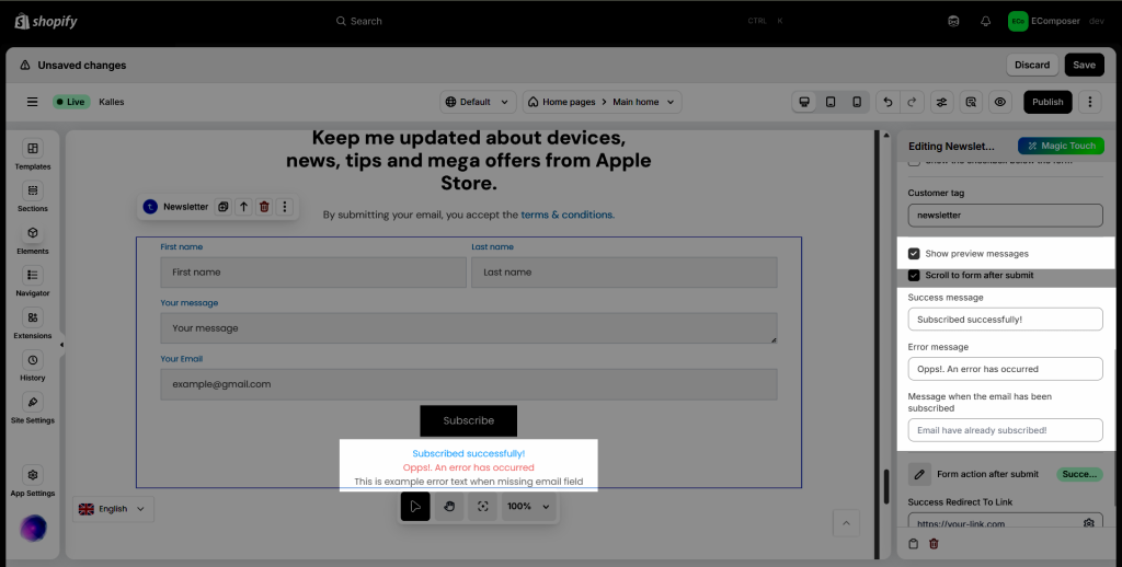
- Show preview messages checkbox: Tick this checkbox to instantly show preview messages.
- Success message: Add the content for the Success message here.
- Error message: Add the content for the Error message here.
- Message when the email has been subscribed: Add the content when the email has been subscribed here.
- Action after subscribing:
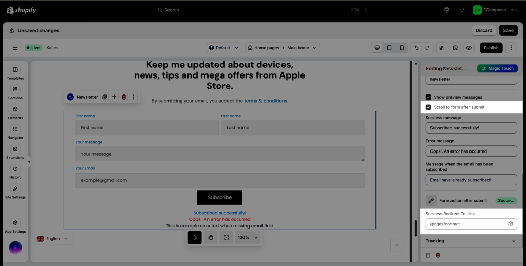
– Scroll to form after submit: After submitting an email, the page will be reloaded and automatically go down to the form’s current position on the same page. If you leave it untick, it leads you to to top of the page.
– Link redirect after successful form submit: After submitting an email, it redirects to another page, not reloading the page.
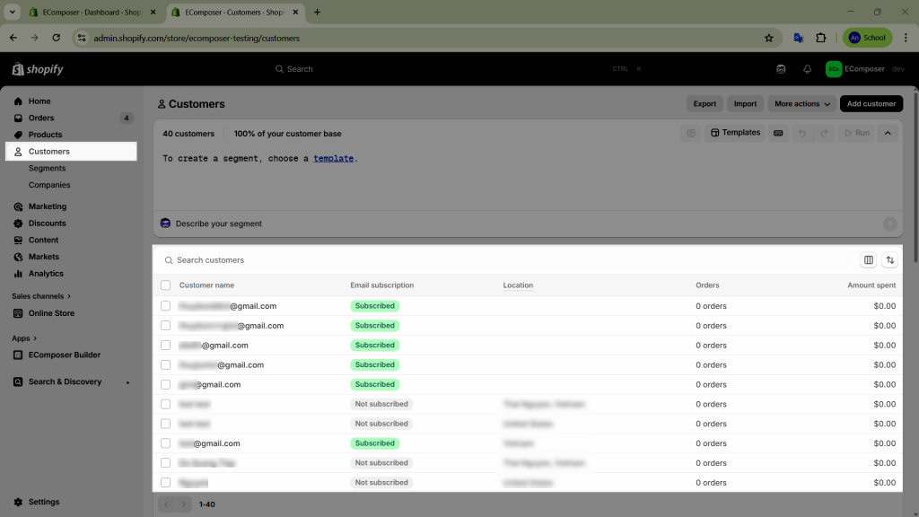
Where will the customer’s email end up after they submit it? The customer’s emails will go to the Customers section in Shopify admin.
1.2 Tracking
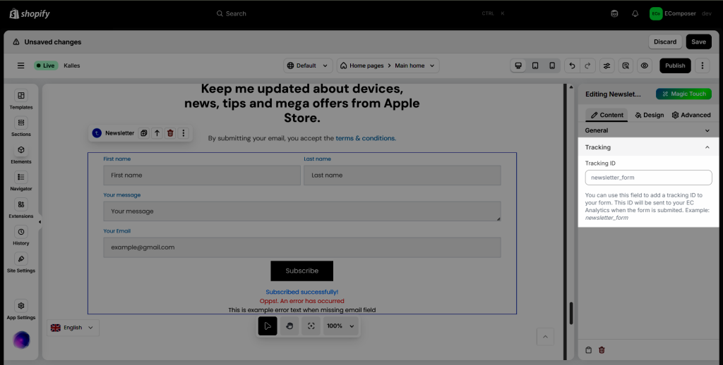
You can use this field to add a tracking ID to your form. The tracking data of this ID will be sent to your EC Analytics when the form is submitted. Example: newsletter_form
2. Design
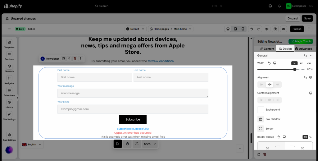
2.1. General
In the General tab, you can configure styles for the individual Newsletter element here.
- Width: Set width of the whole Newsletter.
- Alignment: Allow you to align the Newsletter element. You can choose Align Left, Align Right, or Align Center.
- Content Alignment: Allow you to align the content of Newsletter element. You can choose Align Left, Align Right, or Align Center.
- Background: Configure the background color for the Newsletter element here.
- Box Shadow: Allows you to add a shadow for the Newsletter element by changing the Blur, Horizontal, Vertical, etc…
- Border: Choose border style for the Newsletter here. You also can choose the None style to disable the border.
- Border Radius: This allows you to configure the border radius for the Newsletter.
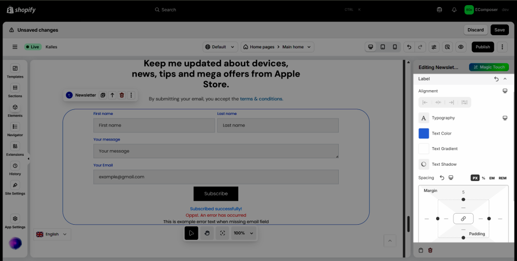
2.2. Label
You can set Alignment, Typography, Text Color, Text Gradient, Text Shadow, and Spacing for the Label.
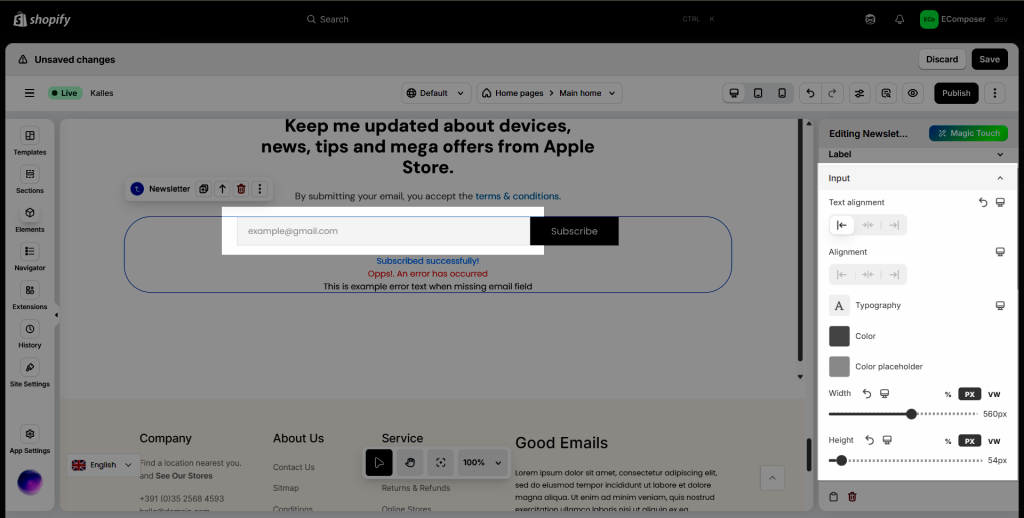
2.3. Input
You can set Alignment, Typography, Color, Color Placeholder, Width, Height, Background, Box Shadow,… for the Input field.
2.4. Button
You can set Typography, Text Shadow, Box Shadow, Width, and Height, Alignment, Background,… for button.
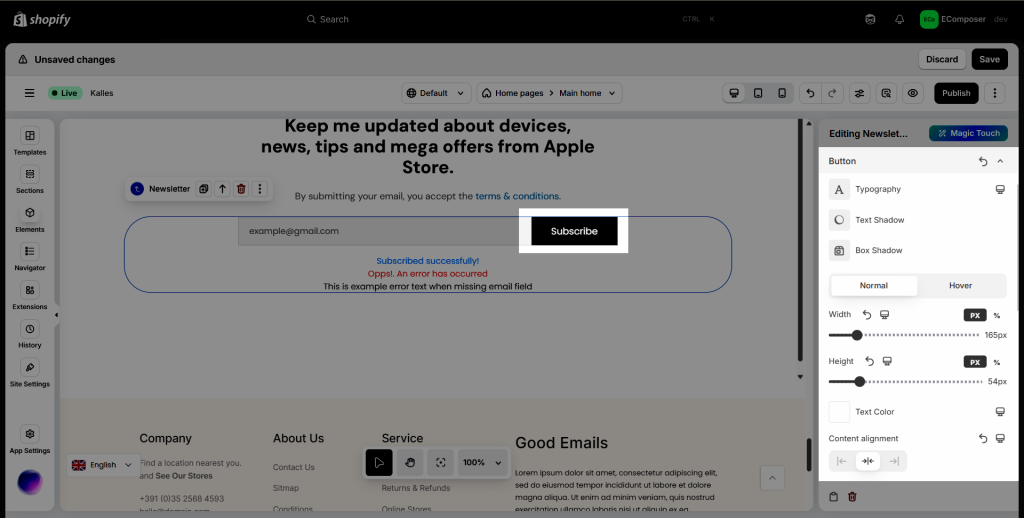
Note: You can configure the style of the Countdown Progress bar on both Normal and Hover mode.
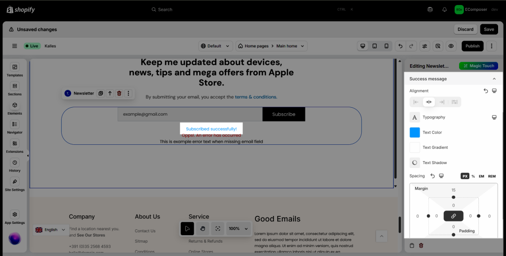
2.5. Success message
You can set Alignment, Typography, Text Color, Text Shadow, and Spacing for the Success message.
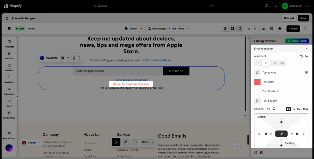
2.6. Error Message
You can set Alignment, Typography, Text Color, Text Shadow, and Spacing for the Error message.
2.6. Icon
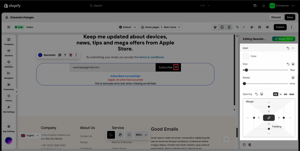
You can set Color, Size, Rotate, Spacing for Icon.
