
Section Overview
Let’s discuss how to add, style and customize rows within your pages and layouts.
Section is the largest block, It contains columns and other elements.
1. Adjust the section with Navigator
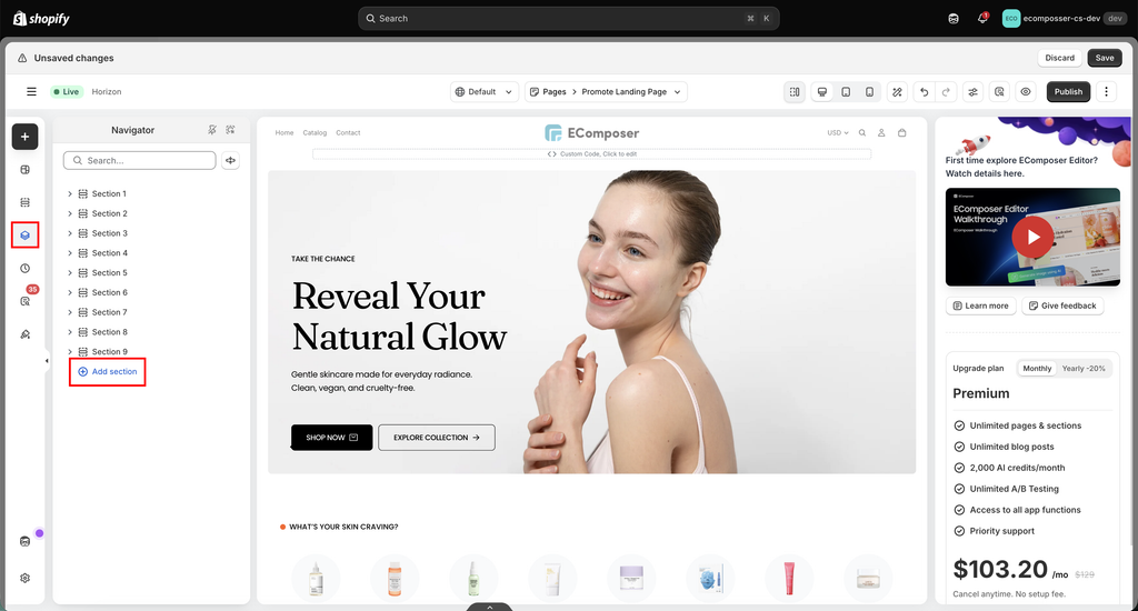
Expand/Collab: See groups of elements by clicking on the triangle icon
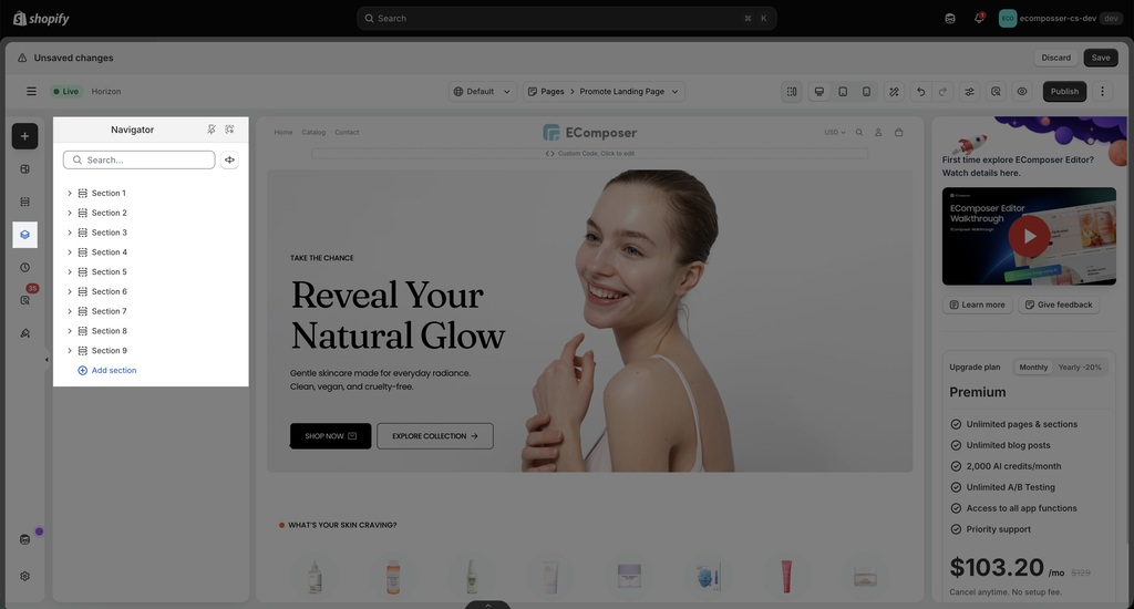
Add a new section: Add a new section at the very bottom of the page.
Visibility: Show or hide your section via this option.
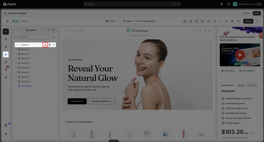
Drag to arrange: You can drag and drop an item by hovering your mouse over it.
Right-mouse Click: hover over the section name -> Right mouse click -> Some options on this pop-up will allow you to do fast actions.
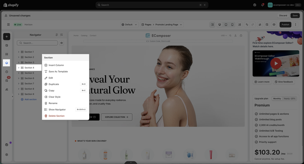
- Insert Column: You can feel free to insert a new column for the section.
- Save as Template: This option allows you to save the newly configured section as a template. Then you can use it on another page by importing it.
- Edit: Start to adjust the section’s settings.
- Duplicate: This option allows you to duplicate the section that you just created.
- Copy/ Paste: This option allows you to copy/ paste the section that you just created.
- Paste Style: This option allows you to paste the style of the section that you just copied. You can view the video below to see how this option works.
- Clear Style: This option allows you to clear the style of the section.
- Rename: Put a name that helps you quickly find the desired section.
- Show Navigator: Define this element’s position on the Navigator bar quickly.
- Delete: This option allows you to remove the selected element.
Copy a section to another page: You can watch the video below to learn how to save the section as a template and then import it into another page:
2. Layout Options
2.1. Layout
- Content Width: Defines how wide the content inside the container is.
– Full width: Content spans the entire viewport width
– Boxed: Content is constrained by the theme’s container width - Content Height: Controls the height of the Flexbox Container.
– Fix to screen: Container fills the viewport height
– Min height: Height adjusts based on content
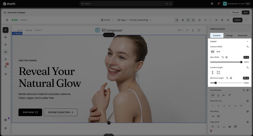
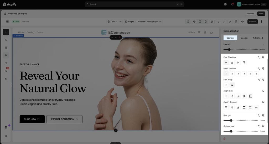
- Flex Direction: This option decides how elements are placed inside the container, in a row or in a column.
- Items per Row: Sets the maximum number of items displayed in a single row (applies when Flex Direction is set to Row).
Example: 3 items per row → Up to 3 elements per row. Extra items will move to the next line when Flex Wrap is enabled. - Flex Wrap: By default, all elements inside a Flex container try to stay on one single line. If there is not enough space, elements may become too small or overflow. Flex Wrap allows you to control whether elements can move to a new line when the container does not have enough space.
- Align items: Align Items controls how elements are aligned inside the container on the opposite direction of the layout. In simple terms, it decides how items are positioned vertically when Direction is set to Row, or horizontally when Direction is set to Column.
- Justify Content: Controls how items are aligned along the main axis.
- Row Gap: adjust vertical spacing between rows.
- Column Gap: adjust horizontal spacing between items
Using Gap provides cleaner and more consistent spacing than margins.
For further information, you need to check this document here
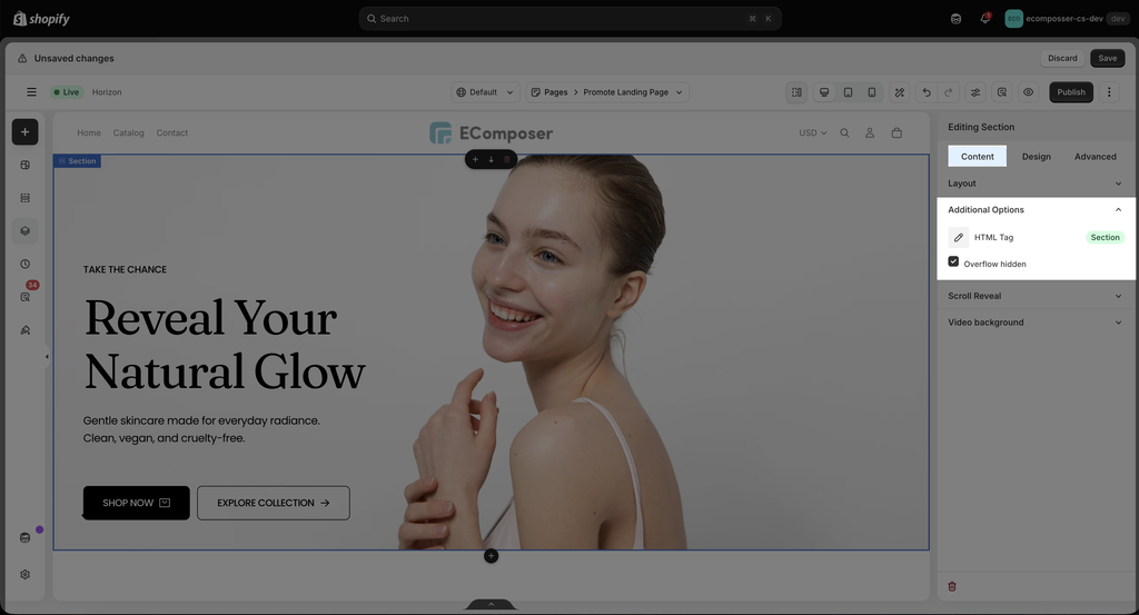
2.2. Additional Options
- HTML Tag: Selects the HTML tag used for the container (div, section, article, etc.). This is useful for semantic HTML and SEO optimization.
- Overflow Hidden: Hides any content that overflows outside the container boundaries. Commonly used with animations, effects, or oversized elements.
2.3 Scroll Reveal
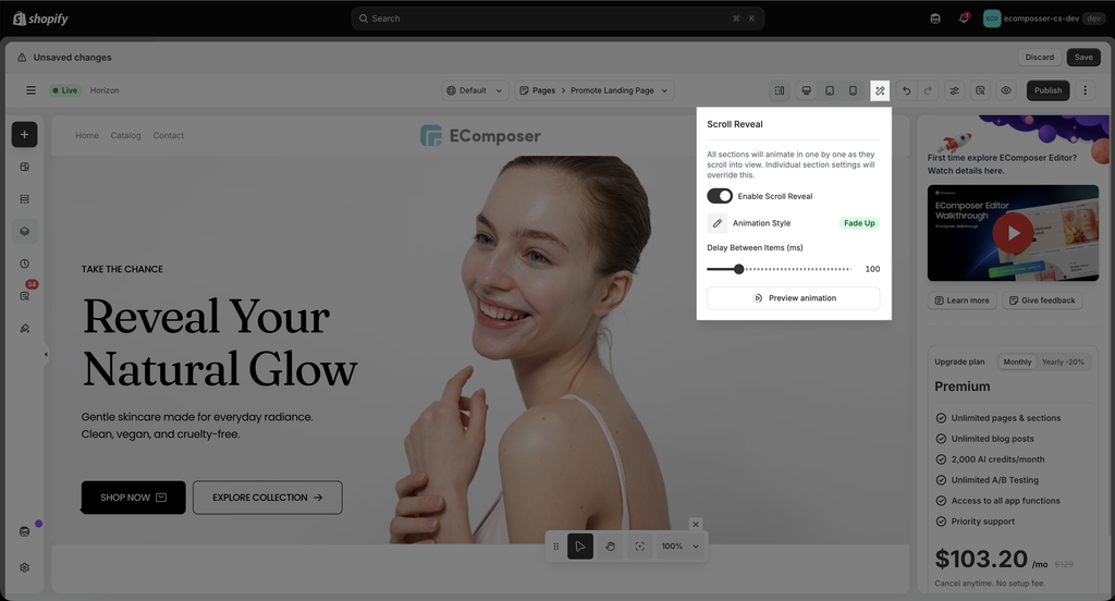
This option will set the animation for all the element inside the section, so you don’t need to set Scroll Animation for each element manually.
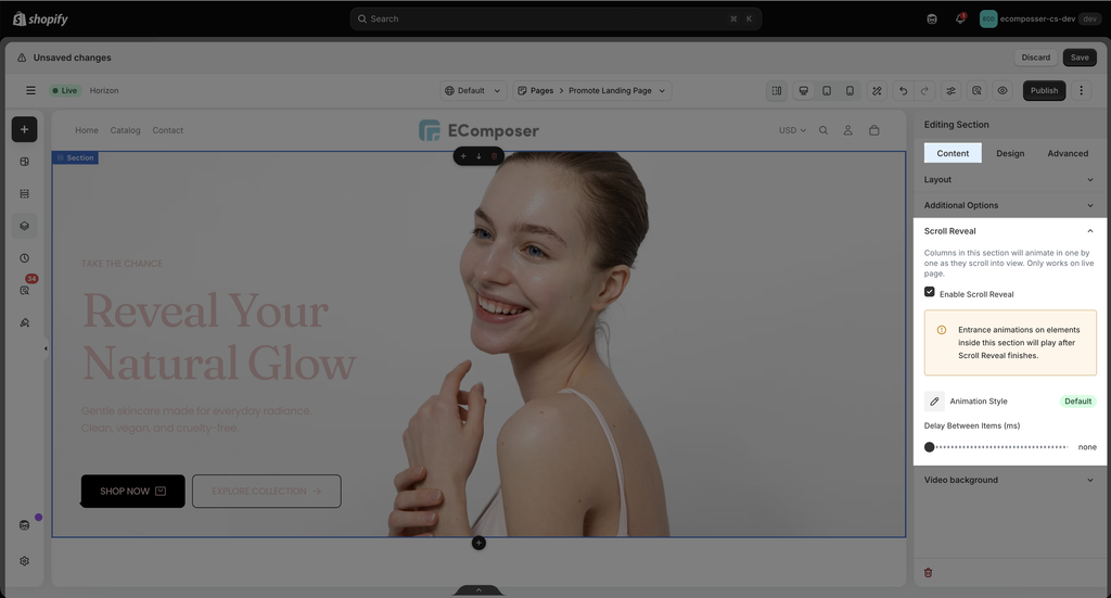
You can preview the animation directly in the editor by clicking this option:
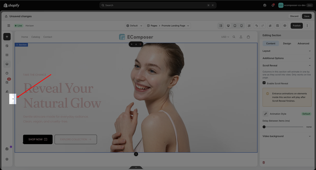
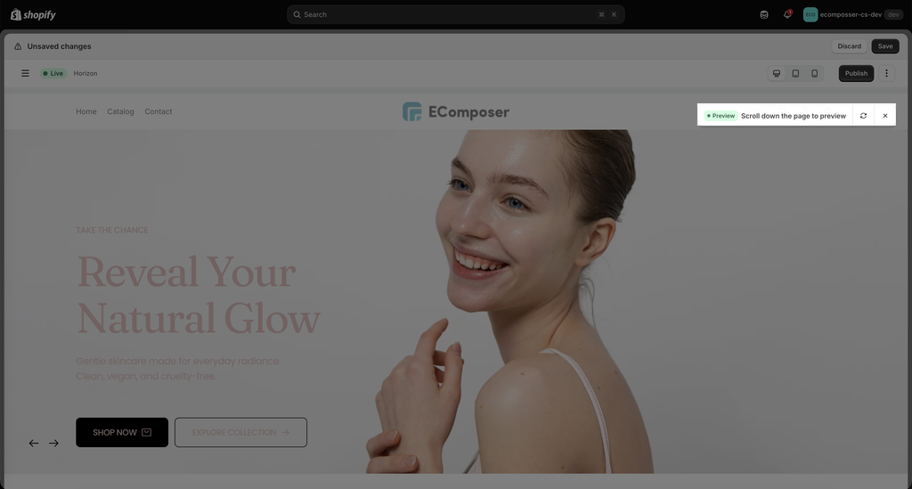
Note: The preview of Scroll Review can only show if at least 1 section enable this option on the page
You can check this video for further information:
You can set the animation for all the section on the page at once with this option:
2.4. Video background
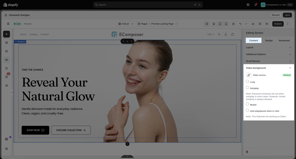
This option allows you to upload the video as a section’s background. You can choose the Video source, then set other attributes for it like Loop, Autoplay, Muted, and autoplay/pause when it is viewed.
3. Design options
3.1. Background
- Background: Choose between Classic (a single color background), Gradient (gradient background mixed by 2 colors) or an image. Available for desktop, tablet, and mobile devices.
- CSS Filters: Adjust only the section’s background Blur, Brightness, Contrast, Saturation, Hue.
- Transition Duration: Set the time for the background to change from the Normal background to the Hover background.
- Use parallax: Set the background to have a parallax effect
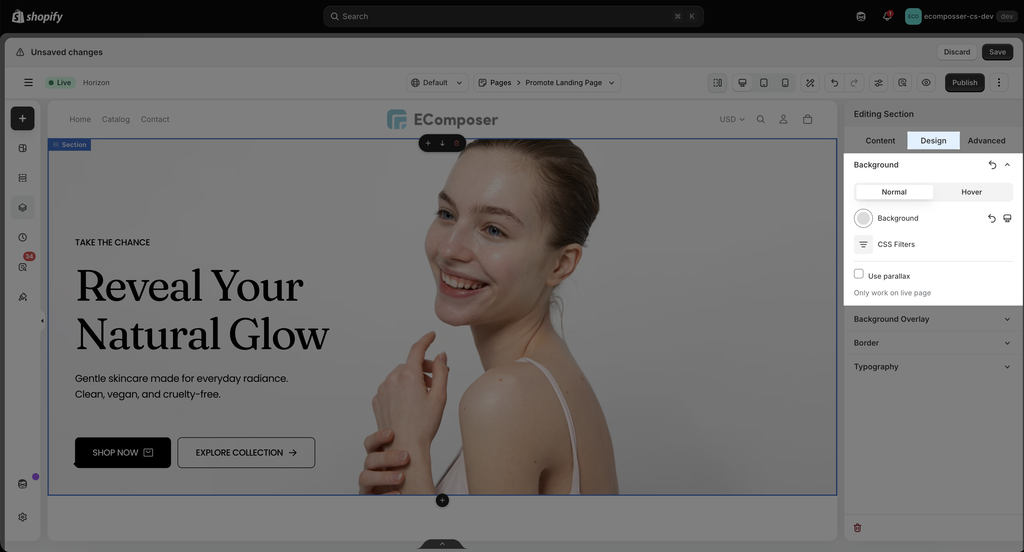
You can set Background with Normal and Hover mode.
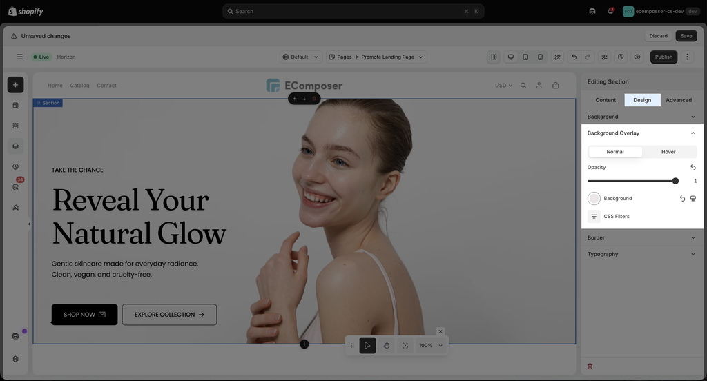
3.2. Background Overlay
- Opacity: Specifies the opacity/transparency of the section.
- Background: Choose between Classic (a single color background), Gradient (gradient background mixed by 2 colors), or an image. Available for desktop, tablet, and mobile devices.
- CSS Filters: Adjust only the section’s background Blur, Brightness, Contrast, Saturation, and Hue.
- Transition Duration: Set the time for the background to change from the Normal background to the Hover background.
3.2. Border
- Border: Choose a border style for your entire section.
- Box Shadow: Choose a color and adjust your section with Horizontal, Vertical, Blur, Spread, and Position changes.
- Border Radius: Set the border radius value for the border (available for desktop, tablet, and mobile devices).
- Transition Duration: Set the time for the border to change from the Normal background to the Hover.
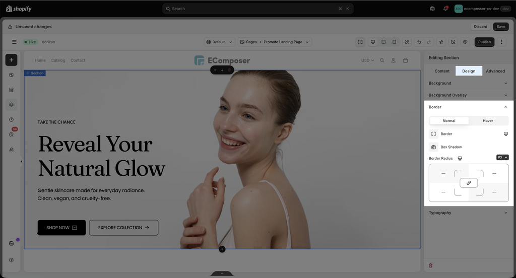
You can set the Border with Normal and Hover mode.
3.3. Typography
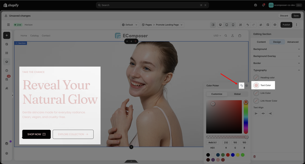
- Heading color: Configure the color for Heading in this option. You can pick your color or use Global colors in the Global tab.
- Text Color: Configure the color for text here.
- Link Color: This option allows you to set colors for the link.
- Link Hover Color: This option allows you to set the color for the link in Hover mode.
- Text Align: Choose an alignment for your text here.
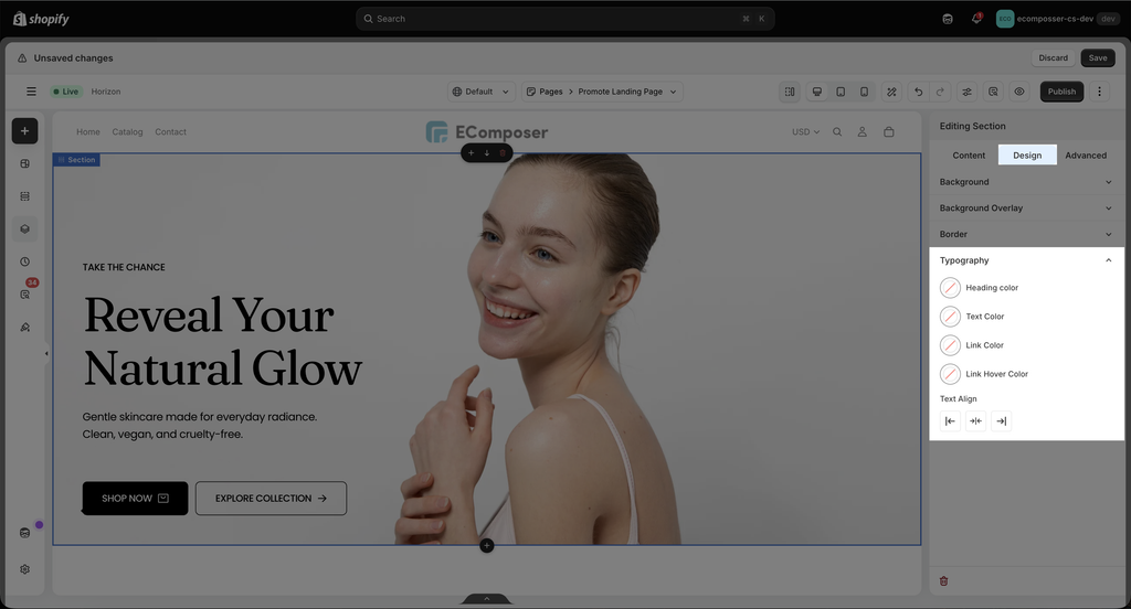
Note: the typography option will only apply to texts inside the element area. And you make sure that the default text style is default value.
- Click the Reset value icon to revert to the default style.