
Recently Viewed Product
Recently Viewed Products is a feature that shows products a customer has viewed recently on a website. It helps users quickly return to items they were interested in, improves the shopping experience, and can increase conversion rates.
The feature usually tracks viewed products using the browser (cookies or local storage) and displays them on pages like the product page, homepage, or cart page.
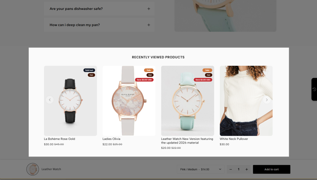
Note: You can use this extension on EComposer Pro and Premium plans. Upgrade now to unlock
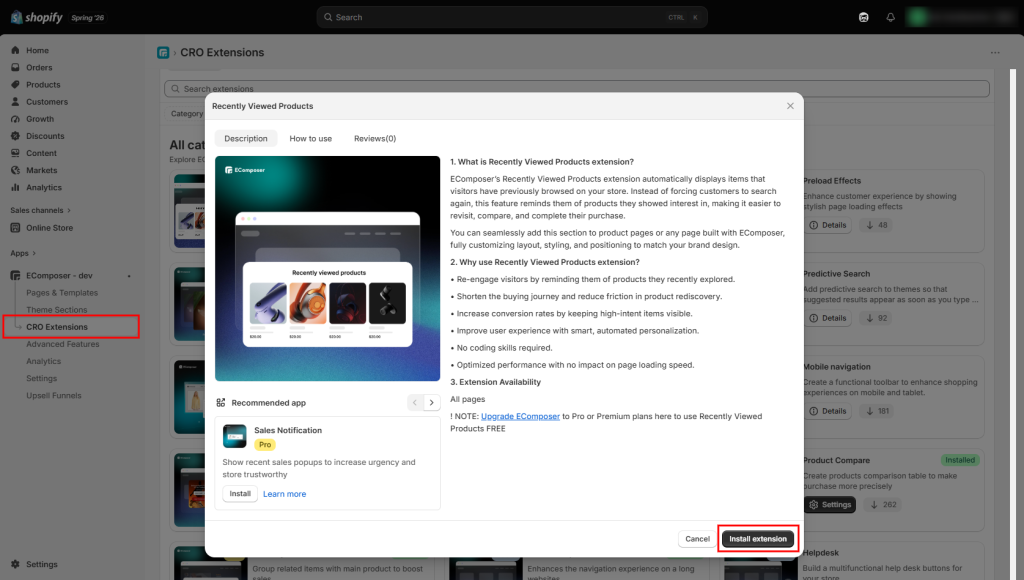
1. How to install the Recently Viewed Products extension
Step 1: From your EComposer dashboard, go to CRO Extensions from the left sidebar menu.
Step 2: Search for the Recently Viewed Products extension.
Step 3: Click Details and install the extension on your store.
2. Add the Extension to your page
Before we get started, I’d like to mention that there are 2 ways to display the Recently Viewed Products feature.
- First: You can drag and drop the extension in the page editor to place it wherever you’d like on the page. Inside the EComposer editor, open the Extensions tab from the left sidebar, then find the Recently Viewed Products extension from the installed extensions list and drag it into your desired position on the page. After adding it successfully, you can start customizing the extension settings and style.
- Second: Alternatively, it can be displayed as a popup when customers click the sticky button on the right side of the screen.
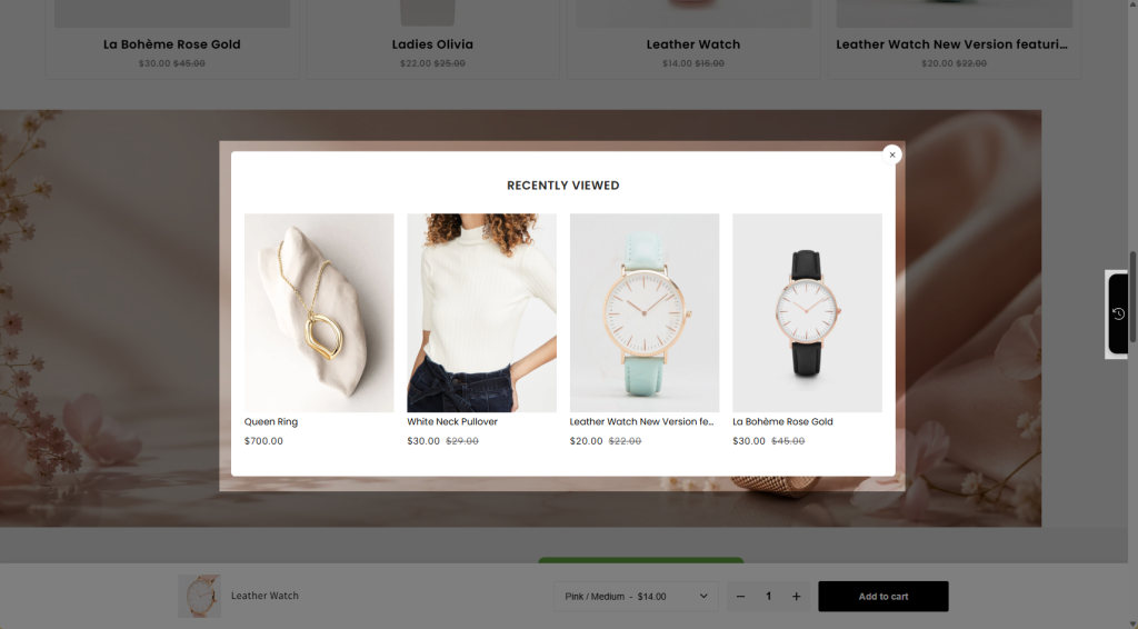
Note: This will display products based on the customer’s recently viewed products.
3. Customize the extension
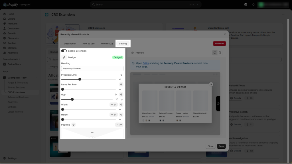
3.1. Recently Viewed Products extension settings for the popup
- Enable Extension: This setting allows you to enable the Recently Viewed Products popup. If you prefer to display the Recently Viewed Products section directly on the page instead, you can disable the popup using this setting.
- Heading: This setting allows you to customize the heading displayed on the Recently Viewed Products popup.
- Product limit: This controls the maximum number of recently viewed products displayed in the popup. The maximum limit is 10 products, but you can reduce it to 4, 5, or any number that best suits your needs.
- Items per row: This setting lets you choose how many products are displayed in each row, such as 3 or 6 items per row.
- Gap: This setting adjusts the spacing between each product item.
- Width: Adjusts the overall width of the Recently Viewed Products popup.
- Height: Controls the overall height of the Recently Viewed Products popup.
- Padding: Determines the spacing between the popup content and its borders, allowing you to create a more spacious or compact layout.
3.2. Recently Viewed Products extension settings in the page editor
3.2.1. Content
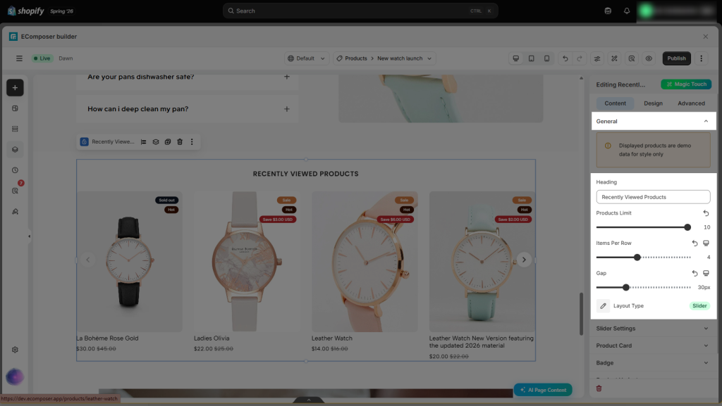
- General
- Heading: You can customize the heading displayed above the Recently Viewed Products section to anything you’d like (such as View what you’ve recently viewed)
- Product Limit: This controls the maximum number of recently viewed products displayed. The limit is 10, but you can reduce it to 4, 5, or any number you prefer.
- Items per Row: This lets you set how many products appear in each row, such as 3 or 6 items per row.
- Gap: Adjust the spacing between each product item.
- Layout Type: You can choose between Grid and Slider layouts. The Grid displays all selected products at once, while the Slider shows a set number of products at a time and lets customers browse more with the navigation arrows.
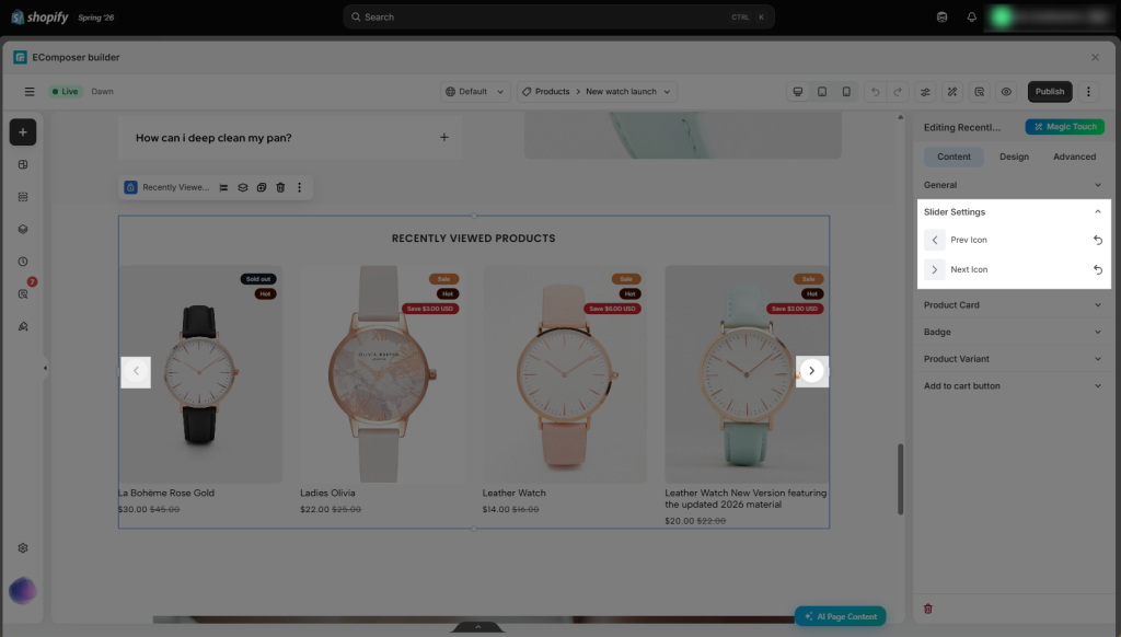
- Slider setting: In this option, you can set the icon for Next and Previous navigation.
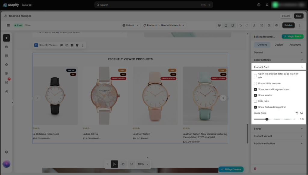
- Product Card
- Open the product detail page in a new tab: Opens the product page in a new browser tab when a customer clicks the product.
- Product title truncate: Limits the length of long product titles to keep the layout clean.
- Show second image on hover: Displays the product’s second image when the customer hovers over it.
- Show vendor: Displays the product vendor or brand name on the product card.
- Hide price: Hides the product price from the recently viewed product card.
- Show featured image first: Displays the product’s featured image as the default image.
- Image Ratio: Sets the aspect ratio of product images for a consistent appearance.
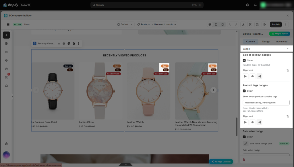
- Badge
- Sale or Sold out badge: Displays the Sale badge when a product is on sale. Similarly, the Sold Out badge is displayed when the product is out of stock. You can also change the alignment of the Sale and Sold Out badges using the Alignment setting.
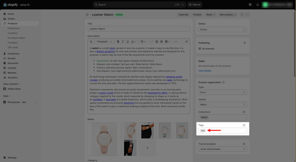
- Product tags badges: This feature allows you to display custom labels. For example, if you’d like to display a “Hot” label, simply add the “Hot” tag to the product and enter the corresponding tag name in this option. The label will then be displayed automatically on the product item. You can also change the position via the Alignment setting.
- Badge
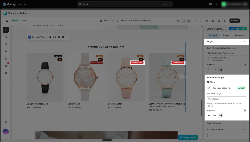
- Sale value badge: Displays a badge showing the discount value, such as Sale 20% or Save $14.00 USD.
- Sale value badge type: Determines whether the discount is displayed as a percentage or a fixed amount. This badge is only available for products with a Compare at Price.
- Sale value label: Allows you to customize the text displayed alongside the discount value, for example, Sale up to 20% or Save $40 today.
- Sale value badge alignment: Controls the position of the sale value badge on the product card.
- Product variant
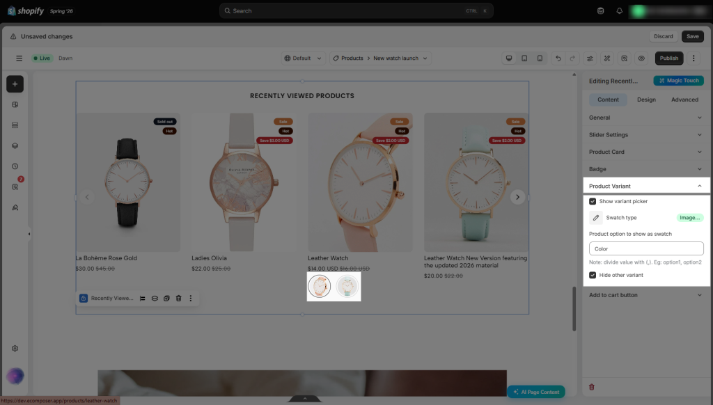
- Show variant picker: Shows or hides the variant picker for each product.
- Swatch type: Select the type of swatch to display. You can choose between Color Picker and Image Picker.
- Product option to show as a swatch: Enter the name of the product option you want to display as a swatch. If you’d like to show multiple options, separate them with commas (for example: option1, option2).
- Hide other variants: Hides any product variants that are not displayed as swatch options.
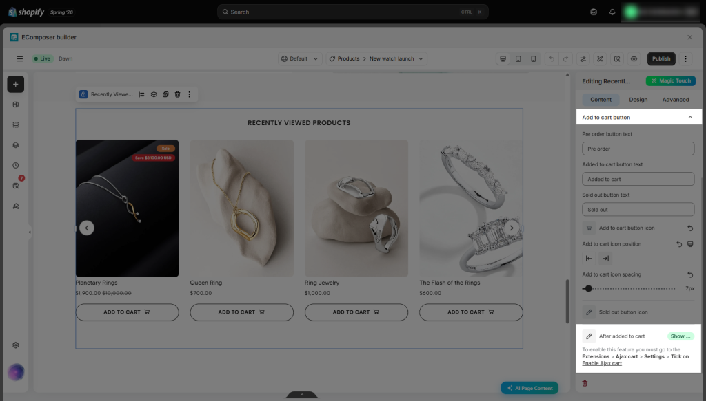
- Add to cart button
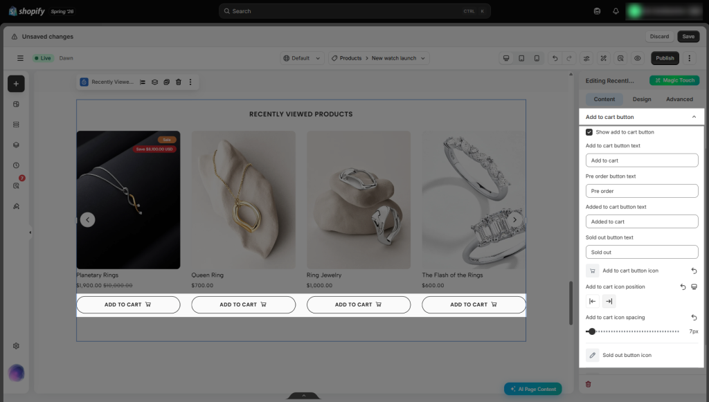
- Show add to cart button: Shows or hides the Add to Cart button for each product.
- Add to cart button text: Lets you customize the text displayed on the Add to Cart button.
- Pre-order button text: Lets you customize the text displayed on the Pre-order button.
- Added to cart button text: Defines the text shown on the button after a customer has successfully added the product to their cart.
- Sold out button text: Lets you customize the text displayed on the button for out-of-stock products.
- Add to cart button icon: Allows you to choose the icon displayed on the Add to Cart button.
- Sold out button icon: Allows you to choose the icon displayed on the Sold Out button.
- After added to cart: Regarding the Add to Cart button, its redirect behavior is based entirely on the settings you have configured (Most of the options require an Ajax cart extension, besides Redirect to the cart page).
3.2.2. Design
- General: Allow modifying the background, border radius, spacing of the Recently Viewed Products extension.
- Heading: Customize the heading’s typography, color, spacing, and alignment.
- Product items: Adjust the layout, spacing, borders, background, and other styling of the product cards.
- Image: Customize the product image appearance, including size, border radius, spacing, and other image styling options.
- Title: Customize the product title’s typography, color, and spacing.
- Navigation: Customize the appearance of navigation controls, including size, color, spacing, and hover effects.
- Price: Customize the regular price’s typography, color, and spacing.
- Price Sale: Customize the sale price’s typography, color, and spacing.
- Compare at price: Customize the compare-at price’s typography, color, and spacing.
- Variant swatch: Customize the appearance of variant swatches, including size, border radius, colors, borders, and spacing.
- Badges wrapper: Controls the spacing and gaps for all product badges.
- Sale badge: Adjust the colors, typography, and shape of the “Sale” badge.
- Sold out badge: Adjust the colors, typography, and shape of the “Sold Out” badge.
- Tag badge: Configure the colors, typography, and spacing of product tag badges.
- Sale value badge: Set the colors, typography, and shape of the discount value badge.
- Sold out button: Modify the colors, typography, border, and spacing of the “Sold Out” button.
- Add to cart button: Modify the colors, typography, border, spacing, width, height and hover effects of the “Add to Cart” button.