
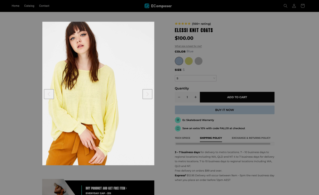
Product Image
Product Image is a necessary element of the product page since it allows you to show the primary picture and thumbnails of the product from Shopify. Customers may also zoom in to examine the featured products in greater detail or alter them according to product variants. The EComposer provides many options to customize the Product Image.
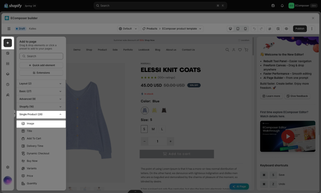
Drag and drop the Product Image to any position you would like.
The Product Image element includes two main tabs: Content and Design. The Content tab is used to configure how product images work and display on the product page, such as selecting the layout, enabling zoom, lightbox, thumbnails, navigation, badges,… The Design tab is used to customize the appearance of the product image.
1. Content
The Content tab lets you customize how product media is displayed, including image layouts, zoom effects, sliders, thumbnails, navigation, and pagination. It also allows you to configure sale, sold-out, and custom badges using product tags or metafields.
1.1 Image layout Change
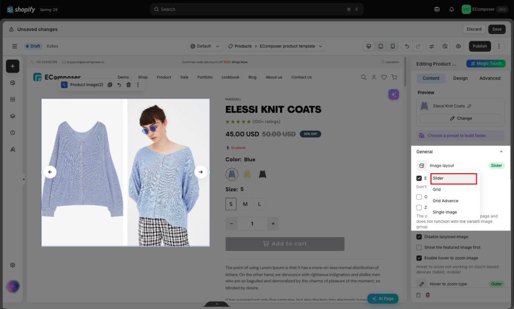
Image Layout Change allows you to choose how product images are displayed and arranged. There are 4 types of layout: Slider, Grid, Grid Advance, and Single image.
+ Slider: Is a carousel-style product image section that allows customers to browse product images slide by slide by clicking the Previous/Next arrows to switch between images. If you choose this kind of layout, you will configure slider settings from the options right below it.
+ Grid: displays multiple product images in a fixed grid format. Customers can scroll down to view all product images without clicking through a carousel.
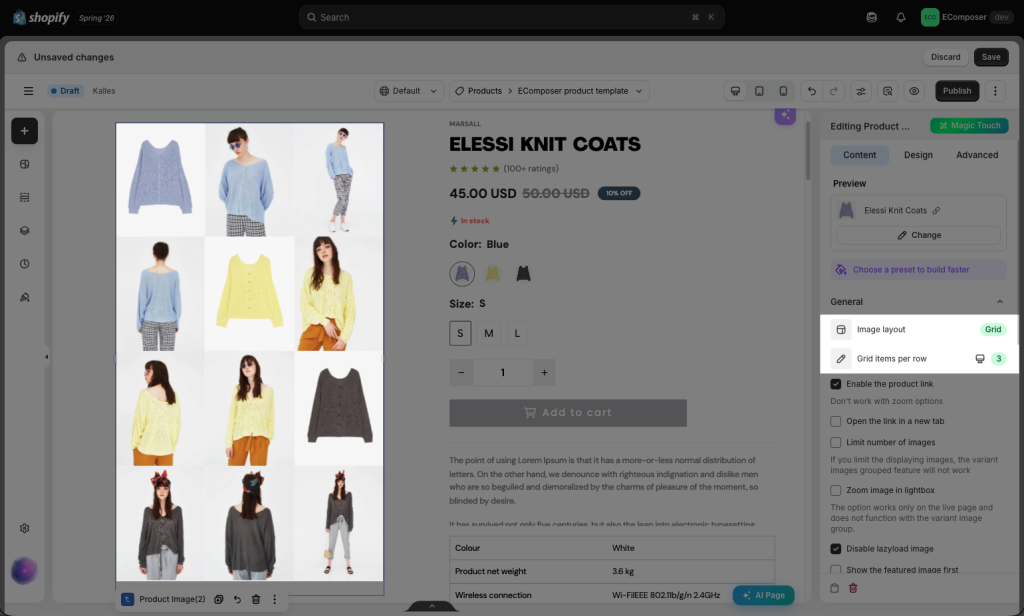
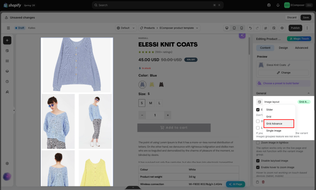
+ Grid advance: an advanced image layout that displays product images in a more flexible and visual grid style. Customers can view multiple product images directly on the page without clicking through a slider.
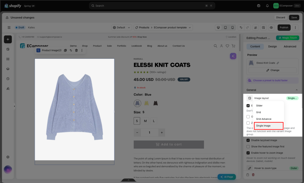
+ Single Image: displays only one main product image instead of showing a full product gallery.
- Disable lazyload image: You can choose this option to disable the Lazyload effect if you don’t want to use it. However, the lazy load effect will be helpful to you. Better performance with shorter page load times; the website performs better overall, which benefits user engagement and SEO rankings.
- Show the featured image first: Allows you to always show the featured image first. This option does not show when you select Grid layout.
1.2 Image Zoom
- Zoom Image in Lightbox: Allows the user to click the icon then it will trigger the lightbox of product photos to appear as a pop-up slider. Also, it will let you choose the icon and the icon position as well.
- Enable hover to zoom image: It helps you zoom in on the Product Image when you hover. You can choose to zoom this image either Inner (like using a pair of magnifying glasses) or Outer (the result will appear outside the product image).
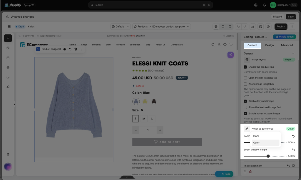
This function can only work properly on the Live page
- Image alignment: This will allow you to reposition the image.
- Enable position sticky: You can use this option to keep the Product image fixed while scrolling across that column. Please be aware that it only works on Desktop.
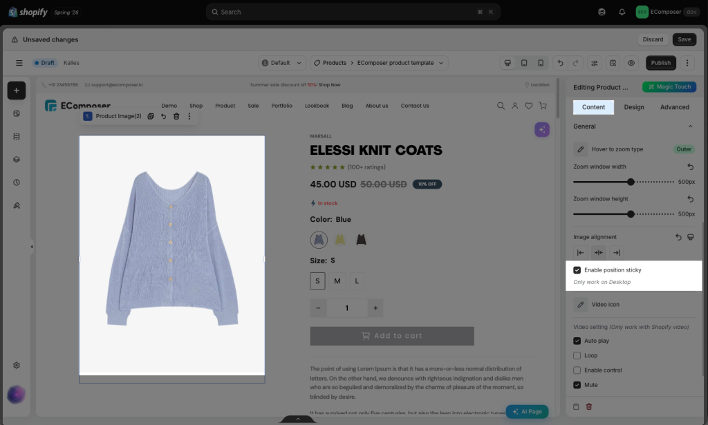
Note: This feature can only work when there is no other elements below the Product image element.
1.3 Slider settings
You can customize the slider’s number of visible slides, spacing between images, autoplay, transition speed, looping, and swipe behavior. These settings help control how product images are displayed and how customers navigate through them on desktop, tablet, and mobile devices.
Note: This tab is only visible to you if the Image Layout option above is Slider.
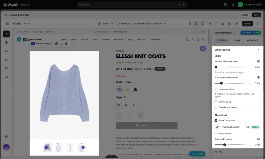
- Number slides per view: Set the number of slides per view. It allows setting different values for each device.
- Spacing between slides: Set space between product images. It allows setting different spaces for each device.
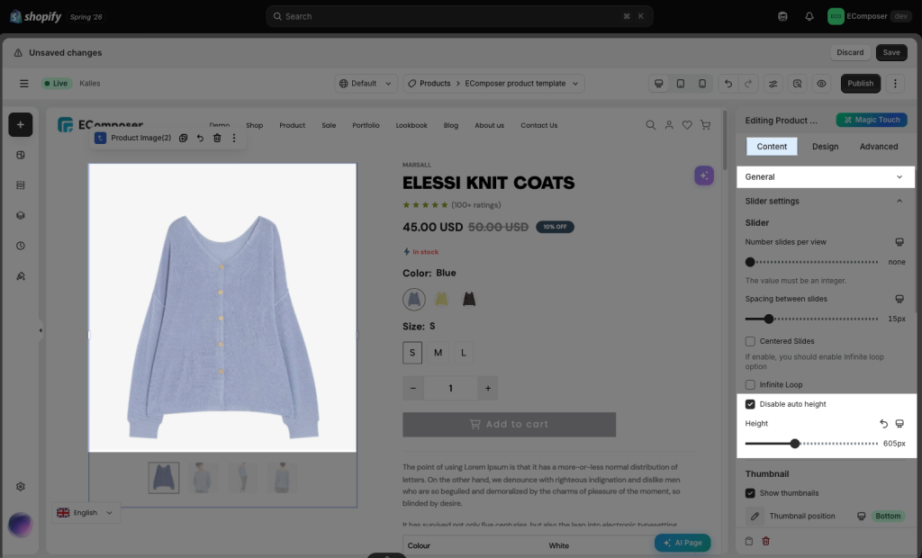
- Disable auto height: The Disable Auto Height option is recommended when the product images have different dimensions or aspect ratios. When this option is enabled, the product gallery uses a fixed image height instead of automatically adjusting its height based on each image. This helps keep all product images displayed at a consistent size and prevents the gallery layout from changing height when customers switch between images.
However, because the images are forced into the same display area, some parts of the images may be cropped.to change the slider height, either increasing or decreasing.
1.4 Thumbnail settings
Product image thumbnails are the small preview images displayed next to or below the main product image on the product page. When a customer clicks a thumbnail, the corresponding image or media item will be displayed in the main product gallery.
You can customize the thumbnail position and spacing. Depending on the gallery layout, you can also control the number of visible thumbnails, navigation arrows, image width and height.
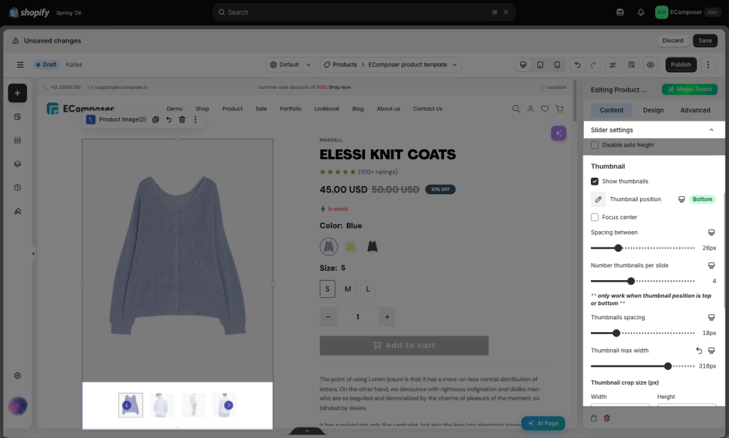
- Show thumbnails: Allows you to show thumbnails or not. When you enable this option, many options will show below for you allow setting different spaces for each device to customize them
- Thumbnail position: This option will show when you enable the Show thumbnails. You can set the position Left, Right, Bottom and Top.
- Spacing between: Set space between thumbnails and product images.
- Number thumbnails per slide: Set the number of thumbnails per slide.
- Thumbnails spacing: Set space between each thumbnail.
- Thumbnail Size (px): Set the width, height and crop position for the thumbnails.
- 3D Model icon: Allow you to select the icon for the 3D image to help clients know this is a 360-degree viewer.
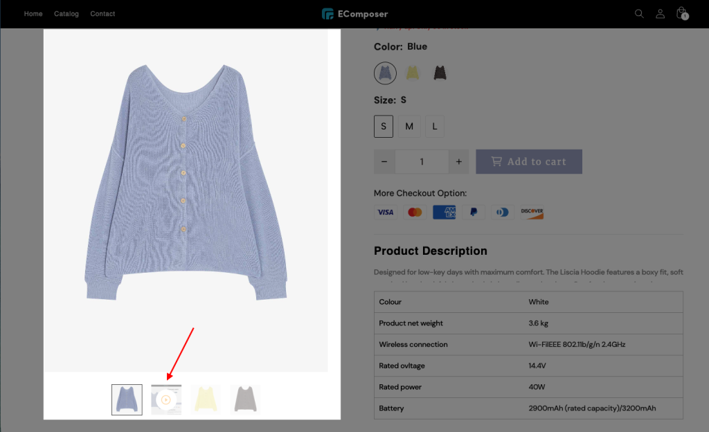
- Video icon: Allows you to add the play icon on the video for the featured image. You can select the icon you want. Included are your own customized settings, such as Auto Play, Loop, Enable Control, or Mute for the product video
1.5 Nav & pagination
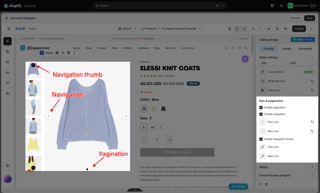
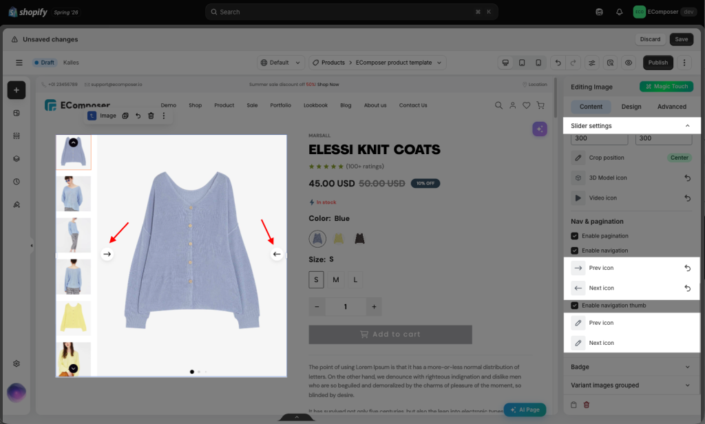
- Enable navigation or pagination/Enable navigation thumb: You can change the Pre/Next Icon for Product Image when you enable them.
1.6 Badge
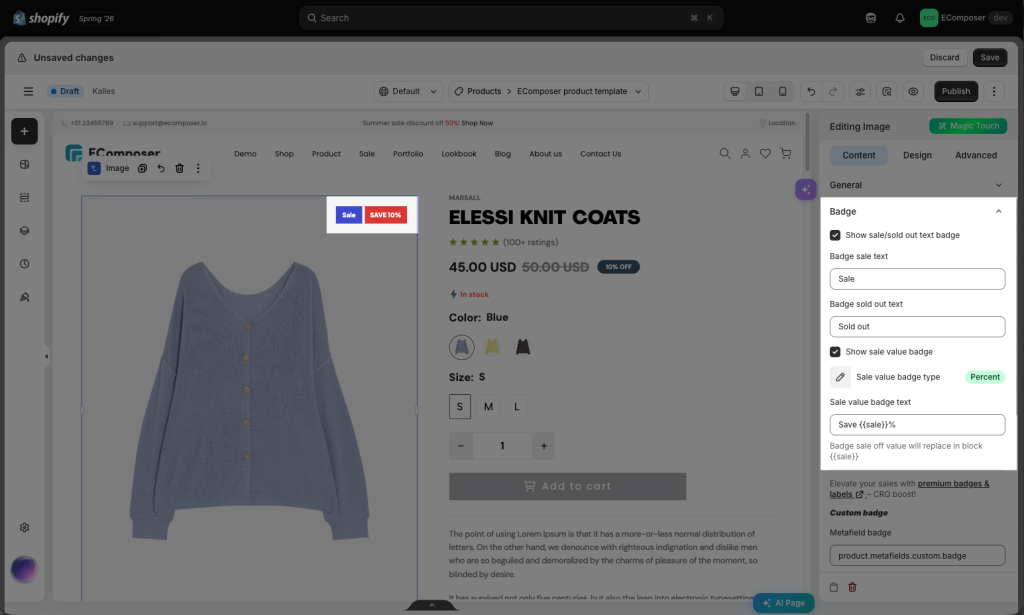
- Show sale/sold out text badge: Display or hide the sale/sold out text badge.
+ Badge sale text: When a product has a sale price, this text will be shown.
+ Badge sold out text: This text will be shown when a product is sold out. - Show sale value badge: Show or hide the sale value badge.
+ Sale value badge type: You can choose either Percent or Amount
+ Sale value badge text: You can fill -{{sale}}% in the box to show the discount value.
- Custom Badge: These can be displayed differently for each product. The badge content is retrieved from the product’s tags or metafields, allowing merchants to assign unique badge text to individual products.
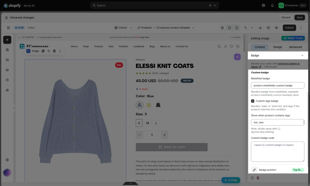
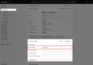
+ Metafield badge: Renders a badge from a metafield, example: product.metafields.custom.example.value. This document might help you have more information about metafield.
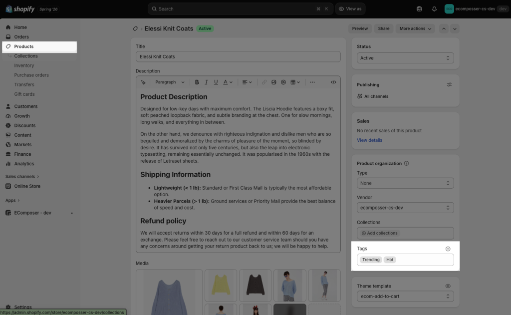
+ Custom tags badge: Renders ‘Best Seller’ or ‘Trending’ tags if the product matches the condition. It only shows when a product contains tags you added to the product. You can read more about the product tags here
- Badge position: set the position for the badge. You can choose Top Left, Top Right, Bottom Left, or Bottom Right.
1.7 Variant Image Grouped
The user will be able to view the product variant images grouped in the Thumbnail, which is linked to the variant you have selected, due to this feature.
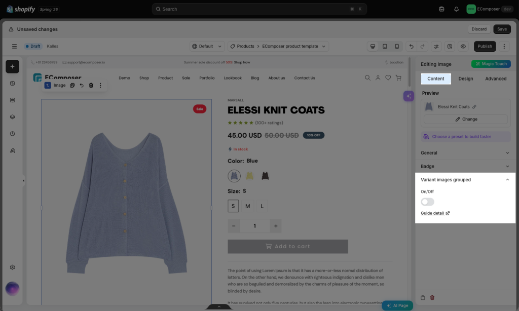
Result: If I select the “Blue” variant, for example, I will be able to see all the product images associated with the “Blue” variant, which is set in Shopify.
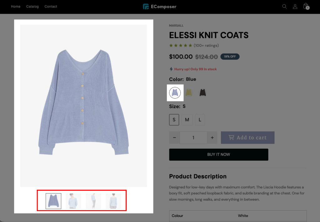
Please follow the steps below to configure this feature and set it up:
Step 1: Add ALT text
From the Shopify admin -> Open the Product you want to use -> Media
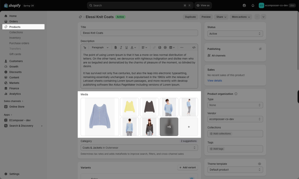
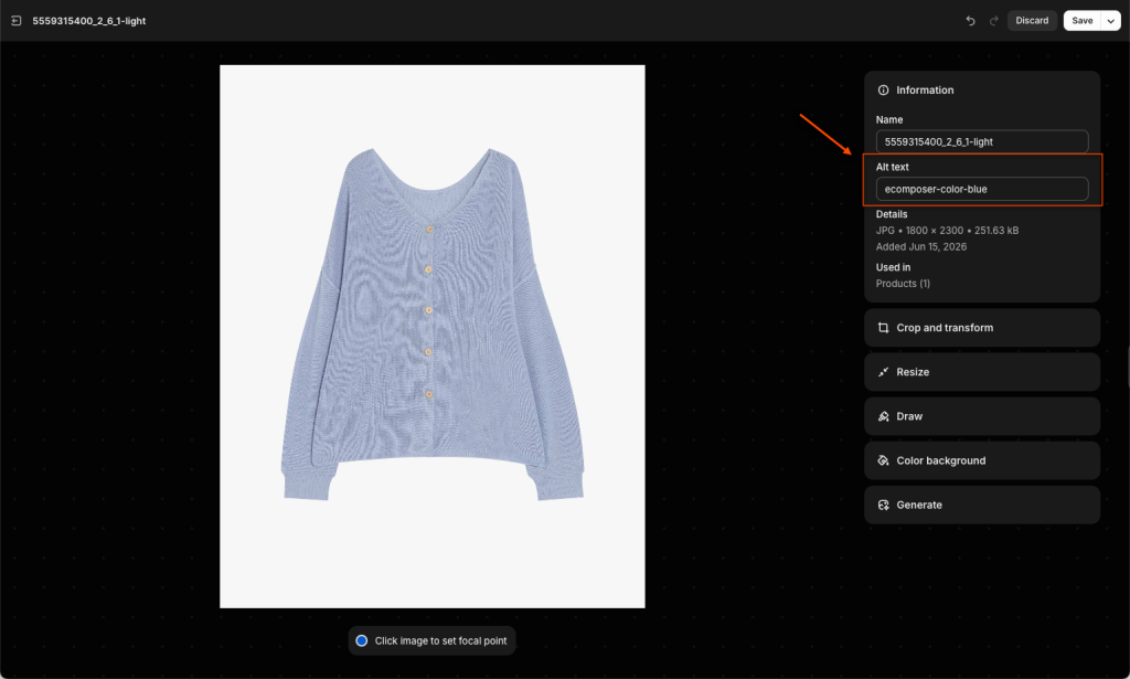
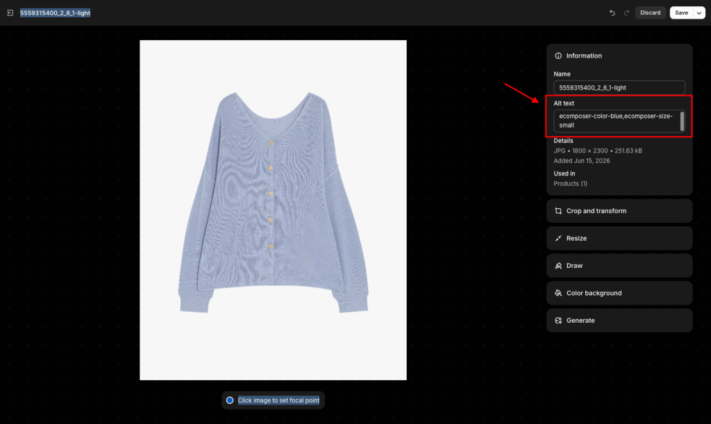
After opening the image -> Enter ALT text’s structure ecomposer-option name-variant name.
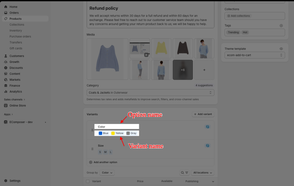
For example, the ALT text will be in all lowercase: ecomposer-color-blue
Notes: If you use this variant image to connect with 2 options, separate the 2 ALT texts by a comma (,) like below: ecomposer-color-blue,ecomposer-size-s
Step 2: Enter Option Name
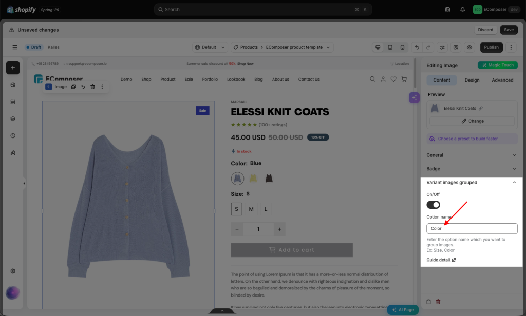
Then you go back to EComposer Editor, adding exactly the option names you want to group by Color.
- If your products have the same option but with different option names as below:
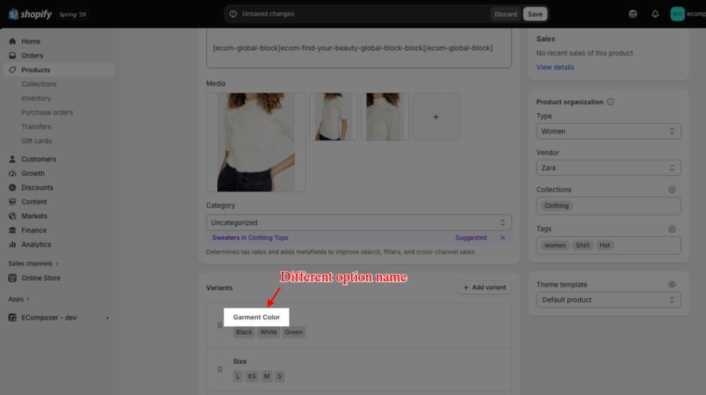
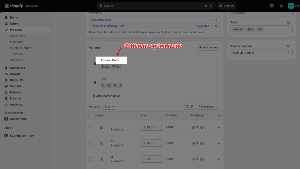
then separate 2 options names by a blank space and a comma (,) Apparel Color, Garment Color
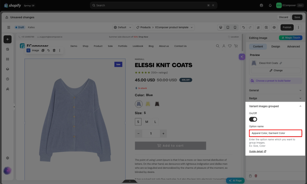
Notes:
- Option name inside our app does not distinguish between uppercase and lowercase. If your option name is COLOR, you just need to put Color or color.
- If your option name has the space, please do not use “-” symbol between characters. For example, ecomposer-fabric material-synthetic-fibres (In this case, option name is: fabric material)
- If your variant name has the space, please use “-” symbol between characters. For example, ecomposer-color-light-blue (In this case, variant name is: light blue)
- If you just want to group for 1 variant only, simply add 1 ALT text like the example above. In this example, we will group Color variant only
- If you want to group more than 1 variant, you need to add 2 or 3, or more ALT text structures of the corresponding variant to the alt field. In this case, we want to group 2 variants: Color and Size, so we will add: ecomposer-color-blue,ecomposer-size-small
2. Design
2.1. Featured image
The featured image is the largest main product image. You can mainly customize the featured image’s alignment, width, height, and image fit. Use Alignment to position the image on the left, center, or right; Width and Max Width to control its display size; Height to set its vertical size; and Image Fit to determine how the image is displayed within the defined area.
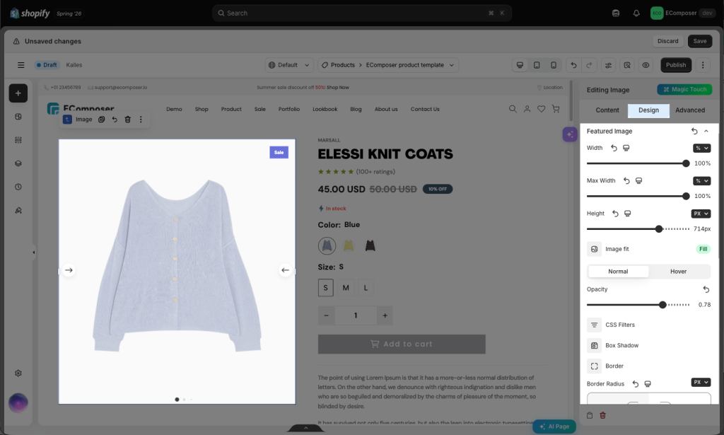
- Opacity: Control the opacity of the image.
- CSS Filters: Adjust the image style by changing the CSS Filter scales for Blur, Brightness, Contrast, Saturation, and Hue settings.
- Box Shadow: Adjust box shadow options.
- Border: Select the type of border.
- Border Radius: Set the border radius to control corner roundness. It allows setting different border-radius for each device.
Normal/ Hover Tab: The settings under this tab are used to select elements when you mouse over it.
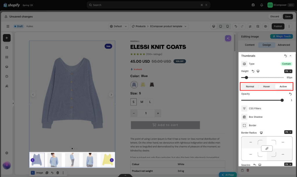
2.2. Thumbnails
Note: This tab is only visible to you if the Show thumbnails option in Slider settings is enabled. Configuration is applied to Thumbnails.
- Type: Allows you to change your Thumbnail’s type.
- Height: Set the height of thumbnails. It allows setting different heights for each device.
- Additionally, you may use this to control the effect when the thumbnail is active, hovering, or normal.
2.3. Navigation
Note: This tab is only visible to you if the Show thumbnails option in Slider settings is enabled. Configuration is applied to Thumbnails.
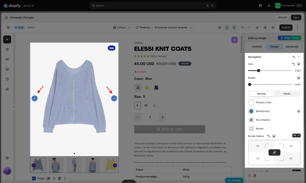
The options below will help you configure the style of the Navigation with options for Size, Rotate and Primary Color, Background, Border, Border Radius, and Spacing of the Normal/ Hover status.
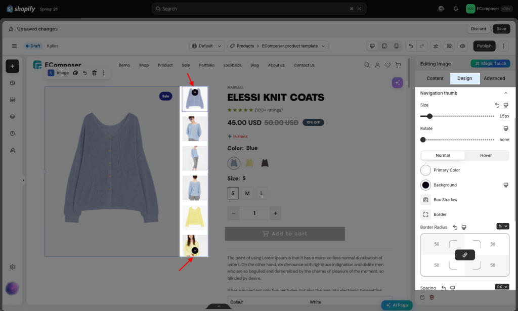
2.4. Navigation thumb
Note:This tab is only visible to you if the Enable navigation thumb option in Slider settings is enabled. Configuration is applied to Navigation thumb.
The options below will help you configure the style of the Navigation thumb with options for Size, Rotate and Primary Color, Background, Border, Border Radius, and Spacing of the Normal/ Hover status.
2.5. Badge
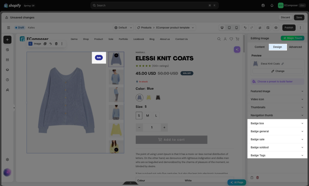
You can use different styles like Color, Background (allow responsive on each device), Border, Box Shadow, Border Radius, Spacing of all types of badges.
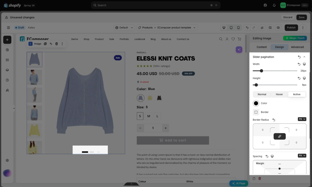
2.6. Slider Pagination
Note:This tab is only visible to you if the Show pagination option in Slider settings is enabled. Configuration is applied to Slider Pagination
The options below will help you configure the style of the Slider Pagination with options for Width, Height and Color, Border, Border Radius, Spacing of the Normal/ Hover/ Active status.
To understand more about the configurations in Design Tab, you can check this guide.