
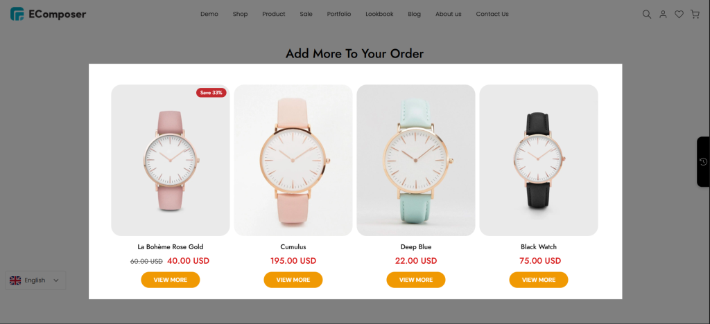
Cart Related Products
Related Products element helps you display recommended products directly on the cart page, encouraging customers to explore more items before checkout. You can use it to showcase complementary products, best sellers, or products that customers may be interested in adding to their cart, helping increase engagement and boost sales opportunities.
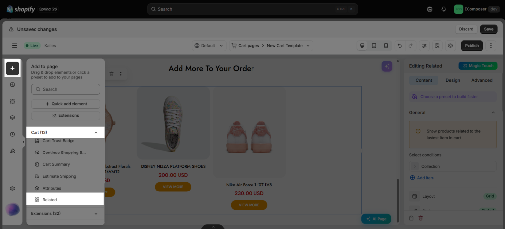
You can find the Related element in the Elements panel => Cart => Related:
1. How to Choose Which Related Products to Display
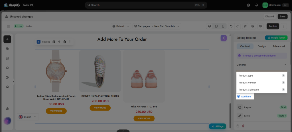
In the Content => General, you can configure conditions to determine how related products are selected and displayed.
When a condition is enabled, the section will show products that match the latest product added to the cart based on the selected criteria:
- Product Type: Displays products with the same product type as the current product.
- Product Vendor: Displays products from the same vendor as the current product.
- Product Collection: Displays products from the same collection as the current product.
Note: If a product belongs to multiple collections, Shopify does not provide a way to determine which collection should be prioritized, so the displayed related products may come from any matching collection.
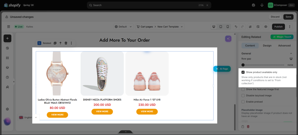
- Show product available only (Live page only): Show only products that are in stock (It will not work if the condition is set to ‘From collection’)
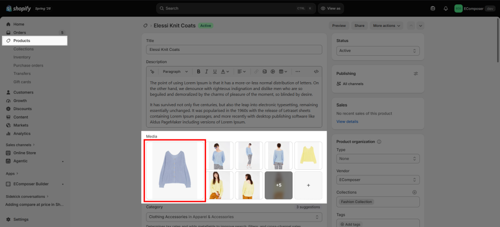
- Show the featured image first: This option will show the first image from your product media in Shopify as a featured image. If you untick this option, the app will show the image of the first variant as a featured image.
- Disable lazyload image: Gives you the ability to disable lazy load for the product images. It will force all images on a webpage to download immediately, rather than loading only when they scroll into view. It could speed up image-heavy sites.
- Enable preload: You can tick this to preload the product grid.
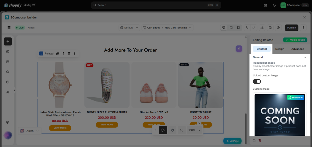
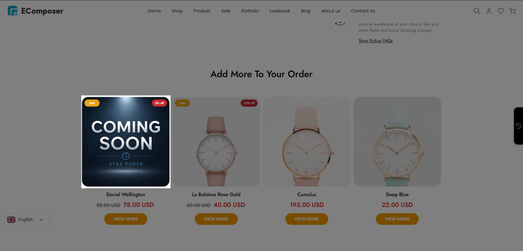
- Placeholder image: This option allows you to select an image to show up as a featured image for products that don’t have an image in Shopify Media.
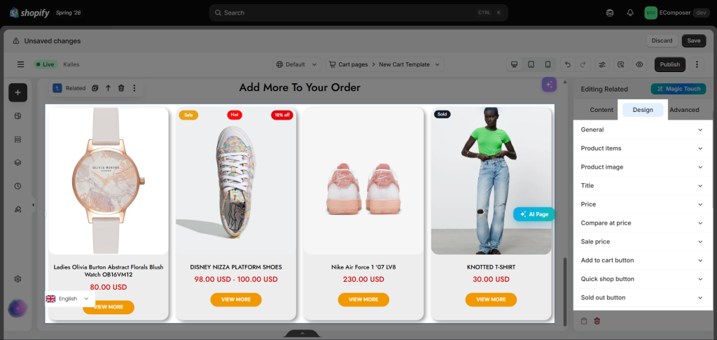
=> Result on the live page:
2. How to Customize the Related Products Layout
There are some other options to configure the layout and style for the Related element:
- Grid Layout: Your product will be shown as a grid of cells. Each item will have a certain space between it.
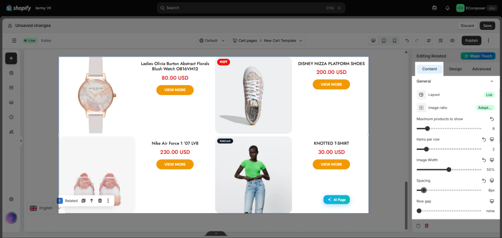
- List Layout: This will be illustrated as a horizontal list of the product.
- Slider Layout: Helps you demonstrate your connected product as a slideshow. There are basic settings for the slide, such as Items per row, Column gap, Navigation, Pagination, or Transition duration. For more details on how to set up the slider, please check out this video:
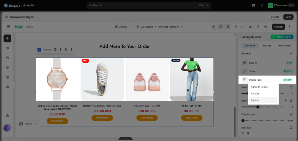
- Image ratio: determines the proportional shape (width-to-height) of the image container, such as Square or Portrait. If you want images with different dimensions to appear consistent and aligned on the storefront, you should set the image ratio here.
3. How to Customize the Related Product Card
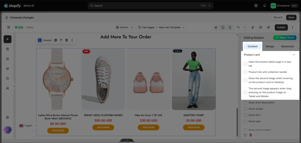
- Open the product detail page in a new tab: Instead of showing the product details page in the current tab, tick this option to open it in a new tab.
- Product link with collection handle: Tick this option to add the collection handle in the product URL after clicking the product from the product grid.
For example: The URL before was https://ecom.myshopify.com/products/plush-jogging-trousers
The URL after is https://ecom.myshopify.com/collections/clothing/products/plush-jogging-trousers - Show the second image when hovering on the product card on Desktop: When hovering on the product, the second product image (if it has any) will be shown.
- The second image appears when long-pressing on the product image on Tablet and Mobile: On tablet and mobile, instead of hovering, customers can long-press on the product page to make it show the second product image (if it has any).
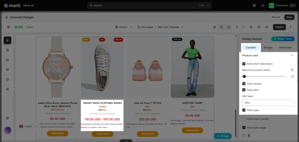
- Product information: We have options available, and you just need to tick the checkboxes to show the short description, vendor, SKU, type, etc.
- Show input quantity: You can use this option to display the quantity selector on the element, to add more than 1 item to the cart.
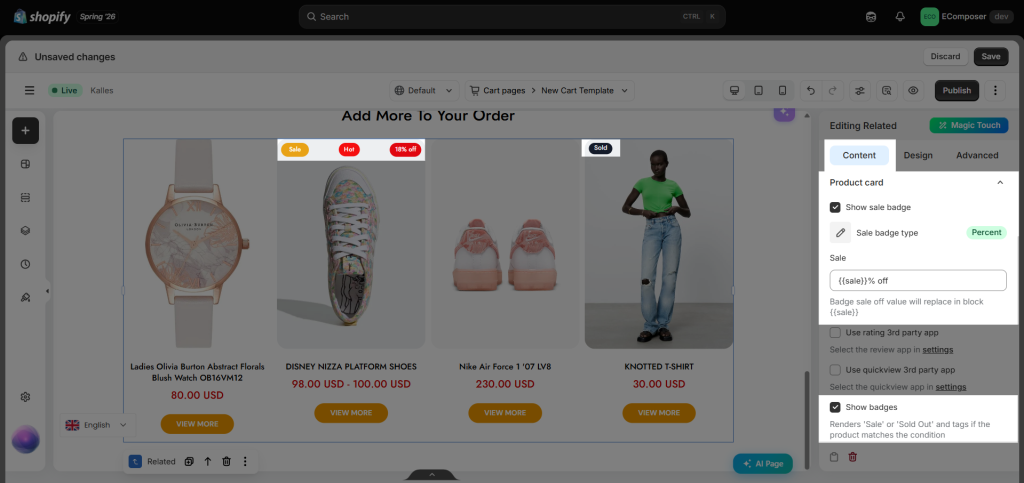
- Badge:
+ Show Sale badge: You can set the badge to show as a percentage or an exact amount, and you can change the text of the badge as well.
+ Show when product contains tags: This is a very nice feature; it helps you to display custom labels on product items through product tags.
+ Display badge via metafield: To show a dynamic badge per product, please check out the Metafield badge guide here.
4. Show/hide Rating, Quickview, Wishlist, and Compare on the Related products
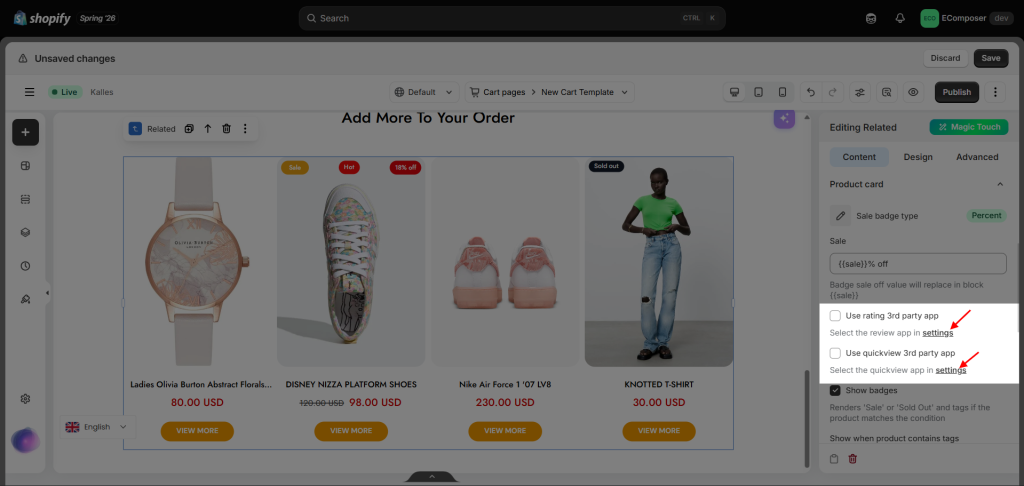
We have some options to show/hide Rating, Quickview, Wishlist, and Compare here. Please click on the “settings” link to open the settings pop-up. You must select an app from our supported app list and install that app from your store to use it.
- Use rating 3rd party app: This is an option to turn ON/ OFF review star icon. You can check the document here
- Use quickview 3rd party app: This is an option to turn ON/ OFF quick view button. We support only the Quickview template built into EComposer. You can check its document here.
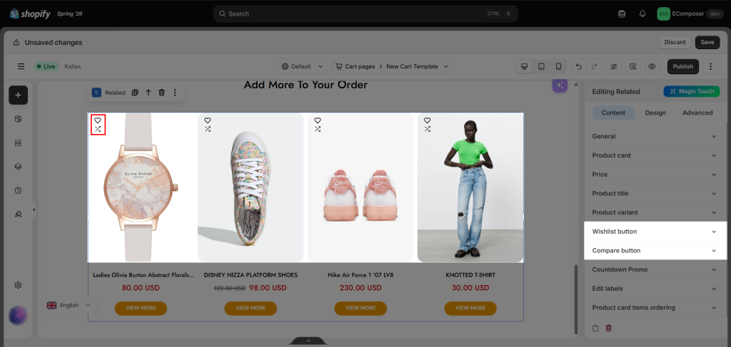
- Wishlist app: This is an option to turn the wishlist icon on/off on the Product card. You can check out the guide for the EC built-in Wishlist extension here. Or install supported wishlist apps such as Growave, Wishify, and Wishlist Hero.
- Compare extension: This is an option to turn the Compare icon ON/OFF; you can check the documentation here.
5. How to Configure Product Price Display
We have some options to configure for the Price on the Related products here.
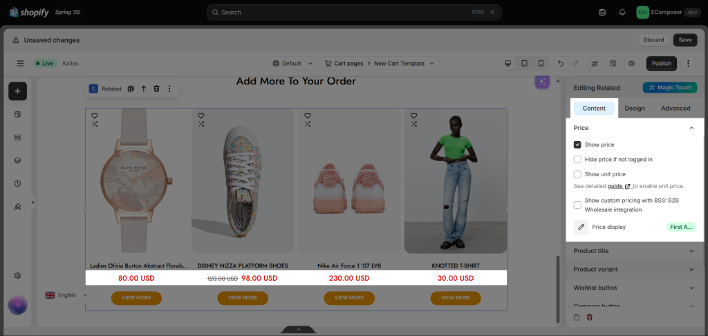
- Show price: You can show the price or not.
- Hide price if not logged in: If you only want to show prices to customers who already have an account, this option will help you do that.
- Show notice login to see price: If you hide the price for Guests, you can show text here to guide what they need to do to view the price.
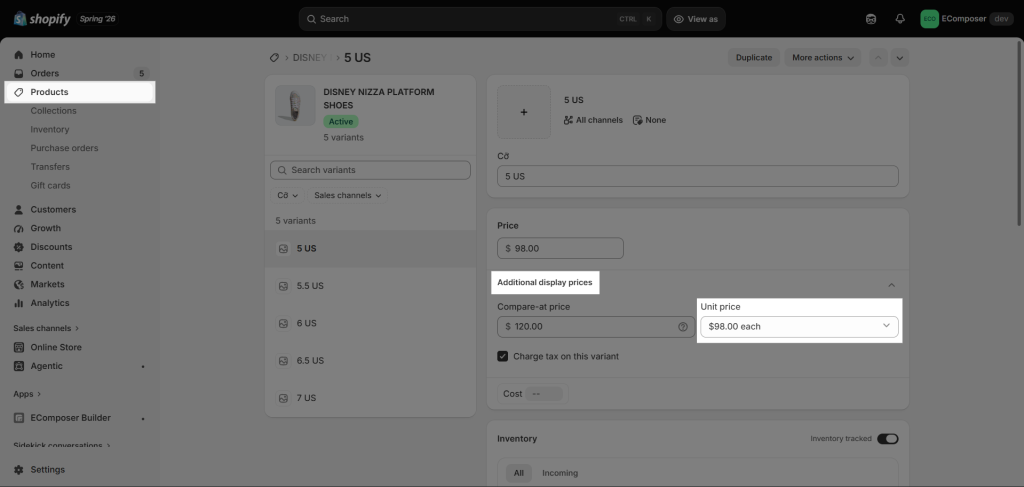
- Show unit price: If you sell products in quantities or measurements, then you might need to display the price per unit for certain products. When you enter a unit price for a product, the unit price is displayed on the product pages, collection pages, cart page, checkout pages, and order confirmation notifications.
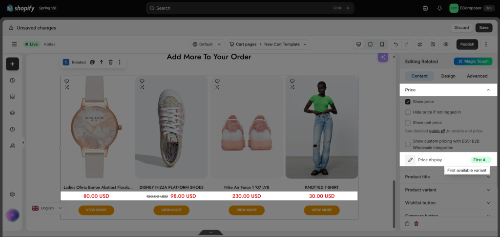
- First available variant: Display the price of the available variant of that item.
- Price display: Price min – max: Display the product’s top and lowest prices based on all variants.
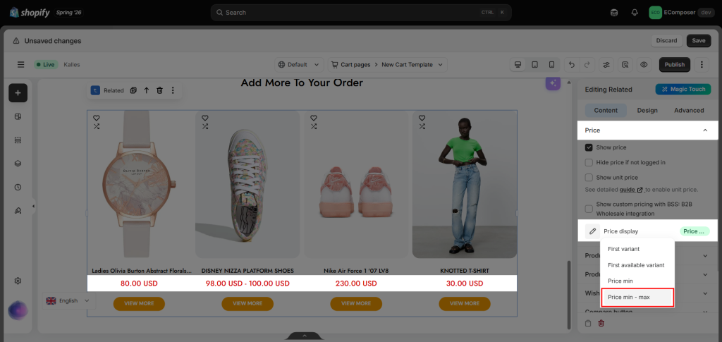
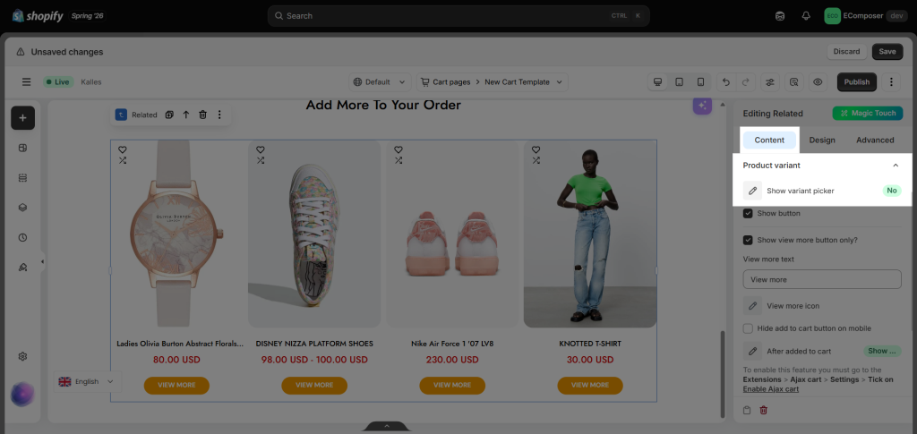
Note: The Price min-max option will only appear if the Show variant picker is No.
6. How to Configure Product Title Display
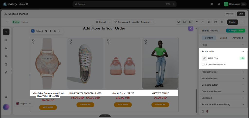
- HTML tag: For SEO optimization, you can modify which heading tag represents the product titles.
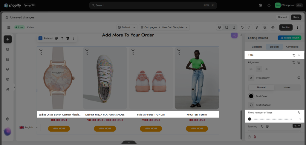
- Fixed number of lines: If the product title is longer than a specific number of lines, the extra text will be hidden and usually shown with… This helps product cards look cleaner and more consistent.
7. How to Configure Product Variant Display
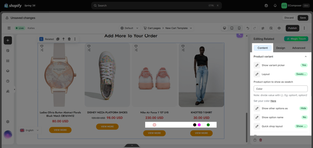
To enable this Variant Picker on the product cards, please choose “Yes”. You can learn more details about Variant settings here.
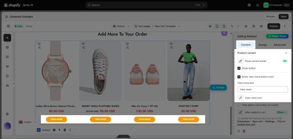
Choose “No” to hide the variant picker if you do not want customers to select a variant in this section. In this case, you should enable the View More button so customers can be redirected to the product page, where they can select a variant and add the product to the cart.
Note: You can simply delete the Add to cart text label to remove the Add to cart button.
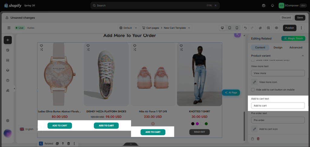
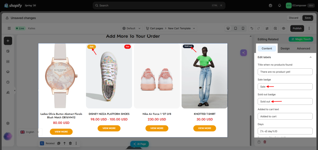
8. How to Edit Labels and Text
You’re allowed to change the text or any flexible word of the Title when no products are found, Sale badge, Sold badge, Added to cart text, Days, Hours, Minutes, Seconds.
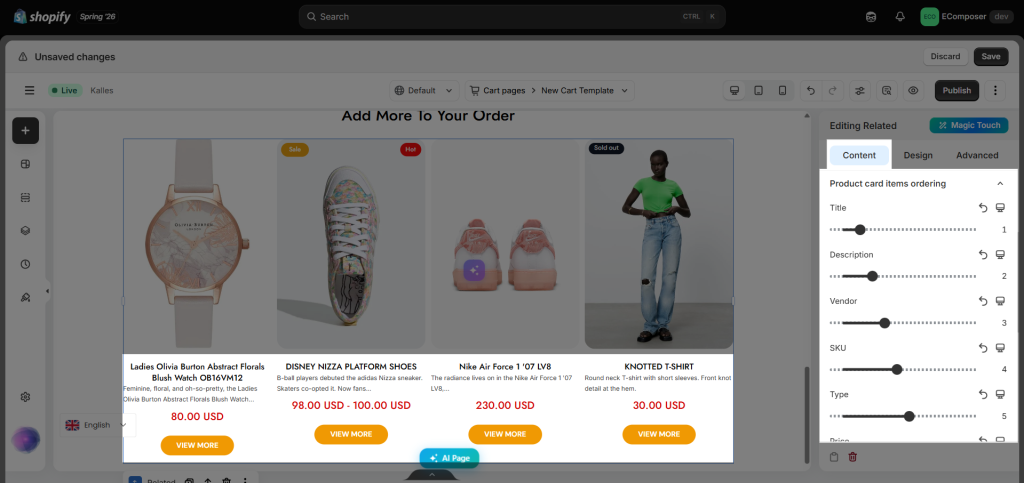
9. How to Reorder Product Card Items
Those features are some of the most important functions that connect with our description, known as Title, Description, Vendor, SKU, Type, Price, Button action, Review, Variant form, Countdown, and Login to see price.
10. How to style the Related element
The Design tab is organized into multiple categories, allowing you to customize the appearance of each part of the Related Products element, including typography, alignment, dimensions, colors, spacing, borders, border radius, box shadows, and other styling options.
- General: Overall element styling (background, border, border radius, box shadow, hover state, and spacing).
- Product Items: Product card styling.
- Product Image: Product image styling.
- Title: Product title styling.
- Price, Compared At Price, Sale Price: Price styling.
- Add to Cart Button, Quick Shop Button, Sold Out Button, View More Button: Button styling.
- Sale Price Badge, Sale Badge, Sold Out Badge, Custom Badge: Badge styling.
- Countdown General, Countdown Title, Countdown Items, Countdown Number, Countdown Label: Countdown timer styling.
- Progress Bar, Progress Bar Text: Progress bar styling.