What is recommended image size on EComposer page?
While building the page, you may have a question what is the image size you should use? This article answers your question :)
1. With the pre-build template of EComposer
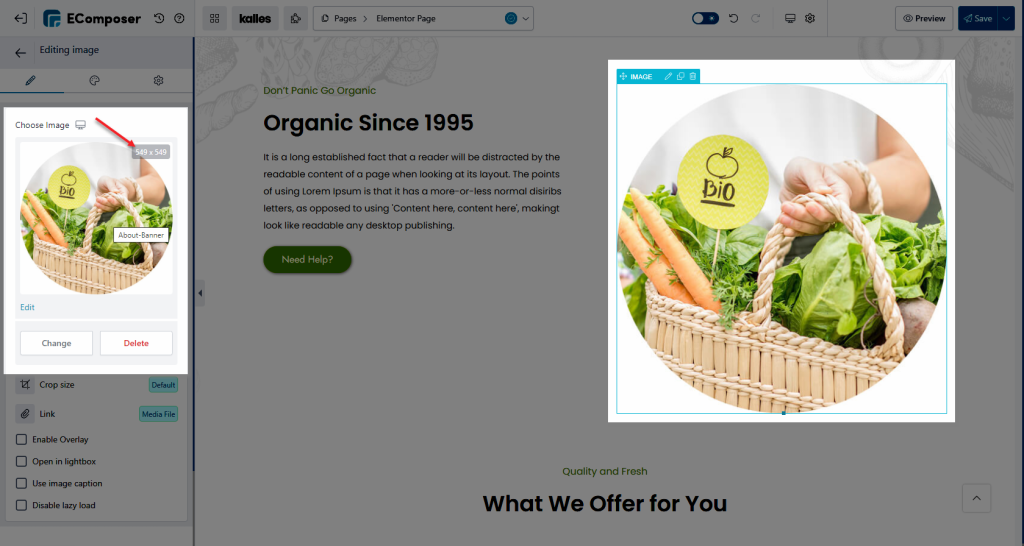
If you create your page by using the templates from our library, you can open the Image settings and then hover over the Choose Image option to see the image size. For example, the below image is an Image element, the image size is 549x549px.
With the Background image, you can open the Section, Inner row, or Column setting to see the default background image. In the below image, the size is 1920×600.
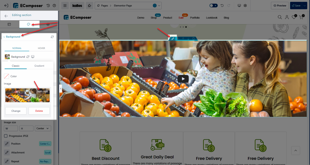
Note: You can use different image size but to make the image looks good, please use the image with the same ratio as the default image.
2. With the custom section
If you create a new page from scratch, it will be difficult to give exact dimensions to the elements. Because maybe you want this but other customers don’t want that. Or for example, you want to create a section with two images but another customer wants it to have three images. That’s why we can’t put the recommended size in every element, as you know you can customize everything and every customer’s needs are different.
The best way to get good-looking images is to pay attention to the proportions of the images. For example, if you want a square image, you can use an image with a ratio of 1:1
- Banner Image: The optimal size for a banner image can vary depending on the theme you are using. However, a commonly suggested size is 1920 pixels wide by 580 pixels tall. It’s best to refer to your specific theme’s documentation or settings for the recommended banner image size.
- Product Image: For product images, it is generally recommended to use high-resolution images to provide the best viewing experience for customers. Shopify automatically resizes images to fit the theme’s design, but it’s advisable to upload images with a minimum resolution of 1024 pixels wide by 1024 pixels tall. This ensures that your product images appear clear and sharp on various devices.
- Single Image: When adding a single image within your store, such as a promotional graphic or a standalone visual element, the recommended size can vary based on its purpose and placement. It’s often helpful to consider the space where the image will be displayed and choose dimensions that best fit that area. If the image is intended to be a standard size across your store, you can aim for dimensions like 1200 pixels wide by 800 pixels tall or adjust it according to your specific requirements.
- Remember, it’s always a good practice to optimize your images by compressing them without compromising too much on quality. This helps improve your store’s loading speed and overall performance.

