Icon List
This section will help you build your list of icons with smooth animation. It’s considered one of the outstanding elements to optimize your page’s content with just a few simple steps.
1. How to add an icon list element
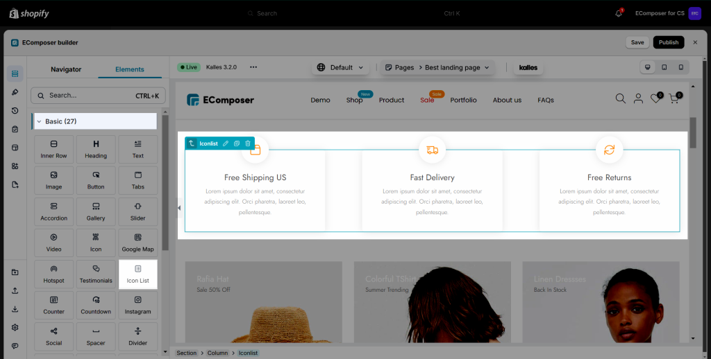
To configure Icon List, you can go to: Elements -> Basic -> Drag the Elementor named Icon List to the position that you want.
2. How to configure the icon list element
2.1. Content
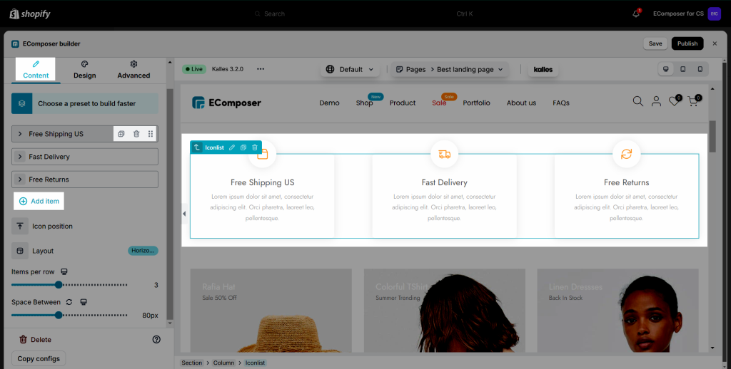
Item Settings

- Icon: Choose an icon for the icon list. You can choose our free icon or upload your icon.
- Label: Add a label to emphasize your icon.
- Description: Enter the content for the description.
- Enable custom link: This option allows you to add a link to the icon item.
General settings
- Icon position: A flexible option that allows you to choose where to put the Icon (to the left, top, bottom or right).
- Layout: This allows you to choose a layout for the icon (Horizontal or Vertical).
- Items per row: This allows you to change the number of icons in a row for desktop, tablet, and mobile devices.
- Space between: This allows you to change the space between icons.
You can add, duplicate, move, and delete the items if you want.
2.2. Design
General
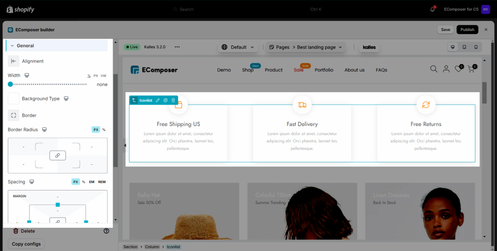
- Alignment: Set the horizontal alignment of the Icon List. It can be left, right aligned or centered.
- Background Type: Set background color or background image for the icon list.
- Border: You can customize the border style for the icon list.
- Border Radius: Define how round the corners of the icon list area are (available for desktop, tablet, and mobile devices).
- Spacing: Set margin or padding value for the icon list (available for desktop, tablet, and mobile devices).
Image
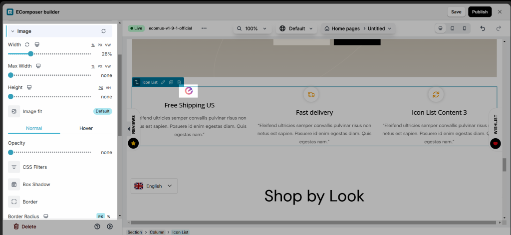
- Width: Set the width of the image. It allows to setting of different widths for each device.
- Max Width: Set the maximum width of the image as a percentage. It allows to set different max-width for each device.
- Height: Set the height of the image. It allows to set different heights for each device.
- Image Fit: Resize the image to fit its container. There are five selections.
- Opacity: Control the opacity of the image.
- CSS Filters: Adjust the image style by changing the CSS Filter scales for Blur, Brightness, Contrast, Saturation, and Hue settings.
- Box Shadow: Adjust box shadow options.
- Border: Select the type of border.
- Border Radius: Set the border radius to control corner roundness. It allows to setting of different border radius for each device.
Icon
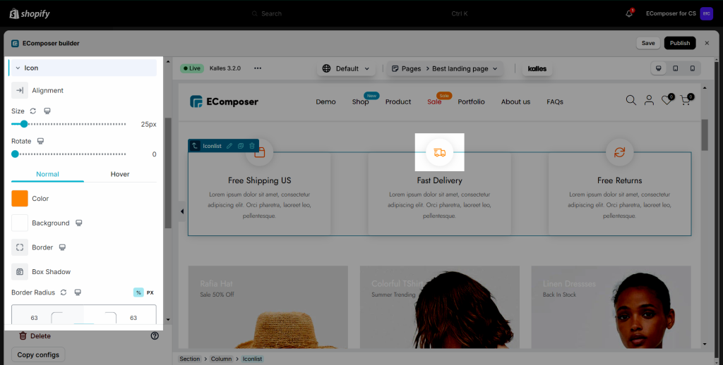
Normal and Hover: You will have the same settings on the Icon with each state of them.
- Size: You can change the size of icons (available for desktop, tablet, and mobile devices).
- Rotate: Set rotation value for icons (available for desktop, tablet, and mobile devices).
- You are also allowed to change Color, Background, Border, and Box Shadow, Border Radius, Spacing for all Normal, Hover.
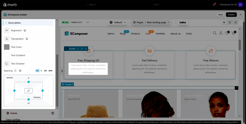
Label
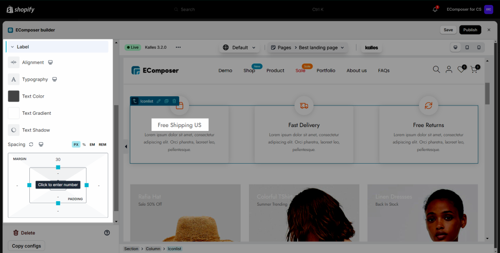
- Alignment: Set the horizontal alignment of the label. It can be left, right aligned or centered…
- Typography: Set the typography options for the label.
- Text Color: Select the color of the label.
- Text Shadow: Add a shadow and blur to the label.
- Spacing: Select the space between the icons.
Description
It includes Alignment, Typography, Text Color, Text Shadow fields that are applicable to text. Alignment and Typography can be set for all devices.