Slider
The Slider element helps you add multiple images or text without page scroll. You can click on left-right arrows to navigate between multiple images/text in the slider. You will probably see a Slider on the homepage of most websites, so it is really important.
With EComposer you can create your own slider, there are so many things that you can do. You can add everything to the slider like text, images or buttons… and you can design each slider a style. In addition, you can also make the entire background image of the slider clickable (this is a very useful function). If you do not how to build a Slider for your website, this article will help you.
To add a Slider element to your page, please drag it from the Basic tab to the position that you want.
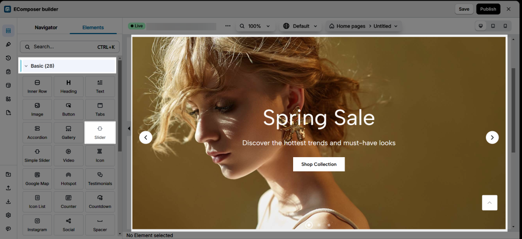
EComposer divides elements into two separate tabs, the Content tab helps you add content to the elements with the element’s settings. The Design tab includes options that allow you to design for that element.
1. Content
1.1. Slides
The Slider element comes with two slides by default, you can click Add new slide to add more slides. Also, you can duplicate (clone), remove or move slides. Please watch the below video.
- Into each slide item tab, you can change the heading (it is the name of the slide and will only appear on the left side of the editor so you can distinguish between the slides), and you can change the background image. Especially, you can add links to background images if you want (this option will make your background image clickable).
- Additionally, you might modify the Image size and Position. Ensure that the image on the slider has the greatest design possible.
- Content width: This option allows you to adjust the width for the Slider element. For example, please drag the progress bar to 100% if you want to have a full-width slider. If you set it to less than 100%, there will be space on either side of the slider. You can set the width for different devices.
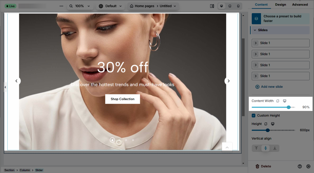
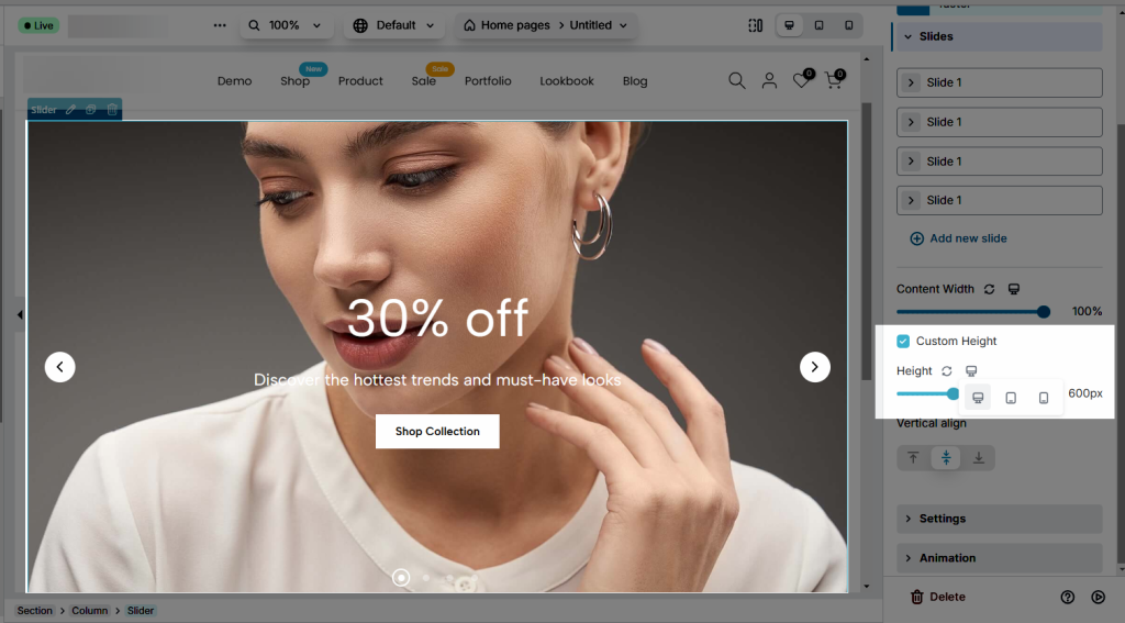
- Custom height: Here you can change the height of the element to make the background image fully visible. And you should set each device to a different size.
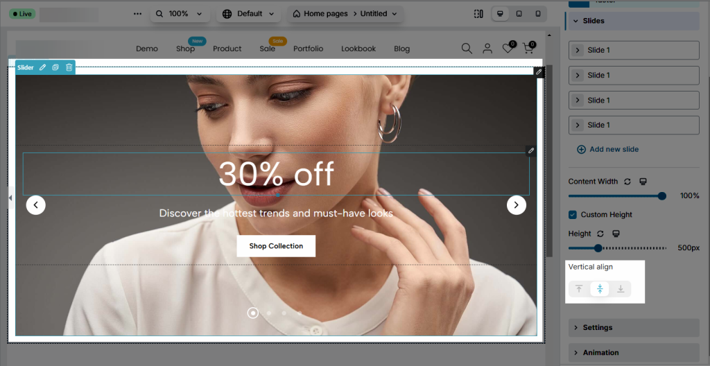
- Vertical align: This option is used to align the position of the content block into the Slider element. You can align it to the top, middle or bottom.
1.2. Slider settings
In this tab there are many options to configure your slider, the option names are easy to understand so you don’t need to worry about them.
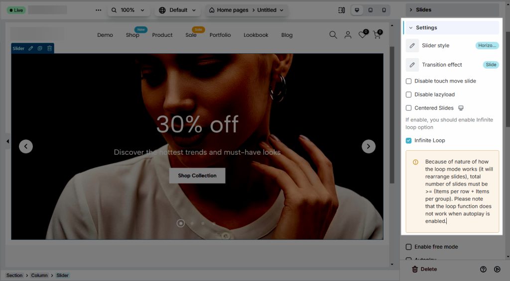
- Slider style: you can choose Vertical or Horizontal style
- Transition effect: When you switch to the next Slider page, the effect for the Slider could be adjusted. Such as Fade, Coverflow, and so on.
- Disable touch move slide: Prevent accidental slides or swipes by disabling touch move gestures
- Disable lazyload: Disable lazy loading to pre-load all images and content immediately.
- Centered Slides: This option will allow you to centre the Slider anytime you move it, but you should also select the Infinite Loop option.
- Infinite Loop: Enable this option to loop your slider again upon reaching the final slide.
Note: Because of nature of how the loop mode works (it will rearrange slides), total number of slides must be >= (Items per row * Items per group * 2)
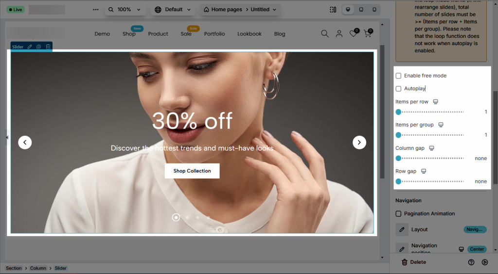
- Activate Free Mode to allow users to scroll or swipe through content naturally without snapping to specific slides or positions
- Autoplay: Enable this option to make your slides automatically advance to the next one. Autoplay works best in conjunction with the Infinite Loop feature. When both functions are enabled, your slides will automatically advance and then loop back to the first slide.
- Items per row: Items per row will display how many Sliders are visible at first glance on 1 row.
- Item per group: When you click the next Slider, items per group will indicate how many Sliders will appear.
- Column gap/Row gap: Set the space between the column or row. These options only work when your slider has more than two columns/rows.
- Navigation: Here you can select the layout and position for the navigation. Additionally, you can change the icon’s appearance for navigation and pagination.
1.3. Animation
Here you can set the animation for the content block in the slider that will appear when the slide advance to the next one.
2. Design
2.1. Design for slides
- Slide animation: We have some available animation options for the slides here, you can select the one you love.
- Background: You can set the background colour for your slides. But this option will work when you don’t use a background image for your slide.
- Border: Set the type of border, choosing from None, Solid, Double, Dotted, Dashed, or Groove. Also, allow editing of the border colour of the slides.
- Border Radius: Set the border-radius to control corner roundness, available for desktop, tablet, and mobile devices.
- Spacing: Set the spacing for the slide, available for desktop, tablet, and mobile devices.
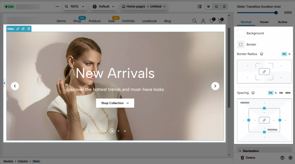
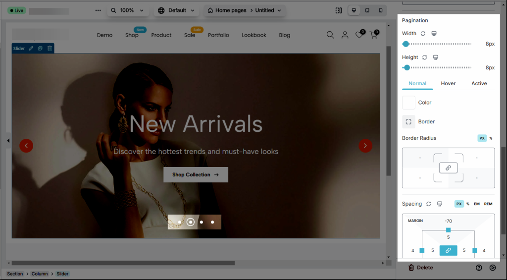
Note: There are NORMAL, HOVER, and ACTIVE. NORMAL is the pagination that you see first when browsing the Slider element. HOVER is the tag you see when you hover on. ACTIVE is your current position as the Slider. You can customize both with different designs.
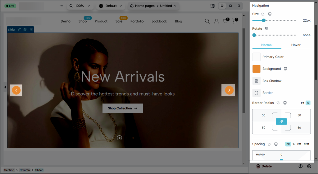
2.2. Design for Navigation
- Navigator: We have options for you to design the navigator however you want. Such as the size, rotate, colour, primary colour background colour, border-radius and spacing
- Pagination: The design options are almost similar to Navigator. You can set the Pagination’s width, height, and more for the Normal/Hover/Active effect.
2.3. Overlay
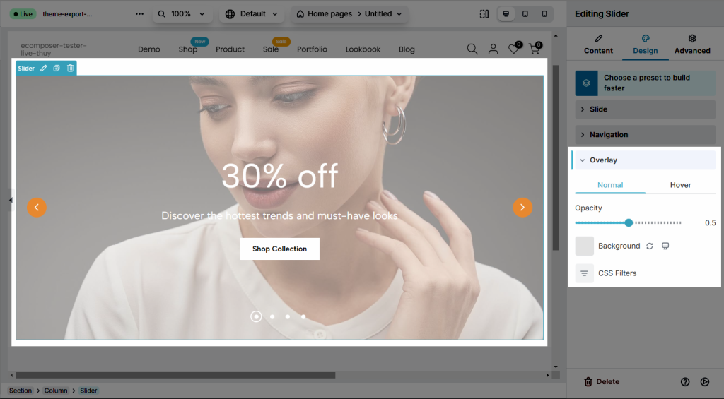
Use overlays to create a layered effect that highlights content while adding a touch of elegance to your design.
- Opacity: Adjust the opacity of elements to create subtle or bold visual effects
- Background: Customize the background with solid colors, gradients, or images to enhance visual appeal and complement your design.
- Apply CSS filters to enhance or modify elements with effects like blur, brightness, grayscale, and more.


2 Comments
Alexander
My slider freezes :(
Autoplay deaktivated
Anna Nguyen
Hi Alexander,
Please contact our support team via live chat. We will help to check and solve it :)