Tabs
A tab layout on a website is a UI pattern that lets users switch between different content sections in the same area without leaving the page. It contains:
Tab titles = the labels users click
Tab panels = the content shown for each label
Active state = the currently selected tab
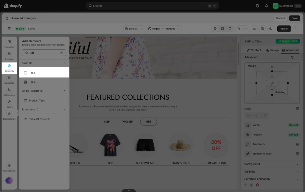
From the left side (Elements tab), you will see the Tabs element in the list of elements. Drag and drop it to any position on the page.

On the right sidebar, you will see all options to adjust this Tab element.

1. How to change the content of the tab
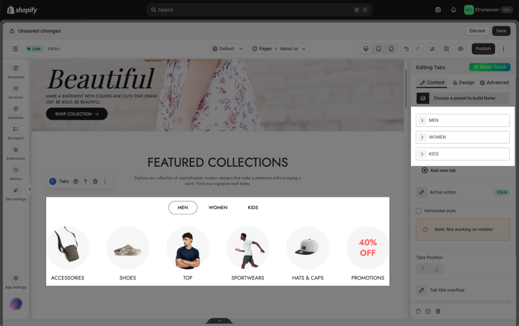
- Women, Men, and Kids are tab buttons that you can edit/add/delete/move between them. When the user clicks Men, the Men content appears, and the other content is hidden. You can drag additional elements for each tab as well. Please follow the video below to learn how to set them up:
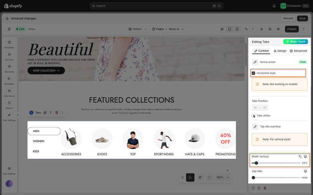
Horizontal style: You can choose this option to change the layout of the tab to horizontal style instead of the vertical mode as the default.
Note: This option doesn’t work on mobile.

2. How to change the design of the tab
You can change the borders, color of tab buttons, adjust the spacing of tab titles, etc. Please follow the video below to learn more about it.
3. How to display Tab titles using Metafield
4. How to use Tab ID


