

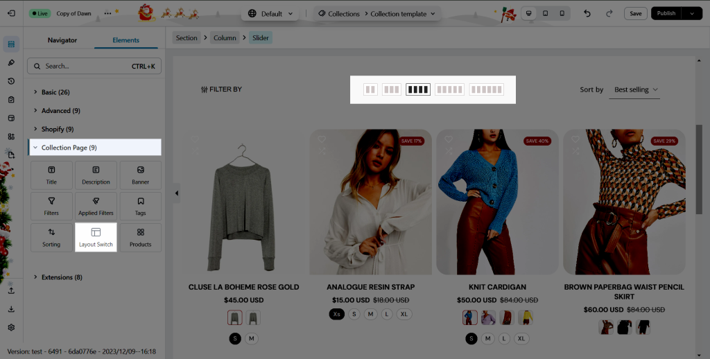
Layout Switch
This element allows users to switch between the Listing Grid layouts on the front end to select the most convenient one.
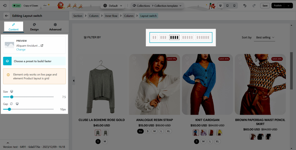
1. Content
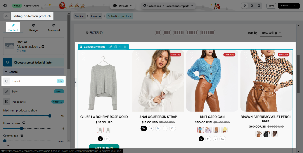
Note: This element only works on live page of the Collection page, and with the Grid layout of the Collection products element.
Under the Content tab of this element, you can change the size and adjust the space between each switcher.
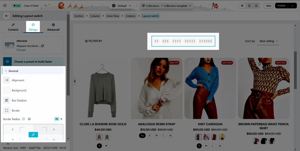
2. Design
2.1. General
You can adjust the Alignment, Background, Box Shadow, Border, Border Radius, and Spacing for the Layout Switch.
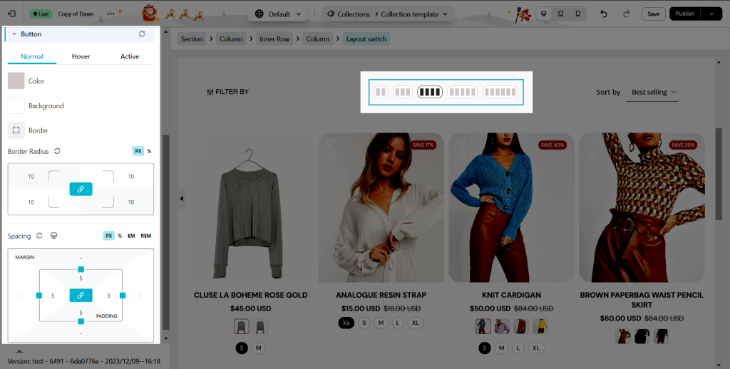
2.2. Button
You can adjust Color, Background, Border, Border Radius and Spacing for the Button on Normal, Hover, and Active mode
This is a result of the live page


