LookBook
Related to the LookBook element, which will demonstrate the Product Information. Each product featured in the LookBook is accompanied by essential information such as product names, descriptions, prices, and available sizes or colours. This helps customers make informed purchasing decisions.
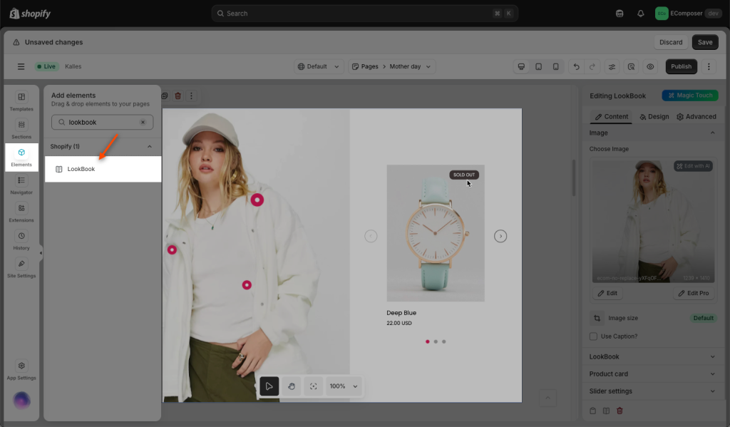
Drag and drop the LookBook element to any position you would like to.

1. Content
Image
- Image: You could utilize the image as the main image, including Editing the image size, or Use the caption as well.

Lookbook
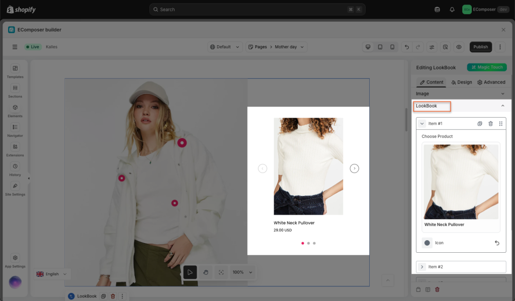
- Item: You can select the Product for each item, as well as the symbol for the LookBook.

- Add item: Simply select the Add item option if you’d like to add more items to the LookBook.
Product Card
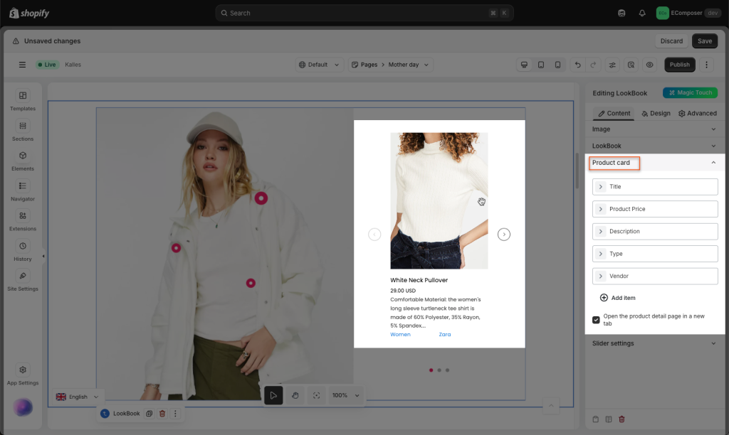
To keep the portion you want to display exclusively, select the condition below. I want to use the Product Title, Price, and Short description, as in the example below.

- Product title: If necessary, you could change the HTML tag by selecting the “Show title on one row” option.
- Product price: For the initial price, you may enter words like “From:…”
- Product type: The text for the Product type title might be set to something like “Type:…”
- Sale value badge: If the product is on sale, you can select a Save badge type like Percent or Amount. Also, you may choose Show on the image if needed.
- Product badge: You can place a badge here, such as a hot or new tag, if that product is on sale and you want to display it.
- Product short description: If you select this option, a short and clear overview could be shown for the user to read. Also, you may set how many words to show as well.
- Use Quickview 3rd party app: Choose this option to enable Quickview if you have any Quickview apps and prefer to use them.
- Open the product detail page in a new tab: By selecting this option, you might force it to open a new tab after clicking on the Product
Slider setting
- Enable free mode: Drap/ drop slider free
- Autoplay: Feel free to select Autoplay in the setting, if you want the auto-play effect
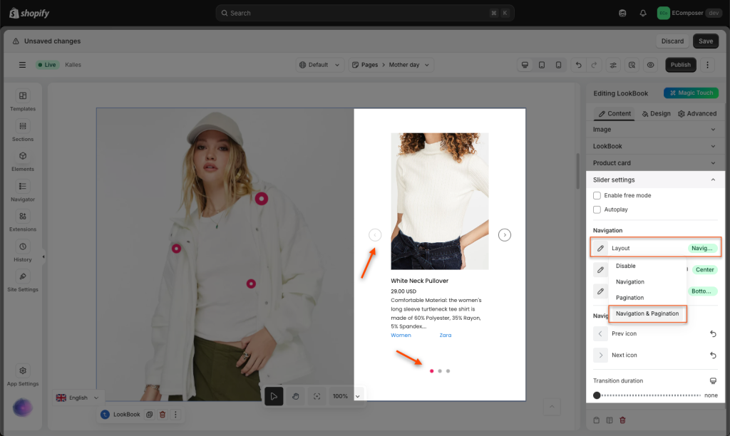
- Navigation: In order to use the Slider, you can either select the Navigation or the Pagination. The position for that can then be selected.
- Transition: You can control when you transition to the following slide by using this option.

2. Design
How to adjust the Lookbook Pins?
You can follow this video below to learn how to Add more pins/ Move pins/ Change pin color


