Masonry
The Masonry Layout is one of the basic elements and plays an important role in your sales page. It is used to display multiple images. Let’s go through all the settings you can control for this element.
1. Add Masonry Layout
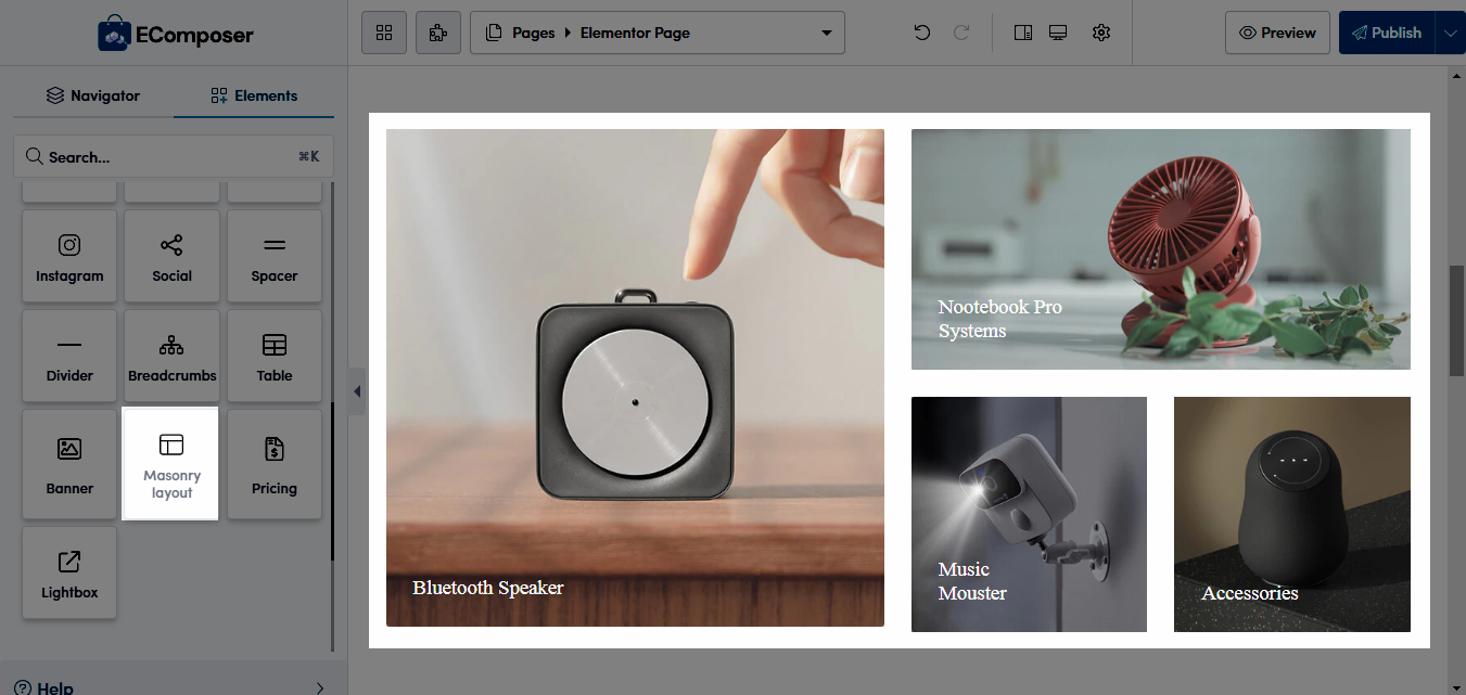
From the Basic tab, you can drag and drop the Masonry Layout element to wherever you want it to stay.

2. Configure Masonry Layout
2.1. Content
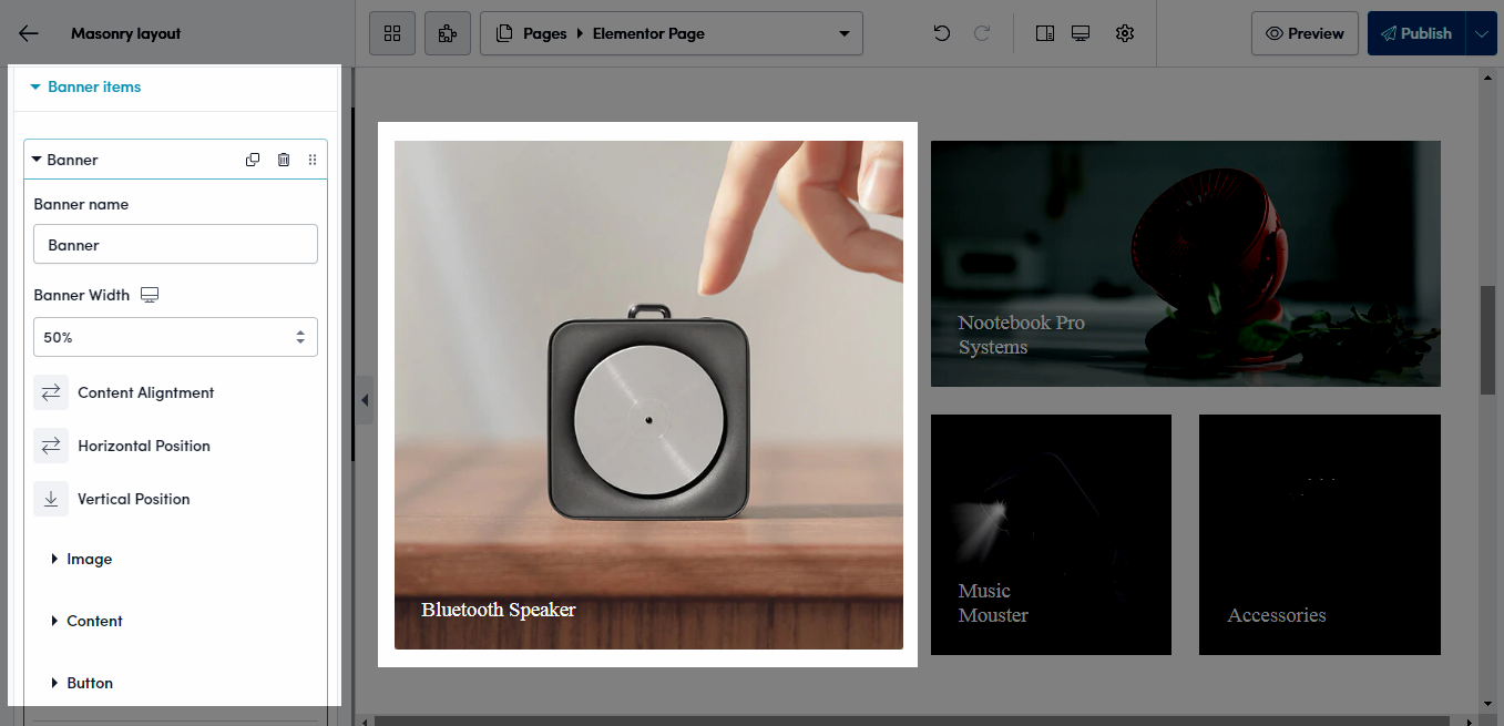
Banner Items

- Banner Name: Enter the name for banner.
- Banner Width: Choose the width for the banner here.
- Content Alignment: This option will arrange the content of the element. Example: Align left, Align center, Align right.
- Vertical Position: Allows you to align the position of the content block into the Banner. You can align it to the top, middle or bottom.
- Image: You can upload your image or use an image from the library. And input the image link for the banner.
- Content: It includes Heading, Sub heading and Content fields that are applicable to content.
- Button: It includes Button Label, Button Link and Button ID fields that are applicable to button.
Settings
- Disable lazyload: refers to turning off the mechanism that defers the loading of images until they are needed, ensuring all content loads immediately when the page is rendered.
- Display content when hover image: Instead of always displaying content on the image, now you can hover over the image to view content.
- View in lightbox: You can turn the image on the lightbox to see the image more clearly.
- Enable Overlay: Tick on this checkbox to enable overlay for the banner.
- Hover Animation: Choose animation for the banner when hovering here. We have more than 10 animation styles.
- Transition: Allows you to set the transition duration of the border when hovering.
You can add, duplicate, move, and delete the items if you want. Please follow this video below to understand its details:
2.2. Design
General
Spacing: Set margin or padding value for the banner (available for desktop, tablet, and mobile devices).
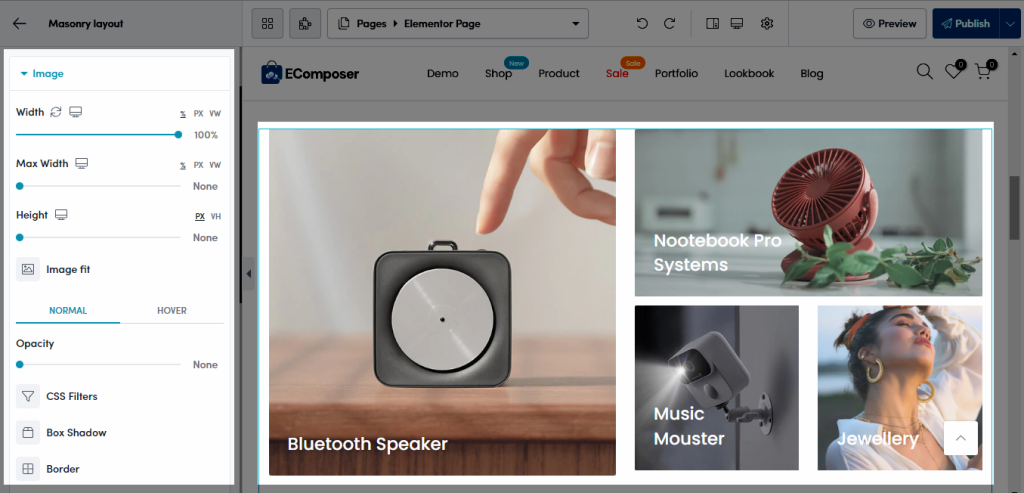
Image

- Width: Set the width of the image. It allows to set different width for each device.
- Max Width: Set the maximum width of the image as a percentage. It allows to set different max-width for each device.
- Height: Set the height of image. It allows to set different height for each device.
- Image Fit: Resize the image to fit its container. There are five selections.
You can use different below styles between normal and hover state.
- Opacity: Control the opacity of the image.
- CSS Filters: Adjust the image style by changing the CSS Filter scales for Blur, Brightness, Contrast, Saturation, and Hue settings.
- Box Shadow: Adjust box shadow options.
- Border: Select the type of border.
- Border Radius: Set the border radius to control corner roundness. It allows to set different border radius for each device.
Heading, Sub Heading and Content
- Alignment: Set the horizontal alignment of the label. It can be left, right aligned or centered…
- Typography: Set the typography options for the heading, sub heading, content.
- Text Color: Select the color of the heading, sub heading, content.
- Text Shadow: Add a shadow and blur to the heading, sub heading, content.
- Spacing: Select the space between the icons.
Button
- Typography: Set the typography options for the button.
- Text Shadow: Choose a color > Adjust the position of Shadow using Horizontal and Vertical attribute.
- Box Shadow: Set the shadow for the button content.
- Also, you can set effect for button when Hover over it: You can set up Width, Text color, Background, Border, Border Radius, Spacing as normal and set an Hover Animation and also Transition Duration. These settings are only applied when hovering.
The button is only visible to you if you input content for Button Label and Button Link in Banner Item from Content
You can follow this video below to understand Masonry Layout details:


