Hotspot
What do you know about Hotspot? Let’s figure it out with the EComposer App.
The purpose for us using the Image Hotspots element and add interactive areas on top of your images which is useful for cross-selling products. You can take photos of multiple items at once and link to each one. This approach will also encourage your users to experiment with different combinations of your products. You can send across a message to your customer like how to wear a jacket with a skirt and shoes, for example.
1. Adding Hotspot
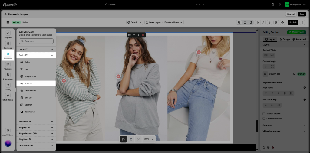
- Click into Elements –> Basic –> Hotspot
- Drag the Hotspot element from the left sidebar and Drop it wherever you want it to stay.

2. Configure Hotspot
2.1. Content
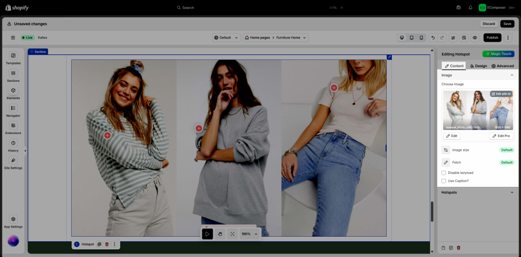
Image Setting
- Choose image: Allow you to change another image by Uploading it or using Free Images (Be attention, please click on the “Select” button after you finish it)
- Image Size: Let you edit the size of the picture that you choose before.
- Fetch: helps browsers prioritize resource loading. There are 3 options: Auto, Low, High.
- Disable lazy load: By disabling lazy loading, all images or media files load instantly when a page is accessed
- Use Caption: This option helps you create a small title below the picture, letting the reader can be easier to understand the image.

Hotspot
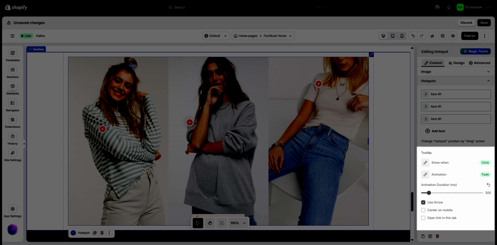
- You can either duplicate, remove or change the hotspot position:
- When you go on Item, you can set lots of fun things such as:
- Source: Let you change the photo, even the source of the product location such as turning it from Product to Image to upload the one belonging to you.
- Icon: Help you select another icon to replace as a mark for example on the image.
- Custom text: When you click the “Custom Text” option, the Label option will show up and may help you add the name next to the icon.
- Text, Content, Link Text: This one will let you create the script of the product post.
- Tooltip Slide: This function makes you change the item position when you hover it like Right, Left, Top, or Bottom.
- Link Text: Let you create a couple of words for your customer to click on it (For example View here, Buy now, More details,…).
- Link Button: Let you add the link for your customer after clicking it, and go on the setting next to change the special option like open that link in the new window,…
- Show when: You can set your picture will show up with a Click or just need to Hover to view.
- Animation: This function will help you choose the way that the photo will be shown, run smoothly as a Slide, or show immediately as a Fade.
- Use Arrow: Create a seamless navigation experience by adding arrow hotspots to your design.
- Center on mobile: Centering elements on mobile devices is key to delivering a professional and user-friendly design that adapts seamlessly to smaller screens.
- Open link in this tab: Configure links to open in the same browser tab.

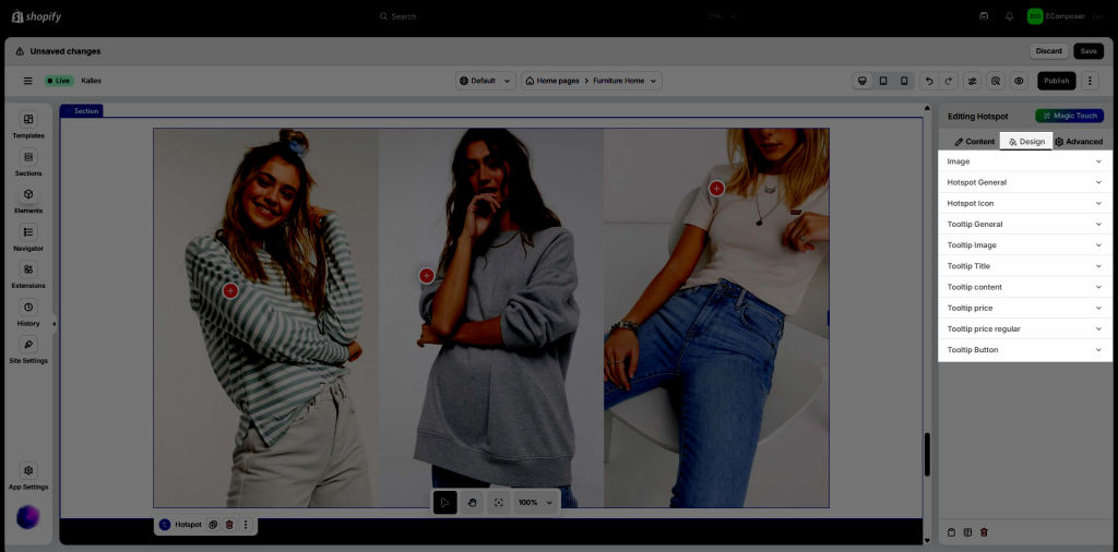
2.2. Change things with “Design”

- Image: Allows you to change Width/Height/Hover’s effect, and so on.
- Normal and Hover: You can set the Opacity, CSS Filter, Box Shadow, Border, and Border Radius.
- Hotspot General: you may change the background color of the icon when you have a movement on it.
- Includes many fun things to set up such as Hotspot Icon, Tooltip General, Tooltip Image, Tooltip Title, Tooltip Content, Tooltip Price, and Tooltip Button.


