

Image
The Image element is part of the Basic Elements in EComposer. It allows you to add and display a single image anywhere on your page. In this guide, you’ll learn how to add the Image element and customize its settings to fit your design.
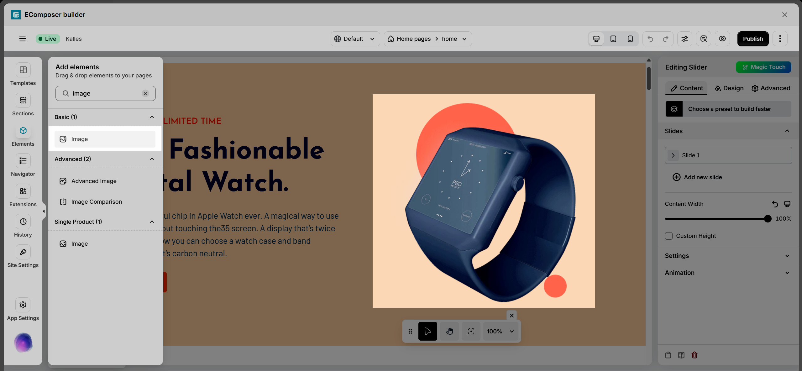
1. Add image
From the Basic tab, drag and drop the Image element to any position on the page.
2. Configure image
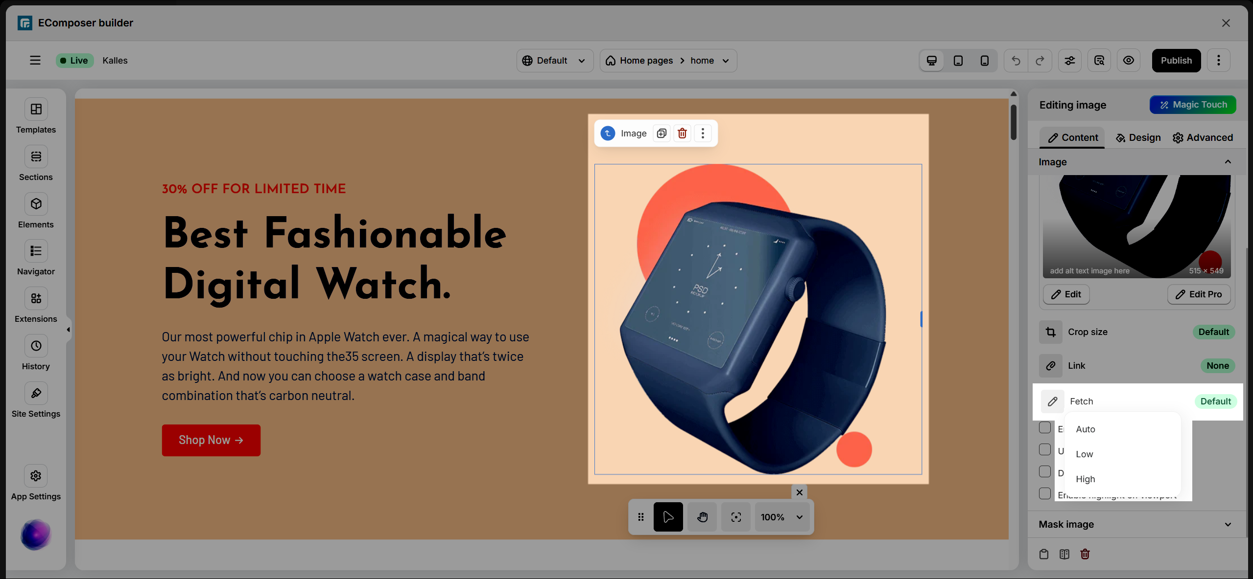
2.1. Content
Choose image: Upload an image from your device or select one from the media library. You can also set different images for each device, including desktop, tablet, and mobile, to ensure the best display across screen sizes.
- Edit: Click Edit on the image to access additional settings. Here, you can preview the image, update the alt text to improve accessibility and SEO, and adjust the focal point to control which part of the image remains visible when the image is resized.
Note: The Focal Point option only works when Image fit is set to Cover. It will not apply if you use the Crop size option. - Edit pro: This feature is available on the Pro and Premium plans only. For more details, please refer to the related documentation.
Crop size: The Crop size setting allows you to control the display size of the image. There are four preset size options available to choose from.
Link: Choose how the image should be linked. You can link it to None, Media File, or a Custom URL.
- None: When selected, the image will not have any link and will not be clickable.
- Media File: When selected, you can click on the image to open and view the image file.
- Custom URL: Enter a URL to link the image to another page, or click the icon to select a dynamic URL (such as a Post URL).
Fetch: Select how the image should be loaded and displayed.
- Auto Mode: Automatically adjusts image quality based on the user’s network speed and device.
- Low Mode: Uses a lower resolution to help images load faster while keeping essential details.
- High Mode: Displays images in higher resolution for better clarity and sharper visuals.
Enable Overlay: Allows you to add an overlay layer on the image with text. The text can be taken from the image alt text or entered as a custom text.
Use image caption: Add a caption that will be displayed below the image.
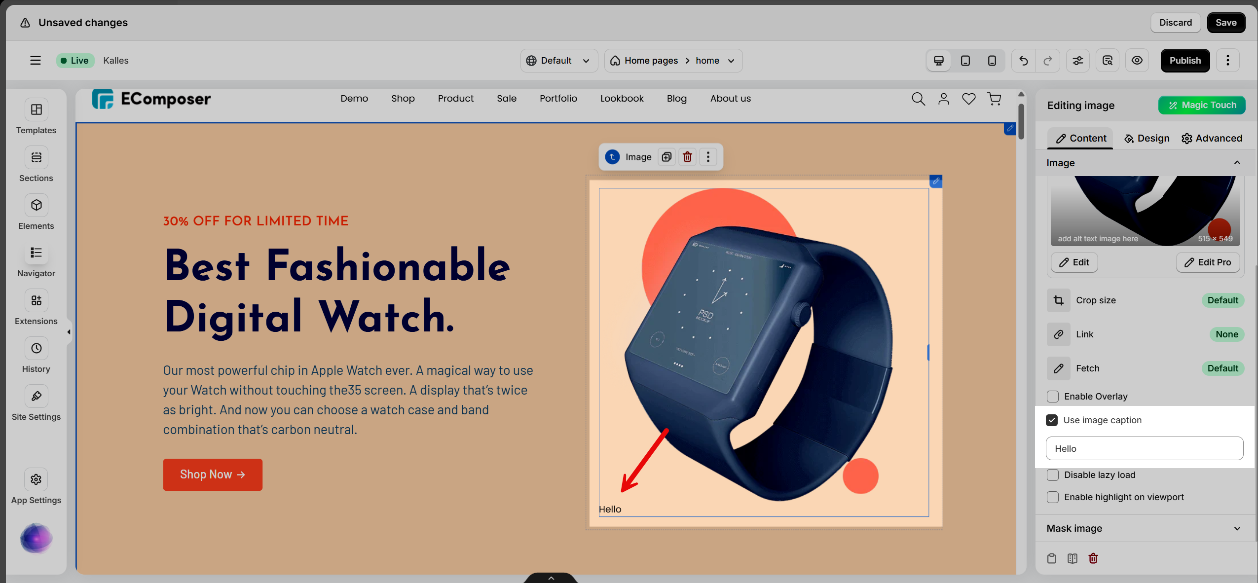
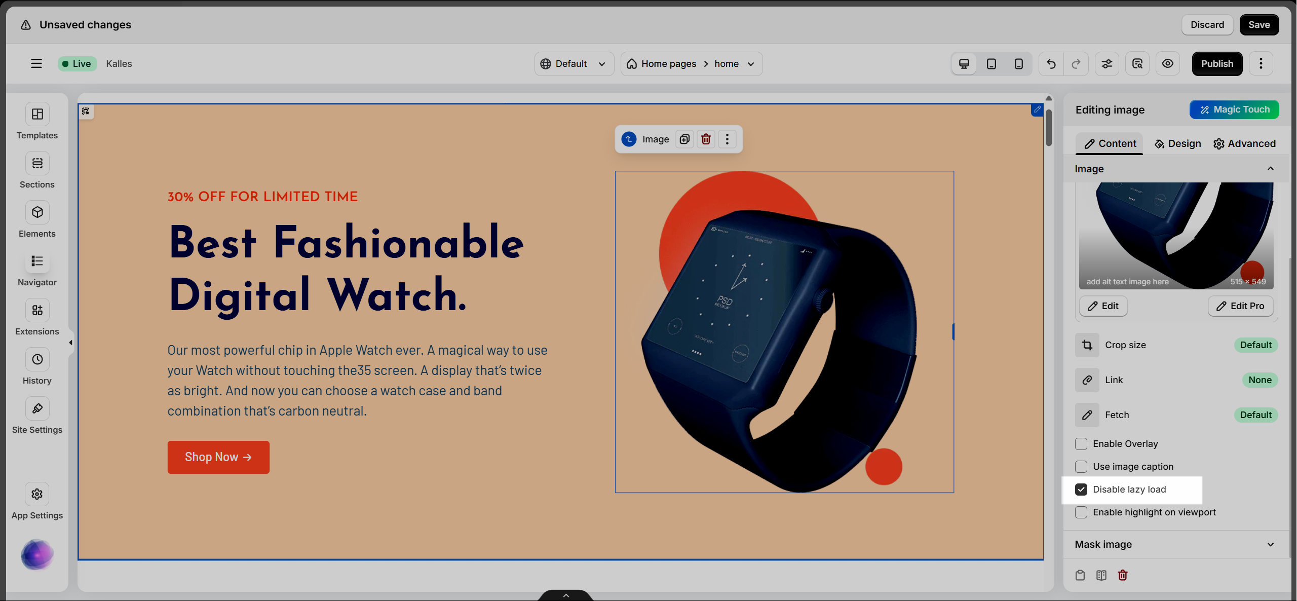
Disable lazy load: Enable this option if you do not want the image to use lazy loading.
Enable highlight on viewport: When enabled, the image will be highlighted as it enters the viewport while scrolling.
2.2. Design
Image:
There are two ways to resize the image: the first is to use the adjustment slider , and the second is to use the resize icon on the image .
- Alignment: Align the image to the left, center, or right. It allows you to set different positions for each device.
- Width: Set the width of the image. It allows you to define different widths for each device.
- Max Width: Set the maximum width of the image as a percentage. It allows you to define different max-width values for each device.
- Height: Set the height of the image. It allows you to set different heights for each device.
- Image Fit: Resize the image to fit its container. There are five available options.
You can use different below styles between normal and hover state.
- Opacity: Control the opacity of the image.
- CSS Filters: Adjust the image appearance using CSS filters such as Blur, Brightness, Contrast, Saturation, and Hue.
- Box Shadow: Customize the box shadow settings.
- Border: Select the border style.
- Border Radius: Set the border radius to control corner roundness. It allows you to define different border radius values for each device.
Hover Tab: The settings in this tab are applied when users hover over the element.
- Animation: When a user hovers over an image, it can scale (grow/shrink) or rotate, creating an interactive effect and enhancing the user experience.
- Transition Durations: Specifies how long the transition effect takes (in milliseconds). It allows smooth changes between states when hovering.
Caption
This tab is only visible when the “Use image caption” option is enabled in the Content tab.
- Alignment: Set the alignment of the caption.
- Typography: Configure typography settings for the caption text.
- Text Color: Choose the color of the caption text.
- Text Shadow: Add shadow and blur effects to the caption text.
- Spacing: Adjust the space between the image and the caption.
Overlay
This tab is only visible when the Enable Overlay option is enabled in the Content tab.
- Typography: Configure typography settings for the overlay text.
You can apply different styles for the normal and hover states.
- Opacity: Control the opacity of the overlay.
- Text Shadow: Add shadow and blur effects to the overlay text.
- Text Color: Choose the color of the overlay text.
- Background: Select the background color of the overlay.
- CSS Filters: Adjust the image appearance using CSS filters such as Blur, Brightness, Contrast, Saturation, and Hue.
Image Scrolling Highlight
This tab is only visible when the Enable highlight on viewport option is enabled.
- Opacity: Adjust the opacity of the background surrounding the image.


2 Comments
Fay
Is there css or html i can add under attributes on this component to allow a touch on mobile to replicate hover on a desktop
Henry Pham
Hi, could you please contact our team in live chat? our support agent will check it for you
Thank you