Product Accordion
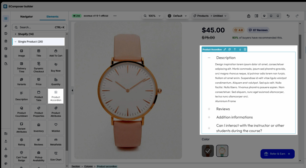
EComposer allows you to add Product Accordion to the product page. There is also an Accordion Tab on Basic Element, however, you should go to Elements > Single Product > Product Accordion to use the special features of Accordion for a product.
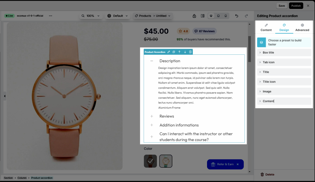
To adjust the content of Product Accordion, please click on the Accordion button on the top of the Element.
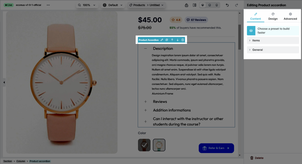
1. Content
1.1. Item
- This is the place where you can add Titles for Accordion, you also can change HTML tags for them. Moreover, you are allowed to Move, Delete, Clone, and Add these items freely. There is a button called Preset at the end, you can click there to paste available accordions, or even only their styles.
- How to configure the content inside? One of the outstanding functions is EComposer allows us to add any reasonable Elements for the content insight. The reasonable Elements mean Basic/ Shopify/ the elements for the page. For example, you can’t add the Collection’s elements to the product page. This is the function that themes can not do.
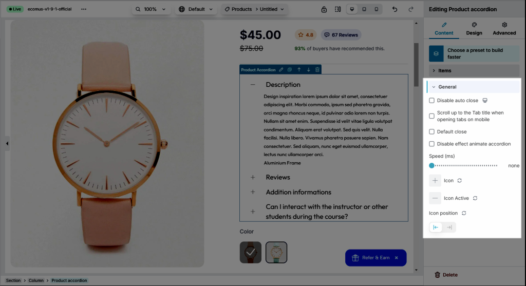
1.2. General
- Disable auto close: Disabling auto close ensures that multiple sections remain open simultaneously, allowing users to view multiple pieces of content without collapsing previous sections.
- Scroll up to the Tab title when opening tabs on mobile
- Default close: This feature keeps all sections or tabs closed by default
- Disable effect animate accordion: This setting disables accordion animations
- Icon: Choose the Icon for the tab title in a non-active mode.
- Icon Active: Choose the Icon of the accordion title in active mode.
- Icon Position: A flexible option that allows you to choose where to put the Icon of the accordion title (to the left or right).
2. Design
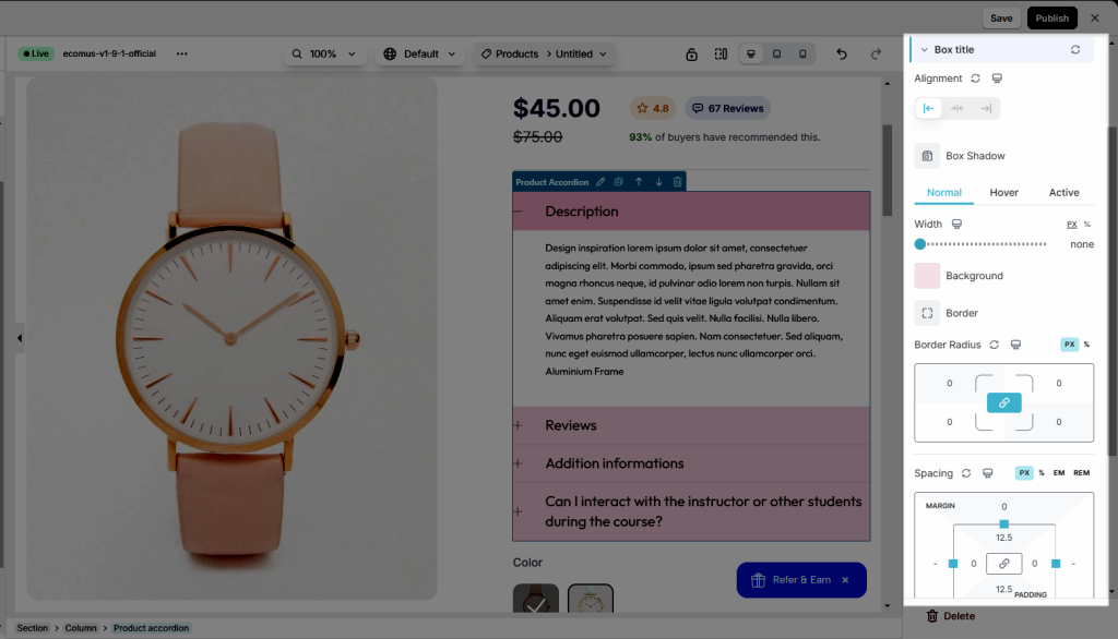
2.1. Box title
- Alignment: Set the position of each accordion title (available for desktop, tablet, and mobile devices).
- Box Shadow: Box shadows add dimension and emphasis to elements
- Width, Background, Border, Border Radius, Spacing: You can freely change these options for the Heading for Normal, Hover, and Active mode.
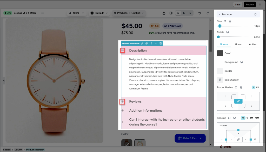
2.2. Tab icon & Title icon
- Adjust Size and Rotate for icon
- Color, Background, Border, Box Shadow, Border Radius, Spacing: You can freely change these options for the Heading for Normal, Hover, and Active modes.
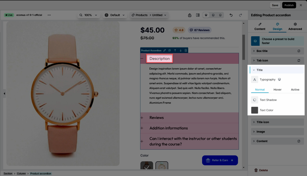
2.3. Title
- Typography: Customize the typo option for you to make.
- Besides, you can also set
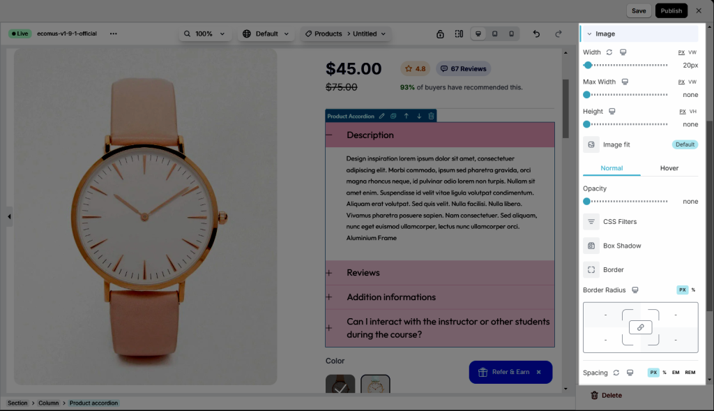
2.4. Image
Config style for Image: Width, Max Width, Height, Image fit, Opacity, CSS Filters, Box Shadow, Border, Border Radius, Spacing
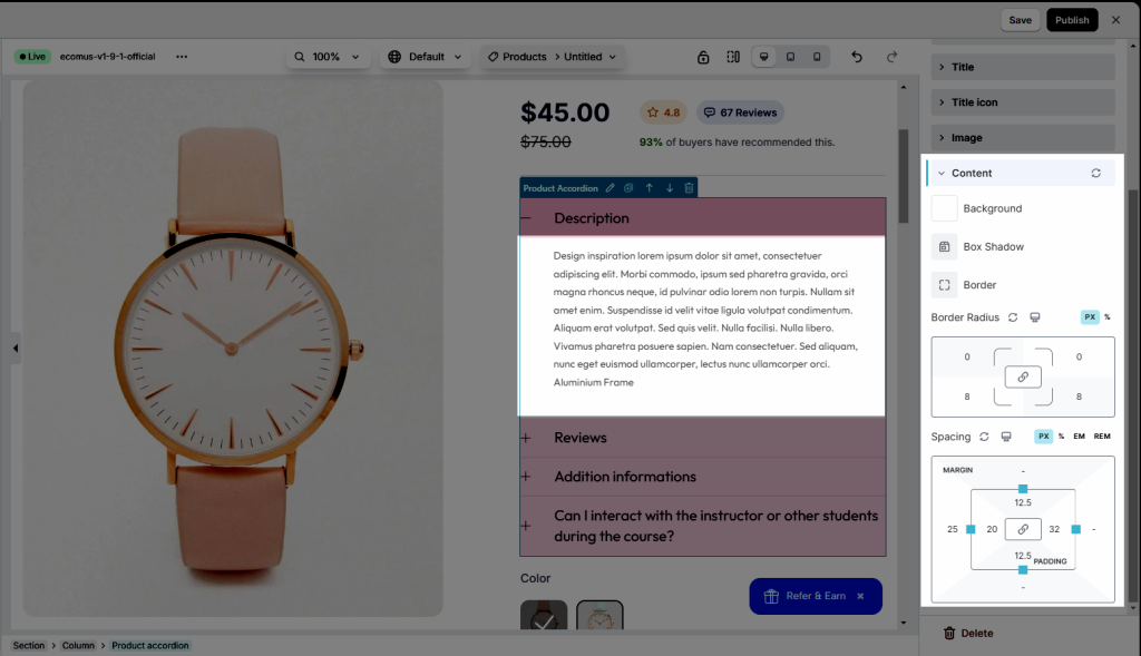
2.6. Content
The same as other elements, you can also change the Background, Box Shadow, Border, Border Radius, and Spacing for the content insight. If you need anymore details about theme, please go here to figure them out!