

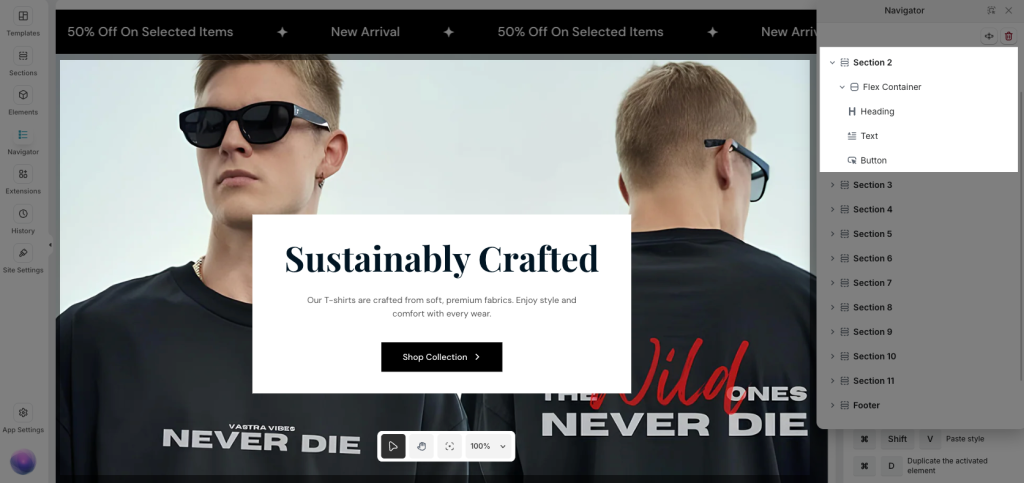
Layout with Flexbox Container
The Flexbox Container in EComposer is a layout element based on CSS Flexbox, designed to give you precise control over alignment, spacing, and ordering of elements inside a section.
It is especially useful when you need:
- More control than a traditional Inner Row
- Flexible horizontal or vertical layouts
- Precise alignment (center, start, end, space-between…)
- Responsive control without creating multiple Inner Rows
In EComposer, the Flexbox Container is the parent, and elements inside it (Text, Image, Button, etc.) are flex items.
When should you use Flex Box?
Flex Box is recommended when you need to:
- Place multiple elements on the same row or column
- Align elements quickly (left, center, right, top, bottom)
- Distribute spacing evenly between items
- Build responsive layouts with minimal setup
- Reduce layout complexity and nested structures
Flexbox Container Settings
To add a Flexbox to your page in EComposer, open your page, go to Add Element → Flex Container, drag & drop the Flex Container element inside a section.
The Flexbox helps you control how elements are arranged inside a container. Because it offers more layout options, it is best suited for users who want more control over positioning and alignment.
Below are the available layout options in Flexbox Container and how each one works.
- Content Width: Defines how wide the content inside the container is.
– Full width: Content spans the entire viewport width
– Boxed: Content is constrained by the theme’s container width
- Content Height: Controls the height of the Flexbox Container.
– Fix to screen: Container fills the viewport height
– Min height: Height adjusts based on content
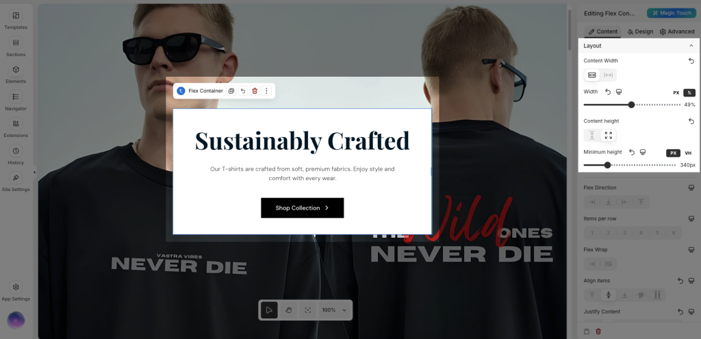
- Flex Direction: This option decides how elements are placed inside the container, in a row or in a column.
– Row(default): Elements are placed side by side, from left to right
– Column: Elements are placed side by side, from right to left
– Row Reverse: Elements are stacked from top to bottom
– Column Reverse: Elements are stacked from bottom to top
- Items per Row: Sets the maximum number of items displayed in a single row (applies when Flex Direction is set to Row).
Example: 3 items per row → Up to 3 elements per row. Extra items will move to the next line when Flex Wrap is enabled
- Flex Wrap: By default, all elements inside a Flex container try to stay on one single line. If there is not enough space, elements may become too small or overflow. Flex Wrap allows you to control whether elements can move to a new line when the container does not have enough space.
– No wrap: All elements stay on one line, even if space is limited
– Wrap: Elements move to a new line when there is not enough space
- Align items: Align Items controls how elements are aligned inside the container on the opposite direction of the layout. In simple terms, it decides how items are positioned vertically when Direction is set to Row, or horizontally when Direction is set to Column.
– Top: Elements are aligned to the beginning of the container
– Middle: Elements are aligned to the center of the container
– Bottom: Elements are aligned to the end of the container
– Base line: Elements align based on their text baseline
– Stretch: Elements stretch to fill the available space
- Justify Content: Controls how items are aligned along the main axis.
– Top: Elements are aligned to the beginning of the container
– Middle: Elements are aligned to the center of the container
– Bottom: Elements are aligned to the end of the container
– Base line: Elements align based on their text baseline
– Stretch: Elements stretch to fill the available space
- Row Gap: adjust vertical spacing between rows.
- Column Gap: adjust horizontal spacing between items
Using Gap provides cleaner and more consistent spacing than margins.
Additional Options
- HTML Tag: Selects the HTML tag used for the container (div, section, article, etc.). This is useful for semantic HTML and SEO optimization.
- Overflow Hidden: Hides any content that overflows outside the container boundaries. Commonly used with animations, effects, or oversized elements.
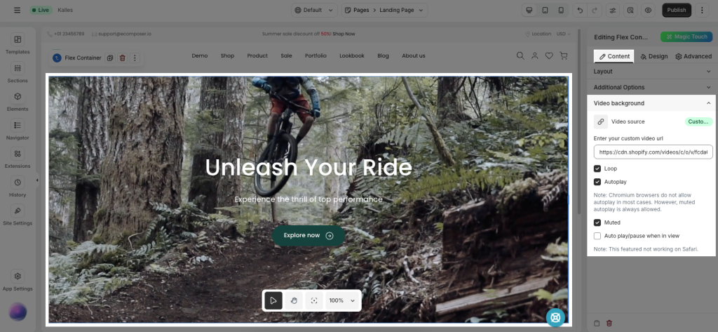
Video Background
Flexbox Container supports video backgrounds for advanced visual sections.
- Video Source: Select the video source based on EComposer’s default settings.
- Loop: Repeats the video continuously.
- Autoplay: Automatically plays the video when the page loads.
Note: Most Chromium-based browsers block autoplay unless the video is muted. - Muted: Mutes the video audio (recommended for autoplay support).
- Auto play/pause when in view: Plays the video when it enters the viewport and pauses when it leaves.
Note: This feature does not work on Safari.
Common cases
Making a Flexbox Section Full Width
In some cases, you may want a Flexbox section to stretch across the entire screen, without any spacing on the left and right sides. This is useful for banners, full-width content blocks, or edge-to-edge layouts.
Step 1: Open the Section/Flexbox container settings. In the Content tab, set the Content Width option to Full width.
Step 2: Go to the Advanced tab and set Padding to 0px.
After applying these settings, the Flexbox section will extend fully across the screen.


