

Heading
The Heading element helps you create clear and visually appealing titles that guide visitors through your page content. With customizable options for font size, color, alignment, and heading levels (H1–H6), it ensures your design matches your brand style while improving readability and SEO structure.
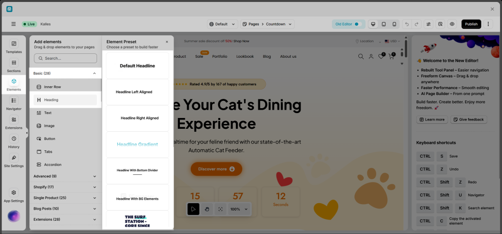
1. How To Access Heading Element
To add the Heading element, please follow these steps:
- Step 1: In Ecomposer Editor, please click on the element.
- Step 2: Click on the “Basic” drop-down to display the basic elements, then select the “Heading” element to display element variations.
- Step 3: Drag and drop your desired “Heading” element variation into the page editor. Now you can start configuring that element.
2. How To Configure For Heading Element
The Heading element gives you plenty of options to design a clear and attractive title for your page.
To get started, just click on the Heading element you’ve added. Then:
- Go to the Content tab to edit the text, choose how it’s aligned, and pick a heading level (H1, H2, H3, etc.).
- Open the Design tab to style your heading — you can change the font size, color, spacing, and more to match your store’s look.
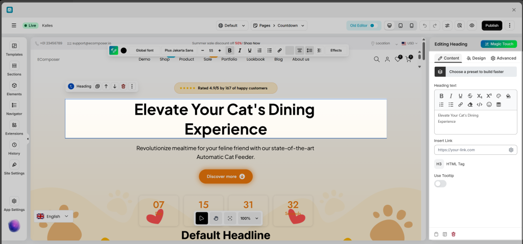
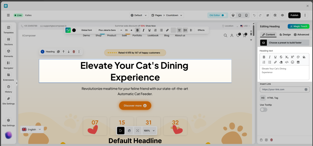
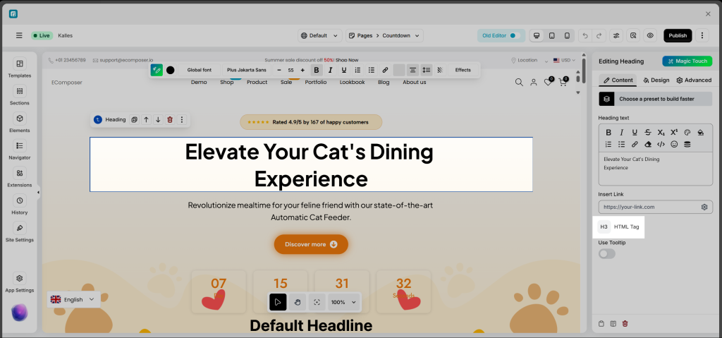
2.1. Content tab
The “Heading text” section allows you to enter and style the main content of your heading on the page.
Here, you can:
- Add the heading content that you want to display.
- Customize the text style (bold, italic, underline, font size, color, alignment, insert links, etc.) to make it stand out and match your store’s branding.
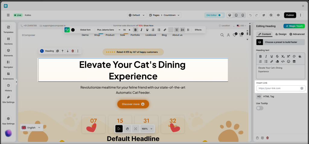
- Insert Link: Configure a link for the entire heading. You can either paste the URL directly here or click the settings icon to access advanced options:
– Link: Enter a custom URL or select one from the available sources.
– Link Title: Improves accessibility and SEO by providing additional context for the link.
– Open in New Tab: Enable this option to open the link in a new browser tab.
– Add Nofollow: Adds therel="nofollow"attribute to prevent search engines from following the link.
– Custom Attributes: Add any extra HTML attributes to further customize the link element.
- HTML Tag: Select the heading level from H1 to H6 for your title. Once chosen, the heading will be rendered on the front end using the corresponding HTML tag. Using the correct heading tag helps organize your content structure and enhances SEO by clearly defining the content hierarchy for search engines.
- Use Tooltip: Enable this option to display a tooltip that provides additional information about the heading. When visitors hover over the tooltip icon, they’ll see the text you’ve added, helping to clarify or give more context about the heading’s meaning.
2.2. Design Tab
Design tab: It includes Alignment, Typography, Text Color, Text Gradient, Border, Text Shadow, and Spacing.
- Alignment: The Alignment setting controls how your heading text is positioned within its container. You can choose from Left, Center, Right, or Justify alignment. It’s also possible to reset the value or set different alignments for each device (desktop, tablet, mobile) using the device icons.
- Typography: This option allows you to control the text style of your heading. It includes two tabs:
– Global tab: Uses the predefined typography styles from your Site Settings, keeping your design consistent across the store.
– Customize tab: Allows you to manually fine-tune your text with options such as Font Family, Font Size, Font Weight, Text Transform, Font Style, Text Decoration, Line Height, and Letter Spacing.
You can also reset to default styles or set styles for specific devices by clicking the device icon. - Text Color: This option allows you to change the color of the heading text. You can choose a color that matches your store’s branding or helps the heading stand out on the page.
- Text Gradient: Apply a gradient effect to your heading text for a more dynamic look. Instead of a solid color, your text smoothly transitions between two or more colors, helping it stand out visually.
- Text Border: Add a border around your heading text to create a distinct or highlighted look. You can customize the border style, color, width, and spacing for the best visual effect.
- Text Shadow: Add a shadow to your heading text to create depth, improve readability, or add a creative touch. You can control the color, blur level, and position (horizontal and vertical offsets).
- Text Spacing: Adjust the spacing around your heading text, including margin and padding. You can set different spacing values for Desktop, Tablet, and Mobile by using the device icons, ensuring your heading looks perfect on all screen sizes.
3. Common Cases
Change Heading Size
To change the heading size, first select the Heading element on your page. Then, open the Design tab in the editing panel on the right side. In the Text section, click on Typography, and choose Customize to access detailed settings. Within the Typography panel, you’ll find the Size option, which allows you to adjust the text size using a slider or by entering a specific value. You can also switch between different units like PX, EM, REM, or VW, depending on your design preference. Once you make the adjustment, the heading will automatically update its size on the page.
Change Heading Text Alignment
This option allows you to control how your heading text is positioned within its container. You can align the text to the left, center, right, or justify it for balanced spacing across the line. Additionally, you can set different alignments for desktop, tablet, and mobile devices to ensure your heading looks perfect on all screen sizes.
Change Heading Color
In the Design tab of the Heading element, you can customize the text appearance to match your store’s branding or create visual emphasis for your titles.
Text Color
- Allows you to apply a solid color to the heading text.
- You can pick a color using the color palette, enter a HEX/RGB code, or select a Global Color to maintain consistency across your website.
Text Gradient
- Lets you apply a gradient effect to the text, giving it a more dynamic and modern look.
- You can customize the gradient direction, choose multiple colors, and adjust opacity for a smooth transition effect.
4. Frequently Asked Questions
1. How many heading tags should I use on a single Shopify page?
The number of headings you use depends on how detailed your content is. In general, headings should organize information and make it easier to read. Use one H1 for the main title, H2 for key sections, and H3–H4 for smaller subsections.
2. What does the heading hierarchy level mean in EComposer?
The Heading hierarchy level in EComposer defines the heading’s importance (from H1 to H6). Use H1 for the main title and lower levels (H2–H6) for subheadings to organize content and improve SEO.
3. How do I make my heading look good on mobile devices?
EComposer lets you customize your heading for each device. Use the Device option to check how it appears on mobile, then adjust settings like font size, alignment, and spacing in the Styling tab to ensure it displays perfectly across all screen sizes.


