How do I edit the Tablet and Mobile versions of my page?
Do you know that you can configure your page appearance in different device screen resolutions (mobile/tablet)? Let’s find out what Ecomposer offers with responsive option.
1. Responsive Mode
Some templates and elements are built and tested automatically for device-responsive, but if you want to make sure how they look on each device, you can check these following options.
- Click the Monitor icon on your editor page
 and choose between Desktop mode (
 ) Tablet mode (
 ) or Mobile mode (
 ) to see how your design looks in different screen sizes.
2. Edit the page for different devices.
- According to the principles of HTML and CSS, all modifications made for desktop applications will be applied universally across all devices, including mobile phones and tablets. However, if changes are made while viewing the mobile version, they will only be applicable to mobile devices. They will not affect the layout on tablets and desktops. You can design how your page looks on Desktop, Mobile, and Tablet independently. Let’s check the video below to see what we can do.
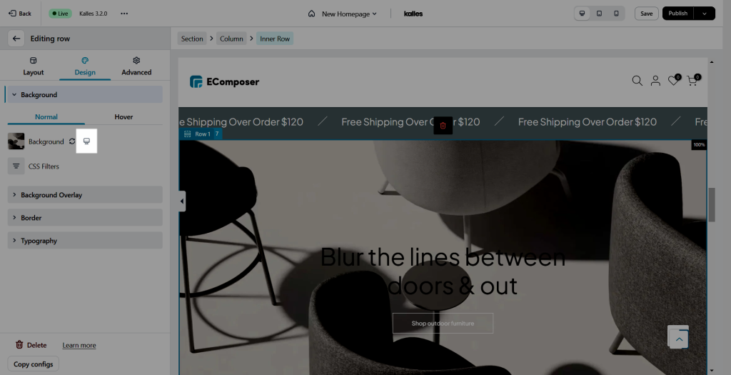
Note: Only a setting which has responsive icon would be affectted how your page looks on Desktop, Mobile, and Tablet independently. For example, the option to change the background in the video below has a responsive icon next to it


