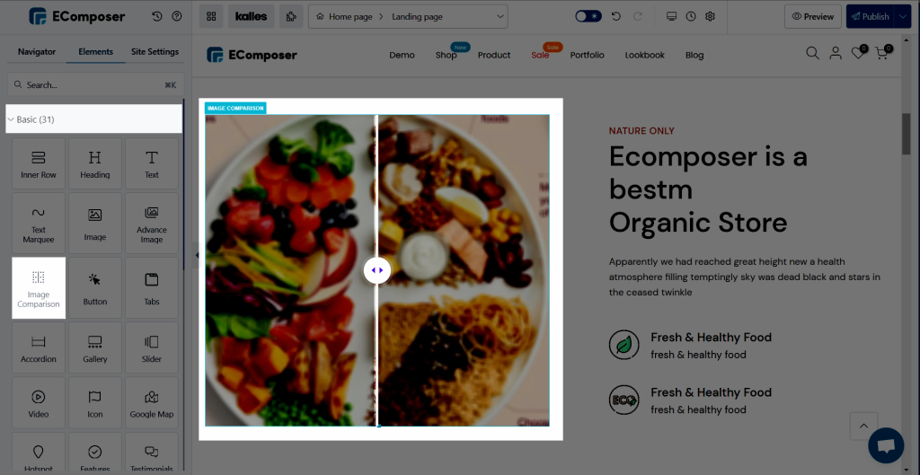
Image Comparison
Your visitor will get a visual impression of your store thanks to this EComposer feature. Particularly if you use the “Image Comparison” element, which will display details you wish to convey to your consumer as well as a clear/comparison image of the product. In addition to giving your store a more professional appearance, this will benefit the new consumer who is currently visiting.

1. Content tab
General
Before/ After: Gives you the option to select the comparative image.
Default Ratio: The percentage can be freely adjusted for that or changed directly by the bar.
Auto slide on hover: Allow your consumer to move the bar to see the change as soon as their cursor touches the picture.
Overlay: And you choose this option, when your consumer hovers over the image, that black cover effect will be visible. Additionally, if you choose this option, the “Overlay text” settings will appear below, feel free to change the content for that section to what it should be before/after.
Icon: This option allows you to modify the signal’s icon, which is seen in the image’s exact center.
2. Design
General: You can use this option to adjust the image’s Element height, which includes the Border style, Border colour, Spacing, and other Border effects.
Overlay: In this option, you can customize the Background Overlay.
Overlay Text: You can alter the font, colour, text shadow, and many other aspects of the text effect using this.
Spacing bar/ Spacing icon: Permit changing the colour, box shadow, and, most importantly, the size of the icon and bar.


