Timeline Showcase
This Timeline Showcase element will walk you through the process step-by-step so you can display how the product in your store is being made or how the product’s story unfolds. More than that, you might describe the history of your shop from its inception to the present and what objectives you have for the near future.
As you can see, we can use this element in a variety of situations like those mentioned above. If you follow along, we’ll demonstrate how to do so.
1. Add Timeline Element
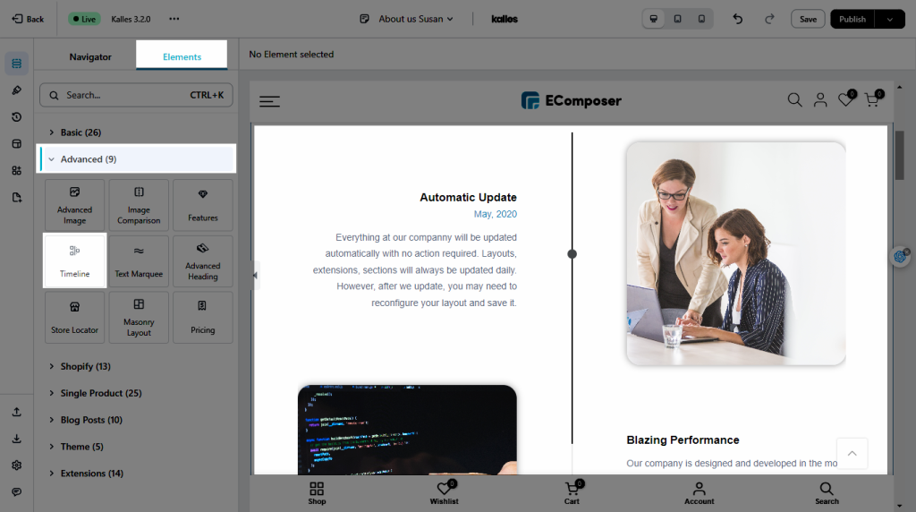
You can drag & drop the Timeline element from the Advance tab to any location where you want to add it in the editor. Let’s check out the screenshot below:

2. Configure Timeline Element
2.1. Content
- Layout: We can set the layout with Horizontal Alternating, Horizontal Standard, Vertical Separated, or Vertical Side.
- Point style: You can alter the layout’s focal point to provide your customers with plainly visible information such as Date or Icon.
- Edit the Items: This option allows you to change the content, and images for the initial items, and the remainder. Active, Point icon, Changing the image, Style for the first item, Title and Links, Date and Text are some examples. You could also click the Add Items button for more.
- Appearance animation: When you choose this option, each item and image will begin to appear as you scroll.
- Dynamic line: If you select this option, the line will appear wherever you scroll.
- Loop animation: When you scroll up and down, information and photos will be shown with the appearance effect. You can try it first for more information.
Note: The Dynamic Line and Loop Animation choices only appear when you utilize the Appearance Animation.
2.2. Design
- Item Content: You can modify the Border, Box shadow, Border-radius, Inner padding, and Outside padding among options.
- Dynamic line: It will allow you to change the Dynamic line’s style, such as size and colour.
- Thumbnail: The Width, Max Width, Height, and Image fit options allow you to change the thumbnail’s size. For the Normal and Hover effects, you may additionally adjust the Opacity, CSS Filter, Box Shadow, Border, Border Radius, and Spacing.
- Date/ Title/ Content: After filling in the details for Date, Title, and Content, allow you to customize the design. Alignment, Typography, Text Color, Text Gradient, Text Shadow, and Spacing are mostly just the design variables that you can change.
- Line: Settings the Type with the Inside or Outside style, Normal Color/Active Color, and Thickness can all be modified.
- Point: With the Type (Standard or Diamond), Border Radius, and Color option, you can alter the point’s style. The Normal/Hover/Active effect’s Width and Height are included.


