Breadcrumbs
Breadcrumb navigation, also known as breadcrumbs, can reduce the number of actions a visitor needs to take in order to navigate to a higher-level page, and it helps you to have a visual guide of your current location on your website.
1. General
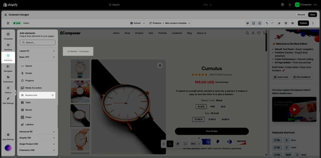
This element allows you to add breadcrumbs to a pre-built layout. You can drag and drop this element to any position on your page. However, it is often placed on the top of the page to help customers return to the homepage faster.
2. Content
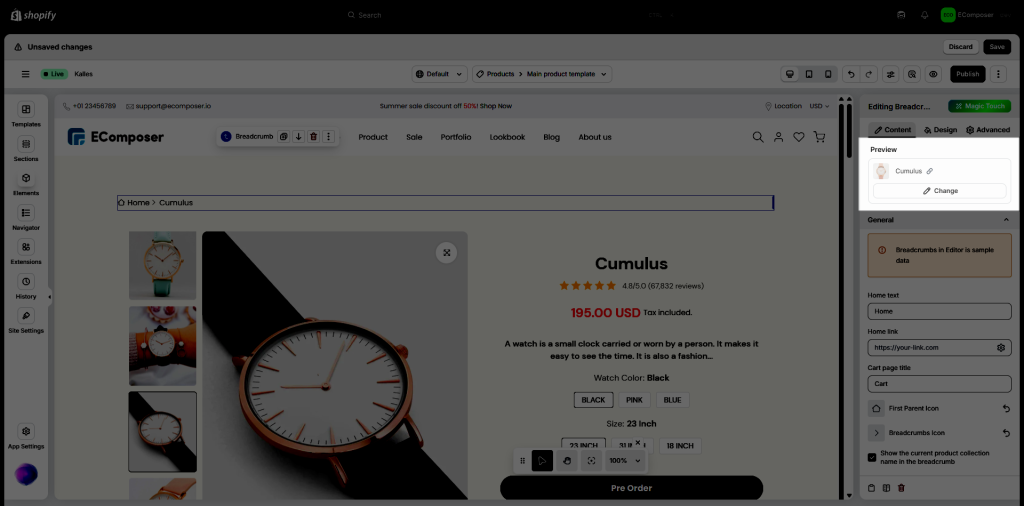
If you add the Breadcrumbs into the template, it will have the Preview option.
PREVIEW: The preview option allows you to pick a product and display its breadcrumbs in the backend to preview.
Note: When you drag and drop the Breadcrumbs into the Standard Pages, it will not show the Preview option. The Breadcrumbs will be shown like Homepage -> Page Name
General
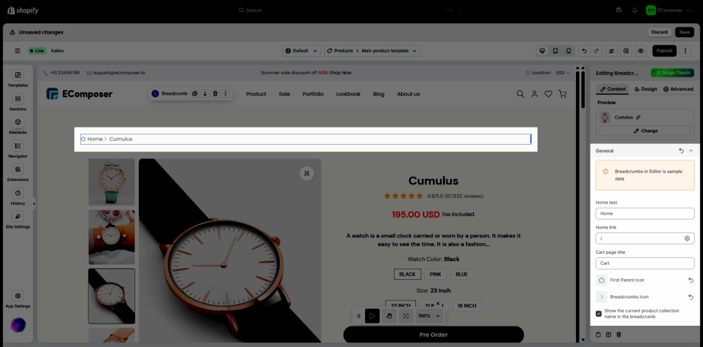
- Home text: Show the home page text directory.
- Home link: Make it easy for users to return to the homepage from any page on your site.
- Cart page title: Use a specific and descriptive title for the cart page in your breadcrumb trail to enhance clarity and user experience.
- First Parent Icon: It allows you to find and change the new icon in the library for Home.
- Breadcrumbs Icon: You can find and change the icon for Breadcrumbs Icon.
- Show the current product’s collection name in the breadcrumb: This option is only available on the Product template, it allows you to show/hide the current product’s collection name in the breadcrumb.
Note: If you want to show the collection in the breadcrumb, the product URL has to have a corresponding collection of that product
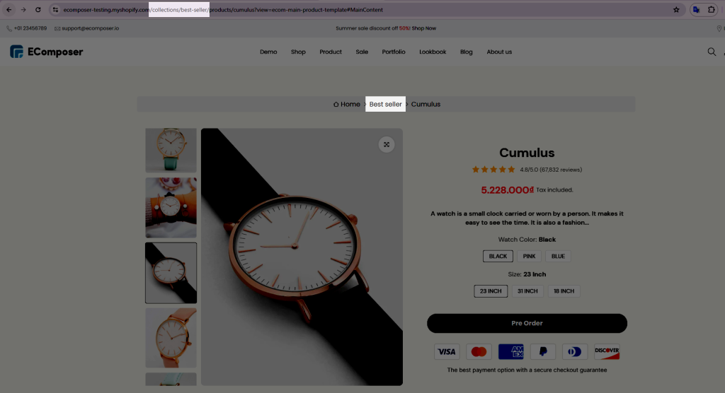
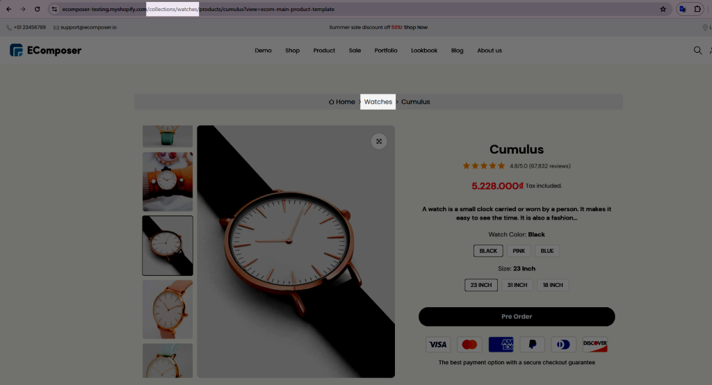
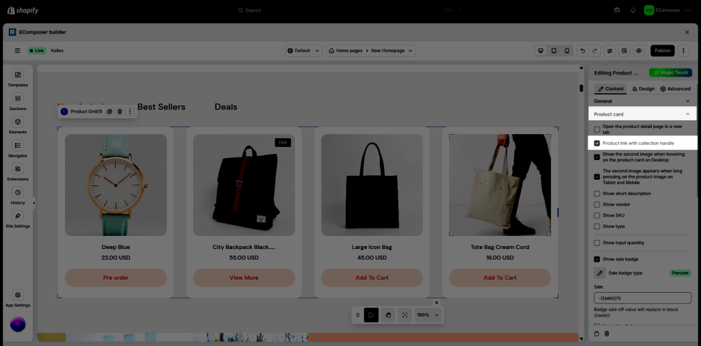
To do this, you need to redirect the visitor from collection product or product grid or even on the menu. In EComposer, we do support the option to attach the collection handle inside product URL on the product grid and collection product:
3. Design
3.1. General
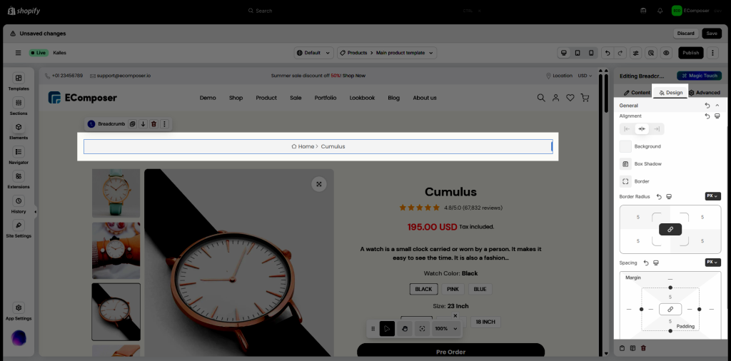
In this setting, you can adjust Alignment, Background, Box Shadow, Border, Border Radius and Spacing for whole breadcrumb.
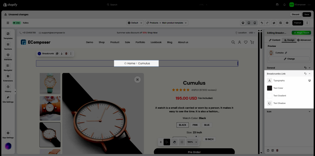
3.2. Breadcrumbs Link
In this option, you can set Typography, Text Color, Text Gradient and Text Shadow for Breadcrumbs Link only.
3.3. Icon
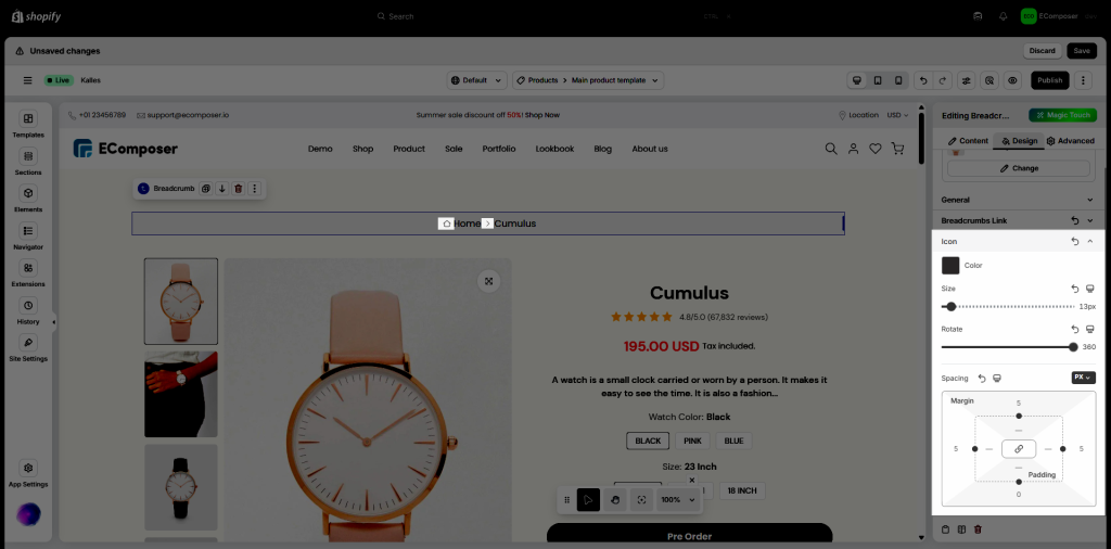
You can configure Color, Size, Rotate and Spacing for Icon
These features Size, Rotate, and Spacing allow you can set different values for each device.
