Element Fields
Each element in EComposer will contain multiple fields, and the possible fields are listed under the Design tab.
It helps you control the color, font, size of the text, and spacing between elements. In addition, the Design tab can also help position and layout elements in devices with different screen sizes. There are many interesting features in the Design tab, and we will introduce them in this article.
1. Design Tab
1.1. Alignment
The horizontal alignment of an element can be left, right, or centered (left alignment is the default).
1.2. Typography
Typography Customize
- Font family: Apply a font for the texts. The EComposer supports 2 types Uploaded font and Google font
- Uploaded font: This allows you to upload a new custom font (or your brand font, for example).
- Google Fonts: These fonts are free to use with no copyright issues.
Note: Font file formats you can upload: .ttf / .otf / .woff
- Size: Sets the size of texts. Font size units: PX, EM, REM, VW.
- PX is an absolute unit. The value assigned is fixed irrespective of the user’s device screen.
- EM, REM, and VW scale accordingly to screen size; they are responsive units.
- Weight: Controls the thick or thin characters in text that should be displayed.
- Transform: It can be used to make text appear in all-uppercase or all-lowercase, or with each word capitalized.
- Style: Sets whether a font should be styled with a Normal, Italic, or Oblique face from its font family.
- Decoration: Sets or removes decoration from the text.Line height: Sets the height of a line. It’s commonly used to set the distance between lines of text.
- Letter spacing: This will increase/decrease the space between characters in a text. You can fill in the data or use the drag bar to adjust.
Typography Global
- Global: If you prefer to use the Global font, you come to this option and pick the font that you would like to use. Or you can click here to get more details about the Global font.
- Reset mark: If you prefer to use the theme’s font, simply click the Reset button to return everything to its default setting.
- Plus mark: Clicking this will instantly allow you to add a new font to the Global font. (you can only see it when you are in the Font Customize setting)
- Manage Global setting button: You can click here to go directly to the Global Font Setting Board when you wish to add more font designs to the Global font.
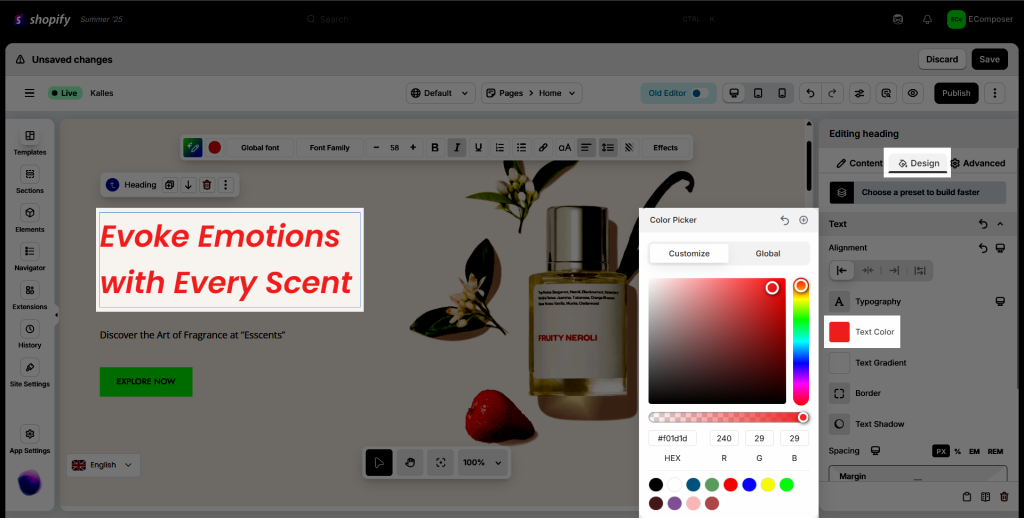
1.3. Text color
Specifies the color of text; you can put both the HEX code and the RGB code. By the way, you can set the Global color and then apply it to any text you want.
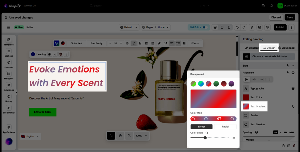
1.4. Text Gradient
In short, text gradients are a fun, useful way to create engaging designs and eye-catching features for your site. If you want to hop on the gradient train and want something a little different than radial and linear gradient backgrounds, then gradient text might be the perfect choice for you!
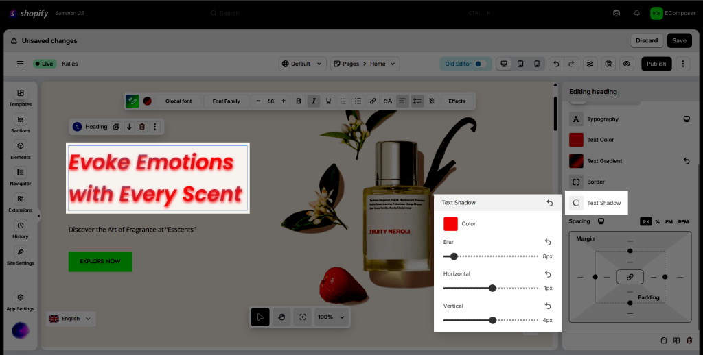
1.5. Text shadow
This option allows you to add the shadow to text only.
- Color: Set the color for the shadow.
- Blur: Increase or decrease blur level.
- Horizontal: Set the position of the horizontal shadow.
- Vertical: Set the position of the vertical shadow.
1.5. Spacing
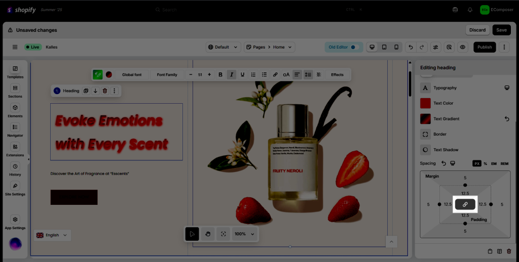
- Padding: Create extra space inside an element’s content. You can change four sides: padding-top, padding-right, padding-bottom, and padding-left.
- Margin: Create extra space outside of an element’s content. You can change four sides: margin-top, margin-right, margin-bottom, and margin-left.
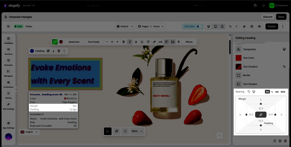
- Synchronization button: The Link symbol of every option, like below, stands for synchronizing 4 values. If you disable it, you can set it one each value separately.
1.6. Background
Specifies the background color of the whole element. You can use both the HEX code and the RGB code.
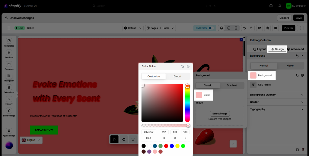
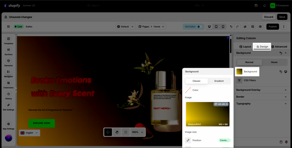
You can also use an image as an element’s background.
- Image Size: The image size setting controls the size of the background. Select the image size or enter a custom size.
- Image fit: A Few types of options, like Fill, Contain, Cover, and Scale down, for you to choose.
- Progressive JPGE: This option allows you to set a custom size for the image but keep the aspect ratio.
- Position: Image position lets you choose which area of the image will get focused on, in cases where the image is larger in width or height than the section spacing.
- Attachment: You can adjust the background attachment here. There are 4 types: Fixed, Scroll, Local, and Inherit.
- Repeat: Choose the background repeat that you want to show for the Background image here. Example: Repeat, No-repeat, Vertically, etc…
- Size: Choose the background size that you want to show for the Background image here. Example: Auto, Contain, Inherit, etc…
1.8. Border
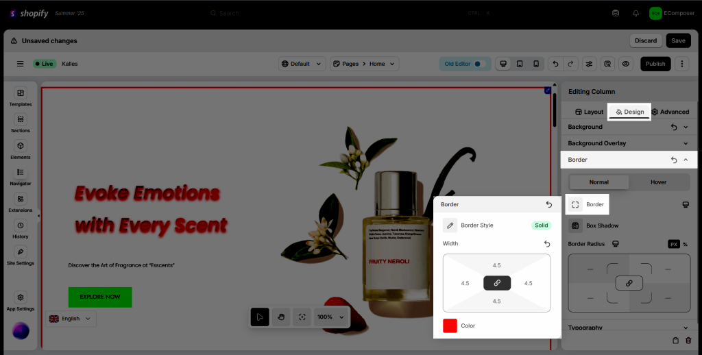
Draw a line on 4 edges of the element to which it is applied.
- Border Style: Default, None, Solid, Dashed, Dotted, Double, Groove.
- Width: Define the width of the four borders (top border, right border, bottom border, and left border). Also, you can set all to 0 to leave the border invisible.
- Color: Change the color of the border.
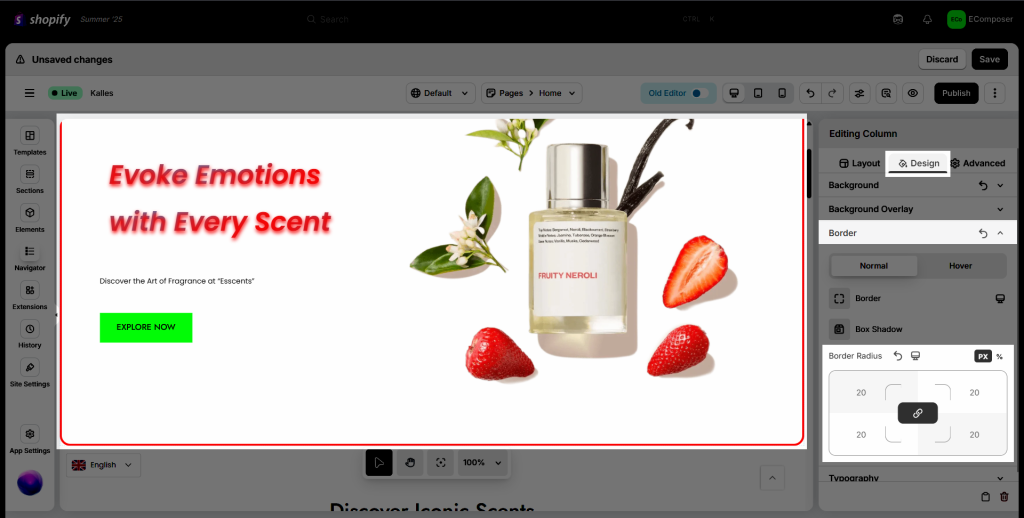
1.9. Border Radius
Border Radius: To control corner roundness. You need to set 4 values for 4 corners: top-left, top-right, bottom-right, and bottom-left.
1.10. Box shadow
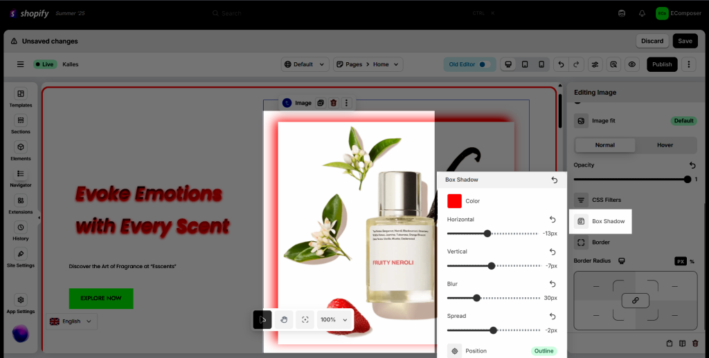
Add shadow effects around an element’s frame.
- Horizontal: Adjust the horizontal position of the shadow area.
- Vertical: Adjust the vertical position of the shadow area.
- Color: Set color for the shadow.
- Spread and Blur: Increase or decrease the blur level.
- Position: You can set the box shadow outside or inset.
1.11. Hover tab
Hover property can be used on all elements, not only on links and buttons.
- Transition Duration: It allows you to change property values smoothly (from one value to another) when hovering.
- Animation: When a website visitor hovers over an animated element like a link or button, for example, it can change color, grow, shrink, rotate, and more.
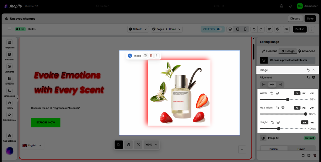
1.12. Width, Max-width, and Height
Scale up or down the width and height of an element, in pixels, %, or VW. This prevents the value of the width property from becoming larger than the max-width. The value of the max-width property overrides the width property.
- The width/ height of an element does not include padding, borders, or margins.
- The max-width property defines the maximum width of an element.
- If the content is larger than the maximum width, it will automatically change the height of the element.
- If the content is smaller than the maximum width, the max-width property has no effect.
1.13. Opacity
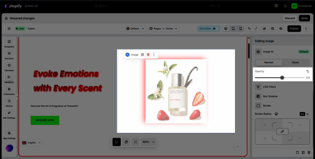
The opacity: The transparency level, where 1 is not transparent at all, 0.5 is 50% see-through, and 0 is completely transparent.
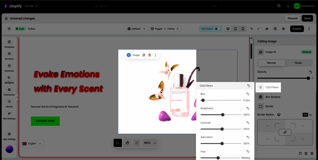
1.14. CSS Filter
Filters are commonly used to adjust the rendering of images, backgrounds, and borders.
- Blur: How many pixels on the screen blend into each other, so a larger value will create more blur.
- Brightness: Applies a linear multiplier to the input image, making it appear more or less bright
- Contrast: Adjusts the contrast of the image.
- Saturation: Saturates the image.
- Hue: This applies a hue rotation to the image.
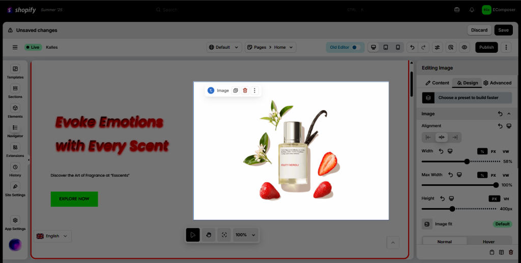
Before:
After:
2. Advanced Tab
Admins: Every Basic element always has this tab. The settings here take effect on the whole element.
2.1. Advanced
Spacing: You can click on “Size units” to get more details about properties. Also, you can use default metrics or fill in the data in the box to adjust.
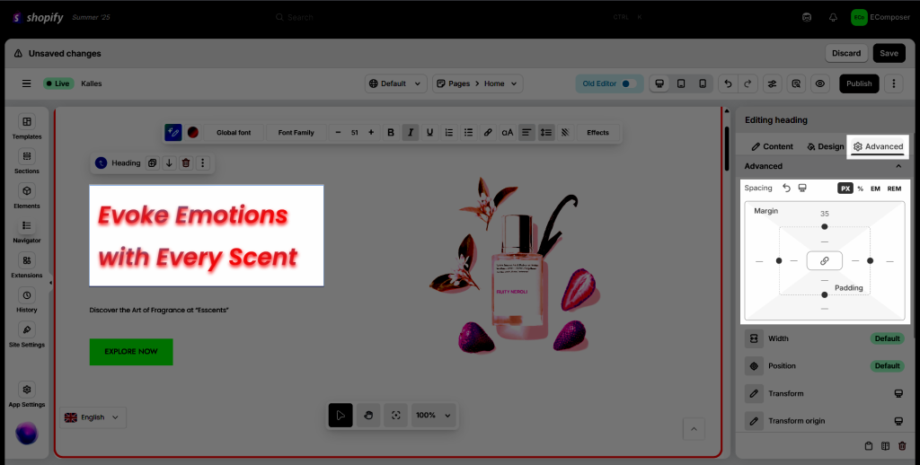
Position: This option allows you to select absolute or fixed positioning for your element. If using the absolute or fixed positioning, you may manually enter the numeric X and Y positions in the Horizontal and Vertical Offset scales.
- Default Position: The element is in its natural state, positioned merely by the natural flow of the page. This is the default position of all elements.
- Relative Position: This is very similar to static positioning, except that once the positioned element has taken its place in the normal flow, you can then modify its final position, including making it overlap other elements on the page.
- Absolute Position: The element is positioned absolutely to its first positioned parent.
- Fixed Position: Set your widget to have a fixed position and place it in a custom position. The element will stay fixed in that position as the page is scrolled. The element is positioned relative to the user’s viewport.
Vertical Align: Only available if Full Width (100%), Inline (auto), or Custom is chosen. Select to display the element on the Start, Center, or End.
Horizontal Orientation: Sets the horizontal reference point for the absolute positioning, with choices of either Left or Right.
Offset Right: Changes the horizontal reference point by the amount of the offset right.
Vertical Orientation: Sets the vertical reference point for the absolute positioning, with choices of either Top or Bottom.
Z-index: Set the Z-Index. Learn more about Z-Index.
Transform: The transform property applies a 2D or 3D transformation to an element. This property allows you to rotate, scale, move, skew, etc., elements.
Transform Origin: The transform-origin property allows you to change the position of transformed elements. 2D transformations can change the x- and y-axis of an element. 3D transformations can also change the z-axis of an element.
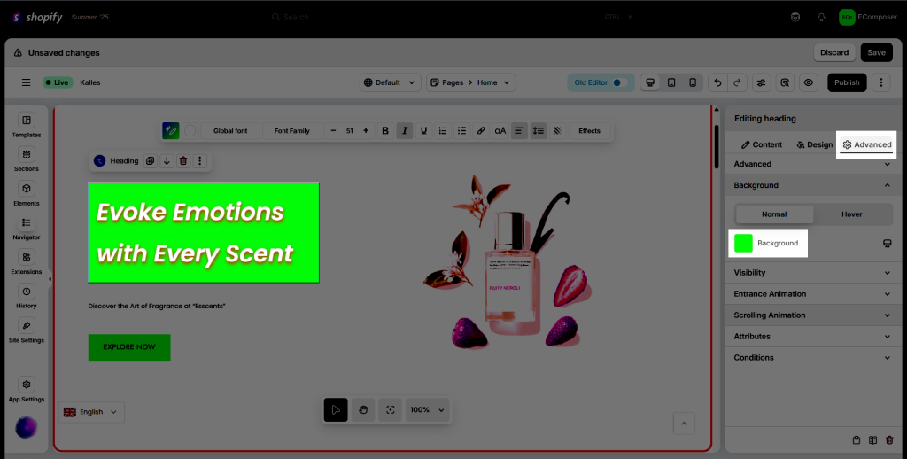
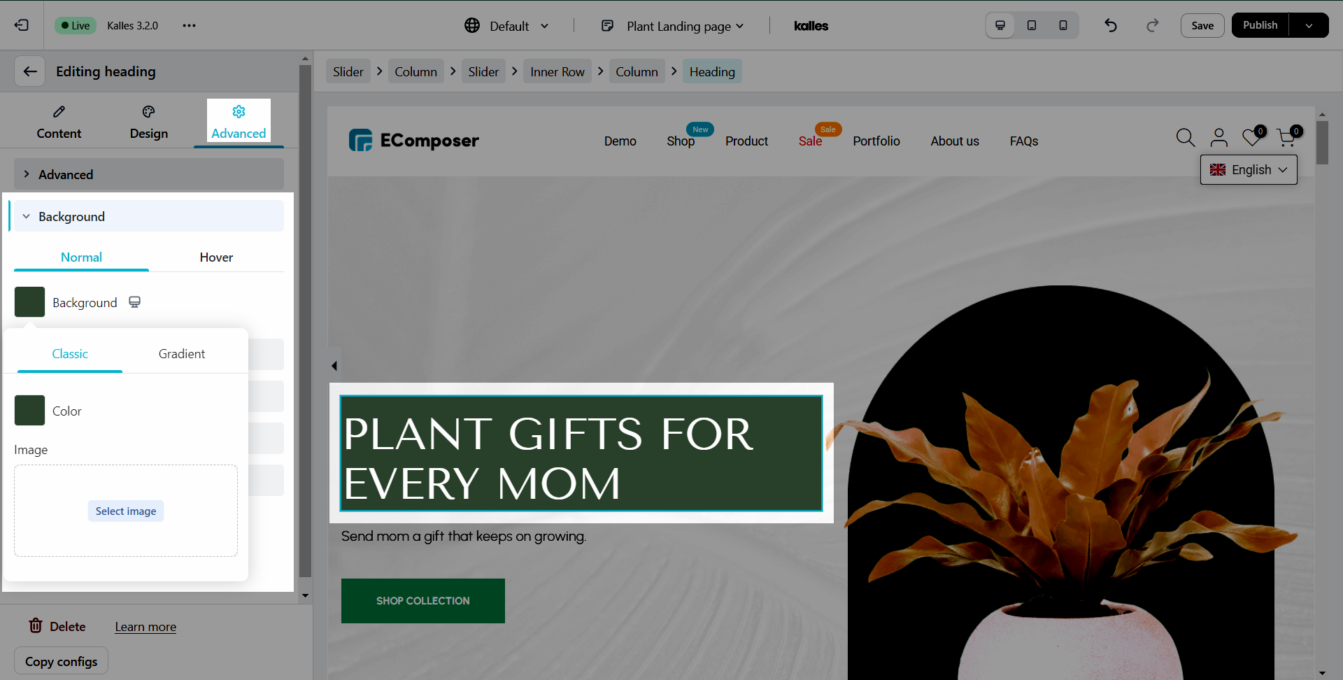
2.2. Background
You can always use this Background property to change the background color of the whole element.
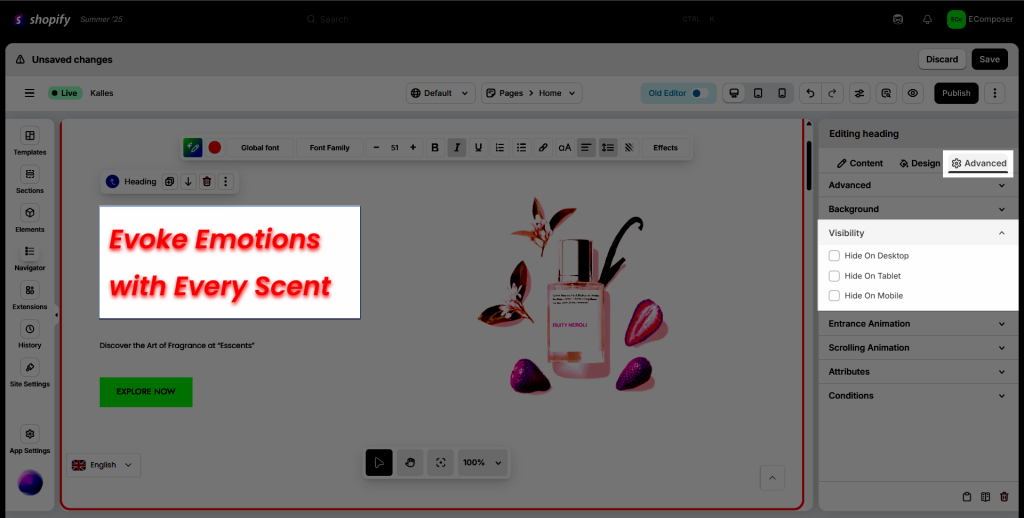
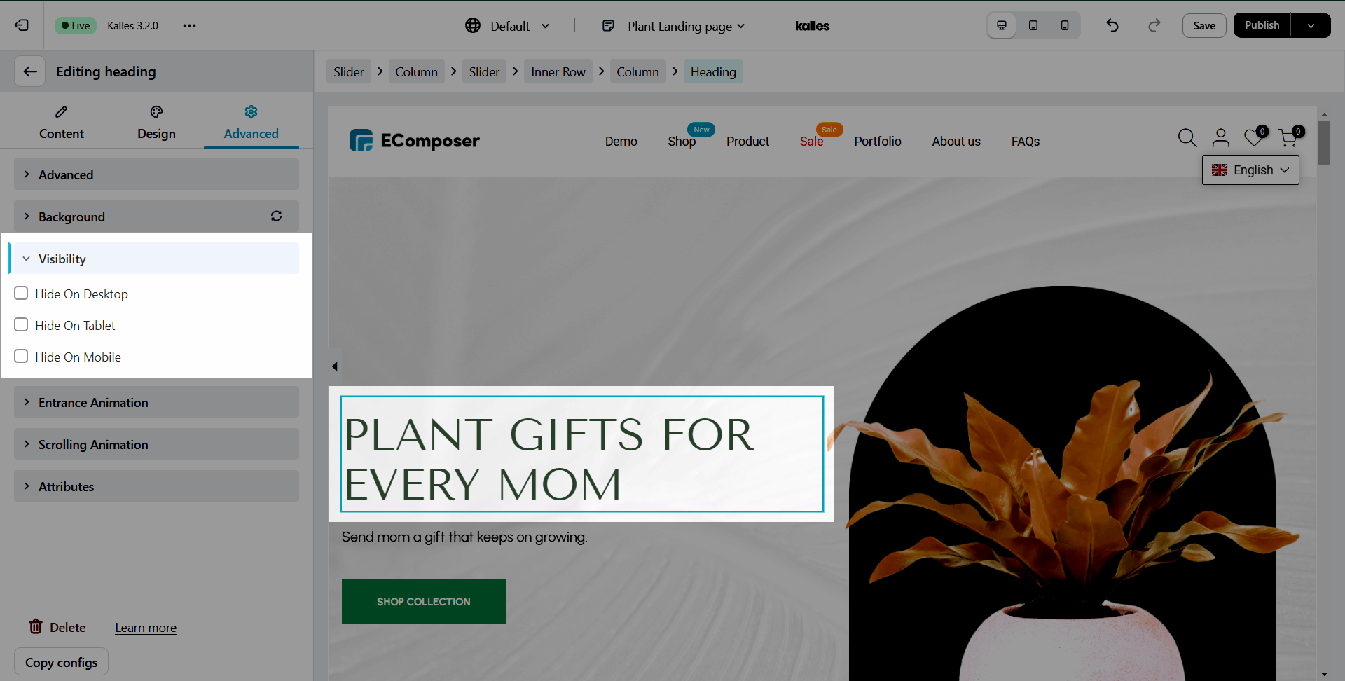
2.3. Visibility
In this tab, you can choose to Show or Hide your element on Desktop, Tablet, or Mobile.
2.4. Scrolling Animation
Here you can set the animation for the element.
Horizontal position, Vertical position, Rotate, Opacity, Scale, Blur: These are all the options you can use for the scrolling animation. You can check the settings for each of these down below.
- Start: Value at the start position.
- Middle: The middle value between the start and end.
- End: Value at the end position
- Start from: Start position of the animation in vertical, the value is calculated as a % of the screen.
- End from: The end position of the animation in vertical, the value is calculated as a % of the screen.
Animation Duration: The duration of the animation.
Timing function: These are used to smooth out the animation; for example, the transition will go from slow to fast for ease in.
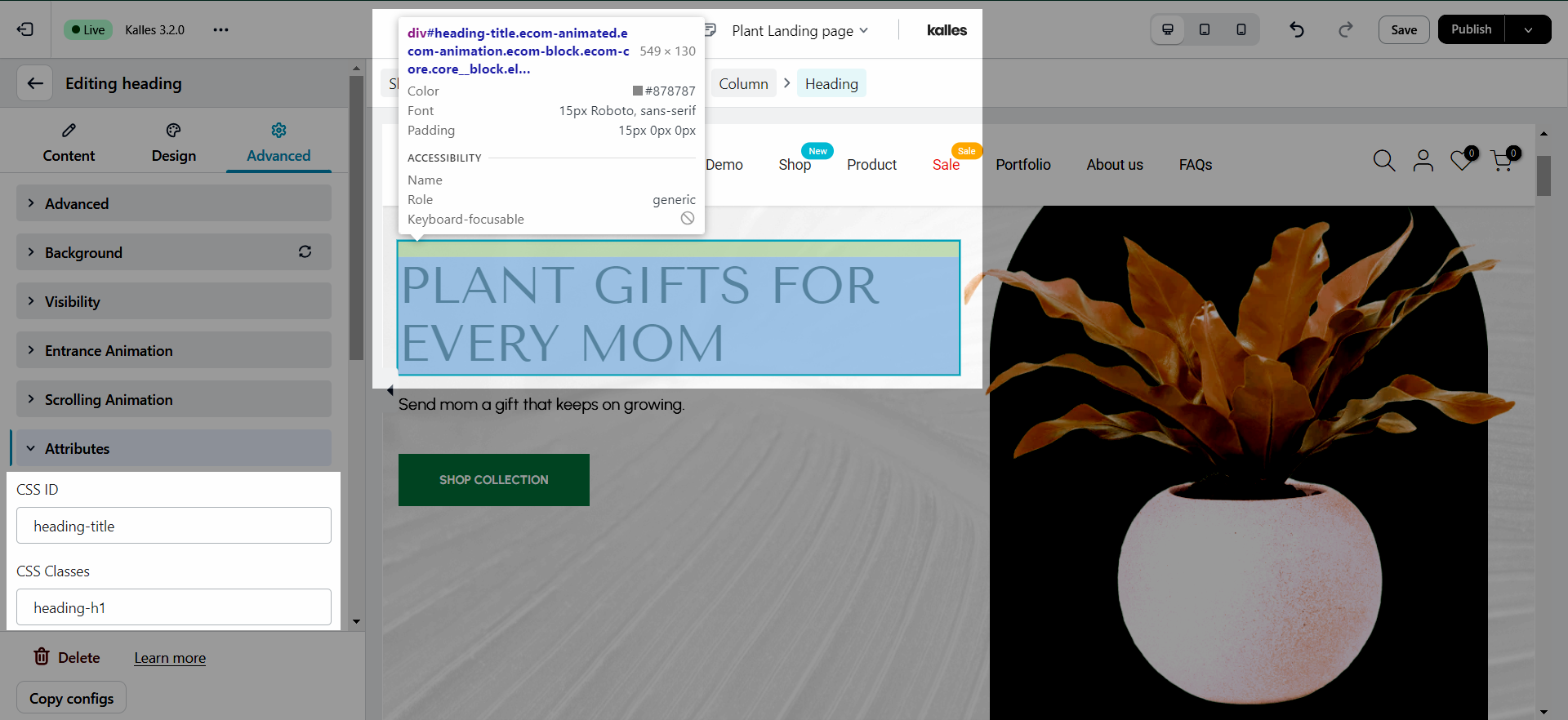
2.5. Attributes
HTML and CSS box: If you want to add your own coding for individual elements, use the Additional CSS and HTML box here.
No matter what style you choose, you can tweak CSS and HTML and overwrite that style.
2.6. Conditions
This allows you to display or hide the elements on a page depending on set conditions.
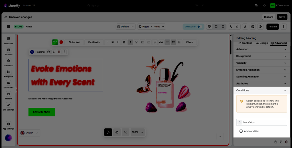
Each page type has different conditions set. For example:
- Home page/Standard page/Collection list/Password-Coming soon: Users, User tags, Language, and Metafield.
- Product template: Users, User tags, Language, Current page, Product Vendor, Product Type, Metafield.
- Cart page: Users, User tags, Language, Cart page, and Metafield.
- Collection template/Blog post/Blog list: Users, User tags, Language, Current Page, and Metafield.
Here’s the specifics of what each condition does:
- Users: You can choose the condition to show the element as a Guest or only when they’re logged in.
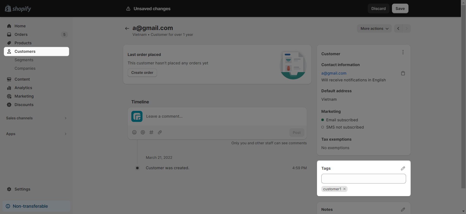
- User tags: Also known as customer tags, you can separate the tags by a comma, for example, tag1,tag2,…
- Language: You can display the element in one or some languages you want, rather than all languages.
You can find the ISO code that you want to use in this link.
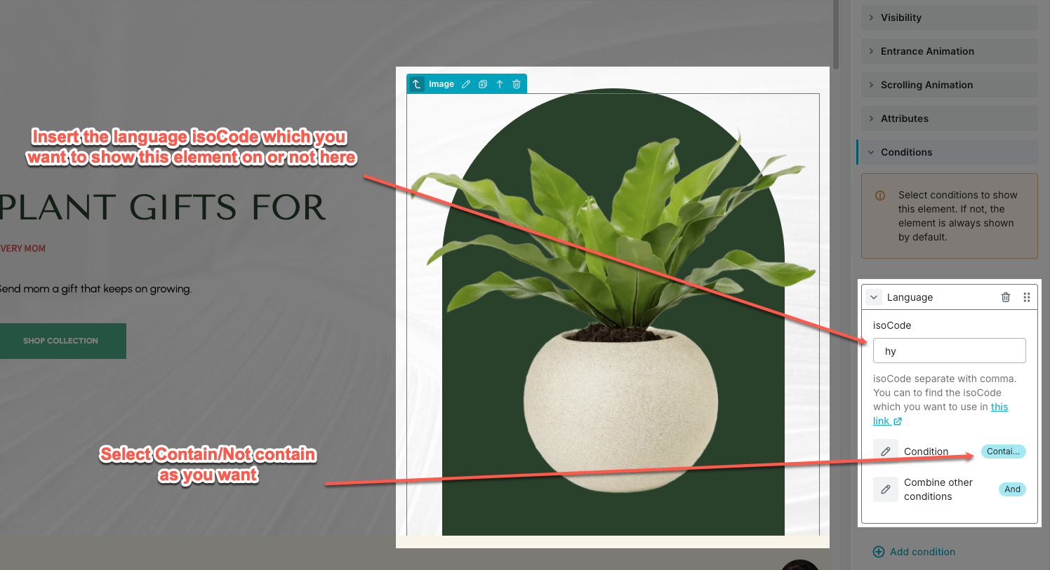
See the video to view how the Language condition works:
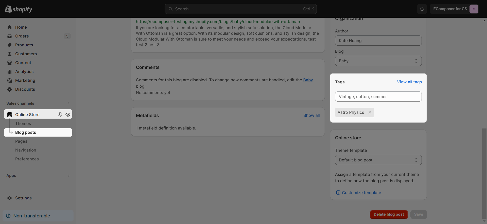
- Current page: Use current page tags as conditions only work on blog lists, blog posts, collections, and product pages.
- Product vendor/type: Use the product vendor/type as conditions, for example, vendor1, vendor2,…, only work on product pages.
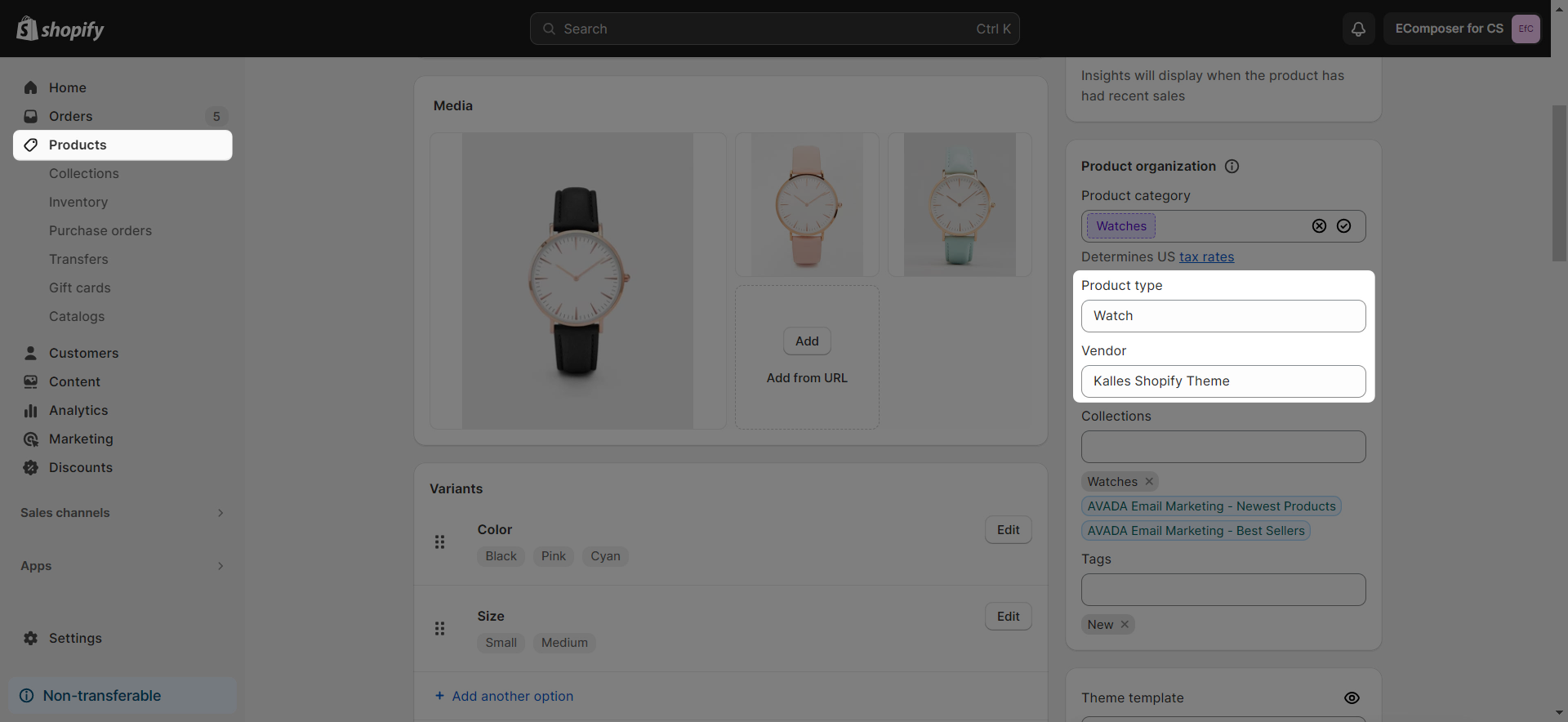
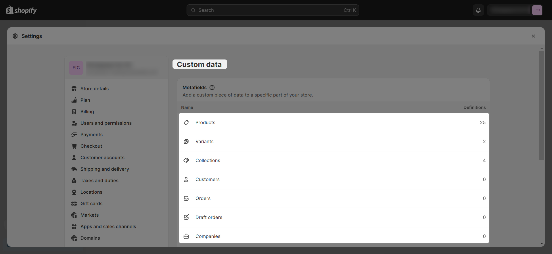
- Metafield: Use a metafield as a condition; you can fill in the metafield value or not, based on whether the metafield value is set to empty or not.
In the Shopify admin, navigate to Settings -> Metafields and Metaobjects -> Choose the metafield type to create your metafield:
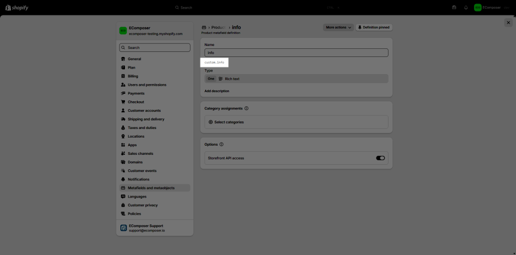
Enter the metafield name that you want to set the condition for. To do that, open your metafield in Shopify admin to copy the metafield namespace and key:
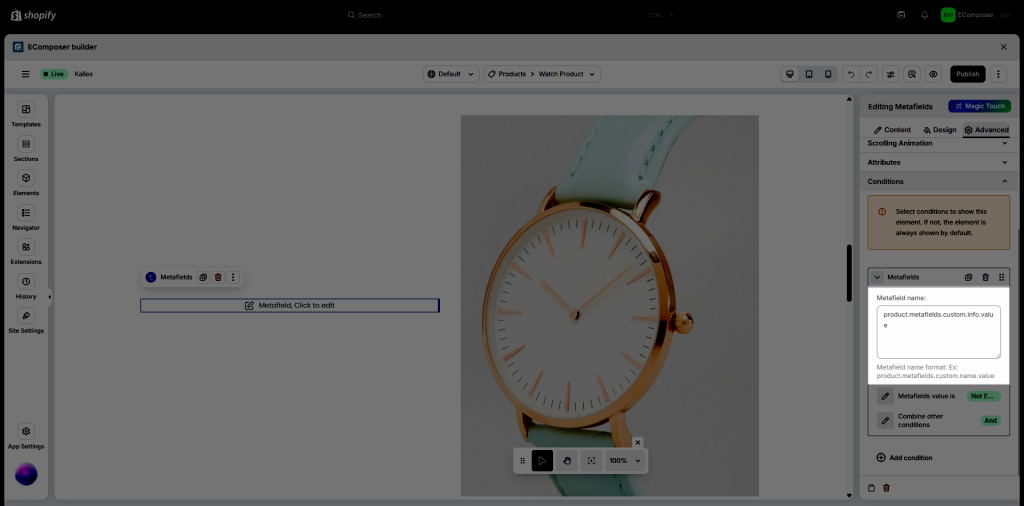
Paste your metafield namespace and key code to replace the red bold text with your metafield in the code below:
product.metafields.custom.info.valueThen add it to the Metafield name in the Condition:
EComposer provides three main condition types for Metafield:
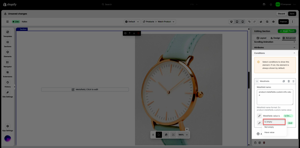
– Metafields value is “Is empty”: display the element/section only when metafield value is empty. It means:
+ If metafield has no value → Show
+ If metafield has value → Hide
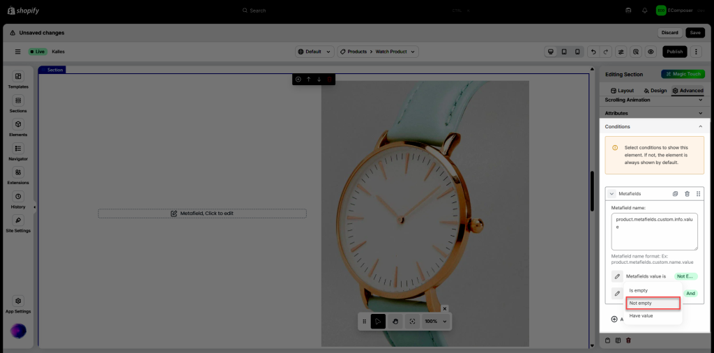
– Metafields value is “Not empty”: display the section/element only when metafield value exists. It means:
+ If metafield has no value → Hide
+ If metafield has value → Show
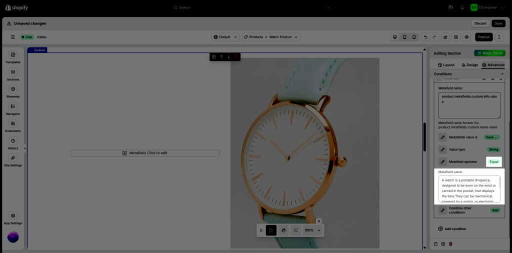
– Metafields value “Have value”: display section/element only when metafield equals a specific value
For example, the metafield value of the Watch product is: “A watch is a portable timepiece, designed to be worn on the wrist or carried in the pocket, that displays the time. They can be mechanical, powered by a spring, or electronic, using quartz crystals or other methods. Watches have evolved from larger, spring-driven clocks, with the first pocket watch appearing in the 16th century.“
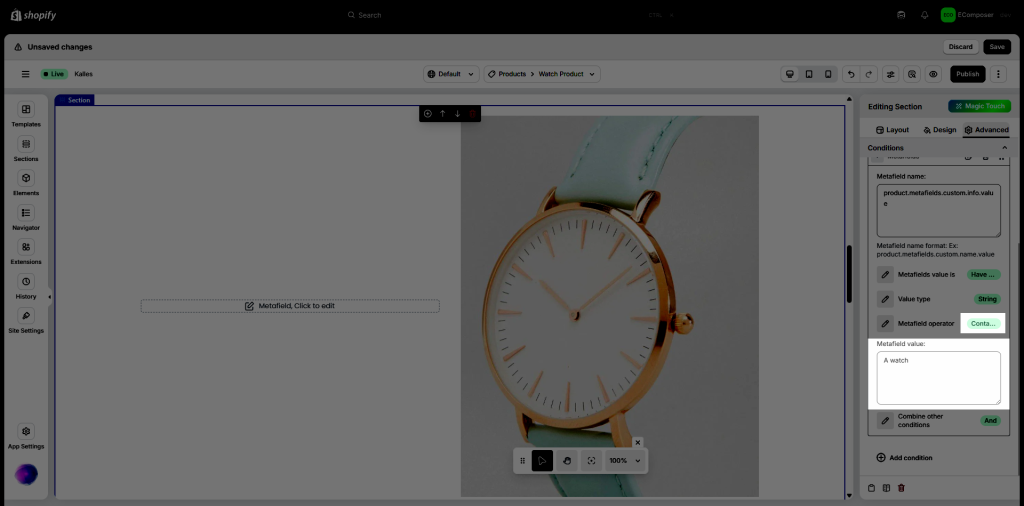
To show the section/element that has that metafield value only, you can set Metafield operator to Equal or Contain.
+ With Equal, you need to add a whole metafield value of the product:
+ With Contain, you just need to add a part of the metafield value:
It also depends on the Value type of the metafield. There are 3 main types of metafields: Boolean, Number, and String.
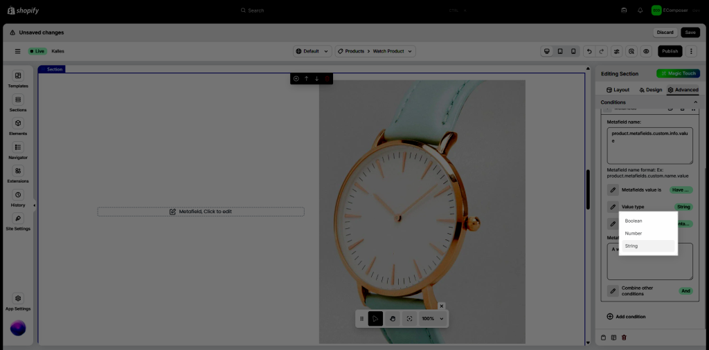
Please check the video below for more details on how the conditions work (specifically the metafield condition). In this video, we will set conditions for each metafield to show.
For text, we use this metafield code as a condition:
product.metafields.custom.info.valueFor the image, we use this metafield code:
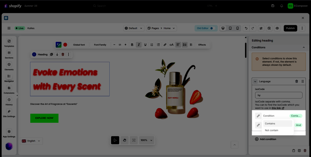
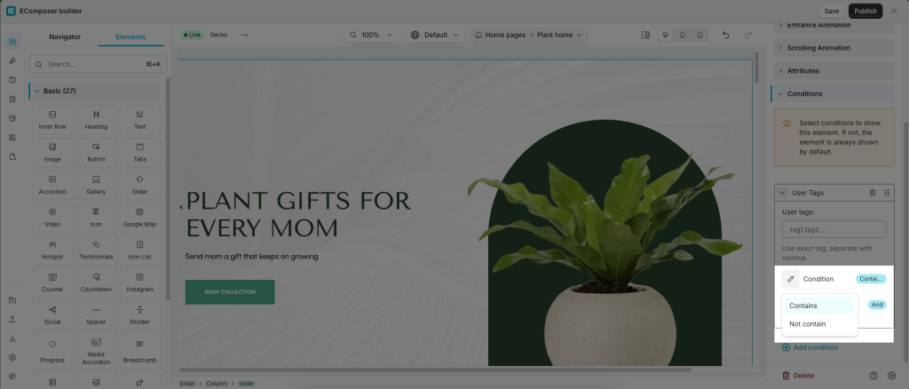
product.metafields.custom.image.valueWith 5 conditions about User Tags, Language, Product Type, Product Vendor, and Current Page, you can choose condition Contains or Not contain
- Contains: Show components containing the entered condition.
- Not contain: Show components without the entered condition.
You can view a detailed guide on using the EComposer element condition function here:


