Size Chart
What do you know about the Size Chart? Let’s find it out with EComposer App.
The Size Chart element will help your store display more information about the product’s size table. If your products have some different types/sizes to choose from or you want to inform your customers about a specific type, then follow our steps to create one for your shop.
1. Adding Size Chart Element
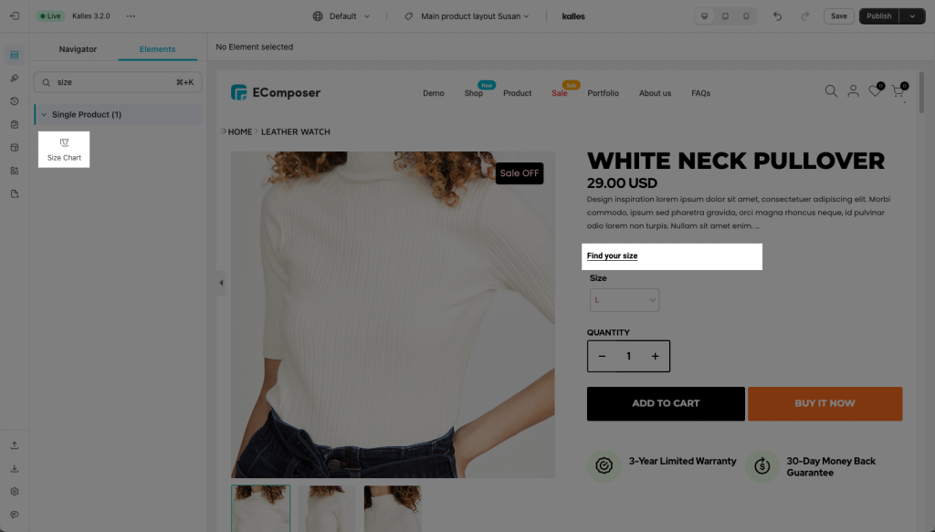
- Click into Elements –> Single Product –> Size Chart
- Drag the Size Chart element from the left sidebar and Drop it wherever you want it to stay.
2. Configure Size Chart
2.1. Content
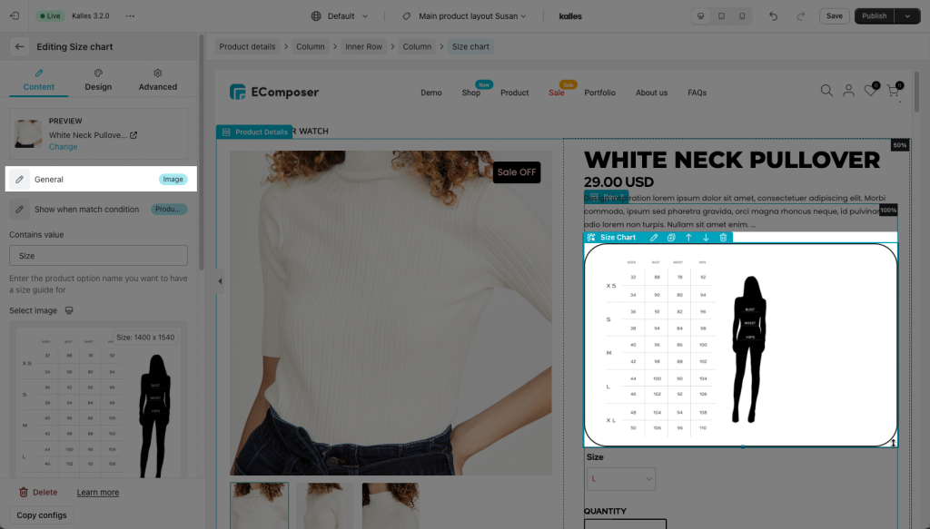
- General: You can choose whether to set the view as just a Button or replace it with an Image (the image is clickable like a button in this case)
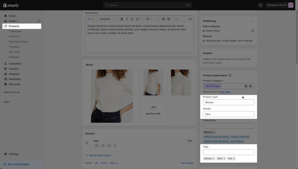
- Show when match condition: You can add a size chart based on conditions such as All products, Product tag contains/type contains/vendor contains/option contains. It helps you get desired products to show the size chart.
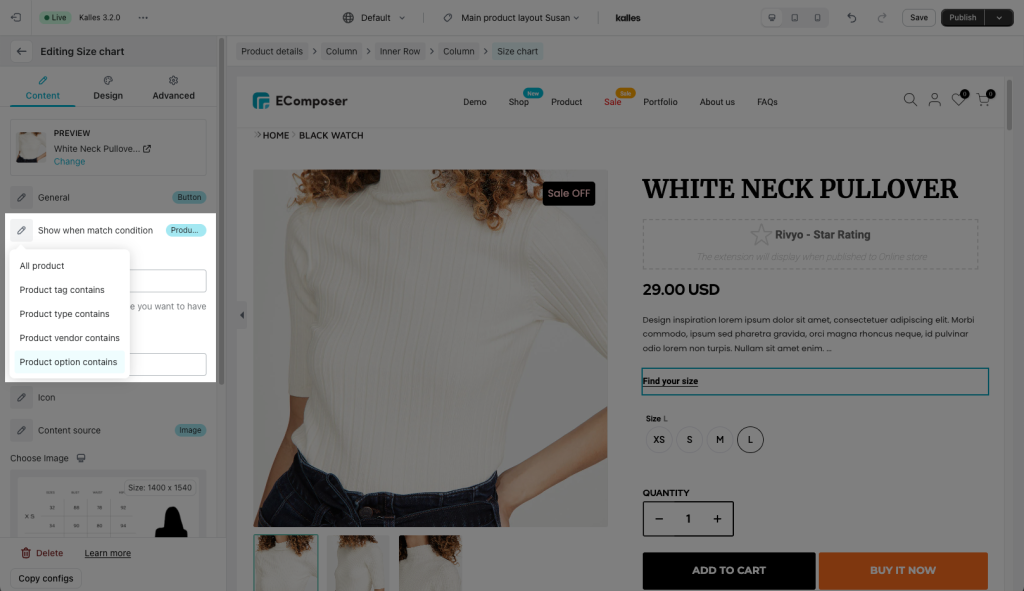
Product tag contains/type contains/vendor are rendered from your Shopify Admin
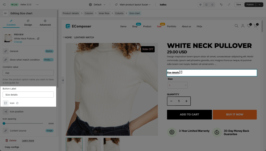
- Button Label: This allows you to make a name belong to the button if you set the General setting which is in Button style.
- Icon/ Icon position/ Icon spacing: Those functions help you to change pick the Icon that you like, change wherever you want it to be, or set the space for that icon.
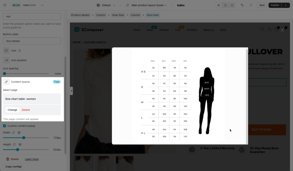
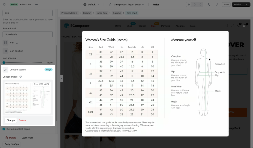
- Content source: All these content types below will be displayed on the pop-up. You must click to Sizechart button to show a pop-up.
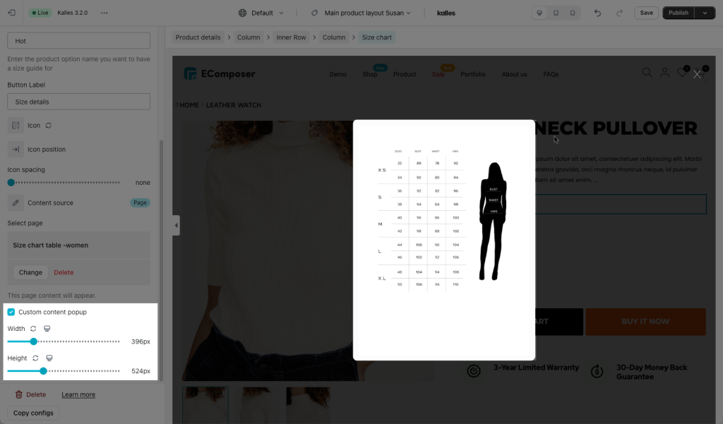
+ Page: With this choice, you need to create a page in Shopify with the size guide content first, then select that page name in EComposer to show its content of the Size chart. Please note that the app can only show the content from a Shopify page, not the page content of EComposer.
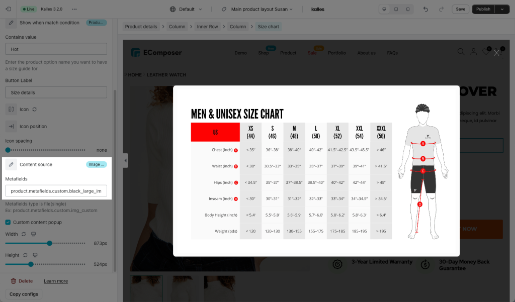
+ Image: Show the Image size chart in the Pop-up
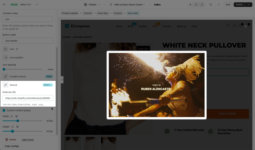
+ Video: You may choose the source get from Youtube by adding the Youtube link in the blank, Vimeo, or an External URL.
+ Metafields: Learn more about Metafields here. This option allows you to show different size charts on each product page.
- Custom content popup: You may change the Width and Height for that like whatever you expect to make it look better.
2.2. Design
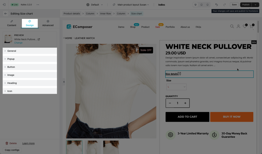
- Box: Let you set some of the basic settings to make your element look more colorful, such as Typography, Background Color, Box Shadow, Border/ Border Radius, and Spacing.
- Button: Let you change the position or more than that with functions like Alignment, Typography, Text Shadow, Box Shadow, or a few more main settings that will be shown when you choose the Normal or Hover feature.
- Heading: If you choose the Custom Content at the Content Source stage, this function will assist you in making changes to the Custom Content. For example Alignment, Typography, Text Color, Text Shadow, and Spacing.
- Icon: You may change your style for this Icon like Color, Size, Rotate, and Spacing.
