Collections
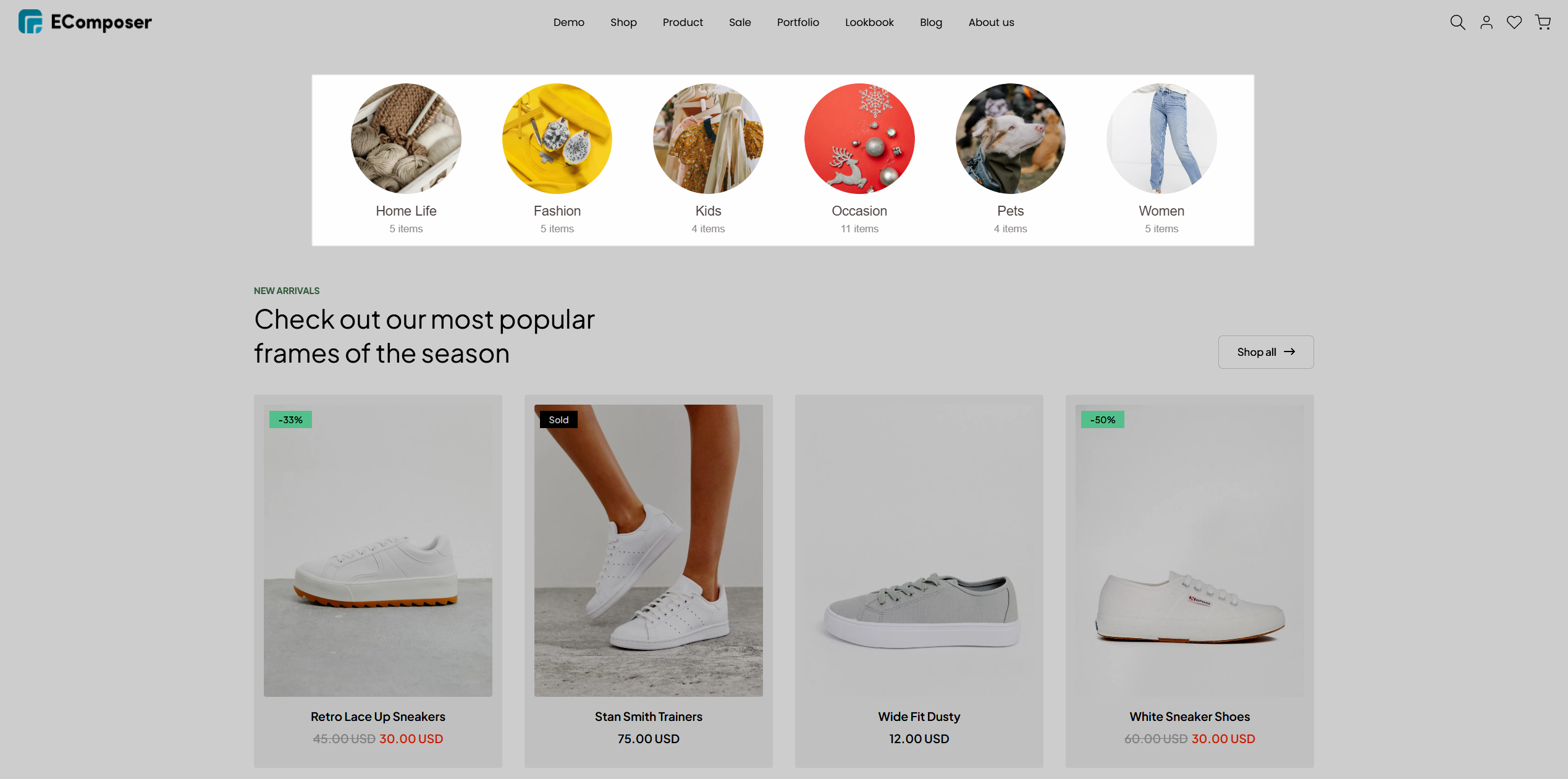
The Collections element in EComposer enables you to showcase a group of Shopify collections on any page, including the homepage, landing pages, or collection templates.
You can manually select collections, use metafields as a data source, or connect collections directly from a Shopify menu for more dynamic content management.
1. How to add the Collections element
In the EComposer editor, go to the Elements tab and search for the Collections element. Then, simply drag and drop it into your desired section on the page.
2. Configure for Collections element
2.1. How to choose the collection source to show
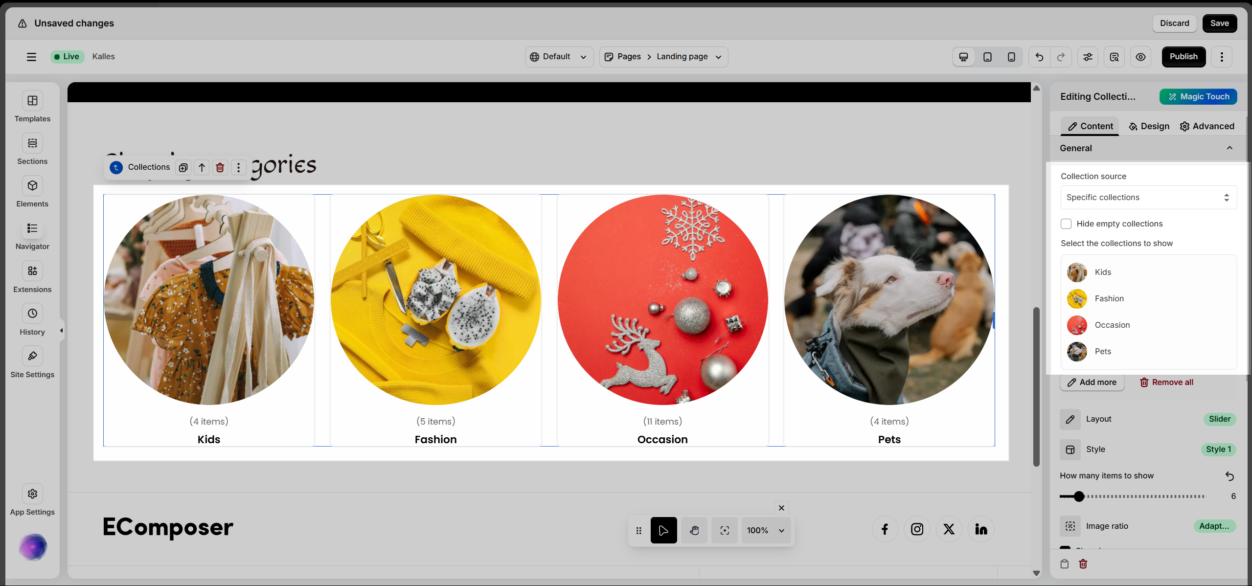
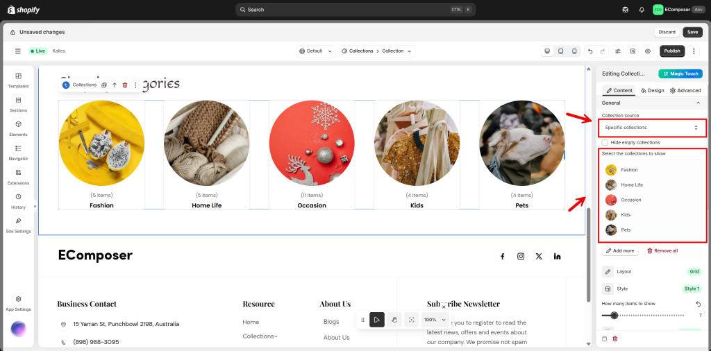
There are three sources you can use to display collections on your page:
- Select specific collections
- Use a metafield from the current collection
- Pull collections from a Shopify menu
In most cases, we recommend using the Select specific collections option for better control and flexibility.
Select Specific Collections
This is really easy; you just need to select the collections that you want to show and add them.
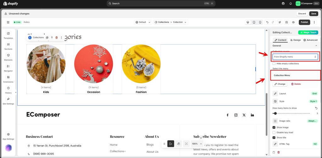
Show collections from a Shopify menu
To display collections using this method, you need to create a menu in your Shopify admin that includes links to the desired collections. Once set up, you can select this menu in EComposer to automatically display the collections on your page.
Step 1: Go to your Shopify admin → Content → Menus.
Step 2: Click the “Create menu“, then create a new menu.
Add menu items and link each item to a collection you want to display. Click Save to apply your changes.
Step 3: In EComposer, select the Shopify Menu option as the collection source, then choose the menu name you just created from the dropdown list.
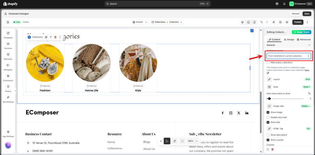
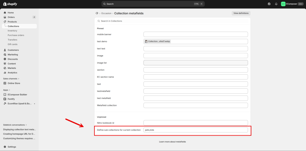
Show Collections from the Metafield of the Current Collection
This method allows you to display collections dynamically using metafield data from the current collection.
Step 1: In your Shopify Admin, navigate to Products → Collections, then select a collection. Scroll to Metafields and add the collection URLs (separated by commas) into the Define sub-collections field.
Step 2: In EComposer, drag the Collections element into your page and set the Collection Source to From metafield of current collection.
Step 3: Assign the template to the collection, then preview the page to verify that the sub-collections are displayed correctly.
Note: Metafields are only supported in the collection template. They are visible on the live page only after the template is assigned to a collection.
For example: You can use this option when you want to show sub-collections on a main collection.
2.4. Other settings
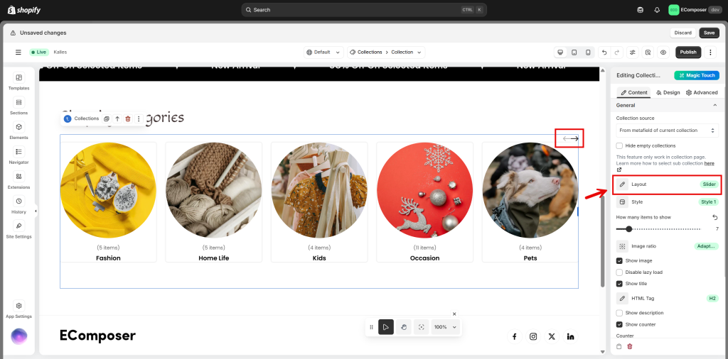
This section includes configuration options such as Layout, Style, Items per row, and Image ratio.
Additional settings, such as Show image/Show title (with support for custom HTML tags in titles), Show description, Disable lazy load, and Show counter, allow you to control how collection items are displayed.
You can also customize counter text, as well as adjust the number of items per row, column gap, and row gap when using the Grid layout.
3. Design
3.1. Items
This section allows you to configure the appearance of collection items with options such as Background, Box Shadow, Border, Border Radius, Padding, and Layout Flow.
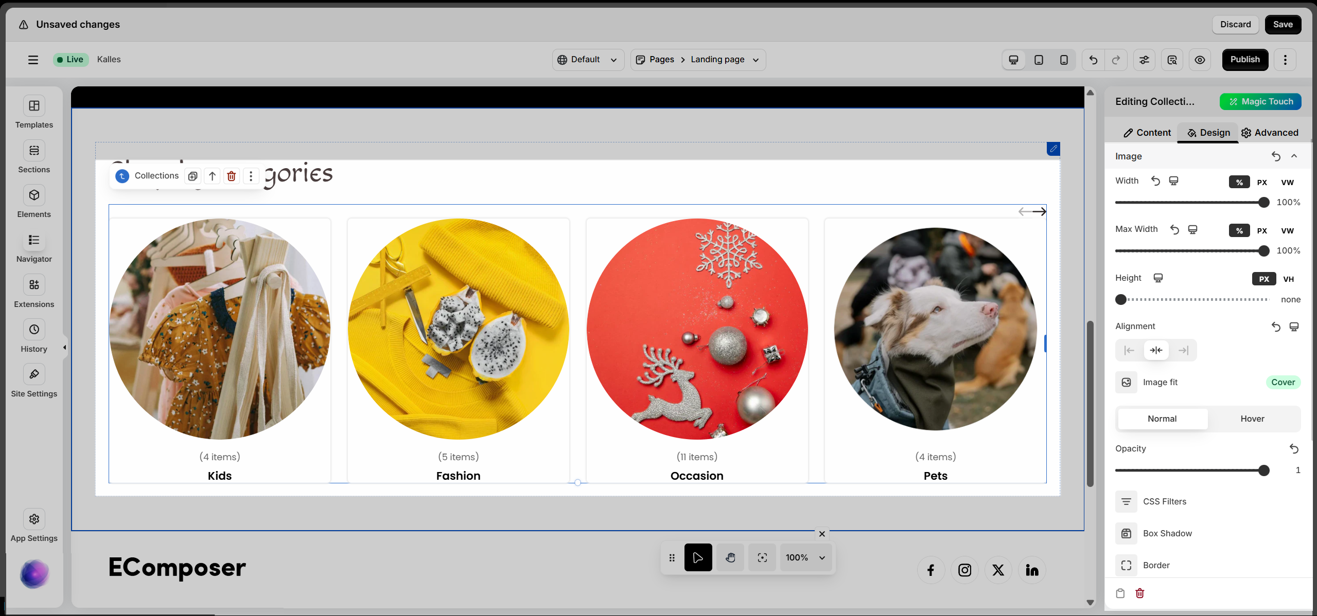
3.2. Image
This section allows you to configure collection images, including Width, Height, Alignment, Image Fit, and Opacity.

3.3. Title, Counter, Description
This section allows you to configure text elements, including Alignment, Typography, Text Color, and Text Shadow. Alignment and Typography settings can be applied across all devices.
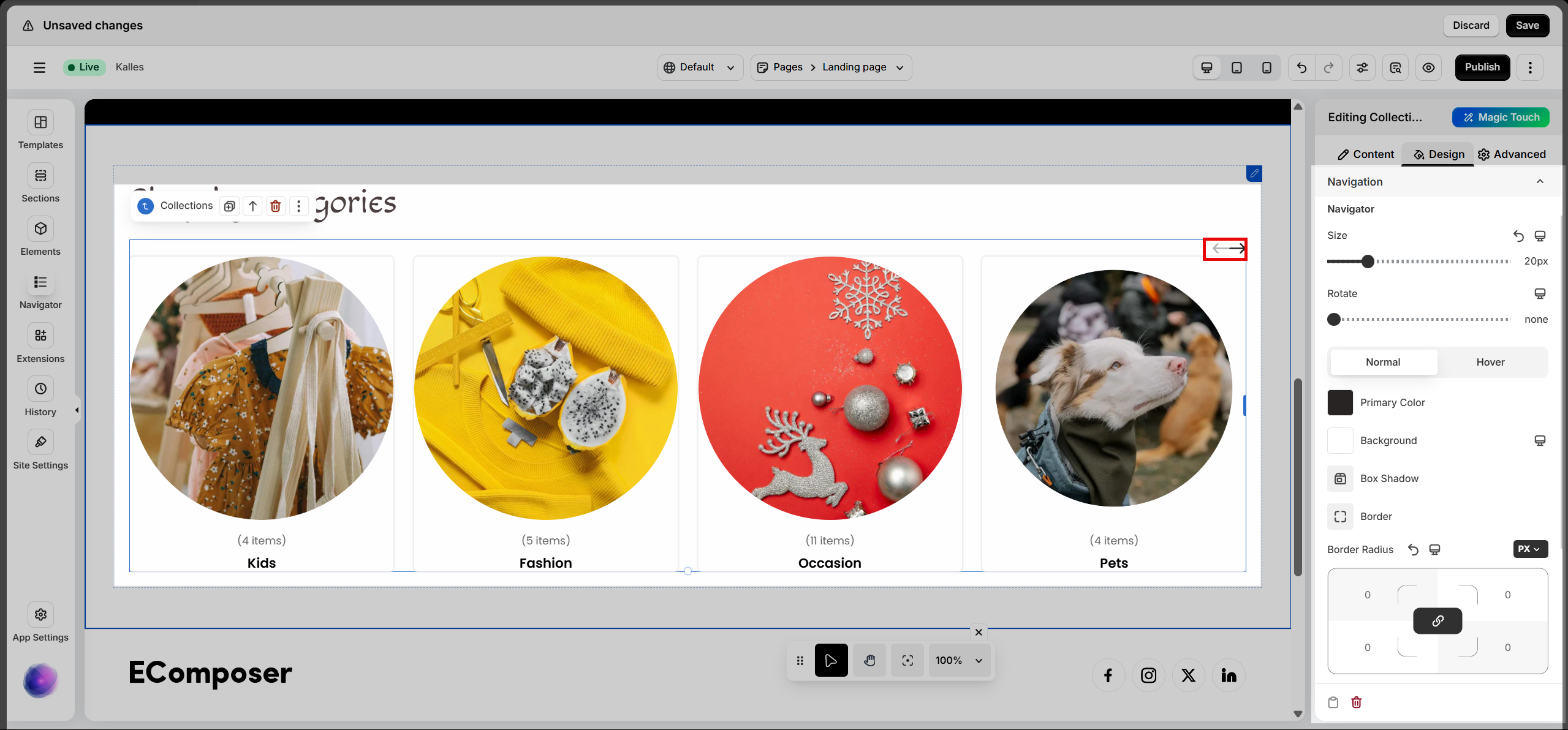
3.4. Navigation
This section is available only when using the Slider layout for Collections.
You can configure navigation icons, including Size, Rotate, Primary Color, Background, Box Shadow, Border, Border Radius, and Spacing.
You can learn more about design options here.
4. Frequently Asked Questions
1. Why are my collections not displaying on the page?
Please ensure that the collection source is properly configured and correctly linked in the editor. Note that collections can still be displayed even if they do not contain any products.
If you choose “Specific collections”, remember to manually select the collections you want to display.
If you want to display collections based on metafields, select the “From metafield of current collection” option and make sure the metafields are properly set up in Shopify.
If you want to display collections based on a menu containing collections, select the “From Shopify menu” option.
2. Why does the metafield option not work?
The metafield option only works within a collection template and will appear on the live page only after the template has been assigned to a collection. Additionally, please ensure that you have added the collection URLs (separated by commas) into the Define sub-collections field, and that the metafield is properly configured with valid data.
3. Can I display collections dynamically?
Yes. You can use metafields or connect collections from a Shopify menu to display content dynamically.
4. Why is the Navigation setting not visible?
The Navigation option is only available when using the Slider layout.