Why can’t I use EComposer on a tablet or mobile?
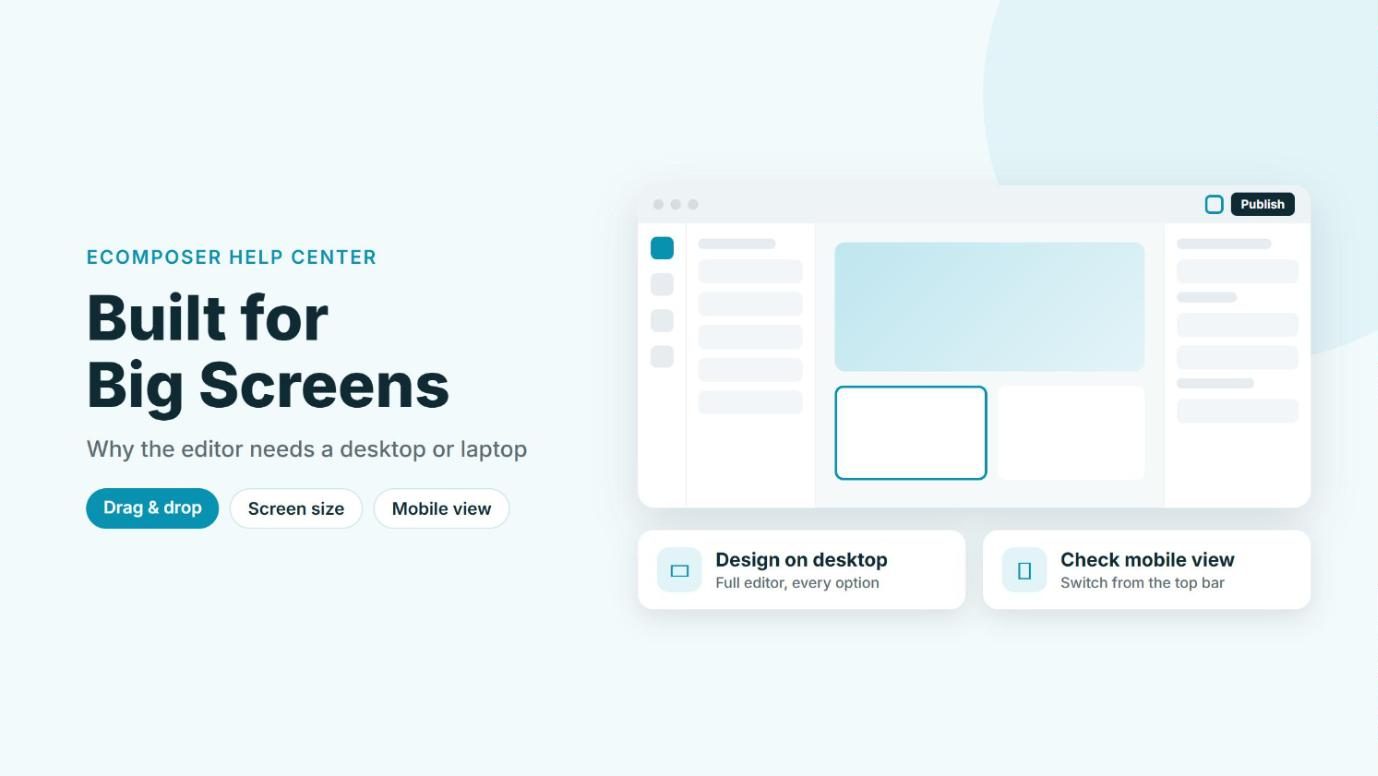
You might want to tweak a page from your phone or tablet when you’re away from your desk, but the EComposer editor is built for a big screen with a mouse. On touch devices, dragging elements, opening settings, and reaching the sidebars simply doesn’t work reliably, so we strongly recommend designing on a desktop or laptop. Here’s why, and what you can do instead.
1. Drag and drop needs a mouse
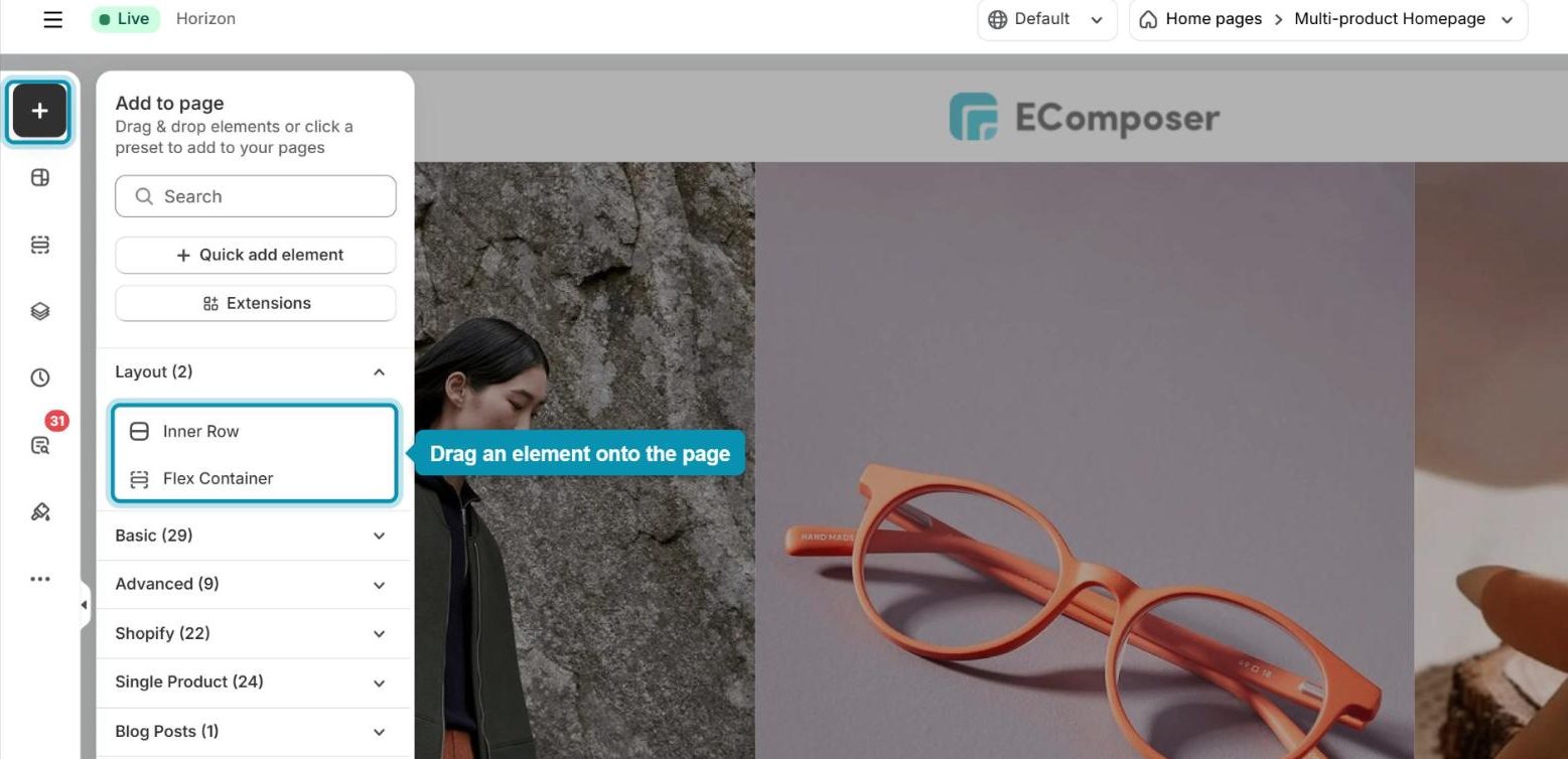
Most of the building in EComposer happens by dragging elements from the Add (+) panel onto your page and moving them around. On a computer, the browser tracks this through mouse events (press, move, release). Phones and tablets use touch events instead, which behave differently, so dragging an element, dropping it in the right spot, or selecting a small part of a section becomes unreliable or doesn’t respond at all.
2. Small screens can’t fit the editor
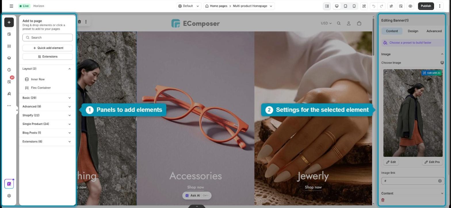
The editor shows a lot at once: the element panels on the left, your page in the middle, and the settings panel on the right, plus a top bar with device views, Preview, and Publish. On a small screen, there isn’t room for all of this, so the sidebars get cut off or cover your page, and you can’t see the changes you’re making.
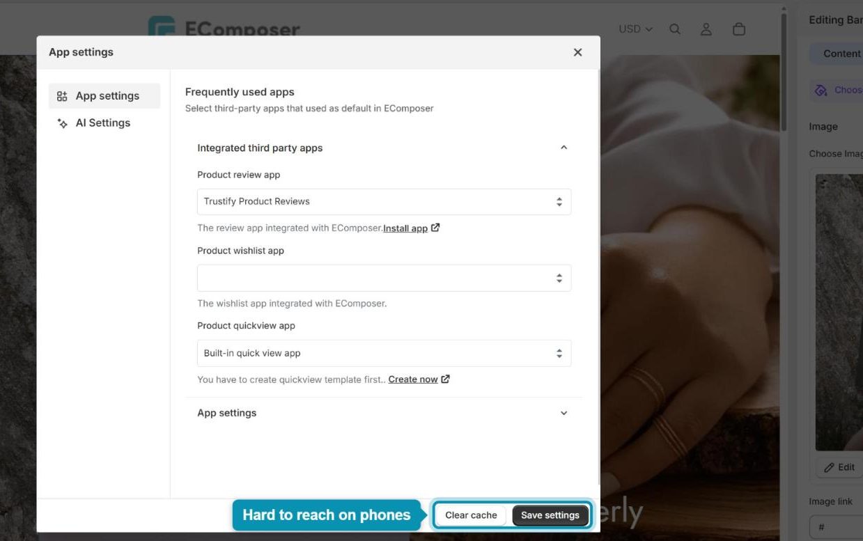
Pop-ups such as App settings also need plenty of space. On a phone, they overflow the screen, and the buttons at the bottom (like Clear cache or Save settings) can end up out of reach.
3. Mobile browsers have technical limits
Mobile browsers, especially Safari on iOS and many Android browsers, don’t fully support some of the HTML and JavaScript features the editor relies on for dragging and precise positioning. Even when the editor loads, placing elements accurately on a touch screen is very hard to get right, which can lead to misplaced elements or unsaved changes.
4. What you can do instead
You can still build a great mobile experience; you just do it from a computer. Here are the options that work best:
Design on a desktop or laptop: This gives you the full editor with every option visible, so it’s the quickest and most reliable way to work.
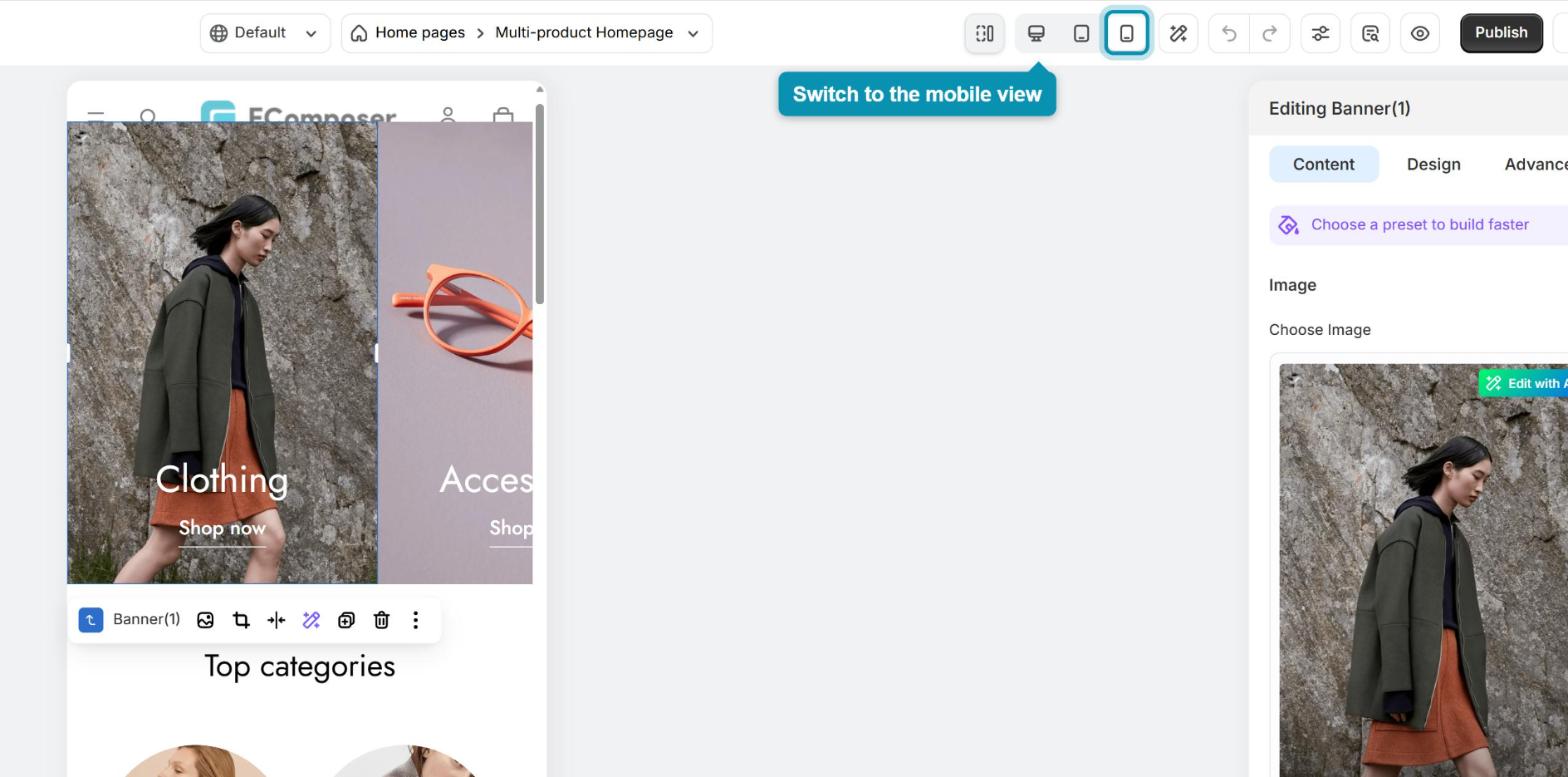
Check your mobile layout in the editor: To see and adjust how your page looks on phones, click the Mobile icon in the top bar of the editor. The canvas switches to a phone-sized view, and settings you change there apply to mobile only.
Use a remote desktop app: If you only have a tablet with you, apps like Chrome Remote Desktop or Microsoft Remote Desktop let you control your computer from it, so you’re still using the editor on a desktop browser.
Your published pages work perfectly on phones and tablets. This limit only applies to the EComposer editor, not to the pages your customers see.
While designing your pages, small details matter, so working on a big screen where you can see everything at once makes the job much easier and faster. Still stuck? Feel free to reach out to us via live chat and we’ll be happy to help.