

Popup Builder
Popup builder in EComposer allows you to quickly and easily create focused, attention-grabbing messages/submission form. By using a popup template, you can customize the appearance, content, and layout to:
- Boost engagement by directly asking a user for information (like an email).
- Highlight critical information or offers that the user might otherwise miss.
- Save time on design and development, letting you deploy a professional-looking message quickly.
Also, you may use this Popup template to show different popups on different pages. As an alternative, you can use this popup template to show up when you hit the submit button on a form, or click on the button.
1. How to build a new Popup template EComposer?
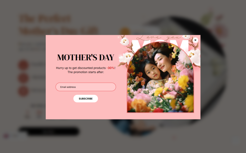
With the Popup Template feature, you can design engaging popups for your store. You can start from scratch using EComposer’s elements or choose a ready-made design from the template library to save time.
Build a New Popup Template from Scratch
- Step 1: In the App Dashboard, go to Templates → Popup → Build Popup Page.
- Step 2: Select Blank Template.
- Step 3: Drag and drop the elements you want to include in your popup layout.
This option gives you full creative control to design a unique popup that matches your store’s branding and purpose.
Build a Popup Template from Pre-made Designs
- Step 1: In the App Dashboard, navigate to Templates → Popup → Build Popup Page.
- Step 2: Choose a design from the available templates and click Select to apply it.
You can then customize the layout, content, and style to fit your store’s look and campaign goals.
2. Settings for the Popup
Popup trigger
Note: When you select trigger click, then all conditions ‘Show on’ will be disabled. And popup will only show when you select action click on button or form.
- Popup shows when: You can choose to use either Time delay, Scroll, Button Click/Form Click.
- Time delay: Allow you to set the time wait to start displaying the popup.
- Scroll (% down): Allow you to set how far visitors scroll down to see the popup
- Button Click/Form Click: Show the popup when you click a button or submit a form. See guide on how to connect EComposer form to Popup/SpinWheel.
- Time cookie expires: You can choose a time to show the popup again, such as always, an hour, or a day later.
- Show on: You can choose to use either All pages or Custom pages.
- All pages: The popup will appear for all pages on your website.
- Custom Pages: You can choose specific pages where the popup will appear. This allows you to display different popups on different pages of your store.
- Devices: It will let you choose the device to show the popup, including Desktop, Tablet, and Mobile.
- All users: You can choose to show the popup for target visitors. It could be for all, or for your guest or customer only
- All languages/All countries: It will let you choose the language/country that you want to display the popup in
- Popup animation to show: This will let you choose the animation effect when displaying the popup. Following the animation duration of the effect could be set.
- Popup priority: It will let you set the priority when you have other popups displaying on the same page.
Note: For popups with same triggers: lower number means higher priority
Popup design
- Popup position: It will enable you to adjust the position to the Center, Top left, Top right, etc.
- Design settings: This will allow you to adjust Width, Max width, Height, Max height, Background, Overlay color, Blur, and other fundamental design parameters.
Popup overflow
- Overflow: Options like Hidden, Scroll, and Auto are available in this configuration. When the content in the popup template is longer than the popup height, you can use the Scroll or Auto option to view it via scrolling. However, you can try Hidden to lock the overflow to scroll if you don’t want to use any like.
- Design settings: Selecting the Scroll or Auto option above will display the scrollbar. It will then allow you to customise the scroll bar’s size, color, and border radius.
Close button
- Close icon: You have the option to use the library’s close icon or upload your own.
- Design settings: The close icon’s location can be changed to the Top, Right, Left, or Bottom. and that will also allow you to change the icon’s Width, Height, Color, and other basic options.
3. How to delete a Popup template?
Go to App dashboard > Template > Popup > Click on the three dots > Remove button.


