

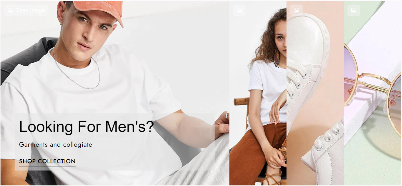
Media Accordion
The Media Accordion element helps improve your store’s layout and user experience by displaying images and videos in a compact, interactive format. It reduces visual clutter while guiding customers to focus on key product visuals and information step by step, making content easier to consume. By keeping pages clean and engaging, Media Accordion can help increase customer understanding, on-page engagement, and overall conversion performance.
1. Content
1.1 Banner items
The Banner Items section allows you to add, edit, or remove items displayed in the Media Accordion element. Each item consists of three main parts: Media, Content, and Button.
In Media, we have the settings such as:
- Source: Choose the media type (Image or Video).
- Upload / Select Media: Select the corresponding image or video based on the chosen source.
- Link (Source URL): Enter the URL where users will be redirected when clicking on the item.
In Content, you can add text to the item via 2 fields:
- Heading: Enter the main title.
- Sub Heading: Enter the subtitle.
In Button, there are settings for:
- Button Label: The text displayed on the button.
- Button Link: The URL the button redirects to when clicked.
- Button ID: Assign an ID to the button (for advanced customization purposes).
- Icon: Choose an icon to display with the button.
1.2. General
The General section contains global settings for the entire element:
- Banner expand on: Choose how items expand – on Hover or Click.
- Space between items: Adjust the spacing between items.
- Show media button: Display a button that allows users to view the image or video in a larger size when clicked.
- Enable lazyload for video: Enable lazy loading for videos to improve page performance.
- Disable video play on hover: Prevent videos from automatically playing when hovered.
- Video button icon: Select the icon displayed on the video when it is paused.
- Video button label: Customize the label text for the video button.
- Image button icon: Set the icon for the media button when the media type is an image.
- Open lightbox when click to: Choose how the lightbox opens:
- Only media button – Opens only when clicking the media button
- Whole item – Opens when clicking anywhere on the item
- Full width on mobile: When enabled, the accordion switches to a full-width slider layout on mobile devices, with navigation controls to switch between items.
2. Design
There are multiple categories to let you modify the styles of the details inside the Media Accordion element.
2.1. General
There are settings that let you adjust the Spacing around the element and the Height of the Media Accordion:
2.2. Media File
You can change the Image Fit with Opacity, Overlay, CSS Filter, Border and Border Radius of the medias in Normal and Hover states:
2.3. Media Button and Media Button Icon
With the buttons that open the media in a lightbox, you can adjust its style via Alignment, Typography, Text Shadow, Box Shadow, Spacing with the settings in Normal and Hover states, including Text Color, Background, Border and Border Radius.
And the Position, Color, Size, Rotate and Spacing of the media button icon:
2.4. Content
In this category, you can edit the Background, Position and Spacing of the content inside the items
2.5. Heading and Sub Heading
In these categories, via the Alignment, Text Color, Text Shadow, Text Gradient and Spacing, you can configure the texts in the Content as your desire.
You can check this video for the Heading settings:
And Sub Heading settings:
2.6. Button and Button Icon
Here you can adjust the Alignment, Text Aligment, Typography, Text Shadow, Box Shadow, Spacing with the settings in Normal and Hover states, including Text Color, Background, Border and Border Radius. With the button icon, you can change its Position, Color, Size, Rotate and Spacing settings. Please refer to this video for more details:


