Testimonials
This element provides merchants with a powerful tool to create and showcase feedback and reviews from clients, and collaborators and display them in an organized and visually appealing manner, enhancing their store’s credibility and reputation.
1. Adding the Testimonials
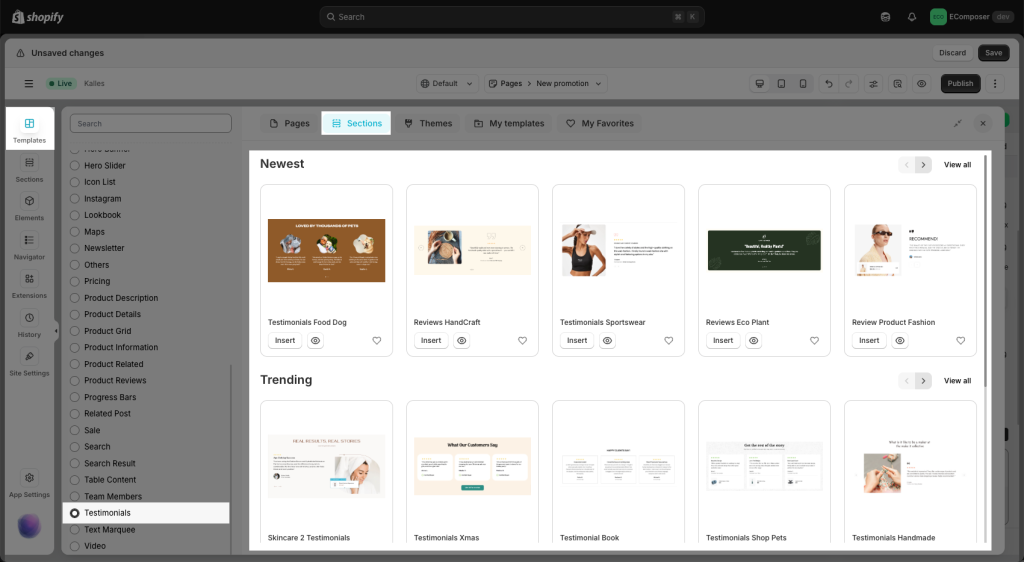
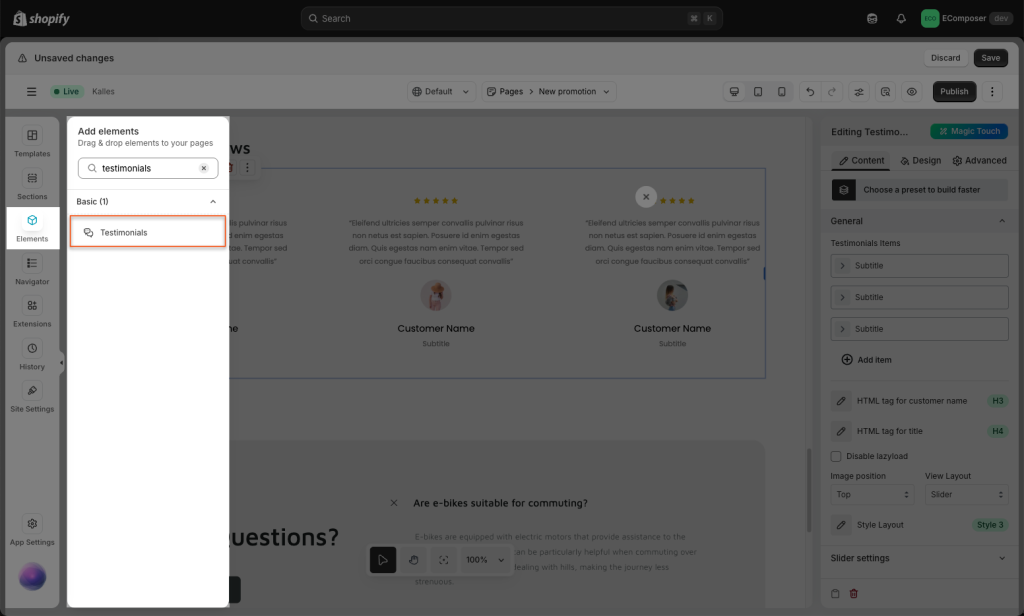
- Click into Elements –> Basic –> Testimonials
- Drag the Testimonials element from the left sidebar and Drop it wherever you want it to stay.
2. Configuring Testimonials
General:
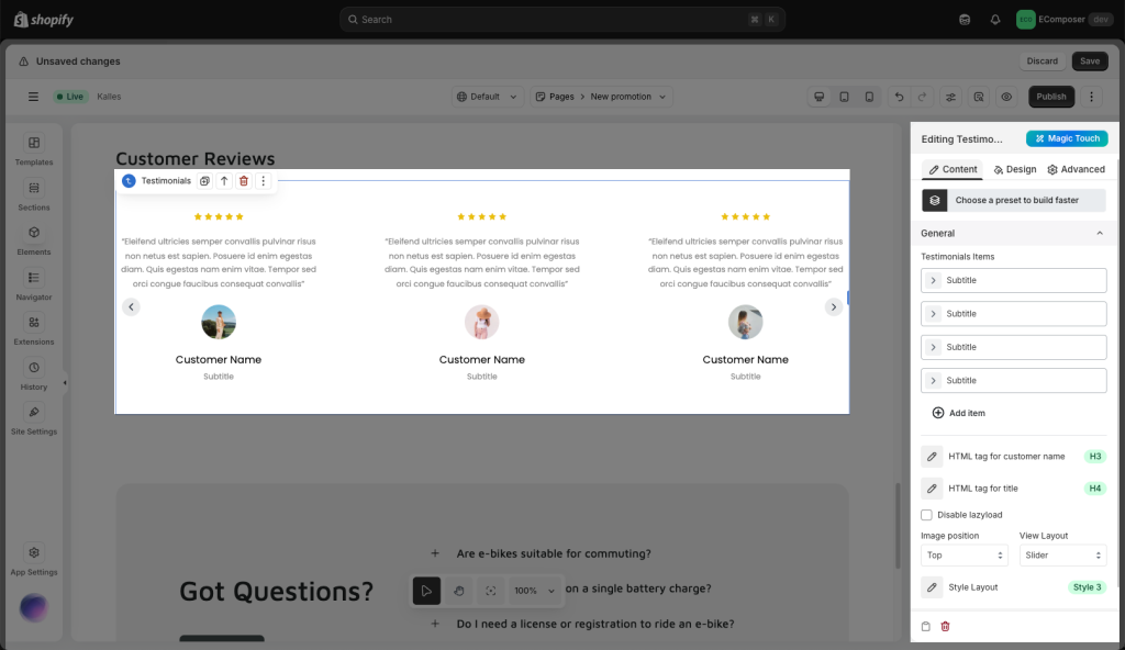
- Testimonial Items: Inside each item, we have the option to change the avatar, star rating, text, title, and customer name.
- Disable lazy load: By disabling lazy loading, all images or media files load instantly when a page is accessed, ensuring a seamless and uninterrupted user experience.
- Image position: You can set the avatar image to be on top of the name or aside it here.
- View layout: You can switch between slider or a grid layout for the testimonials.
- Style layout: There are a total of seven styles for you to choose from here.
Slider setting:
- Layout: You can set the slider layout as horizontal or vertical.
- Container height: You can increase or decrease the height of the slider here.
- Infinite Loop: After you go on Autoplay, this function will let you view the slide smoothly as a repeating roll and never stop.
- Autoplay: This allows this element to auto-run and goes back to the beginning to play it again and again. Whenever you click on Pause on hover, so the slide will stop when you hover on it.
- And some of them basically settings for the slide such as Items per row, Column gap, Navigation, Navigator, or Transition duration.
3. Designing Testimonials
General
- You can change the Background color, Border, Box Shadow, and Border Radius here.
Slide
- You can change the Background color, Border, Box Shadow, and Border Radius and Spacing for 3 states Normal, Active and Hover.
Rating icon
- You can change the Size and Rotation, Background color, Border, Box Shadow, Border Radius and Spacing for 3 states like Normal, Active and Hover.
Image
- There’s an option to change the Vertical alignment, Width, Max width, Height, Image fit, Opacity, Border, Box Shadow, and Border Radius and Spacing.
Name/Title/Content
- You have the option to change the Typography, Text color, Text gradient, and Text shadow.
Navigation
- You can change the Size and Rotation, Primary color, Background color, Border, Box Shadow, Border Radius, Transition duration and Spacing for 2 states like Normal and Hover.